You don’t need to reinvent the wheel when it comes to Gantt charts, but you should make it roll in the right direction. It can be helpful to take inspiration from existing Gantt chart examples to make sure your project continues down the right path.
In this guide, we’ll go through different Gantt chart examples spanning different industries and use cases. We’ll also introduce you to different tools you can use for building your Gantt chart, including a look at how monday work management can boost your project planning with AI and automations.
Get startedWhat is a Gantt chart?
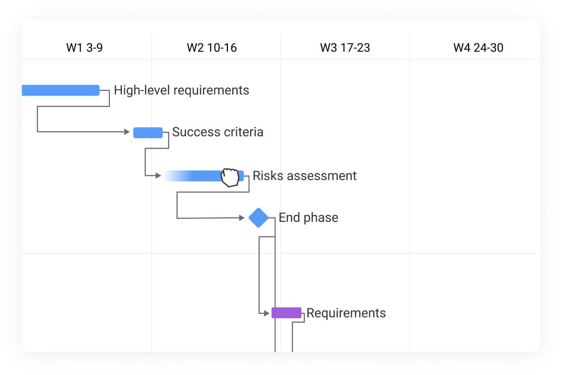
A Gantt chart is a visual project management tool that displays tasks as horizontal bars along a timeline, showing start dates, end dates, durations, and dependencies.
Project managers use Gantt charts to understand how work is sequenced, how tasks relate to one another, and where delays may impact delivery. Gantt charts are most effective when paired with software that supports real-time updates, collaboration, and automation.
Did you know? Gantt charts were created by Henry Gantt and date to 1896!
Why are Gantt charts important in project management?
At the fundamental level, Gantt charts are used for planning and managing projects, though they are definitely stronger on the planning side of things. More specifically, Gantt charts are used by project managers to:
- Plan and allocate resources
- Determine task dependencies
- Understand project timelines
- Determine the critical path
- Set project priorities
- Break complex projects down into manageable tasks
The essential components of a Gantt chart
While each Gantt chart is tailored to its corresponding project, there are specific components you’ll find in every chart. These essential components ensure that the chart is easily visually readable and that the work is accurately represented. Here’s what to look for in a Gantt chart:
- Timeline spans left to right, is usually measured in days, and depicts the dates the project will take place.
- Tasks are represented by a rectangle on the Gantt chart.
- Duration determines how long the project is going to take and is often marked by a start date and an end date.
- Assignees are available in most Gantt chart software platforms, whether as names or images.
- Milestones are tasks with no duration, which are ticked off when a major section of the project is completed or major events occur. Often, larger projects will be split up into multiple phases, represented as milestones on a Gantt chart.
- Dependencies appear as arrows or lines connecting tasks to signify where a task can’t begin or end until another task has started or finished.
Poorly planned projects (and unaccounted for dependencies) are major contributors to project failures, so a strong understanding of task order and duration is a major key to project success.
10 examples of Gantt charts for different use cases
You may have an idea of what a Gantt chart looks like, but how does it work in practice? Gantt charts can vary from one industry to another, or even between departments in the same company. The format itself is versatile enough to fit the needs of engineers, marketers, and even construction workers. Let’s take a look at a few different Gantt chart examples, ranging in functionality.
1. Project management Gantt chart example
Of course, the number one use for Gantt charts is project management, but this can take on a lot of different forms depending on your industry and a project’s scope. You’ll notice in this sample Gantt chart that tasks are color-coded and divided into several sections, such as Planning and Execution. The UX is clean, sleek, and intuitive.
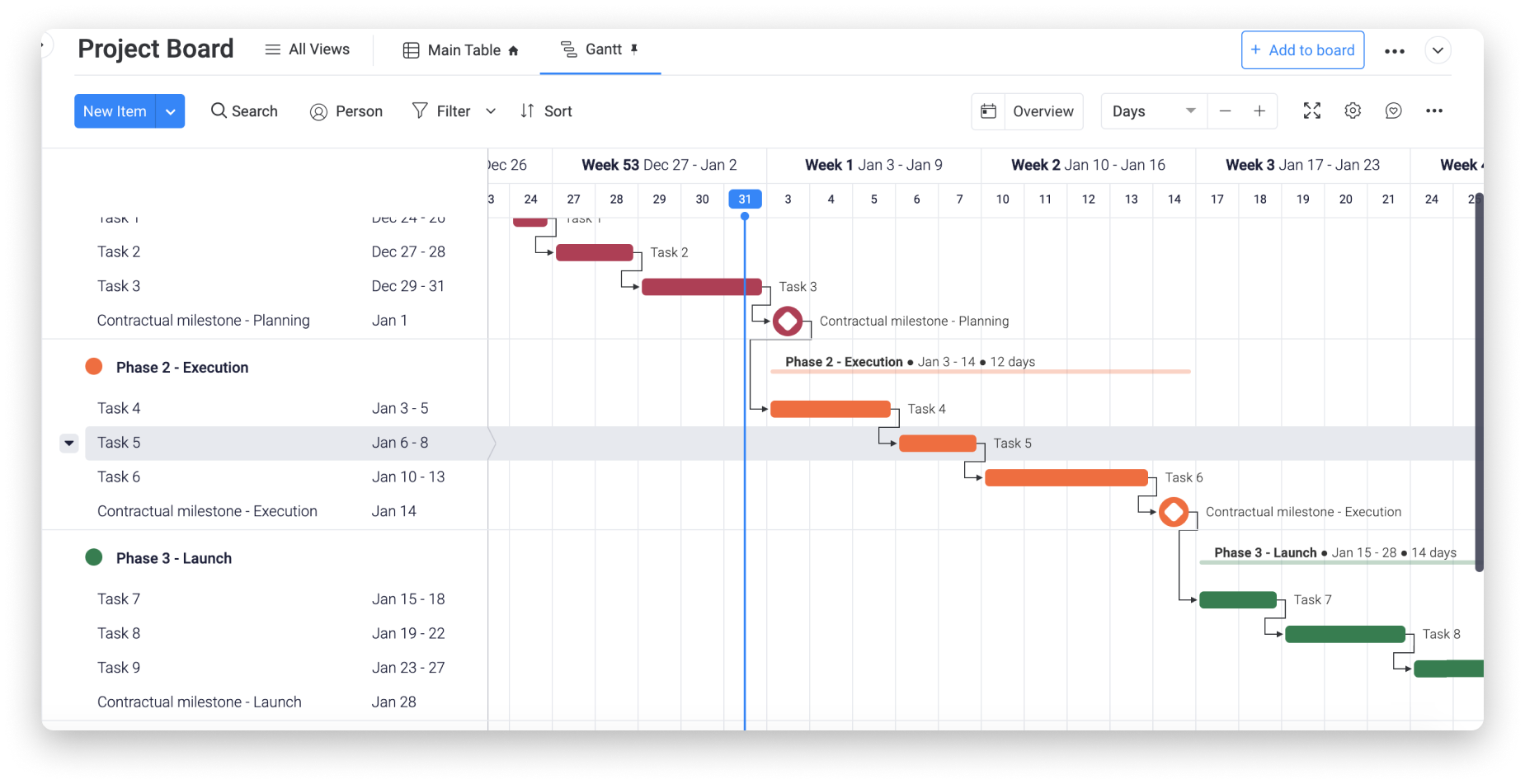
Gantt charts like these allow project managers to separate the project schedule into phases, making it easy for a team leader to quickly see where the project stands. Some advanced Gantt chart tools even allow you to filter out data to really narrow down on a specific part of your project plan.
Why this works: Breaking the project into phases with color-coded tasks gives stakeholders instant visibility into progress without digging into individual task details.
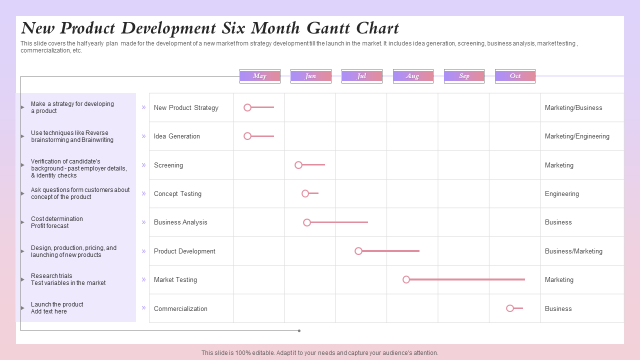
2. Business plan Gantt chart example
If you’re thinking of starting a new business, Gantt charts can be a great way to determine the steps you’ll need to take before going to market. In the Gantt chart example below, you’ll understand how dependencies work in the real world: the stage “identify needed resources” depends on the previous stage, “interview owners of similar businesses.”
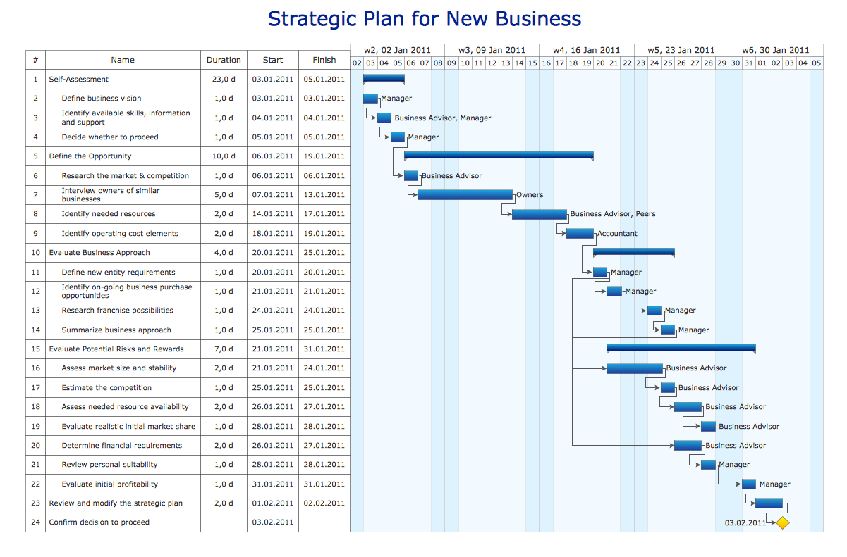
(Source)
Though this follows the standard organizational methods of a Gantt chart, this example is packed with text and information, making it slightly harder to understand at a glance. Additionally, this one is better suited for solo founders or early planning stages than cross-functional teams.
Why this works: Clearly defined dependencies help founders validate sequencing and assumptions before committing time, budget, or external resources.
3. Marketing campaign Gantt chart example
You can plan and manage all kinds of marketing campaigns with Gantt charts, including for social media and email marketing. The example here shows how a company might plan communications around a multichannel campaign, including emails, events, and social media.
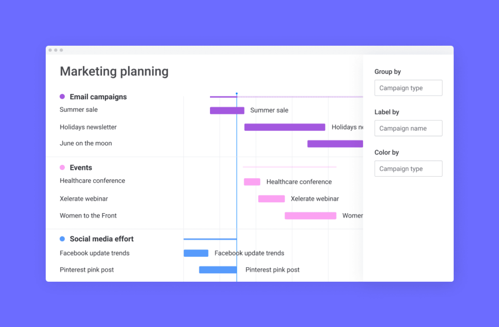
In this example, tasks are grouped by channel, which helps visually divide the Gantt chart so that different teams can focus on their own tasks.
Why this works: Grouping tasks by channel makes ownership clear and helps teams coordinate timing across email, events, and social media without overlap or gaps.
4. Product launch Gantt chart example
A product launch timeline is the central nervous system of a go-to-market strategy. This example visualizes the synchronization required between product, marketing, and business development teams. The chart begins with strategizing and gathering resources, and positioning phases, flows into creative development, and culminates in the launch.
(Source)
Product launch Gantt charts often have many dependencies. For example, a web team can’t build the landing page until the copy is approved, and the PR team cannot pitch to journalists until the embargo date is set. A platform like monday work management makes it possible for different teams to work on their own boards while feeding a master launch Gantt chart.
Why this works: Mapping dependencies across product, marketing, and PR ensures critical launch activities stay aligned and prevents downstream delays caused by missed approvals.
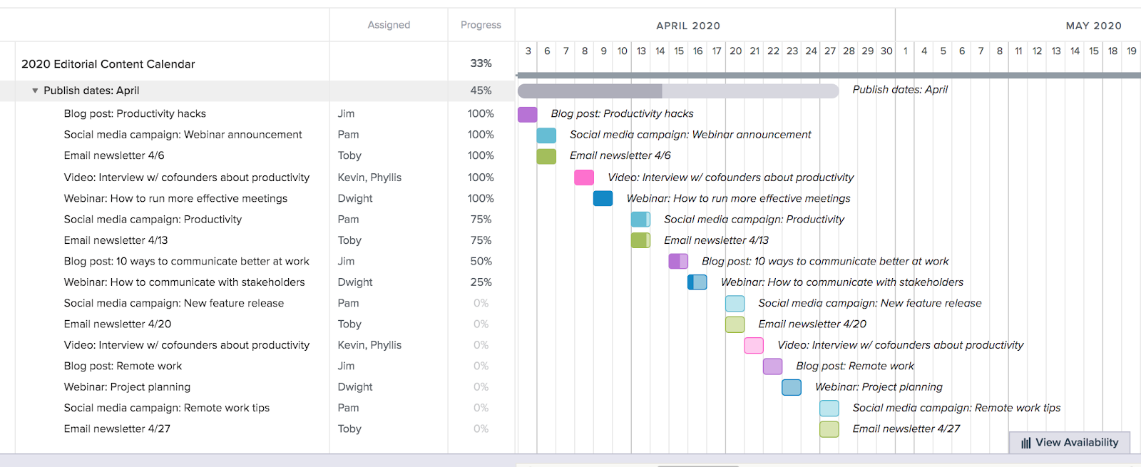
5. Content calendar Gantt chart example
Content strategy requires consistency. This Gantt chart example maps out a quarterly publishing schedule, treating content as a production line rather than ad-hoc tasks. Bars represent individual pieces of content, such as blog posts, social media campaigns, newsletters, and webinars.
(Source)
Recurring activities, such as weekly newsletters, appear as repeating task sequences. In a content calendar Gantt chart, dependencies might link the drafting phase to the design phase, ensuring designers know exactly when to expect copy. This helps content managers identify gaps in the schedule, allowing for proactive adjustments to the editorial calendar.
Why this works: Treating content as a production workflow makes dependencies between writing, design, and publishing visible, helping teams maintain consistency at scale.
6. Bug tracking Gantt chart example
Gantt charts can be used in a lot of different ways in software development, even for tracking and handling bugs. Submitted bug reports can show up on a Gantt chart organized by status, urgency, and timeline. In the example below, bugs are sorted by whether they’re new, in progress, on hold, or closed.
(Source)
Tasks can be dragged and dropped from one group to the next as they move through stages, and even color-coded to indicate higher-priority bugs that need immediate attention.
Why this works: Visualizing bugs by status and urgency allows development teams to prioritize fixes effectively while keeping release timelines intact.
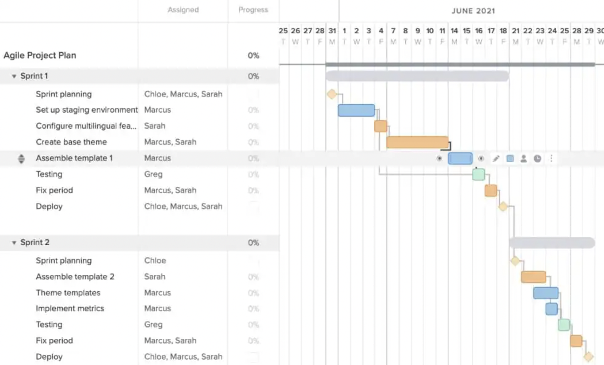
7. Agile sprint planning Gantt chart example
Agile teams often use Gantt charts as a communication layer, not a task manager. Instead of tracking rigid tasks, Agile Gantt charts represent sprints over time by visualizing the duration of each sprint.
(Source)
Gantt charts are also flexible, meaning they can be easily updated if a sprint’s scope or timeline changes. Gantt chart tools can adjust as needed, rearrange tasks to stay on track with deadlines and original plans.
Why this works: Visualizing sprints over time helps Agile teams communicate timelines and dependencies to stakeholders without locking teams into rigid task plans.
8. Software release timeline Gantt chart example
A major software release involves more than just coding. This type of Gantt chart should cover the full software release lifecycle: code freeze, QA testing cycles, User Acceptance Testing (UAT), documentation updates, and deployment.
Dependencies link the “Go/No-Go” decision meeting to the final deployment task. Software release Gantt charts ensure that DevOps, QA, and product teams are aligned on the exact sequence of events leading up to the release window.
Why this works: Sequencing QA, UAT, and deployment tasks clarifies handoffs between teams and reduces last-minute risks ahead of release windows.
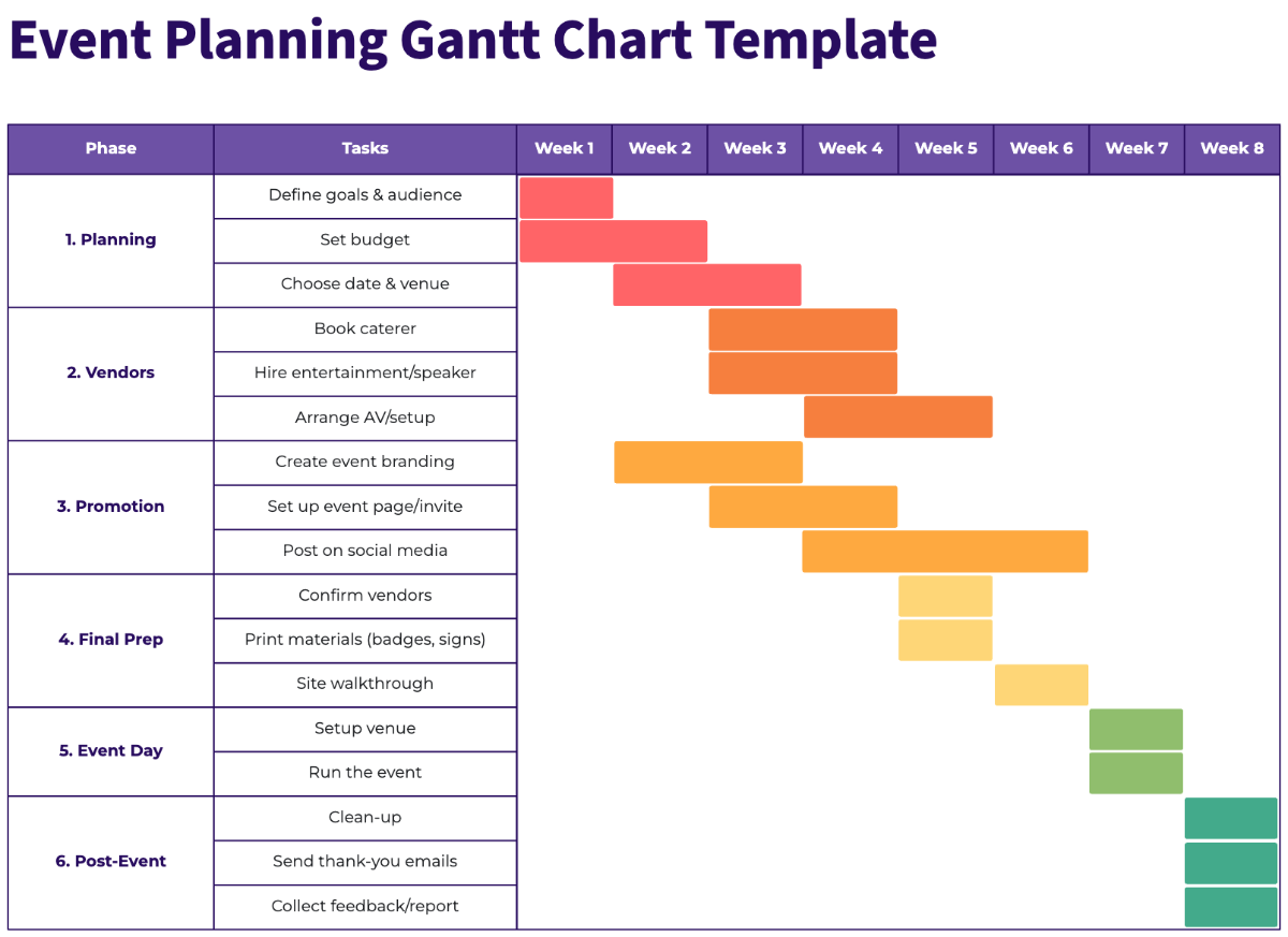
9. Event planning Gantt chart example
There are a lot of similarities between planning an event and a launch, which is why Gantt charts work well in this scenario, too. Gantt charts help event teams make sense of a ton of different variables: deadlines, vendors, and tasks that involve multiple resources.
(Source)
More complex event planning Gantt charts allow you to group tasks by vendor, the people responsible for the tasks, or planning phases. Gantt charts also help outline dependencies in events, like establishing a guest list before finalizing the head count with a venue.
Why this works: Centralizing vendor timelines and task dependencies helps event teams manage complex logistics without missing critical deadlines.
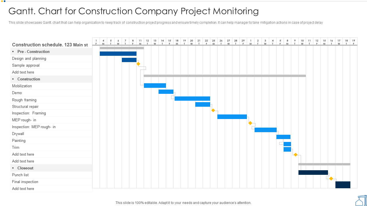
10. Construction schedule Gantt chart example
Construction projects can benefit from Gantt charts when it comes to scheduling shifts, milestones, and building phases. In this Gantt chart example, it’s easy to visualize a large, complex project in one view, including phases for pre-construction, construction, and closeout and inspections.
(Source)
Gantt charts are particularly helpful for signaling dependencies between construction tasks, like approving design plans before beginning to break ground. With all the small tasks that go into a construction project, Gantt chart dependencies are essential for accurate scheduling.
Why this works: Visualizing long-term phases and approvals makes it easier to manage dependencies and coordinate multiple crews across a complex build.
Which Gantt chart tool is right for you?
Creating Gantt charts might be easier than you think. With tools like Excel, Word, and software platforms, teams and project managers can build customized charts in minutes. Here’s a look at a few different tools you can consider for creating your next Gantt chart.
Gantt Chart in Excel
It’s possible to create a simple Excel Gantt chart, but it’s not always easy to identify all the information you need to stay organized. While Excel is great when it comes to managing complex formulas, there isn’t a lot of flexibility to assign people to specific tasks, collaborate in real-time, or group items within a task. Additionally, creating dependencies and task updates takes more effort.
Excel Gantt charts are best suited for static planning, not for managing live projects that require frequent updates, dependencies, and team collaboration.
Pro tip: Look for tools that have time and date customization, a way to assign tasks to teammates, a status column to update stakeholders, and different work views that make it easy for anyone to understand project progress straightaway.
Gantt Chart in PowerPoint
As PowerPoint is a more visual medium than Excel, there are slightly more customization options. You can add color-coded months and teams, along with a clear way to mark milestones.
PowerPoint is a good option if you’re looking to present a project timeline to stakeholders or to your team. That said, it may not be the best option for project management as it still lacks the ability to automate tasks and statuses and collaborate efficiently.
PowerPoint works well for presenting timelines, but it’s not designed for ongoing execution, real-time updates, or dependency management.
Gantt Chart in Word
Microsoft Word makes it easy for teams to create simple visual Gantt charts using premade templates. Teams can create tables and then add timelines, responsibilities, and subtasks in one visual overview. It can be a good option for teams that want to create a straightforward Gantt chart for individual use or small teams. Still, Microsoft Word lacks an interactive element that helps teams adapt to project challenges or updates on the fly.
Word-based Gantt charts are useful for simple, one-off planning, but they lack the flexibility needed for dynamic project management.
Gantt chart software
Using a comprehensive Gantt chart software platform like monday work management, project managers can simply punch in the project data, assign and notify team members responsible for specific tasks, and adjust as required.
Unlike the familiar tools above, project management software allows teams to automate their Gantt charts, add third-party integrations, easily collaborate, gather insights, and even apply AI for more hands-off planning and management.
Get startedTurn your Gantt charts from static to smart with AI
Combining AI with your Gantt chart software brings it from a static record to a tool capable of automating, predicting, and reacting. With AI-integrated solutions like monday work management, AI can be used alongside Gantt charts to anticipate challenges and optimize workflows automatically.
Predictive timeline optimization
AI analyzes historical performance data to suggest realistic task durations. If a specific team consistently takes longer on QA testing than allotted, an AI-enhanced Gantt chart can automatically adjust timeline estimates. This allows teams to more accurately plan and schedule based on past velocity patterns, helping leaders make promises they can keep.
Automated risk detection
Software with advanced AI capabilities can use it to scan projects for overlooked risks. Visual indicators flag potential issues weeks before they become emergencies, such as resource conflicts or critical path diversions.
In monday work management, AI active risk monitoring helps teams receive proactive alerts when a dependency chain is at risk of slipping so that they can take corrective action before tasks or entire projects get derailed.
Smart dependency mapping
Setting up dependencies manually creates a lot of opportunities for error. On the other hand, AI-powered dependency mapping can suggest logical relationships between tasks based on the project type.
Deployment cannot begin until code review is completed. This smart mapping system reduces administrative burden on project managers and prevents tasks from slipping through the cracks.
Automate your Gantt chart with monday AI
Building a Gantt chart from scratch can be time-consuming and prone to error. Using a template in a platform like Excel is a better option, but it still doesn’t get you the level of automation and collaboration you need if you want to improve productivity. A solution like monday work management gives you the best of both worlds: customizable Gantt chart templates powered by easy-to-implement AI and automation.
Gain a visual overview of your projects and tasks with monday work management’s Gantt Chart View and Widget. You can also connect essential files to tasks in your chart, assign tasks to team members, and update statuses all from one place. The platform’s AI makes it simple to automate repetitive workflows, like updating schedules, linking dependencies, or aggregating data.
Here’s a closer look at some of monday work management’s best features for Gantt chart management.
Data-driven insights and in-context collaboration
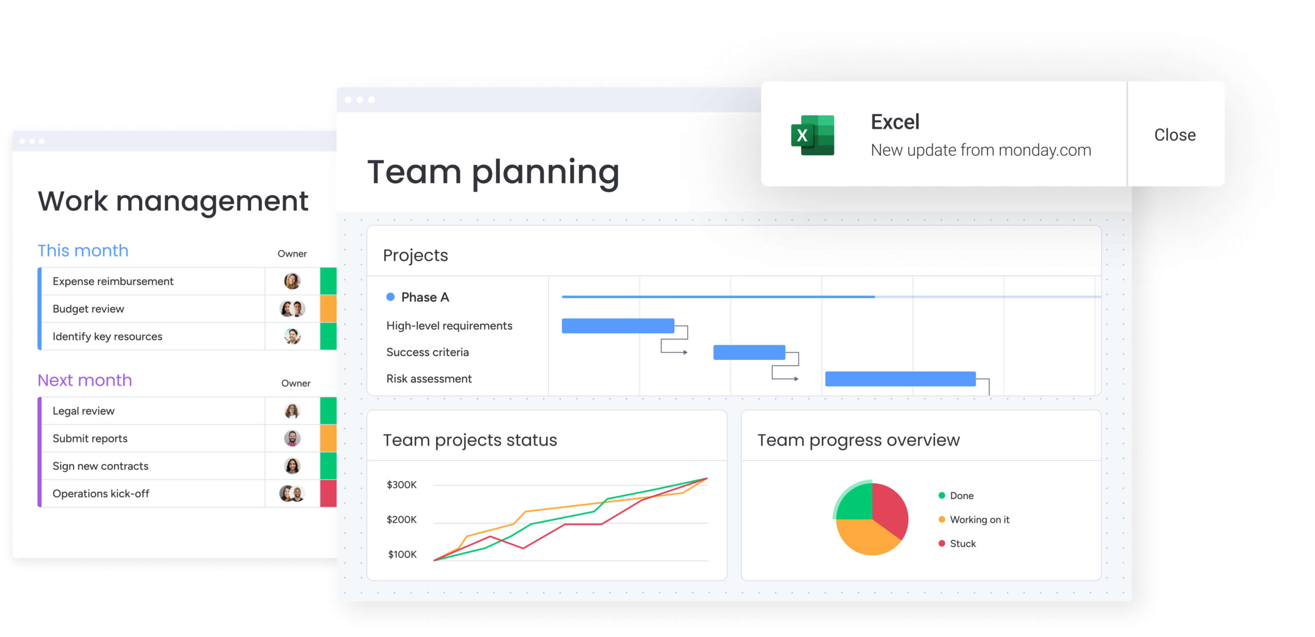
Gantt charts contain valuable data about timelines, workloads, and dependencies, but traditional tools like Excel or Word make it difficult to extract insights or collaborate effectively. With monday work management, teams can generate automated reports and predictive forecasts from Gantt chart history while collaborating directly in context through comments, file uploads, and task-level discussions.
This keeps insights, communication, and execution aligned in one shared workspace instead of scattered across emails and meetings.
Project and task workflow automations
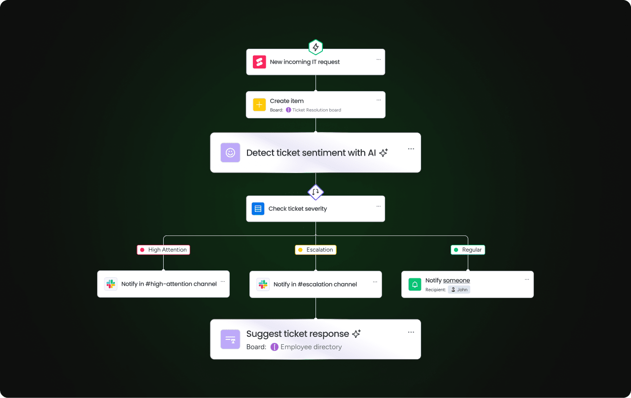
Build your own custom workflow automations with flexible formulas that you can create on your own or with AI. The platforms’ AI Blocks assist in categorizing tasks and suggesting breakdown structures, while automation handles routine dependency shifts. Easily create automations to send time-sensitive updates to the right team members when a deadline approaches so that you’re always on top of your tasks.
Customizable interface that scales
Not only is monday work management a feature-rich platform complete with AI tools that can automate your Gantt chart, but the interface itself is easy to use. With intuitive drag-and-drop functionality, it’s simple to move tasks between groups or reassign work between team members. Easily add new team members, expand projects, or invite external stakeholders for a platform that scales as your business grows.
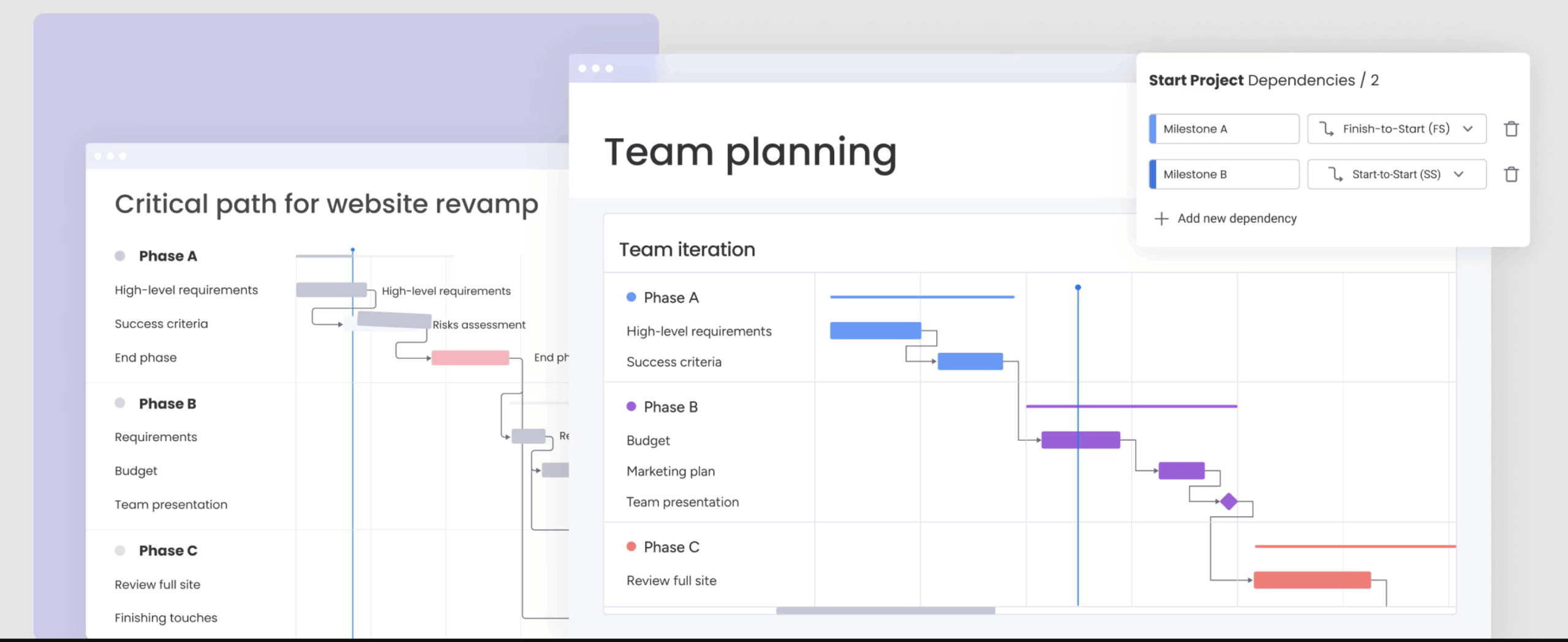
7 best practices for successfully implementing Gantt charts
Succeeding with a Gantt chart isn’t as simple as plugging in tasks and deadlines and expecting things to run smoothly. Maximizing the value of a Gantt chart requires discipline and adherence to core project management principles. These practices ensure the chart remains accurate and reliable.
-
Make dependencies explicit: Dependencies define the logical order of work. Clearly mapping task relationships prevents blockers, exposes risk early, and ensures teams don’t start work before prerequisites are complete.
-
Focus on critical path visibility: The critical path determines the project’s finish date. Highlight these tasks visually so teams understand where delays will have the biggest impact.
-
Update progress consistently: A Gantt chart is only useful if it reflects reality. Establish a regular update cadence or automate status changes to keep timelines accurate.
-
Balance detail with readability: Use parent tasks and sub-items to give executives a high-level view while still supporting detailed execution for delivery teams.
-
Include buffer time for risks: Build contingency buffers into critical phases to absorb unexpected delays without jeopardizing delivery dates.
-
Use color coding strategically: Apply a consistent color system to represent phases, priorities, or teams so stakeholders can orient themselves instantly.
-
Share real-time updates with stakeholders: Gantt charts should be accessible and dynamic. When timelines change, updates should propagate automatically so everyone stays aligned.
Create your custom Gantt chart today
It might feel a bit daunting to create a Gantt chart for an important project, especially if you haven’t built one before. Luckily, with software like monday work management, you don’t have to do it alone.
With pre-built Gantt chart templates, widgets, and AI to automate important workflows, you can take your Gantt chart to the next level. As your projects grow in complexity, the customization options ensure your Gantt charts scale seamlessly from solo tasks to enterprise-wide initiatives.
Get startedFAQs
Can Gantt charts work effectively for Agile teams?
Yes, Gantt charts can support Agile teams when used flexibly. They’re helpful for sprint planning, tracking dependencies, and communicating timelines to stakeholders. The key is avoiding rigid schedules and using them as living documents that adapt to changing priorities. Many Agile teams use Gantt views alongside Kanban boards for comprehensive project visibility.
What’s the difference between a Gantt chart and a project timeline?
A project timeline shows key milestones and deadlines in chronological order, while a Gantt chart displays tasks as horizontal bars with durations, dependencies, and resource assignments. Gantt charts provide deeper detail about task relationships and progress tracking. Think of timelines as simplified overviews and Gantt charts as comprehensive scheduling tools.
How often should you update your Gantt chart?
Update your Gantt chart weekly for most projects, or daily during critical phases. Real-time collaboration tools make continuous updates simple, as team members can adjust task statuses as work progresses. The frequency depends on project complexity, team size, and pace of change. Consistent updates ensure accuracy and maintain stakeholder confidence.
What are the most common Gantt chart mistakes to avoid?
Common mistakes teams make when using Gantt charts include overcomplicating with too many tasks, ignoring dependencies, forgetting resource constraints, and failing to update progress regularly. Avoid unrealistic timelines and ensure task owners are clearly assigned. Finally, it would be a mistake to treat Gantt charts as static documents; they should evolve with your project’s reality and changing circumstances.
Can AI automatically generate Gantt charts from project data?
Yes, AI tools can generate Gantt charts from project descriptions, task lists, or historical data. They can suggest timelines, identify dependencies, and optimize resource allocation. However, human oversight is still essential for validating assumptions, adjusting for team capacity, and checking that the schedule aligns with business priorities and constraints.
How does monday work management’s Gantt functionality differ from other project management platforms?
With monday work management, teams get highly visual, customizable Gantt views integrated with other workflow views like Kanban and Calendar. The platform offers a simple drag-and-drop no-code interface, real-time collaboration, and automation features to streamline updates. Additionally, the integration of AI features helps suggest optimal timelines, identify potential bottlenecks, and automate task dependencies, making project planning faster and more intelligent than traditional tools.