


Every project manager knows the feeling: dozens of tasks, overlapping deadlines, and a team waiting for direction. A Gantt chart Excel template gives you a quick way to map out tasks, durations, and milestones without investing in new software. It’s a practical starting point for teams that already live inside spreadsheets, letting you sketch a project timeline in minutes and share it with stakeholders right away.
This guide walks you through building a Gantt chart in Excel from scratch, offers a free downloadable template, and explores when a dedicated platform like monday.com’s AI Work Platform might serve your team’s needs even further.
Key takeaways
- A Gantt chart Excel template helps you visualize project timelines, task durations, and dependencies inside a familiar spreadsheet environment.
- Building a Gantt chart in Excel requires formatting a stacked bar chart manually, which works well for small projects with fewer than 20 tasks.
- Excel Gantt charts lack real-time collaboration, automatic dependency tracking, and built-in automations, making them difficult to scale for complex projects.
- monday.com’s AI Work Platform offers a built-in Gantt view with drag-and-drop scheduling, visual dependencies, baseline comparisons, and automations that eliminate manual updates.
- Choosing between Excel and dedicated project management software depends on your project’s complexity, team size, and need for real-time collaboration.
What is a Gantt chart?
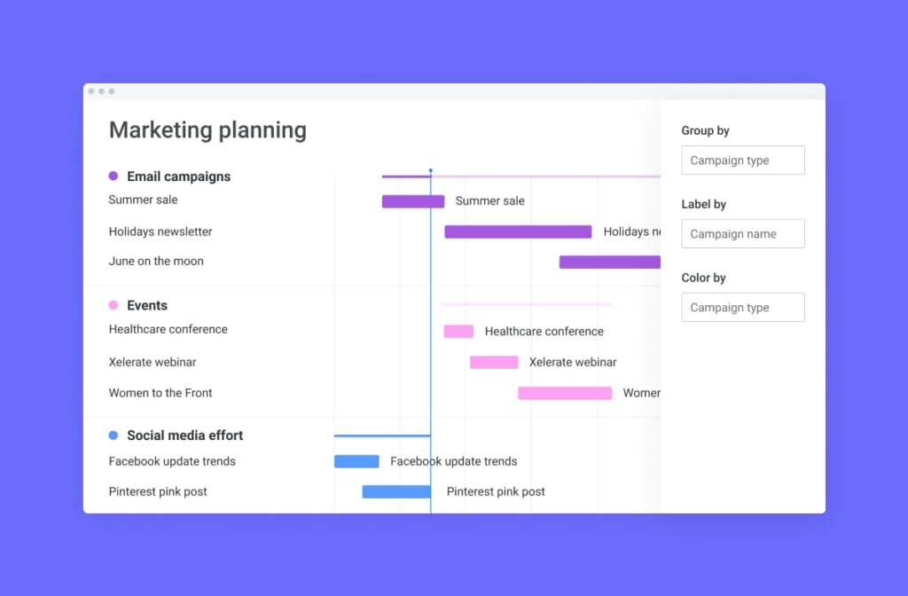
A Gantt chart is a horizontal bar chart that maps project tasks against a timeline. Each bar represents a single task, stretching from its start date to its end date. The result is a visual snapshot of your entire project schedule on one screen.
What makes a Gantt chart so useful? It answers the three questions every project manager asks daily: What needs to happen? When does it happen? And how do tasks connect to each other?
The chart typically has two sections. On the left, you’ll find a list of tasks organized by phase or category. On the right, a horizontal timeline displays colored bars showing each task’s duration. Arrows or lines between bars indicate dependencies, which are the relationships that determine the order of work.
Teams use Gantt charts across industries, from construction and software development to marketing campaigns and event planning. They’re especially valuable when projects involve multiple people, overlapping timelines, or tasks that can’t start until others finish.
The core components of a Gantt chart include tasks and subtasks, start and end dates, task durations shown as horizontal bars, dependency arrows, milestones marking key deliverables, and a vertical line indicating today’s date. Together, these elements give you a comprehensive view of where your project stands and what’s coming next.
How to make a Gantt chart in Excel: Step-by-step guide
Building a Gantt chart in Excel takes some manual formatting, but the process is straightforward once you know the steps.
Whether you’re working on a PC or a Mac, the approach is similar. The key difference is in how Excel’s interface labels certain menus. We’ve broken it down for both platforms so you can follow along regardless of your setup.
How to create a Gantt chart in excel on a PC
Follow these steps to build a functional Gantt chart in Excel on Windows.
- Set up your project data: Create a table with three columns: Task Name, Start Date, and Duration (in days). List every task your project requires, along with its planned start date and how many days it will take to complete.
- Calculate the duration column: If you have both start and end dates, use a simple formula to calculate duration. In the Duration cell, enter
=End Date - Start Date. This gives you the number of days each task spans. - Insert a stacked bar chart: Highlight your Start Date and Duration columns (including headers). Go to the Insert tab, select Bar Chart, and choose Stacked Bar. Excel will generate a basic stacked bar chart with two color segments for each task.
- Add your task names: Right-click the chart and select “Select Data.” Under Horizontal Axis Labels, click Edit and select your Task Name column. Your tasks now appear on the vertical axis of the chart.
- Hide the start date bars: Click on the start date portion of any bar (the first color segment). Right-click, select Format Data Series, then set the Fill to “No Fill” and the Border to “No Line.” This makes only the duration bars visible, creating the Gantt chart effect.
- Reverse the task order: By default, Excel places the first task at the bottom. To fix this, right-click the vertical axis (task names), select Format Axis, and check “Categories in reverse order.” Your first task now appears at the top.
- Format the timeline: Adjust the horizontal axis to show your project’s date range. Right-click the date axis, select Format Axis, and set the minimum and maximum bounds to match your project’s start and end dates. Convert the dates to serial numbers by using Excel’s date-to-number conversion.
- Add finishing touches: Apply color coding to differentiate project phases. Add a chart title, remove the legend if it’s not needed, and resize the chart for readability. You can also add data labels to show task names directly on the bars.
How to create a Gantt chart in Excel on a Mac
The process on a Mac mirrors the PC steps, with a few interface differences worth noting.
- Set up your project data: Create the same three-column table: Task Name, Start Date, and Duration (in days). Enter all your project tasks with their respective dates and durations.
- Calculate your durations: Use the same formula (
=End Date - Start Date) to populate the Duration column automatically. Double-check that your date cells are formatted consistently. - Insert a stacked bar chart: Select your Start Date and Duration data, navigate to the Insert tab in the ribbon, and choose Stacked Bar under the Bar Chart options. The chart appears on your worksheet immediately.
- Add task labels: Click on the chart, then use the Chart Design tab to select “Select Data.” Map your task names to the vertical axis so each bar corresponds to a specific task.
- Make the start date bars invisible: Select the start date bars in the chart. Open the Format pane and set both Fill and Border to “No Fill” and “No Line.” Now only the duration bars remain visible.
- Reverse the task order: Click on the task name axis, open Format Axis, and enable “Categories in reverse order.” This places your first task at the top of the chart, matching the natural reading order.
- Adjust the date axis: Set the minimum and maximum values on the horizontal axis to match your project’s timeline. Use Excel’s date serial numbers for precision.
- Save as a template: Once your Gantt chart looks the way you want, save the workbook as a template. Go to File, then Save as Template. This lets you reuse the same formatting for future projects without rebuilding from scratch.
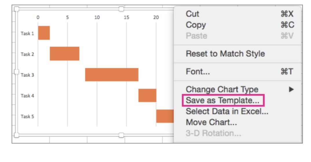 (
(Types of Gantt chart Excel templates
Is there a built-in Gantt chart template in Excel? Not exactly. Excel doesn’t include a native Gantt chart feature, but you can build one using stacked bar charts or download pre-made templates that do the formatting for you. The right template depends on your project’s complexity and what you need to track.
Here are the most common types of Gantt chart Excel templates and when to use each one.
Simple gantt chart template
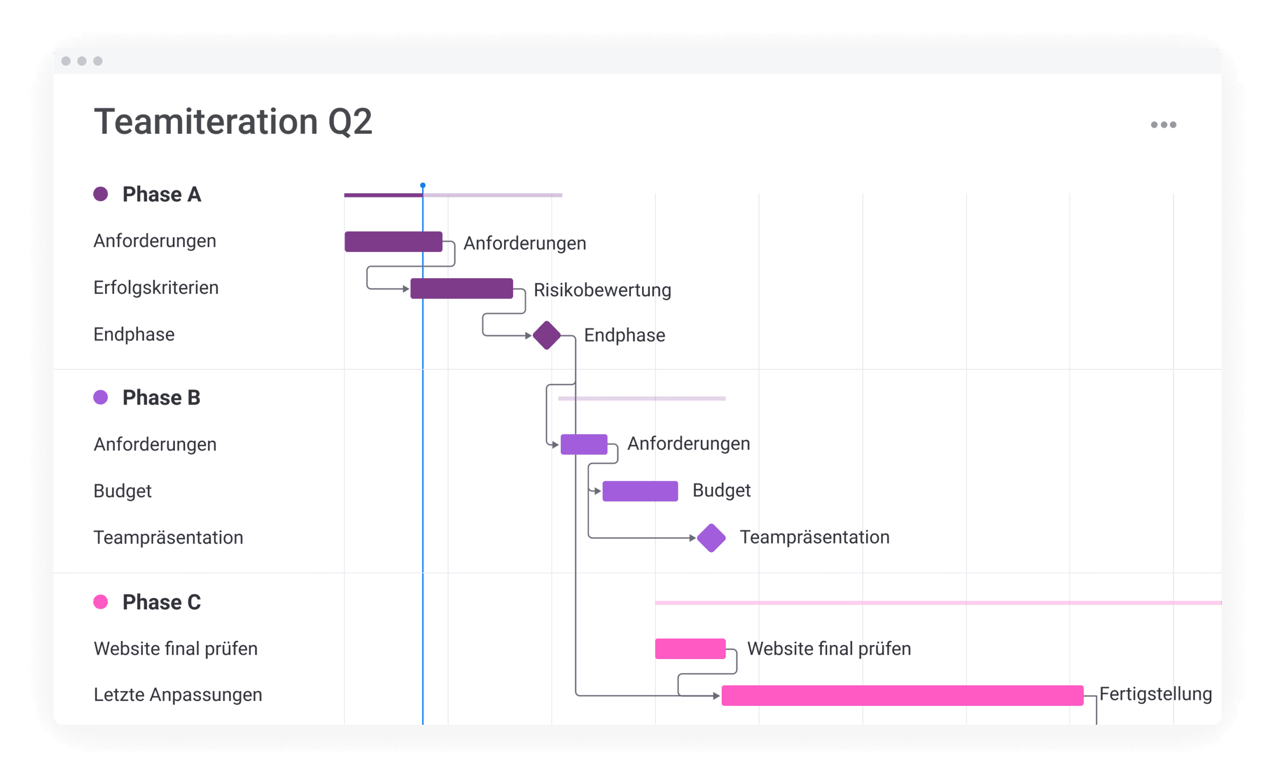
A simple template covers the basics: task names, start dates, end dates, and duration bars on a timeline. It’s ideal for small projects with a linear workflow where tasks don’t depend heavily on each other. Think of it as your starting point for quick planning sessions or personal project tracking.
Gantt chart template with dependencies
This template adds dependency tracking, showing which tasks must finish before others can begin. It typically uses conditional formatting or helper columns to visualize finish-to-start relationships. It’s a stronger option when your project involves handoffs between team members or sequential phases.
Gantt chart template with milestones

Milestone templates highlight key deliverables and deadlines alongside your task bars. They use diamond markers or distinct shapes to call out important dates, such as client approvals, launch dates, or review checkpoints. This format is useful when stakeholders need a high-level view of progress.
Project timeline template
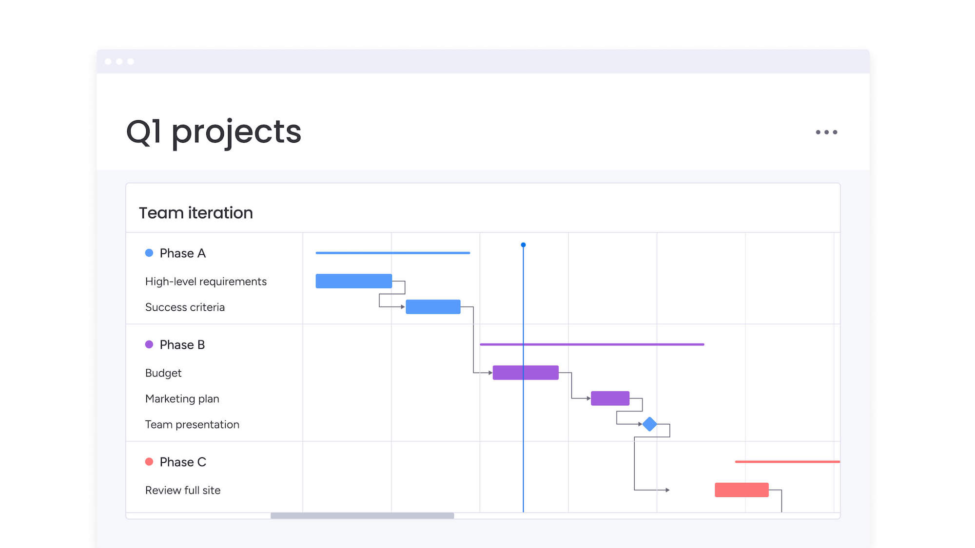
A project timeline template takes a broader view, organizing major phases rather than individual tasks. It’s less detailed than a full Gantt chart but provides a quick overview of your project’s structure. This works well for executive presentations or early-stage planning.
You can download our free Gantt chart Excel template to get started right away. If you’re looking for templates that go beyond spreadsheets, explore free Gantt chart templates for every project type, or browse monday.com’s template library for ready-made project plans with built-in Gantt views, automations, and collaboration features.
Best practices for using Gantt charts in Excel
Getting the chart built is only half the work. How you maintain and use it determines whether it actually helps your team stay on track. What habits separate a Gantt chart that drives results from one that collects dust?
Keep these best practices in mind to get the most from your Excel Gantt chart.
- Keep tasks at the right level of detail: Break work into tasks that take 1 to 5 days. Tasks that are too broad hide problems. Tasks that are too granular create clutter and make the chart hard to read.
- Use color coding strategically: Assign colors by project phase, team, or priority level. Consistent color coding lets anyone scan the chart and understand the project’s structure at a glance.
- Update the chart regularly: An outdated Gantt chart is worse than no chart at all. Set a cadence for updates, whether that’s daily or weekly, and stick to it. Mark completed tasks and adjust dates as timelines shift.
- Apply conditional formatting: Use Excel’s conditional formatting to automatically highlight overdue tasks, upcoming deadlines, or tasks nearing completion. This adds a layer of visual urgency without manual effort.
- Limit Excel Gantt charts to 20 tasks or fewer: Excel Gantt charts work best for smaller projects. Once you exceed 20 tasks, the chart becomes difficult to navigate and maintain. For larger projects, consider dedicated Gantt chart software that’s built to handle complexity.
- Save your formatted chart as a template: Once you’ve built a Gantt chart you’re happy with, save it as a reusable template. This saves hours of formatting time on your next project and ensures consistency across your team’s planning documents.
Limitations of using Excel for Gantt charts
Excel is a versatile spreadsheet application, but it wasn’t designed for project management. As your projects grow in scope and team size, those limitations become harder to work around. What are the disadvantages of using a Gantt chart in Excel?
Here are the most common challenges teams face when relying on Excel for Gantt charts.
- No real-time collaboration: Excel files are typically shared via email or cloud storage, which creates version control issues. When multiple people edit the same file, conflicting changes can overwrite important updates. Teams end up working from different versions of the truth.
- Manual dependency management: Excel doesn’t natively support task dependencies. You can simulate them with formulas, but they won’t automatically adjust when upstream tasks shift. Every schedule change requires manual recalculation across the entire chart.
- No baseline comparison: There’s no built-in way to compare your current schedule against your original plan. Without a baseline view, it’s difficult to measure schedule slippage or understand how far your project has drifted from its initial timeline.
- Scaling issues: Once a project exceeds 20 to 30 tasks, Excel Gantt charts become unwieldy. The chart gets crowded, scrolling becomes constant, and finding specific tasks takes longer than it should. Complex projects need a platform built for that level of detail.
- No automations: Every status update, notification, and schedule adjustment in Excel requires manual input. There’s no way to trigger automatic alerts when tasks are overdue or to auto-assign follow-up work when a predecessor finishes. This adds administrative overhead to every project.
These limitations don’t mean Excel is the wrong choice for every project. But when your team hits these walls repeatedly, it’s worth exploring alternatives built specifically for project management. monday.com’s AI Work Platform addresses each of these challenges with built-in Gantt views, automatic dependency tracking, real-time collaboration, and intelligent automations that eliminate manual updates.
Get startedHow monday.com's AI Work Platform simplifies Gantt charts
When your projects outgrow spreadsheets, you need a platform that handles the complexity without adding friction. monday.com’s AI Work Platform gives you the structure to plan, track, and deliver projects at scale, with intelligent features that adapt to how your team actually works.
The platform combines visual project planning with AI-powered automation, so you spend less time updating charts and more time making decisions. Whether you’re managing a product launch or coordinating cross-functional initiatives, the AI Work Platform keeps everyone aligned without the manual overhead that bogs down Excel-based workflows.
AI-powered task scheduling with monday sidekick
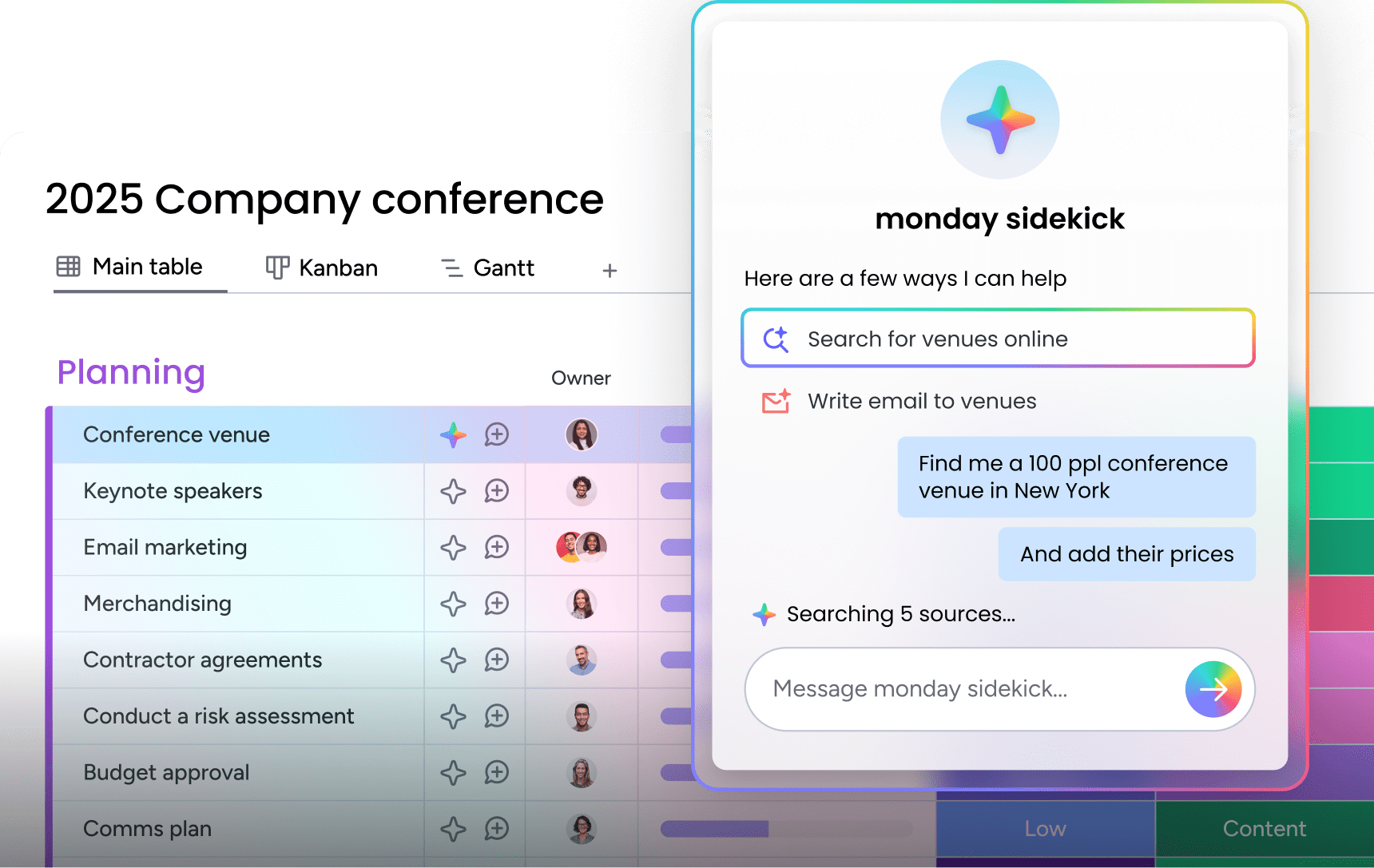
monday sidekick acts as your intelligent project assistant, helping you build and adjust Gantt charts through natural language. Ask it to create a project timeline, shift deadlines based on new constraints, or identify scheduling conflicts, and it handles the updates instantly. Instead of manually dragging bars and recalculating dates, you can describe what needs to change and let the AI do the work.
Automated dependency management
Draw dependency lines directly on your Gantt chart to connect related tasks. When one task shifts, every dependent task adjusts automatically, keeping your entire timeline accurate without manual recalculation. The platform supports finish-to-start, start-to-start, and other dependency types, so you can model complex project relationships that Excel can’t handle natively.
Smart automations for routine updates
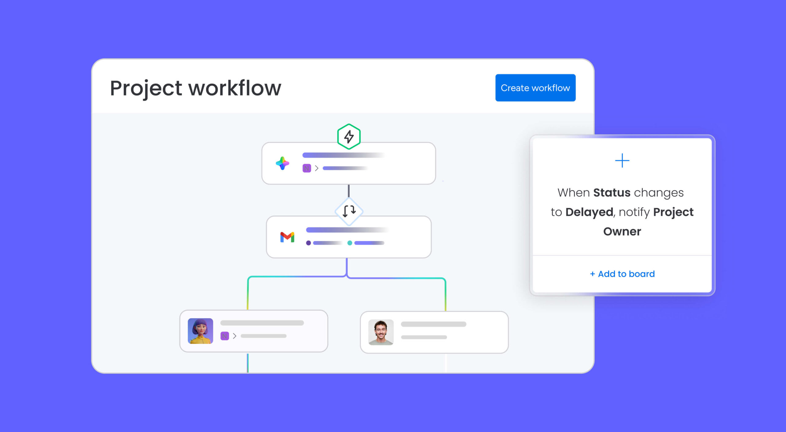
Set rules that trigger actions based on your project’s progress. Notify team members when their predecessor tasks finish, update statuses when deadlines approach, or reassign work when priorities shift. These automations eliminate the repetitive updates that consume hours each week, letting your team focus on execution instead of administration.
Real-time collaboration and baseline tracking
Every team member works from the same live Gantt view, so updates appear instantly for everyone. Set a baseline to capture your original plan, then compare it against current progress to measure schedule drift and communicate changes to stakeholders. The platform also highlights your critical path, showing you which tasks directly impact your project’s completion date.
Organizations using the platform report saving 60 hours per employee yearly and a 46% improvement in headcount planning accuracy. Ready to see how it works for your team? Explore the monday.com Gantt chart solution, learn how tocreate your own Gantt chart, or start with a ready-made Gantt chart template.
Excel vs. dedicated project management: Which approach fits your team?
Excel works well when you’re managing a small project with a handful of tasks and a single owner. If your team already uses spreadsheets daily and the project doesn’t require real-time collaboration or complex dependency tracking, a Gantt chart Excel template is a solid starting point.
But when your projects involve multiple teams, shifting timelines, or dozens of interconnected tasks, a dedicated platform gives you the structure and automation that spreadsheets can’t match. The choice comes down to your project’s complexity and your team’s collaboration needs. For teams ready to move beyond spreadsheets, monday.com offers everything you need to plan, track, and deliver projects with confidence.
Get startedFAQs
Does Excel have a built-in Gantt chart template?
Excel doesn't include a dedicated Gantt chart template by default. You can build one manually using a stacked bar chart, or download free templates from Microsoft's template gallery and third-party sources.
How do I add dependencies to a Gantt chart in Excel?
Adding dependencies to an Excel Gantt chart requires manual formulas that link task start dates to predecessor end dates. Excel doesn't update these automatically when schedules change, so each adjustment needs to be recalculated by hand.
Can I share an Excel Gantt chart with my team?
You can share Excel Gantt charts through cloud storage services like OneDrive or SharePoint. However, simultaneous editing often causes version conflicts, and the chart doesn't update in real time for all viewers.
What's the difference between a Gantt chart and a project timeline?
A project timeline displays events and milestones in a linear sequence. A Gantt chart adds more depth by showing task durations as horizontal bars, plus dependencies between tasks, making it a more detailed planning and tracking instrument.
How many tasks can an Excel Gantt chart handle?
Excel Gantt charts work best with 20 tasks or fewer. Beyond that threshold, the chart becomes difficult to read, scroll through, and maintain. Larger projects benefit from dedicated project management software with built-in Gantt views.
How does monday.com's AI Work Platform handle Gantt charts?
The AI Work Platform includes a built-in Gantt view that generates interactive project timelines from your board data. It supports drag-and-drop scheduling, visual dependency tracking, baseline comparisons, critical path analysis, and real-time collaboration, with no manual chart formatting required.

 Get started