


Every organization collects data. But only a fraction know which numbers give them valuable insights, and even fewer can access those insights fast enough to act on them. When performance metrics live scattered across spreadsheets, email threads, and disconnected tools, even the most ambitious teams struggle to answer basic questions: Are we on track? Where are we losing momentum? What should we prioritize next? A KPI dashboard template solves this by giving you a proven framework that transforms raw data into visual clarity, replacing guesswork with confidence and manual reporting with instant insights.
This article walks through KPI dashboard templates for 7 departments and 5 industries, explains how to choose and customize the right KPIs, and compares spreadsheet-based tracking with connected, AI-powered platforms that update automatically. By the end, you’ll have a practical framework for building dashboards on monday.com’s AI Work Platform so you can keep your team aligned, proactive, and focused on measurable results in 2026.
Get startedKey takeaways
- Focus on meaningful metrics: track 5-7 KPIs that align directly with business goals and prompt action when results change.
- Save time with proven templates: use pre-built KPI dashboard templates to turn raw data into actionable insights in minutes.
- Automate with AI: AI-powered dashboards on monday.com’s AI Work Platform update automatically and pinpoint trends as work progresses, removing the need for manual tracking.
- Balance leading and lagging indicators: combine predictive and historical metrics to gain a complete view of performance.
- Choose cloud-based platforms: opt for connected platforms that enable collaboration, automatic updates, and native integration across your existing workflows.
What is a KPI dashboard template?
A KPI dashboard template is a pre-built visual framework that displays key performance indicators in charts, graphs, and metrics to track business performance. It provides a ready-made structure for organizing and presenting data so teams can start measuring results without building dashboards from scratch.
A strong template acts as a foundation for tracking the metrics that are important to your organization. It saves setup time and ensures consistency by using proven layouts designed to highlight the most important insights at a glance. Think of it as both a KPI report template and a KPI metrics dashboard rolled into one: a starting point that you customize to fit your specific goals.
These dashboard templates transform raw data into visual stories that inspire action and reinforce a data-driven culture, a priority that continues to gain momentum across organizations of every size.
By removing the guesswork from dashboard design, a solid KPI template makes it easier to apply effective layouts across teams and departments. When combined with reporting tools, they help elevate data-driven decision-making across the entire organization.

Benefits of using KPI dashboard templates
KPI dashboard templates help teams move from static spreadsheets to structured, visual dashboards that highlight progress instantly. Instead of spending weeks building reports, you can deploy working dashboards in just a few hours.
Here are the reasons KPI dashboard templates are valuable for growing organizations:
- Speed to insight: set up meaningful tracking quickly without extensive development
- Consistent standards: maintain uniform metrics and visuals across departments
- Proven designs: rely on layouts tested and refined across diverse teams and industries
- Cost savings: reduce manual reporting and external setup costs
- AI-powered analysis: spot trends, anomalies, and forecasts automatically without manual number-crunching
- Scalable foundation: adjust templates as goals evolve and data needs expand
Platforms such as monday.com’s AI Work Platform bring these advantages to life by connecting templates directly to active workflows. As teams complete work, dashboards update automatically, giving leaders a real-time view of progress and performance.
7 department-specific KPI dashboard templates
Every team measures success differently, and the right KPI dashboard template helps each department focus on their priority metrics, whether that’s revenue growth, campaign performance, operational efficiency, or employee engagement. Which KPIs should you track for your specific department or role? The answer depends on your team’s core objectives and the outcomes leadership cares about most.
Below are examples of department-specific KPI dashboard templates that provide ready-made structures for tracking goals, aligning teams, and improving performance across your organization.
Sales KPI dashboard templates
Sales teams need real-time visibility into pipeline health and revenue performance. These templates focus on metrics that directly impact your bottom line:
- Sales pipeline tracker
- Revenue performance dashboard
- Sales rep activity monitor
- Lead generation tracker
- Customer acquisition dashboard
The metrics that separate high-performing sales teams from the rest include win rate, average deal size, sales cycle length, and quota attainment. Tracking pipeline velocity alongside these KPIs reveals how accurately your team can forecast revenue and where deals tend to stall. A CRM dashboard can bring all of these data points together in one view.
Marketing KPI dashboard templates
Marketing teams manage multiple channels, audiences, and campaigns at once, making it difficult to see which efforts drive results. Data-driven reporting has become essential for connecting activity to measurable outcomes, especially as AI-powered analytics now find insights that would take analysts hours to uncover manually.
These KPI dashboard templates help marketing teams translate complex data into performance insights:
- Campaign performance tracker
- Website analytics dashboard
- Social media metrics tracker
- Email marketing dashboard
- Content performance monitor
The KPIs that are key for marketing include customer acquisition cost (CAC), return on ad spend (ROAS), MQL-to-SQL conversion rate, and attribution by channel. Monitoring these metrics together reveals which campaigns generate qualified pipeline, not just clicks.
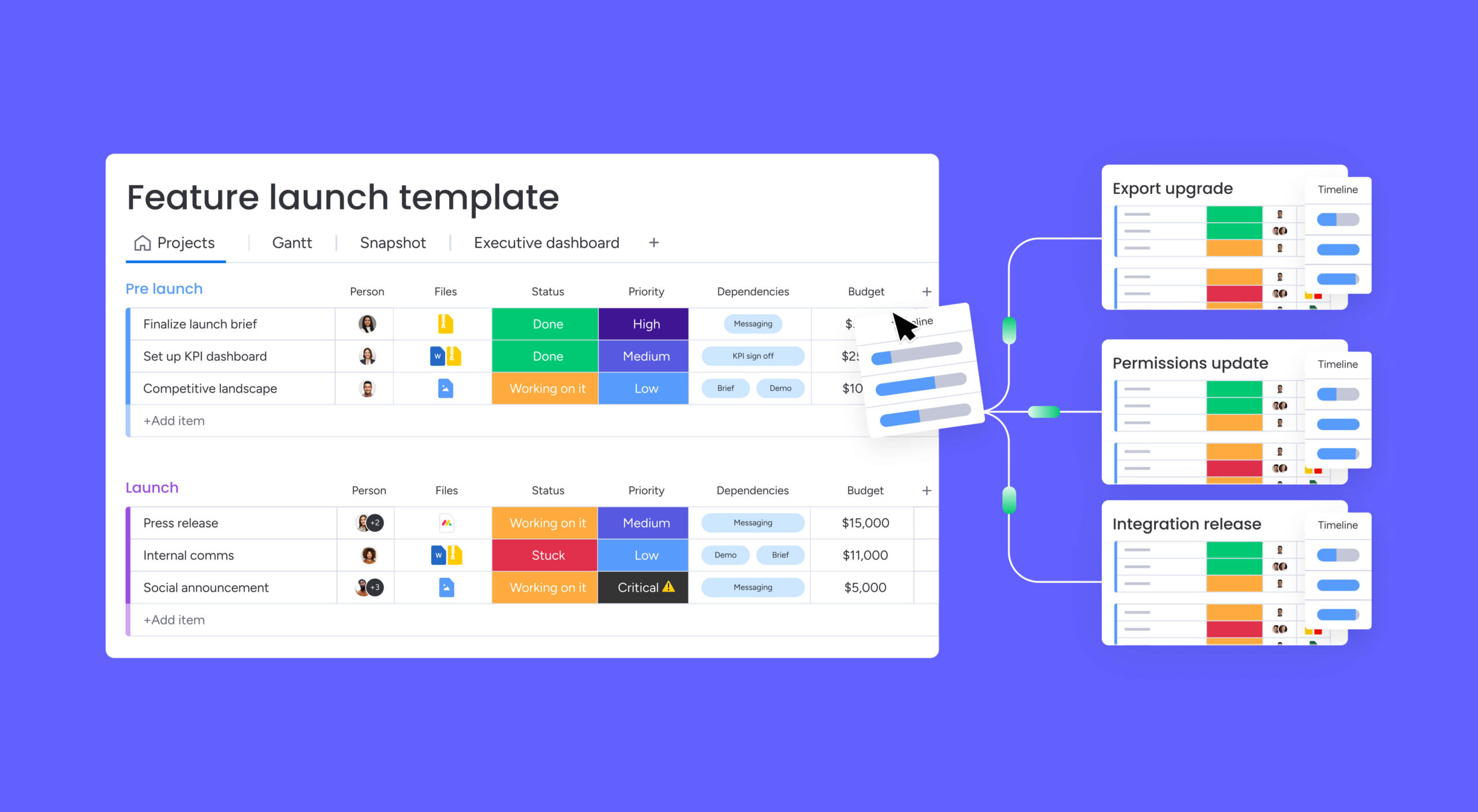
HR KPI dashboard templates
Human resources teams track everything from recruitment efficiency to employee satisfaction. These templates provide visibility into your most valuable asset — your people:
- Employee performance tracker
- Recruitment metrics dashboard
- Employee satisfaction monitor
- Training and development tracker
Key HR metrics to watch include time-to-hire, cost-per-hire, turnover rate, employee net promoter score (eNPS), and training completion rate. Together, these KPIs reveal whether your talent strategy is attracting, retaining, and developing the right people.
Finance KPI dashboard templates
Finance teams rely on accuracy and consistency to manage budgets, cash flow, and compliance effectively. These KPI dashboard templates provide visibility into financial health and deliver the precision that leaders and auditors expect:
- Budget vs. actual tracker
- Cash flow monitor
- Expense management dashboard
- Financial performance overview
Metrics such as burn rate, gross margin, accounts receivable aging, and budget variance percentage give finance leaders an early warning system for cash flow issues and spending drift. Tracking these KPIs monthly or weekly prevents small variances from becoming significant problems.
Operations KPI dashboard templates
Operations teams monitor production, quality, and supply chain performance. These templates focus on efficiency and continuous improvement:
- Production efficiency tracker
- Inventory management dashboard
- Supply chain monitor
- Quality control tracker
Core operations KPIs include overall equipment effectiveness (OEE), cycle time, on-time delivery rate, and defect rate. Monitoring these together reveals bottlenecks in your production process and highlights where small improvements generate the largest returns.
Customer service KPI dashboard templates
Customer service teams depend on real-time visibility to maintain high standards of support. These KPI dashboard templates track performance metrics that reflect responsiveness, quality, and overall customer satisfaction.
- Support ticket tracker
- Customer satisfaction dashboard
- Response time monitor
- Agent performance tracker
The KPIs that define excellent service include first response time, CSAT score, NPS, ticket resolution rate, and escalation rate. When you monitor escalation rate alongside CSAT, you can identify whether complex issues are being resolved effectively or simply passed along.
Project management KPI dashboard templates
Managing timelines, budgets, and stakeholder expectations makes KPIs for project management critical for tracking success. These templates help teams monitor progress and maintain alignment between project execution and strategic goals.
Connected platforms like monday.com’s AI Work Platform update dashboards automatically as work moves forward, giving teams a real-time view of performance and potential risks.
- Project timeline tracker
- Resource utilization dashboard
- Budget tracking monitor
- Risk management tracker
Key project management KPIs include schedule variance, cost variance, resource utilization percentage, and risk score. Tracking schedule variance against resource utilization reveals whether delays stem from capacity issues or scope changes, a distinction that shapes very different corrective actions.
Get started5 industry-specific KPI dashboard templates
Every industry measures success differently. A one-size-fits-all dashboard rarely works when goals, regulations, and performance drivers vary so widely. Industry-specific KPI dashboard templates account for these differences by focusing on key metrics within each sector, from recurring revenue in SaaS to patient outcomes in healthcare.
Below are examples of specialized templates designed to meet distinct compliance needs, performance standards, and business models.
SaaS KPI dashboard templates
Software-as-a-Service companies depend on recurring revenue and user retention to sustain growth. These KPI dashboard templates highlight the key metrics that reveal business performance and customer health:
- Monthly recurring revenue (MRR) tracker
- Customer churn dashboard
- Product usage analytics
Beyond MRR and churn, metrics like net revenue retention, LTV:CAC ratio, and expansion MRR reveal whether growth is sustainable or dependent on new logos alone.
Retail KPI dashboard templates
Retail businesses monitor performance across locations and channels. Key metrics span sales, inventory, and customer behavior:
- Sales performance by location
- Inventory turnover tracker
- Customer traffic analytics
Retailers that track average transaction value, sell-through rate, and shrinkage percentage alongside foot traffic gain a complete picture of store performance, not just top-line revenue.
Healthcare KPI dashboard templates
Healthcare organizations must balance quality of care with operational efficiency and resource management. These KPI dashboard templates help monitor performance, improve patient outcomes, and maintain compliance with healthcare standards:
- Patient satisfaction tracker
- Operational efficiency dashboard
- Staff productivity monitor
Critical healthcare KPIs include readmission rate, bed occupancy percentage, and patient wait time. Tracking these in real time helps administrators identify capacity constraints and quality issues before they escalate.
Manufacturing KPI dashboard templates
Manufacturers need real-time production visibility. Templates focus on output, equipment performance, and quality control:
- Production output tracker
- Equipment downtime dashboard
- Quality control monitor
Scrap rate, changeover time, and capacity utilization are the KPIs that separate efficient operations from those losing margin to waste and downtime.
E-commerce KPI dashboard templates
E-commerce success depends on optimizing every stage of the online buying experience. These KPI dashboard templates focus on conversion, acquisition, and fulfillment metrics that reveal how effectively your store attracts, converts, and retains customers.
- Conversion rate tracker
- Customer acquisition dashboard
- Order fulfillment monitor
Cart abandonment rate, average order value, and customer lifetime value are the 3 KPIs that tell you whether your acquisition spend is paying off long-term or leaking revenue at checkout.
How to choose the right KPIs for your dashboard
Selecting effective KPIs determines whether your dashboard drives action or creates confusion.
Follow these steps to identify your core metrics, and consider using a balanced scorecard template for comprehensive alignment.
Step 1: align KPIs with business objectives
Connect every metric to a strategic goal. Start with what you want to achieve, then work backward to find indicators that measure progress.
Ask yourself: does this KPI directly relate to our objectives? Also consider whether or not you can influence this metric through your actions.
Step 2: select measurable and actionable metrics
It’s important to choose KPIs that are specific and quantifiable. “Increase monthly sales by 10%” gives teams direction. A vague goal like “Improve sales” gives teams no measurable target to rally around.
Your metrics should suggest next steps. When numbers change, teams should know exactly how to respond.
Step 3: balance leading and lagging indicators
Include metrics that predict future performance alongside those that measure past results. Leading indicators help you adjust course. Lagging indicators confirm whether strategies worked.
For example, pair “sales pipeline value” (leading) with “closed deals” (lagging) for complete visibility.
Step 4: limit your KPIs to essential metrics
How many KPIs should be on a dashboard? Focus on 5-7 key metrics per dashboard. Any more than this can overwhelm teams, while fewer might miss critical insights.
Remember: dashboards that show everything highlight nothing. Choose metrics that drive the most important decisions.
Step 5: review and refine your KPI selection
Business priorities shift, and your KPIs should evolve too, especially when risk tracking is part of the equation. Schedule quarterly reviews to keep metrics in line with your current goals.
Listen to stakeholder feedback: remove metrics that no longer drive action and add new ones as priorities emerge.

How to customize your KPI dashboard template
Customizing a KPI dashboard template turns a standard layout into a system built around your organization’s goals. Effective customization keeps the right data flowing in, updating automatically, and presents information in a way that supports confident decision-making.
The steps below outline how to adapt any template to your data sources and reporting needs.
Step 1: select a KPI dashboard template
Choose templates from trusted sources that match your technical environment. Look for options compatible with Excel, Google Sheets, or your preferred platform. Quality templates include sample data and documentation. This foundation helps you avoid common setup mistakes.
Step 2: connect your data sources
Are your dashboards still relying on manual data entry? Link templates to your existing systems: CRM, accounting software, analytics platforms. Automated connections ensure dashboards reflect current information.
Reliable, automated data feeds keep your dashboards accurate without manual effort. Prioritize integration over aesthetics.
Step 3: customize visual elements and layout
Adjust colors, charts, and layouts to match your needs. Most templates support drag-and-drop customization without coding.
Focus on readability over creativity. Choose visualizations that make data interpretation instant and intuitive.
Step 4: set up automated data updates
Configure refresh schedules based on decision-making needs. Real-time updates work for operations. Daily or weekly refreshes suit strategic planning.
Automation eliminates manual work and ensures stakeholders always see current information. When decision-making cadences are locked in, your dashboards become a reliable source of truth rather than a periodic project.
Get startedKPI dashboard templates compared: spreadsheets vs. connected platforms
The platform you choose shapes how effectively your team tracks, shares, and acts on KPI data. While spreadsheets remain a familiar starting point, connected platforms now offer automation, collaboration, and real-time updates that traditional files can’t match.
Below is a side-by-side comparison of the three most common approaches to KPI dashboard tracking:
| Feature | Excel | Google Sheets | Connected platform (e.g., monday.com's AI Work Platform) |
|---|---|---|---|
| Real-time updates | Manual refresh | Semi-automatic | Automatic from workflows |
| Collaboration | Limited (file sharing) | Real-time editing | Real-time + comments + action items |
| AI analytics | None native | Limited add-ons | Built-in (Sidekick, agents, predictive) |
| Data integrations | Manual import | Limited | 200+ native integrations |
| Setup time | Hours | Minutes | Minutes (with templates) |
| Offline access | Full | None | Partial (mobile app) |
| Cost | License required | Free | Free tier available |
Free Excel KPI dashboard templates
Excel provides familiar interfaces and extensive customization. You work offline and maintain complete control over your data.
However, manual updates consume time and version control can become challenging with multiple users.
Google Sheets KPI tracker templates
Google Sheets combines spreadsheet flexibility with real-time collaboration. Teams can update metrics simultaneously, leave comments, and share dashboards instantly, eliminating version confusion.
Access depends on a stable internet connection and some advanced features are limited, but it remains a strong option for teams that value accessibility and simple, cloud-based reporting.
Cloud-based dashboard solutions
Connected platforms like monday.com’s AI Work Platform combine dashboard capabilities with comprehensive work management. Your KPIs connect directly to projects and workflows.
Key advantages of cloud platforms include:
- Automatic updates: data flows directly from work activities.
- Advanced visualizations: interactive charts and drill-down capabilities.
- Team collaboration: comment on metrics and create action items instantly.
- Enterprise security: robust permissions and compliance features.
When your KPI tracking outgrows spreadsheets, and you need automated updates, AI-driven insights, and dashboards connected to live workflows, it’s time to move to a connected platform.
Track KPIs with monday.com's AI Work Platform
monday.com’s AI Work Platform connects KPI dashboards directly to the workflows where work happens, so every metric reflects current progress and teams act on data the moment it changes. The platform brings performance data, collaboration, and automation into a single workspace.
Real-time dashboard updates
Your dashboards update automatically as teams complete work. Your team spends time analyzing insights, not entering data, and decisions reflect what’s happening right now. With 10+ drag-and-drop widgets and 15+ board views, including Kanban, Gantt, Calendar, Timeline, and Workload, you can build a dashboard template that fits exactly how your team tracks progress.
This real-time visibility means you spot trends immediately. You make decisions based on what’s happening now, not last week’s numbers. Because dashboards connect directly to workflows, KPIs update as work progresses, so every metric reflects current performance.
AI-powered KPI insights
Built-in AI capabilities go far beyond basic charts and alerts. The platform’s AI suite turns your KPI dashboards into intelligent systems that analyze, predict, and act:
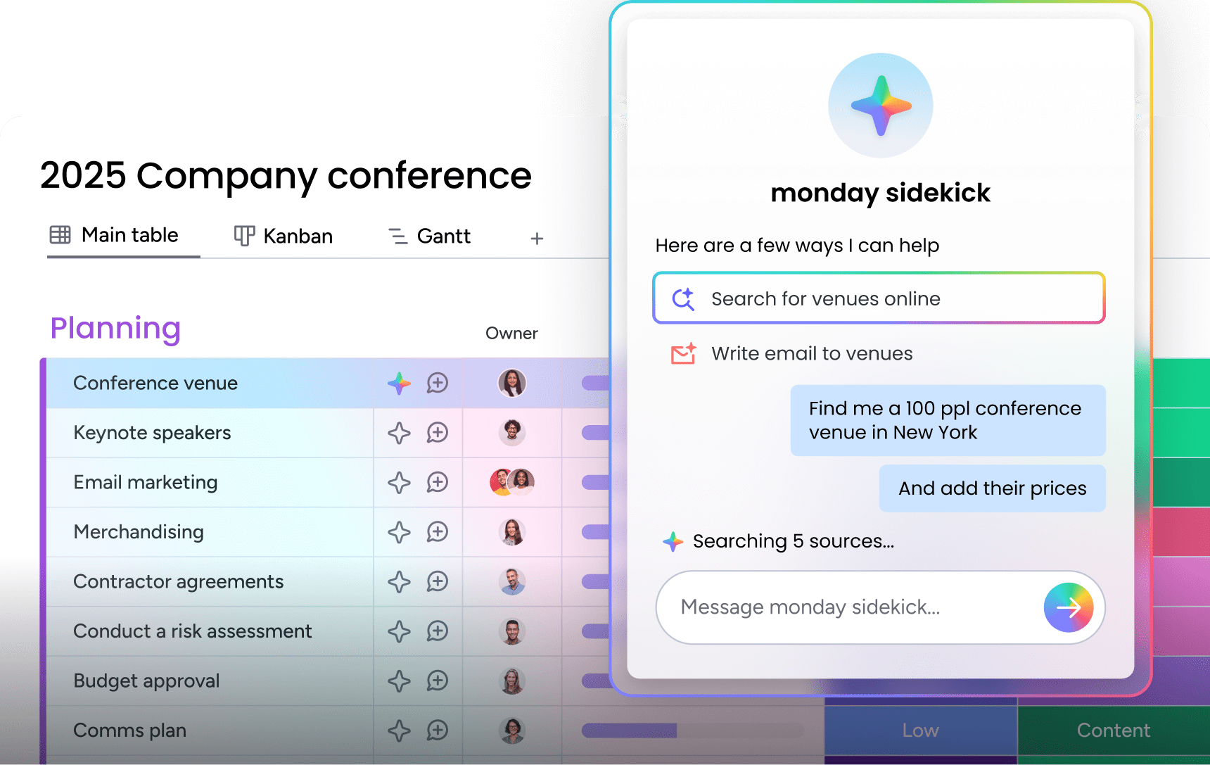
- monday sidekick: a context-aware AI assistant that analyzes dashboard data, answers questions in plain language, and generates dashboards from natural-language prompts, so anyone on your team can build reports without technical skills.
- monday agents: purpose-built AI agents, including the Project Analyzer, that monitor KPIs continuously, flag bottlenecks, and identify risks before they derail timelines or budgets.
- monday vibe: an AI-powered no-code builder that turns a text prompt into custom KPI tracking apps: OKR monitors, executive overviews, department scorecards, without writing a single line of code.
- monday MCP: connect AI assistants like Claude, ChatGPT, and Copilot directly to your monday.com workspace through the Model Context Protocol for advanced KPI analysis and reporting.
Collaborate on KPIs in real time
KPI dashboards become collaboration spaces where insights turn into action, and creating personal dashboards can further personalize metrics. Teams discuss performance, create improvement plans, and track progress, all in one place. Using a performance improvement plan template can also help map out next steps.
When performance tracking connects directly to work execution, improvement happens faster. Your KPIs stop being abstract numbers and start driving concrete results.
How the platform compares
| Capability | Spreadsheet KPI dashboards | monday.com's AI Work Platform |
|---|---|---|
| Data updates | Manual entry | Automatic from connected workflows |
| AI analysis | None | monday Sidekick, agents, predictive alerts |
| Custom KPI apps | Not possible | monday vibe (build from a prompt) |
| AI assistant integration | Not possible | monday MCP (Claude, ChatGPT, Copilot) |
| Collaboration | File sharing | Comments, @mentions, action items on dashboards |
| Integrations | Manual import/export | 200+ native integrations (CRM, accounting, analytics) |
| Security | Local file | SOC 2 Type II, ISO, GDPR, HIPAA |
Organizations using the platform have reported a 346% ROI over three years, a 50% reduction in meetings and emails, and 6,970 hours saved per month, according to a Forrester Total Economic Impact study. With a payback period of less than four months, the shift from spreadsheets to connected KPI tracking pays for itself quickly.
Why KPI dashboards drive measurable results
KPI dashboard templates turn scattered performance data into focused, visual insights that help every team, from sales to operations, make confident decisions. Whether you start with a free Excel template or a connected platform, the goal is the same: track the metrics that matter, act on them fast, and keep your entire organization aligned around shared outcomes.
The shift from static spreadsheets to AI-powered, workflow-connected dashboards is accelerating in 2026. Teams that make this move gain real-time visibility, automated reporting, and predictive insights that manual processes simply can’t deliver. A strong KPI dashboard template in the AI Work Platform is where that journey starts.
Get startedFrequently asked questions
How do you create a KPI dashboard?
Creating a KPI dashboard starts with selecting metrics aligned to your business goals. Choose a template or platform, connect your data sources, then customize the layout for your audience. Most modern platforms offer drag-and-drop builders that make setup accessible without technical skills.
Does Excel have built-in KPI templates?
Yes, Excel has built-in KPI templates and visualization options available in its template gallery. You can access these through the "New" menu or download additional templates from Microsoft's online library.
What are the 4 main types of KPIs?
The four main types of KPIs are leading indicators (predict future performance), lagging indicators (measure past results), quantitative KPIs (numerical measurements), and qualitative KPIs (descriptive insights). Understanding OKR vs KPI can also help with strategic alignment. Each serves different purposes in tracking business performance.
What makes an effective KPI dashboard?
An effective KPI dashboard displays five to seven relevant metrics with visualizations that update automatically. It enables quick decision-making by highlighting trends and exceptions rather than overwhelming users with data.
How often should KPI dashboards be updated?
KPI dashboards should be updated based on decision-making needs — real-time for operations, daily for management, monthly for strategy. Update frequency depends on how quickly metrics change and how often you make decisions based on the data.
Can multiple people edit the same KPI dashboard template?
Yes, multiple people can edit the same KPI dashboard template using cloud platforms like Google Sheets or monday.com's AI Work Platform. Excel requires careful version control to avoid conflicts when sharing files between team members.
Can monday.com's AI Work Platform connect KPI dashboards to live workflows?
Yes, monday.com's AI Work Platform can connect KPI dashboards to live workflows. Dashboards update automatically as connected workflows progress, eliminating manual data entry and ensuring KPIs always reflect current performance.
Does monday.com's AI Work Platform offer AI-powered KPI analysis?
Yes, monday.com's AI Work Platform offers AI-powered KPI analysis. monday sidekick provides conversational data analysis, monday agents monitor KPIs and flag risks automatically, and predictive analytics forecast trends based on historical patterns.

 Get started