


The average organization pulls data from more than 40 different applications — yet most teams still struggle to answer basic questions about project health, budget status, or campaign performance.
A well-designed dashboard template solves that problem by giving every team a ready-made, visual layout for tracking the metrics that matter most. In this guide, we cover what dashboard templates are, why every team needs one, 7 types of dashboard templates by business function, the key components that separate great dashboards from forgettable ones, and how to choose the right template for your organization.
Get startedKey takeaways
- Dashboard templates provide pre-built layouts that turn scattered data into a single, real-time view of business performance, eliminating manual report compilation.
- Different business functions require different dashboards: project management, sales, marketing, finance, executive, KPI, and operations templates each track distinct metrics.
- The most effective dashboard templates include visual widgets, live data connections, filters, KPI tracking, and secure sharing controls.
- Choosing the right template starts with your business function, data sources, audience, customization needs, and AI capabilities.
- monday.com’s AI Work Platform combines 15+ drag-and-drop widgets, AI-powered insights from monday sidekick and monday agents, and 200+ integrations to deliver dashboards that go beyond static reporting.
What is a dashboard template?
A dashboard template is a pre-configured visual layout designed to display business data in one organized view. Instead of building charts, graphs, and metric tiles from scratch, teams start with a structured foundation and customize it to match their specific goals, data sources, and reporting needs.
Dashboard templates differ from static reports in a fundamental way. A report captures a snapshot of data at a fixed point in time — a PDF exported last Friday, a slide deck prepared for a quarterly review. A dashboard template, by contrast, connects to live data sources and updates automatically as information changes. That distinction matters because decisions based on last week’s numbers often arrive too late.
Some dashboard templates refresh data in real time, pulling updates the moment a deal closes, a project milestone shifts, or a budget line changes. Others update on a periodic schedule — daily, weekly, or monthly — depending on the platform and data source. The right cadence depends on how quickly your team needs to respond to changing conditions.
At their core, dashboard templates provide pre-built widget configurations, logical data groupings, and visual hierarchies that teams can adapt without starting from a blank screen. They reduce the friction between having data and actually understanding it.
Why every team needs a dashboard template
When your team’s data is spread across 10 different platforms, reports get delayed and decisions stall. Dashboard templates address the root causes of reporting friction, not just the symptoms. Here are 4 challenges you can eliminate with the right dashboard template.
Data lives in too many places
Sales numbers sit in one platform. Project timelines live in another. Marketing metrics exist in a third. When data is fragmented across disconnected applications, team members spend hours pulling numbers into spreadsheets before anyone can analyze them.
A dashboard template consolidates those sources into a single view. Instead of logging into 5 different platforms to understand performance, teams open one dashboard and see everything they need, from KPIs (key performance indicators) to budget status to workload distribution.
Reporting takes too long
Manual reporting consumes hours that could go toward strategic work. When team members spend Monday mornings compiling weekly updates instead of executing on priorities, productivity suffers across the board.
Dashboard templates automate the assembly process. Data flows in from connected sources, widgets calculate metrics automatically, and stakeholders get the numbers they need without waiting for someone to build a report from scratch.
Teams lack real-time visibility
Decisions based on outdated information carry unnecessary risk. A project that looked on track last Tuesday may have hit a dependency blocker on Wednesday, but without real-time visibility, the project manager does not find out until the next status meeting.
Live dashboards replace periodic snapshots with continuous updates. Team members see the current state of their work at any moment, which means they can identify risks earlier and respond faster.
Stakeholders need different views
An executive reviewing a portfolio of 50 projects needs a high-level summary of progress, budget, and risk. A project manager needs granular detail on milestones, dependencies, and workload. A team member needs to see their own assignments and deadlines.
Dashboard templates solve this by supporting multiple views from the same underlying data. Filters, personal views, and role-based layouts ensure that every stakeholder sees exactly the level of detail they need, without building separate reports for each audience.
Get started7 types of dashboard templates for every business function
The most effective dashboard templates are designed around specific business functions, with widgets, layouts, and data connections tailored to the workflows each team runs daily. Here are 7 dashboard examples organized by function.
Project management dashboard template
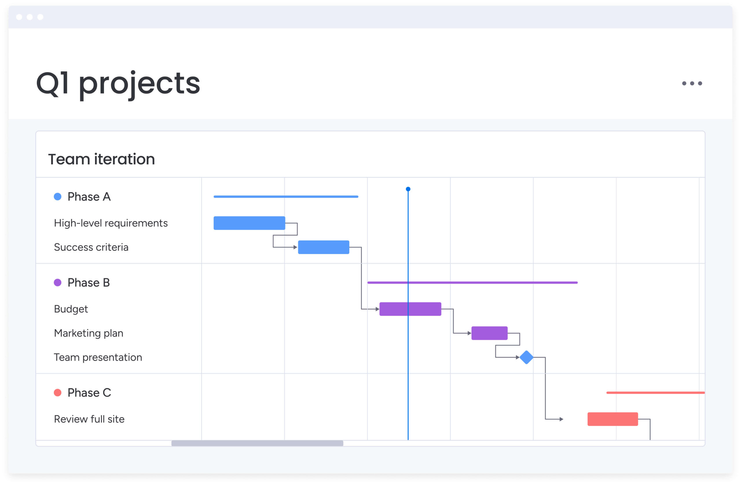
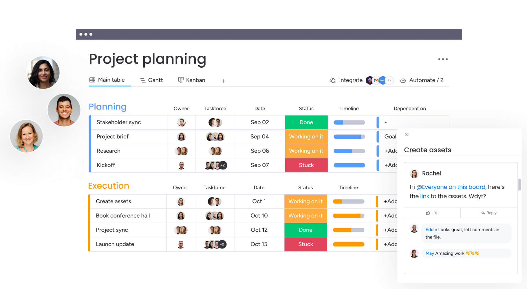
Project managers use this template to monitor progress across milestones, dependencies, resource allocation, and timelines. It provides a centralized view of every active project, making it easier to catch delays before they cascade into missed deadlines.
Key metrics to track:
- On-time delivery rate
- Resource utilization
- Milestone completion percentage
- Budget variance
This template works well alongside visual planning methods like Gantt charts that map dependencies and critical paths.
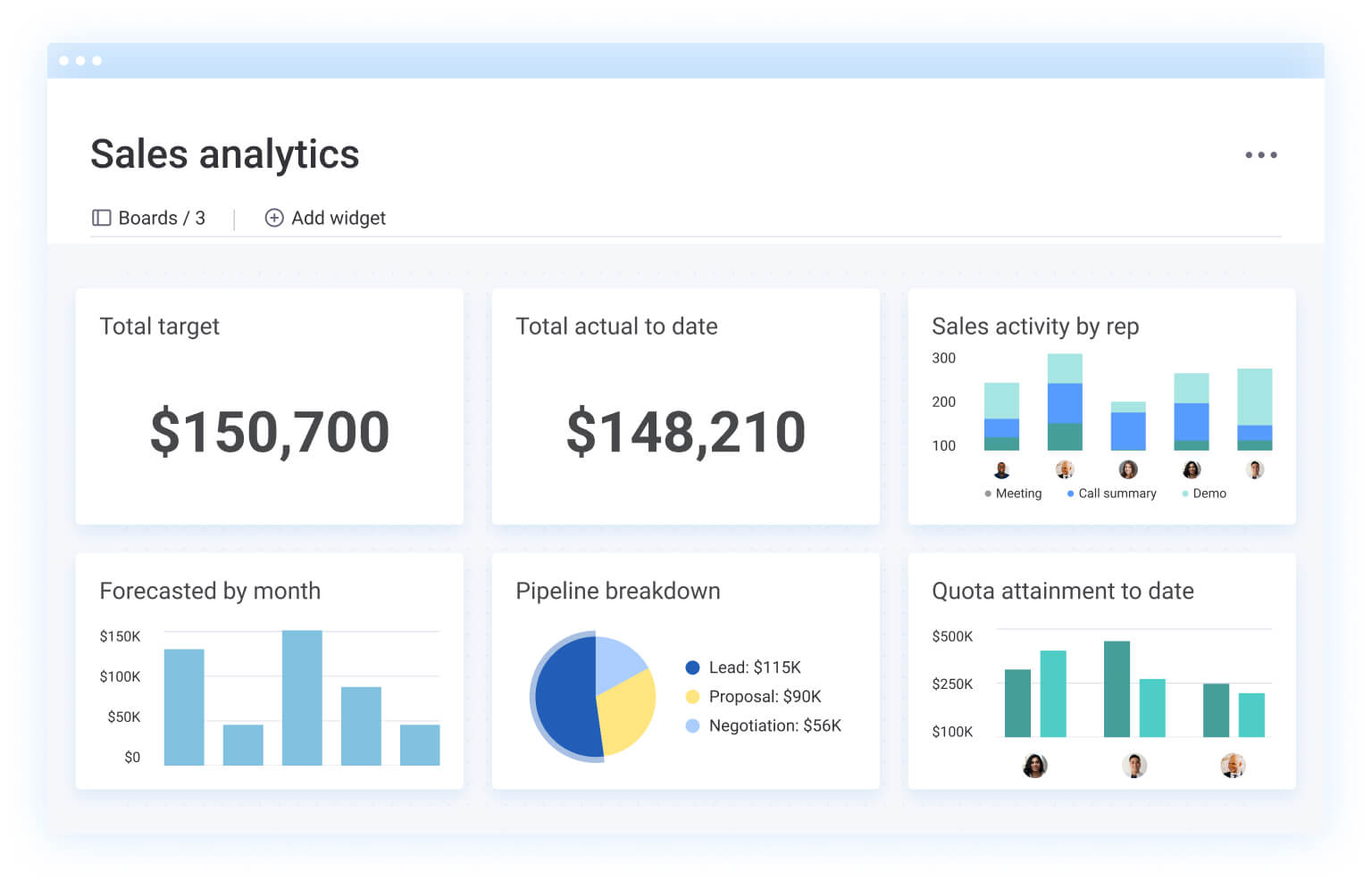
Sales dashboard template
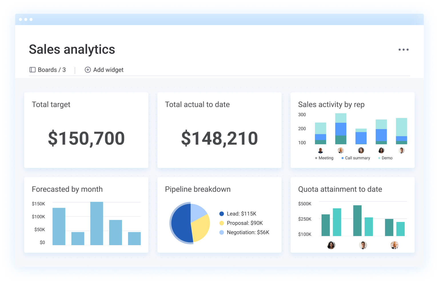
Sales leaders rely on this template to track pipeline health, deal velocity, and revenue forecasting. It gives sales teams a real-time picture of where deals stand — from initial contact through close — so managers can coach reps and forecast revenue with confidence.
Key metrics to track:
- Win rate
- Average deal size
- Pipeline value by stage
- Sales cycle length
Marketing dashboard template
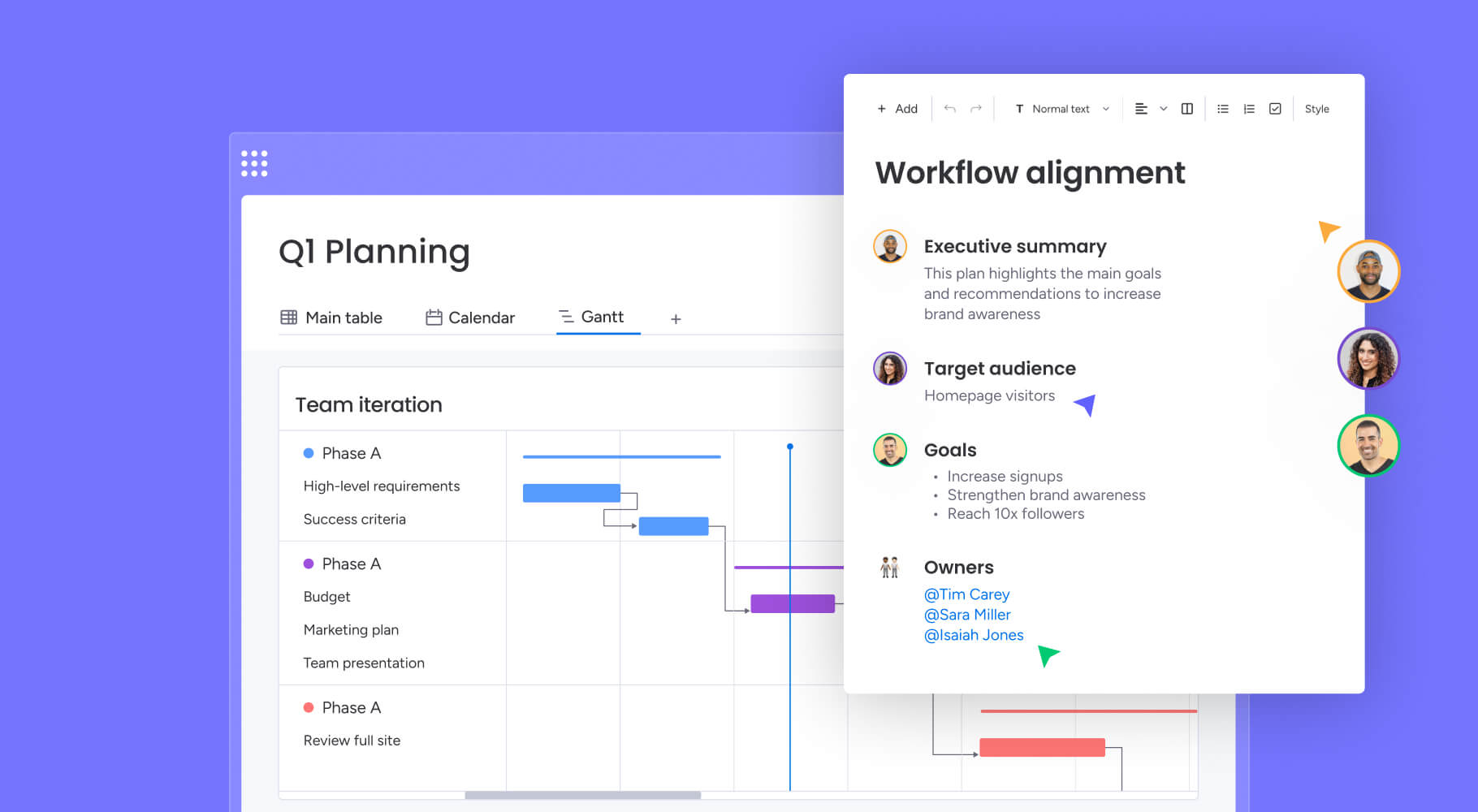
Marketing teams use this template to measure campaign performance, channel attribution, and return on investment. It connects data from advertising platforms, email marketing, social media, and analytics into a single performance view.
Key metrics to track:
- Cost per lead
- Conversion rate by channel
- Campaign ROI
- Engagement rate
Finance and budget dashboard template
Finance teams use this template to monitor budgets, cash flow, and expense trends across departments. It provides a real-time view of financial health — helping finance leaders spot variances early and adjust allocations before overspending occurs.
Key metrics to track:
- Budget variance (planned vs. actual)
- Burn rate
- Revenue vs. forecast
- Revenue projections and cash flow
Executive and portfolio dashboard template
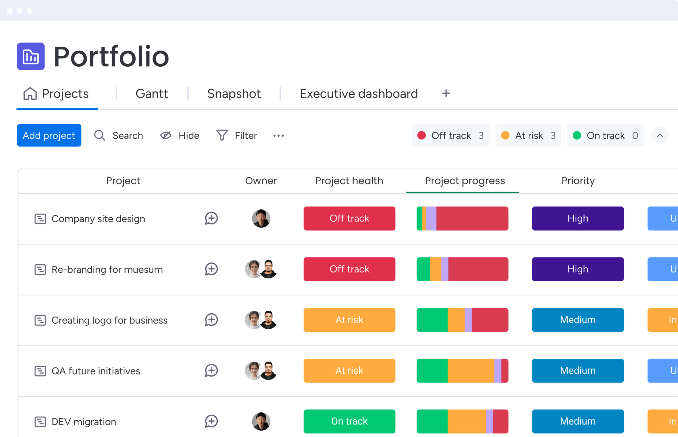
Executives and portfolio managers use this template for a high-level view of organizational health across multiple projects, departments, or business units. It distills complexity into a summary that supports strategic decision-making.
Key metrics to track:
- Strategic goal progress
- Portfolio risk distribution
- Cross-department performance
- Resource allocation across initiatives
KPI and performance dashboard template
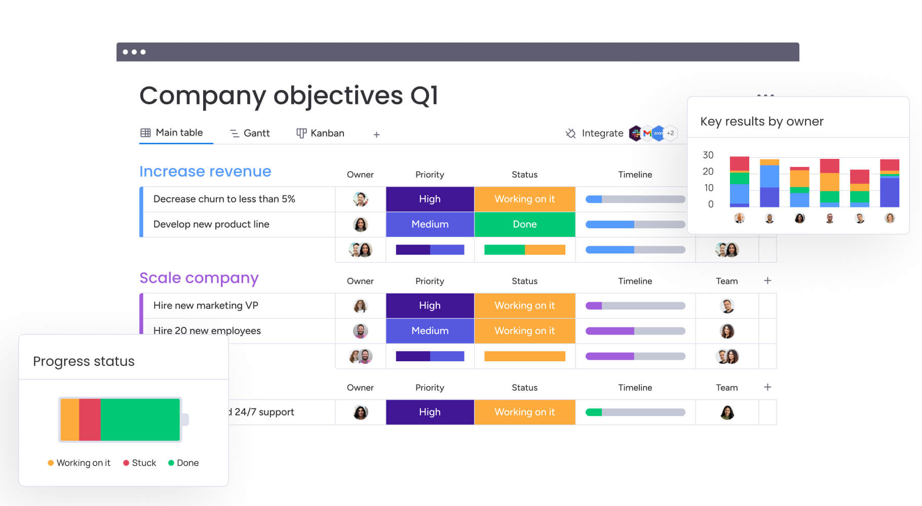
This template is designed for any team that tracks specific goals and targets, whether OKRs, quarterly objectives, or ongoing performance benchmarks. It provides a focused view of where each indicator stands relative to its target.
Key metrics to track:
- OKR progress (target vs. actual)
- Goal completion rate
- Trend lines over time
- Department-level performance scores
For a deeper look at building KPI-focused dashboards, see this guide to creating a KPI dashboard template.
Operations dashboard template
Operations teams use this template to monitor process efficiency, service level compliance, and throughput. It helps operations managers identify bottlenecks, track capacity, and ensure that workflows run within acceptable performance thresholds.
Key metrics to track:
- Cycle time
- Error rate
- SLA compliance
- Capacity utilization
5 key components every dashboard template needs
What separates a dashboard that collects dust from one your team checks every morning? The answer comes down to 5 core components. A dashboard template can have a polished layout, but without the right building blocks, it will not deliver actionable insights. Here is what to look for when evaluating any dashboard template.
Visual widgets and charts
Widgets are the building blocks of every dashboard. Bar charts, pie charts, number tiles, progress batteries, and timeline views each serve a different purpose — from showing trends over time to highlighting a single critical metric. The most effective dashboard templates offer multiple visualization types so teams can match the widget to the data story they need to tell.
Live data connections
A dashboard is only as valuable as the data behind it. Live data connections pull information from existing platforms automatically — CRM, project management, accounting, marketing automation — so team members never have to update numbers manually. Without live connections, a dashboard becomes another static report.
Filters and drill-downs
Not every stakeholder needs the same view. Filters let team members slice data by department, time period, status, assignee, or custom criteria. Drill-downs allow a viewer to click into a summary metric and see the underlying detail — moving from a portfolio overview to an individual project in seconds.
KPI tracking and goal indicators
Visual indicators that show progress toward targets — on track, at risk, off track — give teams an instant read on performance. The most useful dashboard templates include goal-tracking widgets that compare current values against defined benchmarks, so team members can prioritize their attention on what needs it most.
Sharing and access controls
Dashboards often contain sensitive business data. Sharing and access controls determine who can view, edit, or export the dashboard. The right template supports public and private views, external sharing via secure links, and role-based permissions — ensuring that the right people see the right data without compromising security.
How to choose the right dashboard template
With so many dashboard templates available, selecting the right one requires a structured approach. The following 5 criteria will help you narrow your options and find a template that fits your team’s specific needs.
- Start with your business function. Match the template to your team’s role. A marketing team needs campaign attribution widgets, while a finance team needs budget variance tracking. Reference the 7 types above to identify which category fits your workflows.
- Map your data sources. Choose a template on a platform that integrates with the applications you already use — CRM, project management, accounting, communication, and file storage. The fewer manual data transfers required, the more reliable your dashboard becomes.
- Consider your audience. Who will view the dashboard? Executives need high-level summaries with portfolio-wide metrics. Managers need drill-down capabilities. Team members need personal views filtered to their own work. A good template accommodates all 3 perspectives.
- Evaluate customization depth. Can you add and rearrange widgets? Change chart types? Create personal filtered views? Customization determines whether the template adapts to your team or forces your team to adapt to it.
- Check for AI and automation. Modern dashboard platforms use AI to surface insights, flag risks, and generate reports automatically. Look for capabilities like conversational data access, proactive risk detection, and automated summaries — these features transform dashboards from passive displays into active decision-support systems.
How monday.com's AI Work Platform transforms dashboard reporting
Finding the right dashboard template is only half the equation. The platform behind it determines whether your dashboards deliver real-time, actionable insights, or remain static snapshots that go stale within hours. AI Work Platform brings together no-code dashboard building, AI-powered analysis, and deep integrations in a single platform that teams across every function can use without technical expertise.
Build custom dashboards without code
The platform includes 15+ drag-and-drop widgets — Timeline, Battery, Workload, Charts, Numbers, and more — that team members can configure in minutes. No coding or BI training is required. Multi-board dashboards aggregate data from across teams and departments into a single view, so leadership sees the full picture without switching between applications.
For teams that need something entirely custom, monday vibe lets anyone describe a dashboard app in plain language and generates a fully functional, secure application automatically. Need a portfolio health tracker that pulls from 5 different boards? Describe it in a sentence and Vibe builds it.
Let AI surface what matters
monday sidekick answers questions about your data in plain language — ask “Which projects are over budget this quarter?” and get an immediate, contextual response. monday agents like Project Analyzer and Risk Analyzer monitor projects continuously, flagging bottlenecks and schedule risks before they escalate. AI-powered project management features like AI Blocks categorize, summarize, and extract data at scale — turning raw information into structured, actionable insights.
Connect every data source in one view
With 200+ integrations, including Salesforce, HubSpot, Slack, Jira, and Google Workspace, the platform pulls data from the applications your team already uses. Every widget on the dashboard reflects live data, so reports are always current and team members spend zero time on manual updates.
Share securely with the right people
Public and private dashboard settings let you control visibility at a granular level. Share a dashboard externally via a secure link, or restrict access to specific team members with role-based permissions. Whether you are presenting to the board or collaborating with a client, the right people see the right data.
Build smarter dashboards with real-time data
The right dashboard template transforms scattered data into a single, actionable view that helps your team make faster, more confident decisions. From choosing the right template type to configuring essential components, every step in this guide is designed to get you from raw data to real insight with less effort.
AI Work Platform takes that foundation further, combining no-code dashboard building, AI-powered analysis from monday sidekick and monday agents, and 200+ integrations into a platform that grows with your organization. Ready to turn your team’s data into decisions?
Get startedFAQs about dashboard templates
What is a dashboard template?
A dashboard template is a pre-built visual layout for displaying business data in one organized view. Dashboard templates include configured widgets, chart types, and data groupings that teams can customize to track the metrics most relevant to their function — without designing a dashboard from scratch.
How do I create a dashboard template?
Creating a dashboard template starts with identifying the metrics your team needs to track, selecting a platform that connects to your data sources, and choosing widgets that visualize each metric effectively. On monday.com, you can build a dashboard in minutes using 15+ drag-and-drop widgets — or use monday vibe to generate a custom dashboard app from a simple text prompt. Browse the monday.com templates library to find a pre-built starting point.
What KPIs should a dashboard track?
KPIs a dashboard should track depend on the business function it serves. Project management dashboards typically track on-time delivery rate, budget variance, and resource utilization. Sales dashboards focus on pipeline value, win rate, and average deal size. Marketing dashboards measure cost per lead, conversion rate, and campaign ROI.
What does a good dashboard look like?
A good dashboard is interactive, focused, and accessible to its intended audience. The most effective dashboards limit their view to 5–8 key metrics, use a visual hierarchy that draws attention to the most important data first, and include filters that let viewers drill into the detail they need. Avoid overcrowding a dashboard with too many widgets — each element should earn its place.
How do I choose the right dashboard platform?
Choosing the right dashboard platform requires evaluating ease of use, integrations with your existing applications, AI capabilities, customization depth, and collaboration features. On G2, monday.com earns a 9.1 Ease of Use score. The platform supports 200+ integrations and includes AI features like monday sidekick and monday agents that proactively surface insights and flag risks — making it a strong fit for teams that want powerful dashboards without technical complexity.
How do I create a dashboard template?
Creating a dashboard template starts with identifying the metrics your team needs to track, selecting a platform that connects to your data sources, and choosing widgets that visualize each metric effectively. On monday.com, you can build a dashboard in minutes using 15+ drag-and-drop widgets — or use monday vibe to generate a custom dashboard app from a simple text prompt. Browse the monday.com templates library to find a pre-built starting point.
What KPIs should a dashboard track?
KPIs a dashboard should track depend on the business function it serves. Project management dashboards typically track on-time delivery rate, budget variance, and resource utilization. Sales dashboards focus on pipeline value, win rate, and average deal size. Marketing dashboards measure cost per lead, conversion rate, and campaign ROI.
What does a good dashboard look like?
A good dashboard is interactive, focused, and accessible to its intended audience. The most effective dashboards limit their view to 5–8 key metrics, use a visual hierarchy that draws attention to the most important data first, and include filters that let viewers drill into the detail they need. Avoid overcrowding a dashboard with too many widgets — each element should earn its place.
How do I choose the right dashboard platform?
Choosing the right dashboard platform requires evaluating ease of use, integrations with your existing applications, AI capabilities, customization depth, and collaboration features. On G2, monday.com earns a 9.1 Ease of Use score. The platform supports 200+ integrations and includes AI features like monday sidekick and monday agents that proactively surface insights and flag risks — making it a strong fit for teams that want powerful dashboards without technical complexity.
 Get started