
Your team just wrapped up Q3, and revenue is up 12% from the previous quarter. The CEO wants to know exactly what drove that growth. Was it the new product launch? A spike in renewals? Or did a dip in one region nearly offset the gains? A single number doesn’t tell the story, but a waterfall chart does. This data visualization breaks down cumulative changes between a starting value and an ending value, mapping every contributing factor along the way so you can see which elements pushed numbers up and which pulled them down.
In this guide, you’ll learn how waterfall charts work, the different types available, and when to use them across industries like finance, marketing, and project management. We’ll also walk through step-by-step instructions for building one in Excel, Google Sheets, and monday.com’s AI Work Platform, so you can start visualizing your data with confidence.
Key takeaways
- Sequential visualization: A waterfall chart visualizes sequential additions and subtractions between a starting value and an ending value, making it ideal for financial analysis, budget tracking, and performance reviews.
- Color coding is essential: Green typically represents positive changes, red shows negative ones, and blue or gray marks totals and subtotals.
- Cross-department utility: Waterfall charts work across departments, from finance and HR to marketing and supply chain management, wherever you need to explain what’s driving change.
- monday.com’s AI Work Platform integration: monday.com’s AI Work Platform lets you build interactive waterfall-style charts with real-time data, automations, and 25+ dashboard widgets, without needing a separate spreadsheet.
- Know the limitations: Knowing when not to use a waterfall chart is just as important: If you have more than 15 categories or need to compare multiple datasets, other chart types will serve you more effectively.
What is a waterfall chart?
A waterfall chart is a type of bar graph that shows how an initial value is affected by a series of intermediate positive and negative changes. Also known as a bridge chart, cascade chart, or waterfall graph, it breaks down complex data into a visual narrative, helping teams understand the incremental factors that contribute to a final result.
The concept gained popularity in the 1990s when McKinsey & Company began using waterfall charts in consulting presentations to illustrate financial flows for executive audiences. The format was so effective at telling the “what happened and why” story that it quickly spread across industries.
Think of it as a visual audit trail. Each bar represents a category that either adds to or subtracts from the running total, connected by floating columns that show the cumulative effect.
This makes waterfall charts especially useful for tracking performance metrics like revenue changes, cost breakdowns, and profit margins over time.
Unlike a standard bar chart that compares separate categories side by side, a waterfall chart focuses on the relationship between sequential changes. That distinction matters when you need stakeholders to grasp not just what the final number is, but how you got there. It’s also closely related to the Waterfall project management methodology, which follows a similar sequential approach to organizing work.
How does a waterfall chart work?
 Every waterfall chart has three core components: a baseline (your starting value), interim values (the individual additions and subtractions), and a final bar (the resulting total). The chart reads left to right, with each floating bar building on the previous one to show cumulative impact.
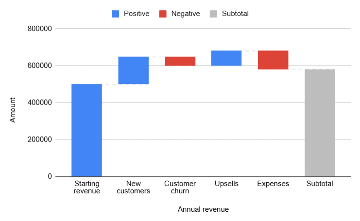
Here’s a practical example. Suppose your company starts a quarter with $500,000 in revenue. New customer contracts add $120,000, upsells contribute another $40,000, but customer churn subtracts $60,000 and a product discount campaign costs $20,000. Your waterfall chart would show each of these factors as individual bars, with the final bar landing at $580,000 in revenue growth.
Before building the chart, you’ll need to structure your data properly. This means organizing categories in the order they should appear, calculating each value as a positive or negative contribution, and computing a running total for each step. A financial manager might set up columns for category name, individual value, and cumulative total to ensure the chart renders correctly.
Color coding brings the whole picture together. Positive changes typically appear in green, negative changes in red, and total or subtotal bars in blue or gray. This visual shorthand lets anyone scan the chart and immediately understand where gains and losses occurred.
Types of waterfall charts
Not all waterfall charts follow the same structure. Depending on what you’re analyzing, one variant might communicate your data more effectively than another. Here are the four most common types and when to use each one.
- Standard waterfall chart: The most common format, showing sequential additions and subtractions between a start and end value. Use this when you need to explain how a single metric changed over time or across categories, such as tracking quarterly revenue from opening balance to closing balance.
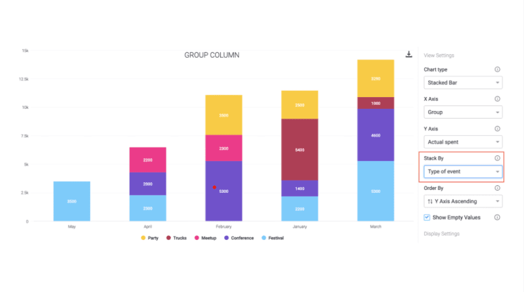
- Stacked (build-up) waterfall chart: Each bar is divided into sub-segments to show multi-category breakdowns within a single step. This works well when you want to illustrate how different product lines or departments contribute to a single total, like breaking down total marketing spend by channel within each quarter.
- Horizontal (cascade) waterfall chart: Rotates the standard layout by 90 degrees so bars flow top to bottom instead of left to right. This is especially useful for timeline-based data or when category labels are long and would overlap on a horizontal axis.
- Variance (movement) waterfall chart: Designed specifically for comparing two scenarios, such as budget vs. actual spending. Each bar represents the difference between the planned and actual values, making it easy to spot where forecasts were accurate and where they missed.
Choosing the right type depends on your audience and what question you’re trying to answer. For most financial reporting, the standard waterfall chart does the job. But when you need to layer in additional dimensions, stacked or variance charts give you more depth without sacrificing readability.
What is a waterfall chart used for?
Waterfall charts are versatile enough to support decision-making across nearly every department. Below are five industries where they’re commonly used, along with specific examples of how teams put them to work.
Financial services
Waterfall charts are an essential part of financial analysis because they break down complex financial data into digestible visual stories. Finance teams use them to track profits, and losses over time, making it easier to identify trends and adjust strategies.
Common financial applications include:
- Revenue decomposition analysis (breaking down changes between gross and net revenue)
- Budget variance tracking (comparing planned vs. actual spending)
- Portfolio performance tracking
- Cash flow analysis across business units
- Risk management impact assessment
Marketing and sales
In marketing and sales, waterfall charts help teams visualize the customer journey from lead generation to conversion. They’re particularly useful for understanding which touchpoints drive the most impact and where potential customers drop off.
Marketing teams frequently use waterfall charts for:
- Campaign performance analysis (showing contribution of each channel to total conversions)
- Sales pipeline visualization
- Customer acquisition cost breakdowns
- ROI tracking across marketing initiatives
- Lead-to-customer conversion rate analysis
Human Resources

HR departments use waterfall charts to track workforce changes and their impact on the organization. These visualizations make it straightforward to present headcount changes, budget allocations, and employee movement data to leadership.
HR applications include:
- Recruitment activity tracking (hires vs. departures)
- Compensation budget analysis
- Training investment impact
- Employee satisfaction score changes
- Benefits cost allocation
Project management
Project managers rely on waterfall charts to monitor project phases, track budget consumption, and communicate progress to stakeholders. They’re especially useful for showing how scope changes, timeline adjustments, or resource reallocation affect the overall project trajectory.
Project management uses include:
- Budget tracking across project phases
- Resource allocation changes
- Milestone completion impact on timelines
- Scope change visualization
- Risk impact assessment
Manufacturing and supply chain
In manufacturing and supply chain management, waterfall charts help teams visualize cost structures, inventory movements, and efficiency metrics. They’re valuable for identifying where waste occurs and which processes contribute to or detract from overall productivity.
Supply chain applications include:
- Analyze supply chain disruptions and their cost impact
- Production cost breakdowns by category
- Inventory movement tracking
- Quality control impact analysis
- Logistics cost optimization
Waterfall chart pros, cons, and limitations
 Like any data visualization, waterfall charts have strengths and weaknesses. Understanding both will help you decide when to reach for one and when a different chart type would serve your audience more effectively.
Pros:
- Visual storytelling: Waterfall charts turn raw numbers into a narrative, showing how you got from point A to point B.
- Trend identification: The sequential layout makes it easy to spot patterns, such as recurring cost categories that consistently erode margins.
- Positive vs. negative distinction: Color-coded bars instantly communicate which factors helped and which hurt, without requiring the audience to interpret a data table.
- Data-driven decisions: By isolating each contributing factor, waterfall charts support operational analysis and strategic planning.
Cons:
- Cluttered with too many categories: Once you exceed 15-20 data points, the chart becomes difficult to read and loses its explanatory power.
- Difficult to compare across datasets: Waterfall charts show one sequence of changes at a time. Comparing two scenarios sidebyside requires two separate charts.
- Not suitable for all data types: Data that doesn’t follow a sequential or cumulative pattern won’t translate well into this format.
Knowing when to use a different visualization is just as important as knowing when a waterfall chart fits. Here are situations where you should consider an alternative:
- Comparing multiple datasets side by side: Use grouped bar charts when you need to contrast two or more series directly.
- Parallel or overlapping processes: Gantt charts are designed for timeline-based work with dependencies and concurrent tasks.
- Forecasting future values: Line charts handle time-series projections more effectively because they emphasize direction and trajectory.
- More than 15-20 categories: At that point, the chart becomes unreadable. Consider grouping smaller categories or switching to a summary table with supporting visualizations.
5 best practices for creating waterfall charts
A well-built waterfall chart communicates quickly and accurately. A poorly built one creates more confusion than it resolves. These five best practices will help you get consistent, professional results every time.
1. Use consistent color coding
Stick with green for positive values, red for negative values, and blue or gray for totals and subtotals. This convention is widely understood, so your audience won’t need a legend to interpret the chart. Use a high-contrast color scheme to ensure readability in presentations and printed reports.
2. Order categories logically
Arrange your data in a sequence that tells a coherent story. For financial data, this usually means starting with revenue, then showing cost categories in order of impact, and ending with the net result. Don’t alphabetize categories unless that order happens to match the logical flow.
3. Include subtotals for complex charts
When your chart has more than six or seven categories, add subtotal bars at meaningful breakpoints. For example, show a subtotal after all revenue items before moving into expenses. This gives your audience a checkpoint so they don’t lose track of the running total.
4. Label bars with exact values
Don’t make your audience estimate values from the axis. Place data labels directly on or near each bar so the exact figure is immediately visible. This is especially important for presentations where viewers can’t hover over elements to see tooltips.
5. Keep it focused
Resist the temptation to include every possible data point. A waterfall chart works when it highlights the most significant drivers of change. If a category contributes less than 2-3% of the total change, consider grouping it into an “Other” category to keep the chart clean and scannable.
3 steps to create a waterfall chart
Whether you prefer spreadsheets or a dedicated work management platform, building a waterfall chart follows a similar workflow. Here are step-by-step instructions for three popular options.
How to create a waterfall chart in Excel
 Microsoft Excel spreadsheet has a built-in waterfall chart type that makes setup straightforward. Follow these steps:
- Enter your data into two columns: one for categories (e.g., “Starting Revenue,” “New Contracts,” “Churn”) and one for values (positive for gains, negative for losses).
- Select your data range, including both columns.
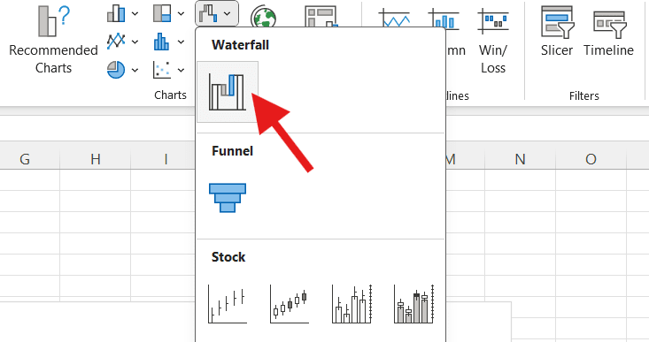
- Go to Insert > Charts > Waterfall.
- Excel will automatically generate a waterfall chart with floating bars.
- Right-click on the first and last bars to set them as totals (this anchors them to the baseline).
- Customize colors, labels, and formatting using the Chart Design and Format tabs.
How to create a waterfall chart in Google Sheets
 Google Sheets also supports waterfall charts natively. Here’s how to build one:
- Enter your categories in column A and your corresponding values in column B.
- Select the data range you want to chart.
- Go to Insert > Chart.
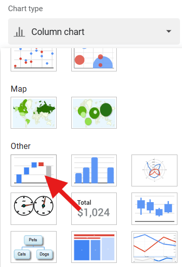
- In the Chart Editor panel, click the Chart type dropdown and select Waterfall chart.
- Use the Customize tab to adjust colors, labels, and axis formatting.
- To set a bar as a subtotal or total, adjust the data or use the chart’s built-in subtotal options.
How to create a waterfall chart with monday.com
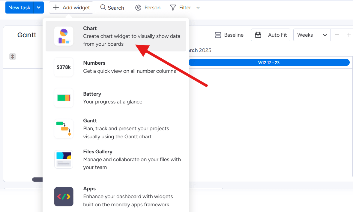 With monday.com’s AI Work Platform, you don’t need a separate spreadsheet to build waterfall-style visualizations. Your data lives on boards, and the Chart widget transforms it into charts directly within your dashboards.
- Create a board with your data categories as items. Add a Numbers column for the values and a Status column to label each item as “Increase,” “Decrease,” or “Total.”
- Populate the board with your data. For example, list “Starting Revenue,” “New Contracts,” “Upsells,” “Churn,” and “Final Revenue” as items with their respective values.
- Navigate to Dashboards and add a Chart widget.
- Configure the chart to pull from your board, mapping categories to the X-axis and values to the Y-axis.
- Select the bar chart type and customize colors to differentiate positive, negative, and total values.
- Your chart updates automatically as board data changes, keeping your visualization in sync without manual refreshes.
Because monday.com connects data across boards, you can also layer in timeline views, Gantt charts, and workload widgets alongside your waterfall chart for a complete project picture.
Get startedHow monday.com transforms your data visualization
Spreadsheets get the job done for one-off charts, but they fall short when your data changes frequently, when multiple team members need access, or when you want visualizations connected to the workflows they represent. monday.com’s AI Work Platform bridges that gap by combining data management, visualization, and automation in one place.
Real-time dashboards

With 25+ widgets, 36 column types, and 25 customizable views, you can build dashboards that reflect your data as it stands right now. No manual exports, no stale snapshots. Add chart widgets, number widgets, battery widgets, and more to create a visualization layer that updates the moment underlying data changes.
Integrations that eliminate data silos

The AI Work Platform connects with 72+ tools including Microsoft Teams, Slack, Salesforce, and Jira. Data flows in automatically, so your charts always reflect the full picture without manual data entry. You can optimize work processes by centralizing information from every platform your team already uses.
No-code automations
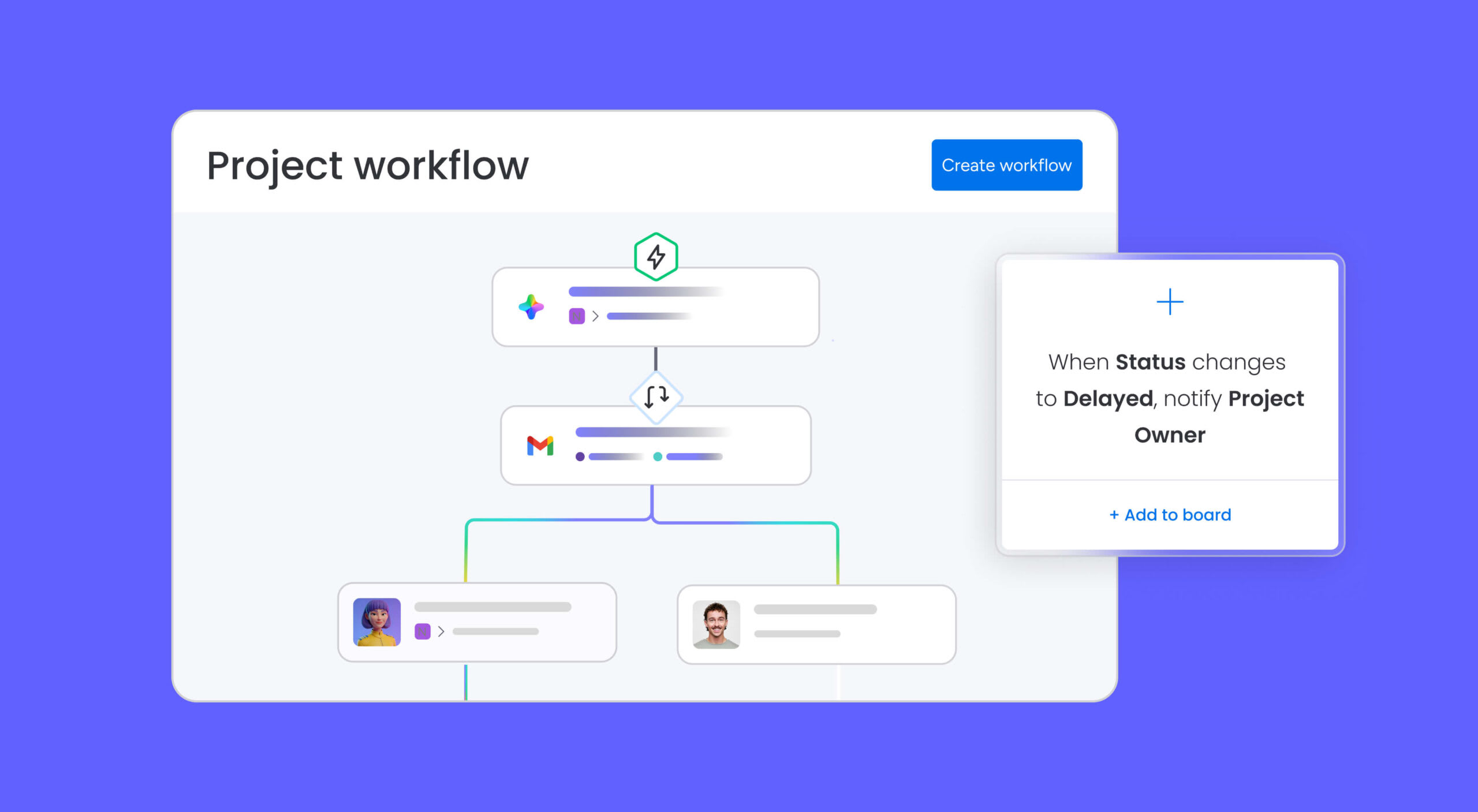
Set up rules that automatically move data, trigger notifications, or update statuses when specific conditions are met. For example, when a deal closes in your CRM integration, an automation can update your revenue board, which in turn refreshes your waterfall chart. No-code building blocks make this accessible to anyone on the team.
AI capabilities

monday sidekick provides context-aware AI assistance directly within your workflows. monday vibe lets you build custom data apps without writing code. monday agents handle autonomous tasks across workflows, and monday’s AI assistant gives developers extensibility through the monday MCP. These tools help you move from raw data to actionable insights faster.
How does the AI Work Platform compare to traditional spreadsheet tools for creating waterfall charts? Here’s a quick comparison:
| Feature | monday.com's AI Work Platform | Excel | Google Sheets |
|---|---|---|---|
| Real-time data updates | Automatic | Manual refresh | Manual refresh |
| Team collaboration | Built-in with permissions | Limited (file sharing) | Good (cloud-based) |
| Automations | No-code automations | Requires VBA/macros | Requires Apps Script |
| Integrations | 72+ native integrations | Limited | Google ecosystem |
| AI-powered insights | monday sidekick, agents | Copilot (separate license) | Gemini (limited) |
| Dashboard widgets | 25+ customizable widgets | Chart types only | Chart types only |
| Workflow integration | Charts linked to workflows | Standalone files | Standalone files |
Turn your data into visual stories that drive decisions
A waterfall chart does what most data visualizations don’t: it explains the journey, not just the destination. By mapping every positive and negative change between a starting value and an ending value, it gives stakeholders the context they need to understand performance, allocate resources, and make informed decisions.
Whether you’re breaking down quarterly revenue, tracking project budgets, or analyzing workforce changes, the waterfall chart is one of the most effective ways to communicate cumulative impact. Pair it with a platform like monday.com’s AI Work Platform, and your charts stay connected to live data, updated automatically, and accessible to everyone on the team.
Get startedFAQs
What is a waterfall chart in simple terms?
A waterfall chart is a bar chart that shows how a starting value increases or decreases through a series of intermediate steps to reach a final value. Each bar represents a positive or negative change, making it easy to see what drove the overall result.
What is the difference between a waterfall chart and a bar chart?
A bar chart compares separate categories independently, while a waterfall chart shows how sequential changes add up to a cumulative total. The bars in a waterfall chart "float" to visually connect each step in the sequence.
When should you use a waterfall chart?
Use a waterfall chart when you need to explain how a value changed over time or across categories. They're ideal for financial analysis (revenue breakdowns, profit and loss), budget tracking, and any scenario where stakeholders need to understand the contributing factors behind a final number.
Can you create a waterfall chart in Google Sheets?
Yes, Google Sheets has a built-in waterfall chart type. You can create one by selecting your data, going to Insert > Chart, and choosing Waterfall from the chart type dropdown in the Chart Editor.
What is another name for a waterfall chart?
A waterfall chart is also called a bridge chart, cascade chart, or waterfall graph. The term "bridge chart" is especially common in financial reporting, where the chart "bridges" the gap between two figures.
How do you read a waterfall chart?
Read a waterfall chart from left to right. The first bar is your starting value, and the last bar is your ending value. Green bars represent increases, red bars represent decreases, and the floating position of each bar shows how it builds on the previous total.