Organizations put a lot of time and resources into setting clear goals. However, teams often struggle when tasks are unclear, workflows are disorganized, or project responsibilities aren’t defined.
A project management dashboard brings clarity by showing key metrics like task status, team workloads, budgets, and project timelines in one easy-to-view place. That means everyone — from project managers to department heads — can easily see what’s happening, spot risks early, and make smarter decisions.
This guide shares practical examples of dashboards for project teams, useful tips to boost adoption, and clear steps to build dashboards that streamline your projects.
What is a project management dashboard and why is it important?
A project management dashboard visually displays important project details like task progress, resource allocation, budgets, timelines, and risks, helping teams quickly understand project status and take action.
Common metrics you’ll see on a dashboard include:
- Task statuses and deadlines
- Resource availability and workloads
- Financial performance (planned vs. actual)
- Project milestones and timelines
- Identified risks and their proactive solutions
Project managers juggle multiple responsibilities daily — like assigning tasks, managing workloads, and keeping budgets on track. Dashboards within project management software make this easier by providing a single, accessible view of all these metrics, reducing confusion and increasing productivity.
While many teams start managing projects using spreadsheets, dashboards simplify project management by reducing manual effort, preventing errors, and allowing everyone to focus on the work that matters most.
Want to learn more about setting up a project timeline? Read these steps, best practices, and examples.
What’s the real benefit of a dashboard?
Project management dashboards centralize key performance indicators (KPIs), giving teams quick insight into projects and enabling better decisions.
For example, project managers regularly need to know:
- Who is working on each task?
- Are tasks completed on time?
- Which team members are overloaded or underutilized?
- Is the project within budget?
- Where should we allocate resources next?
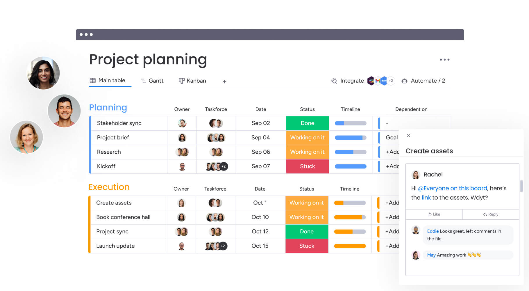
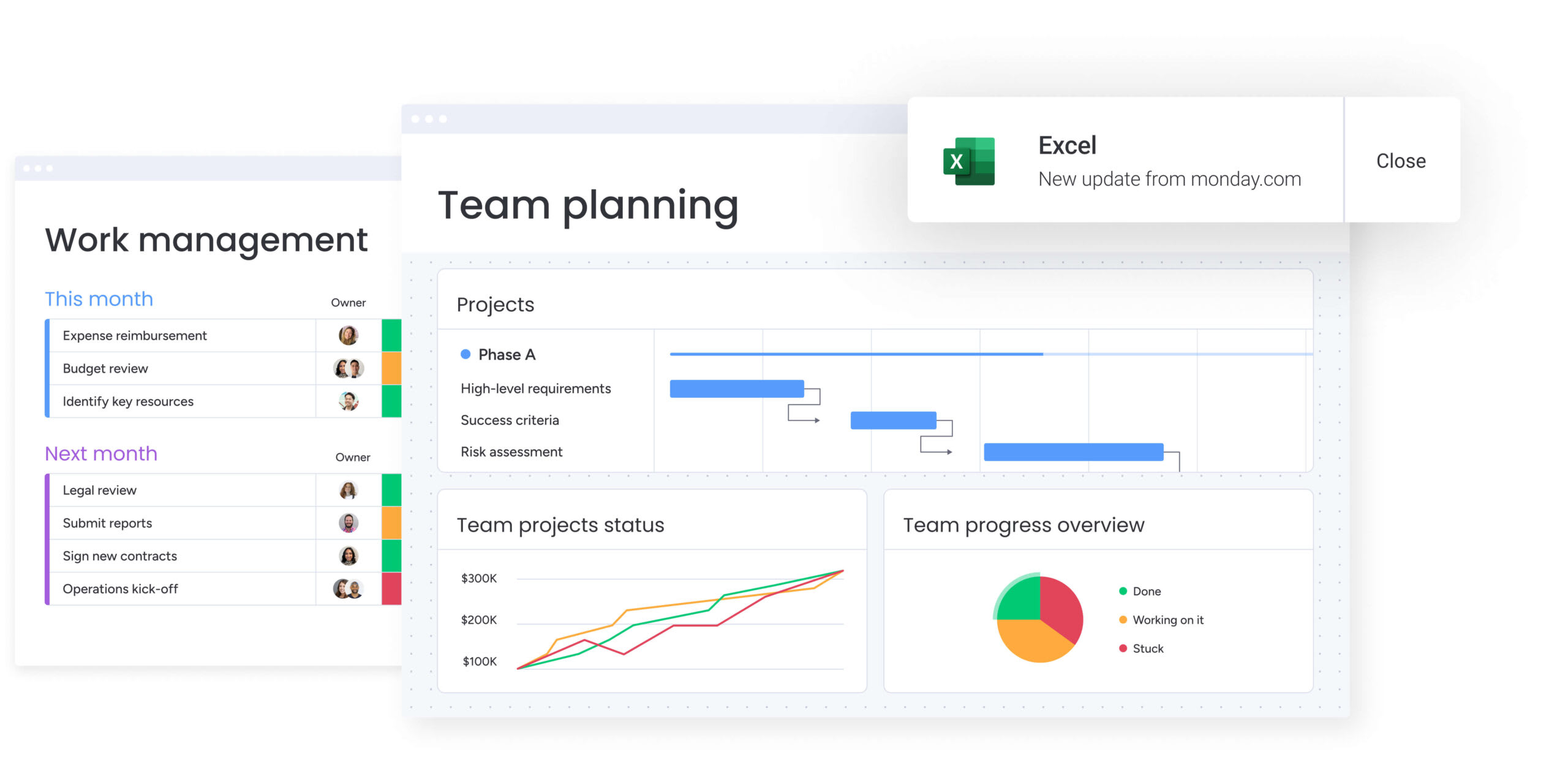
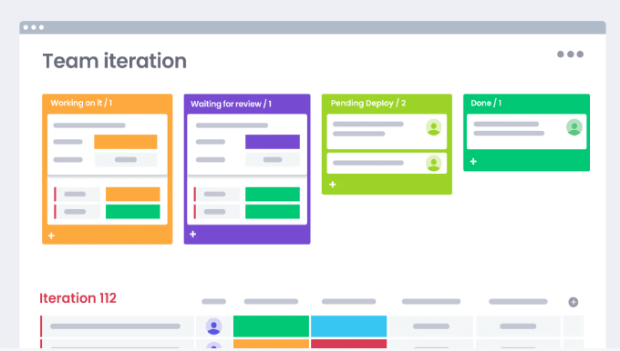
The monday.com process management template shows a ton of information at a glance:
In this screenshot alone, you can see:
- All the active projects
- Project status
- Project owners
- Task priority
At a glance, you can identify where your attention is needed. If you notice a marketing campaign falling behind, for example, you can quickly check if your team is overburdened and take immediate steps to rebalance tasks or adjust deadlines. Project dashboards within PM software like monday.com are tools designed for simplicity and rapid insight.
Key project management dashboard features
Dashboards should feel intuitive from day one, making it easy for project teams, team leads, and department heads to track progress and take action.
According to the 2025 world of work report from monday.com, 71% of employees at the largest enterprise companies use work management software — meaning nearly one-third haven’t fully adopted these tools yet. The same report highlights a gap in comfort levels: While 94% of senior leaders feel confident using work software, only 78% of individual contributors say the same.
These findings suggest ease of use and accessibility matter, reinforcing why dashboards need to cater clearly to all team members.
Here are key features every project management dashboard should have:
Real-time visual updates
Dashboards give teams the latest information on project performance, deadlines, and team availability, helping everyone stay informed without confusion or delays.
For example, if a marketing campaign is falling behind, the dashboard immediately highlights the delay, allowing the team lead to provide timely support and keep the project moving.
Resource and workload management at a glance
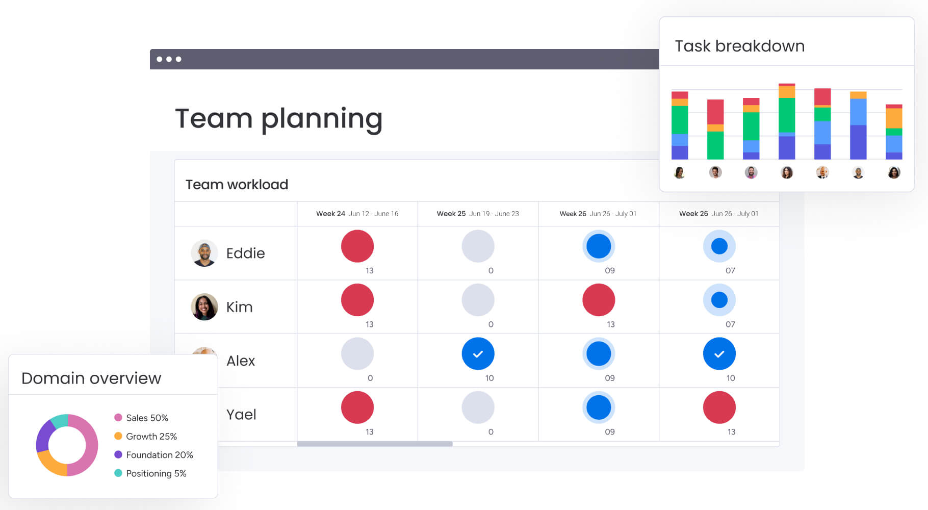
Simple tools for managing resources help team leads clearly see everyone’s workload, making it easier to distribute tasks evenly:
- Visual indicators showing who’s at capacity or has bandwidth
- Easy ways to reassign tasks when priorities shift
- Early alerts to prevent team burnout or underuse
If a design team member is overloaded, the project manager can easily redistribute tasks, keeping productivity high without overwhelming anyone.
Transparent financial tracking
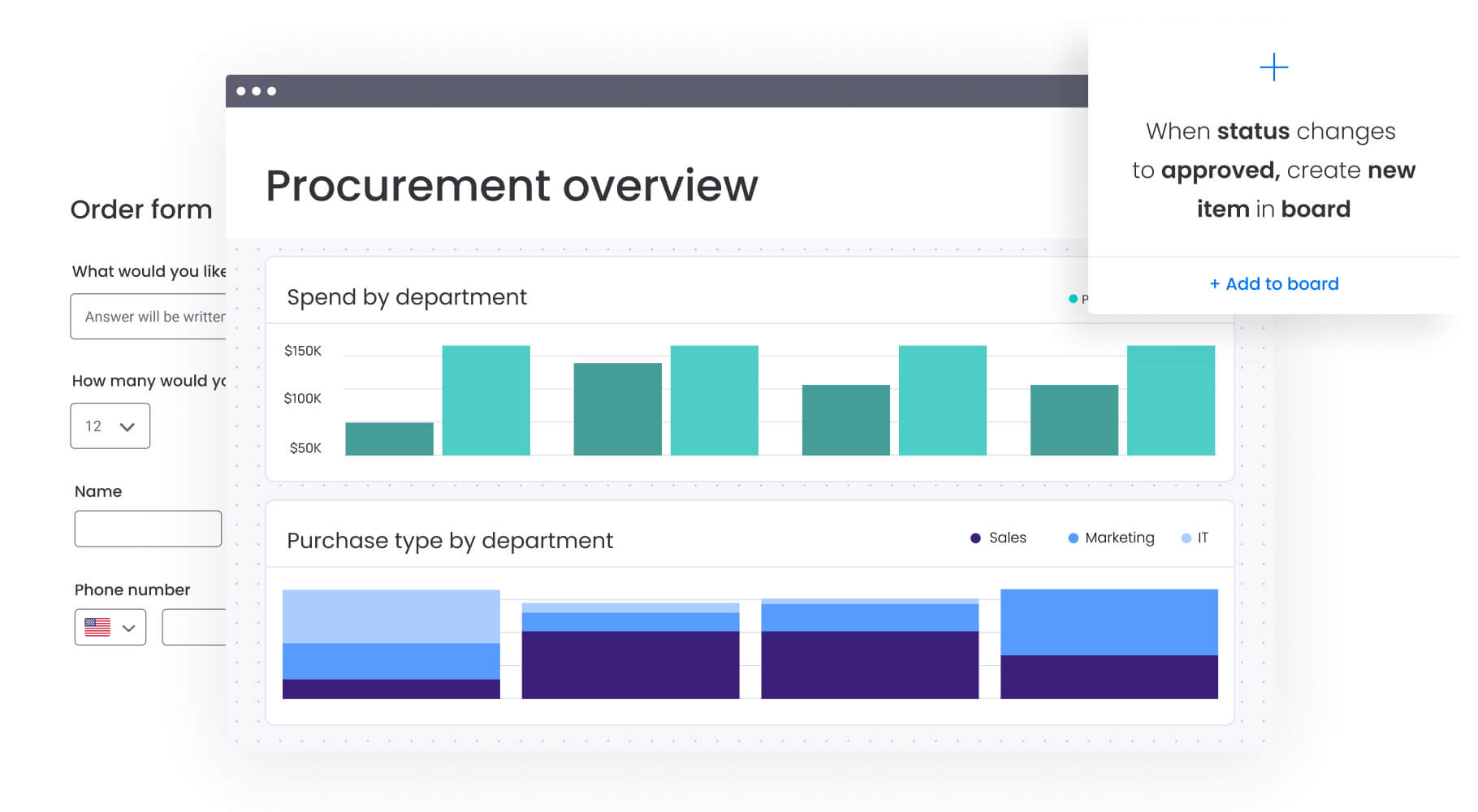
Budget dashboards compare planned costs to actual spending, quickly highlighting areas that need attention:
- Clear visuals showing budget status
- Easy identification of overspending
- Prompts that guide quick budget adjustments
If a project’s expenses start exceeding its budget, the dashboard alerts the team immediately, enabling timely decisions to keep finances on track.
Clear task assignments and timelines
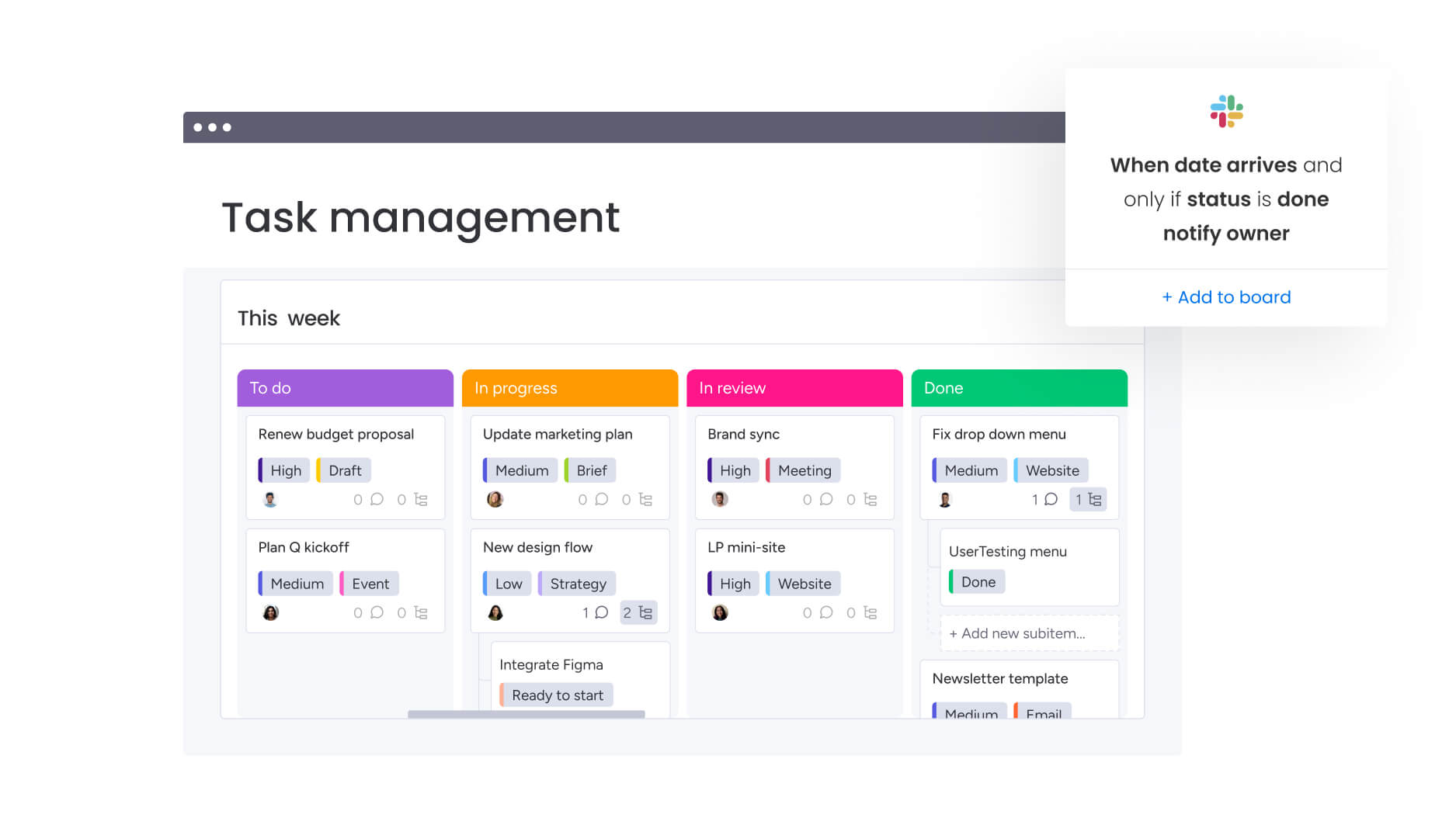
Clear task tracking helps everyone understand their responsibilities and deadlines, supporting better accountability and smoother workflows:
- Instant status updates on individual tasks
- Early warnings about possible scheduling issues
- Increased transparency across the team
If a key deadline seems at risk, the team lead can spot it right away and offer support to ensure the project stays on schedule.
Proactive risk management features
Proactive risk management tools let teams spot risks sooner, preventing bigger problems down the line. These typically include:
- Automatic alerts for emerging issues
- Easy-to-understand visuals that highlight areas needing attention
- Risk categorization for clear action plans
If a vendor issue threatens to delay a project, the dashboard immediately notifies the team, giving them time to find solutions quickly.
Custom views tailored to different teams
Project dashboards can be customized to show the most relevant details for each team or role:
- High-level summaries for department heads
- Task-focused views for project teams
- Budget and resource summaries for managers
Customizable dashboards ensure everyone sees exactly what they need to stay informed and make confident decisions.
8 project management dashboard examples
Project management dashboards come in many forms, tailored to the unique needs of different teams and departments. Here are 8 examples that show how dashboards help teams manage projects effectively and collaborate more smoothly.
1. Marketing project management dashboard
A marketing project management dashboard helps marketing teams track campaigns from start to finish. It clearly shows deadlines, creative assets, and task statuses so everyone stays aligned and campaigns launch on time.
For instance, a marketing team preparing for a product launch can quickly identify which tasks are at risk of delay, helping team leads adjust workloads or timelines proactively.
2. Sales project management dashboard
Sales dashboards keep sales teams organized by tracking leads, opportunities, and pipeline stages. These dashboards highlight sales goals, show how the team is progressing, and quickly reveal areas needing attention.
For example, if a sales team notices a sudden drop in new opportunities, the dashboard helps them promptly spot the issue and take quick action to improve prospecting efforts.
3. Software development project management dashboard
Software development dashboards track sprints, feature statuses, bug reports, and team capacity in one place. This makes it easy for project managers and developers to stay aligned on priorities and deadlines.
If a key feature is falling behind schedule, developers and product managers can immediately see this and coordinate efforts to keep the project on track.
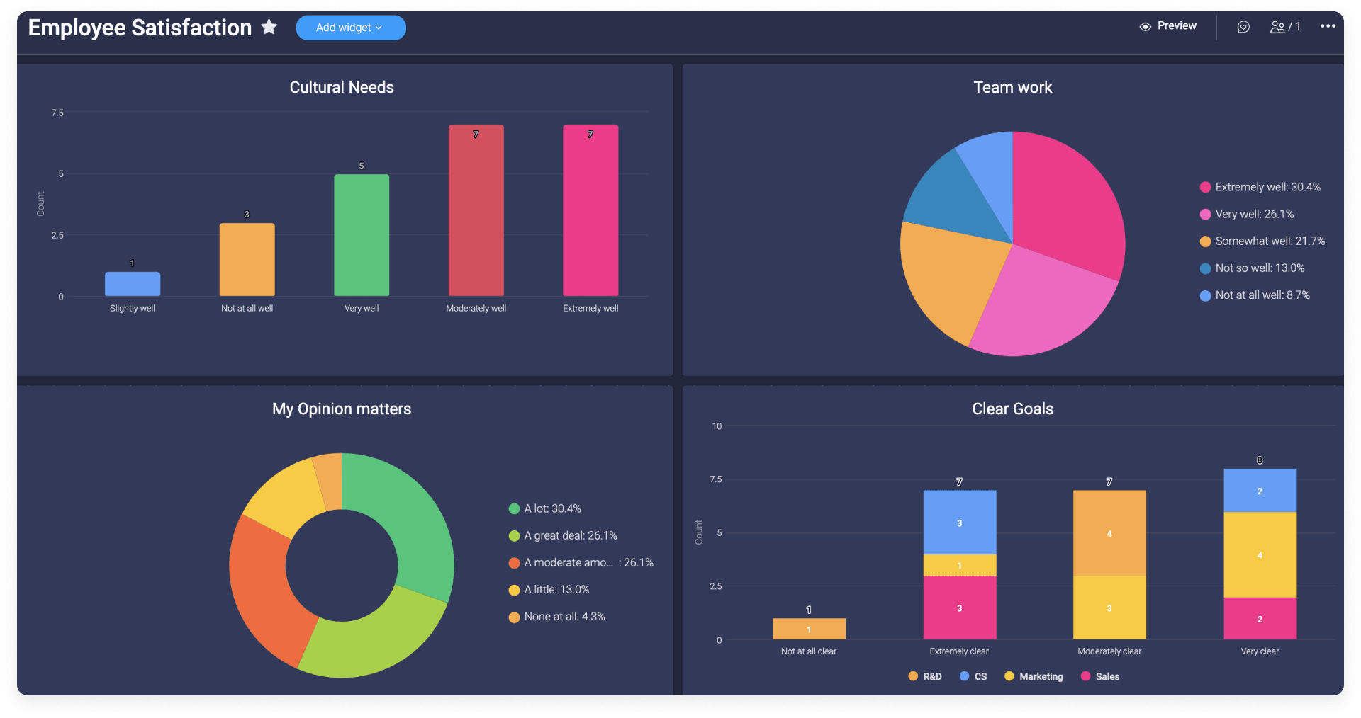
4. HR project management dashboard
HR dashboards help human resources teams manage recruitment processes, onboarding, training initiatives, and employee satisfaction projects. They give clear visibility into recruitment pipelines, training schedules, and HR task completion.
For instance, HR teams can see at a glance if a hiring initiative is moving too slowly, prompting immediate adjustments to interviewing schedules or outreach strategies.
5. Event planning project management dashboard
Event planning dashboards centralize event tasks, vendor coordination, budget tracking, and timeline management. They ensure event teams know exactly what needs to happen next to deliver successful events.
For example, event planners can quickly see if any tasks related to booking venues or vendors are falling behind, allowing immediate follow-up and preventing last-minute scrambling.
6. Product development project dashboard
Product development dashboards provide a clear picture of product roadmap progress, feature requests, user feedback, and development status. Product teams stay informed about current priorities and future planning.
When product managers spot that user-requested features are consistently delayed, they can step in early to adjust the roadmap or reallocate resources.
7. Customer success project management dashboard
Customer success dashboards track onboarding progress, customer health scores, churn risks, and ongoing support tasks. This helps customer success teams proactively address customer needs.
If customer satisfaction scores begin to dip, the dashboard makes it easy for teams to pinpoint affected customers and quickly develop strategies to improve their experience.
8. Construction project management dashboard
Construction dashboards provide clear visibility into project timelines, budget utilization, material deliveries, and contractor schedules. Project managers stay on top of progress and quickly spot potential delays.
For instance, if certain materials are delayed, construction teams can easily see the impact on the timeline and coordinate alternative solutions to minimize disruptions.
Use our single project template to get started with any of these dashboards!
Best practices for creating a project management dashboard
Creating a project management dashboard that your team will actually use requires thoughtful planning and design. These best practices can help your dashboard deliver consistent value:
- Tailor dashboards to the audience: Build dashboards that reflect what your team genuinely needs. For example, team leads often need detailed task statuses, department heads might focus on resource allocation, and project managers typically prioritize timelines and milestones.
- Keep designs straightforward and user-friendly: Stick to straightforward visuals and essential metrics to avoid information overload. Clear visuals make it easy for your team to quickly understand what’s happening and what action is needed.
- Use automated data refreshes: Dashboards within project management software keep everyone aligned by automatically updating key information. This reduces manual work, eliminates errors, and ensures your team trusts the data they’re seeing.
Common project dashboard pitfalls to avoid
Here are a few common dashboard challenges teams face, along with practical ways to overcome them:
- Too many metrics: Stick to just a few key metrics that directly impact your team’s goals. Less is more.
- Not involving your team: Regularly ask your team what metrics and visuals help them do their job better. Dashboards designed with team input see much higher adoption rates.
- Manual data entry: Choose project management software that updates your dashboard automatically, saving time and boosting accuracy.
- Complex or cluttered visuals: Opt for clean, easy-to-read visuals like progress bars or color-coded statuses to simplify decision-making.
- Integration issues: Be sure your dashboard software integrates smoothly with the tools your team already uses, like your CRM or email platform.
- Scalability: Pick a dashboard solution that can easily grow with your team — handling more projects, more data, and more users without slowing down.
Want to learn more? Read about the role of enterprise project management in strategic execution.
How to build your own project management dashboard
Step 1: Choose meaningful KPIs
Choose KPIs directly linked to organizational objectives. According to the 2025 world of work report from monday.com, employees who clearly understand how their success is measured are twice as motivated. Yet, in enterprise-level companies, only 43% understand their success metrics.
Clear, visual KPIs in one executive dashboard help everyone on your team stay motivated and accountable. A few examples could be:
- On-time project completion
- Budget adherence (planned vs. actual)
- Team workload balance
Step 2: Choose scalable dashboard software
Pick dashboard software designed to scale as your team or organization grows. Look for features like:
- User-friendly interfaces
- Integrations with tools you already use (CRM, ERP, accounting software)
- Reliable performance as data and projects grow
- Built-in data security and compliance
Reliable integrations help dashboards stay accurate and reduce repetitive manual updates.
Step 3: Design user-friendly dashboards and intuitive layouts
Dashboards should display key information at a glance. Use visuals that are quick to interpret, like:
- Trend graphs for tracking progress
- Color-coded status bars for immediate visibility
- Gantt charts for timelines and milestones
Clearly organized dashboards help teams quickly identify what’s on track and what needs attention.
Step 4: Provide team training and support
Even intuitive dashboards benefit from training. Offer your team practical guidance on using dashboard features effectively. Regular training sessions and resources like short how-to videos or help articles can significantly boost adoption and ensure everyone benefits from the dashboard.
According to the 2025 world of work report from monday.com, 78% of individual contributors report feeling comfortable using project management tools, according to monday.com. With targeted training, you can further improve these comfort levels and maximize dashboard effectiveness.
Step 5: Keep dashboards updated
Keep your dashboards current and useful with ongoing reviews:
- Frequently revisit KPIs to match your changing goals
- Adjust visuals and layouts based on user feedback
- Set up automated updates to maintain accuracy and reliability
Regularly refreshed dashboards remain relevant and valuable to your team.
Why switch to project management dashboard software?
Relying solely on spreadsheets or disconnected tools can create challenges as your projects grow more complex. Project management software centralizes project information into one centralized place, simplifying project tracking, enhancing collaboration, and reducing the risk of errors or outdated information.
Here are some benefits:
- Better decisions with accurate data: Dashboards provide immediate access to real-time project data, helping your team quickly spot risks, prioritize tasks, and address challenges effectively.
- Unified communication and collaborative workflows: Having a single dashboard brings your project team together, making collaboration seamless. Everyone can easily see task progress, resource availability, and important deadlines.
- Reduced manual workload: According to the 2025 world of work report from monday.com, 82% of employees use project management tools to collaborate. Automating your dashboards reduces manual work, saving your team valuable time and improving overall productivity.
- Built for scaling: Good dashboard software easily grows with your needs, accommodating more projects, users, and data without slowing down or losing functionality.
- Data security and compliance: Built-in data protection ensures sensitive information stays secure, giving your team peace of mind.
Switching to dedicated dashboard software positions your project teams for better clarity, smoother workflows, and stronger results.
Why choose monday work management for your project management dashboard?
Great project management starts with the right tools. With monday work management, your team can build easy-to-use dashboards tailored exactly to your workflows — no matter your industry or team size.
Ready-to-use project management dashboard templates
Kick off your project dashboards faster with ready-made, customizable templates. A few popular examples include:
- Marketing project dashboard: Track campaign progress, creative workflows, and resource allocation clearly in one place.
- Sales team project dashboard: Visualize sales pipeline stages, customer interactions, and revenue goals at a glance.
- Software development dashboard: Easily monitor sprint progress, bugs, feature releases, and deployment schedules.
- HR project management dashboard: Clearly track recruitment cycles, onboarding processes, and employee engagement metrics.
These pre-built templates save time, making it simple for teams to quickly set up dashboards and start managing projects immediately.
See our dashboard template in action! Read the ultimate dashboard template for businesses.
Powerful automation that simplifies workflows
Streamline your workflows using powerful automations that cut out repetitive tasks, allowing your team more time for important, strategic work. Set automations to:
- Automatically assign tasks to team members when project statuses change.
- Set up instant notifications when deadlines approach or if milestones are missed.
- Keep financial data current by syncing budget updates automatically to your dashboards.
Automations ensure your dashboards stay current, helping your team stay organized without extra effort.
Easy integrations to centralize your data
Connect with tools your time is already using like Salesforce, Slack, Google Workspace, and many more. Integrating these platforms centralizes your data directly within your project dashboard, making it easier to access information and stay productive without switching between multiple tools.
Built-in scalability and security
As your team and projects grow, your dashboards effortlessly scale with you. With monday work management, you can expect reliability, speed, and performance at any scale, backed by robust security and compliance standards trusted by enterprise organizations worldwide.
Manage your projects with confidence using monday work management
A project management dashboard gives your team clear insights into tasks, timelines, and resources, making it easier to deliver great results.
With monday work management, your team gets an intuitive dashboard to streamline collaboration, automate routine tasks, and stay on top of every project detail. This simplifies your workflows, boosts productivity, and helps your whole team succeed together.
See how easy managing projects can be with monday work management.
FAQs
What is a PMO dashboard?
A PMO dashboard helps project management offices (PMOs) keep track of multiple projects in one place. It shows overall project statuses, resource availability, key risks, and how everything aligns with strategic alignment.
How can I tailor my project dashboard to different stakeholders?
Customize your dashboards to show only what's relevant to each person's role. Project managers might need detailed views of tasks and deadlines, while department heads prefer a high-level view of project health and resource allocation.
How do project managers keep track of projects?
Project managers regularly check their dashboards to monitor tasks, timelines, budgets, and team workloads. Dashboards help them spot issues early and make quick decisions to keep projects moving forward.
What is a monitoring dashboard?
A monitoring dashboard continuously tracks key metrics like ongoing tasks, deadlines, team workloads, or system performance. It highlights issues as soon as they arise, so your team can act quickly.
How do I create a monitoring dashboard?
First, pick the key metrics your team needs to track. Then, choose visuals that clearly communicate statuses or issues. Finally, use dashboard software with automatic updates to make sure the information stays accurate without extra work.