
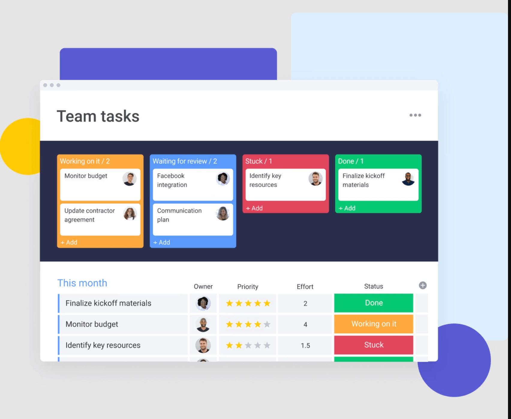
Whether you’re coordinating a marketing campaign, organizing product launches, or managing client projects, Gantt charts help turn complex processes into streamlined, actionable plans. With monday.com’s AI Work Platform, teams can build Gantt views, connect timelines to real work, automate updates, and use AI-powered capabilities to summarize progress, surface risks, and keep projects moving.
Whether you’re coordinating a marketing campaign, organizing product launches, or managing client projects, Gantt charts help turn complex processes into streamlined, actionable plans. And with software like monday.com, you can keep everyone aligned, all within a single, intuitive platform.
Get startedKey takeaways
What is a Gantt chart?
A Gantt chart is a project management tool that visualizes work progress over time against a planned schedule. It typically consists of two main sections: the left side lists all tasks or activities, while the right side features a horizontal timeline with bars representing each task’s duration (which adds up to the entire project duration). These schedule bars clearly show the start and end dates of tasks, making it easy to see what’s in progress, what’s upcoming, and what’s completed.
Gantt charts are popular because they offer a clear, visual way to manage project schedules, helping teams track milestones, deadlines, and task dependencies — how each task connects to and impacts others. With this bird’s-eye view, you can manage complex projects more effectively, ensuring everyone is aligned and on track to meet shared goals.
Who invented the Gantt chart?
The Gantt chart, a cornerstone of modern project management, was invented by Henry L. Gantt, an American mechanical engineer and management consultant, in the early 1900s. Gantt developed this tool to help teams visualize project timelines and manage workflows more effectively. By turning abstract project plans into clear, visual timelines, his chart made it easier to understand the sequence of tasks, track progress, and manage resources.
Gantt’s innovation has stood the test of time, evolving from simple, hand-drawn charts to the dynamic, interactive Gantt charts we use today. Now, with platforms like monday.com’s AI Work Platform, teams can use dynamic Gantt views to plan, execute, and track projects while adapting timelines, dependencies, ownership, and priorities as work changes.
What is a Gantt chart used for and when should you use one?
Gantt charts are powerful tools for visualizing project timelines, tracking progress, and managing tasks. They provide a clear, visual overview of what needs to be done, by whom, and when, making them essential for teams managing complex projects.
Here’s how and when to use Gantt charts effectively:
Breaking down and managing complex projects
Gantt charts help break down large projects into smaller, manageable tasks. By scheduling tasks on a timeline with details like start and end dates, assignees, milestones, and dependencies, teams can easily see the entire project’s structure. This approach helps keep everyone aligned on priorities and timelines, from planning a marketing campaign to coordinating a product launch.
Breaking down and managing complex projects
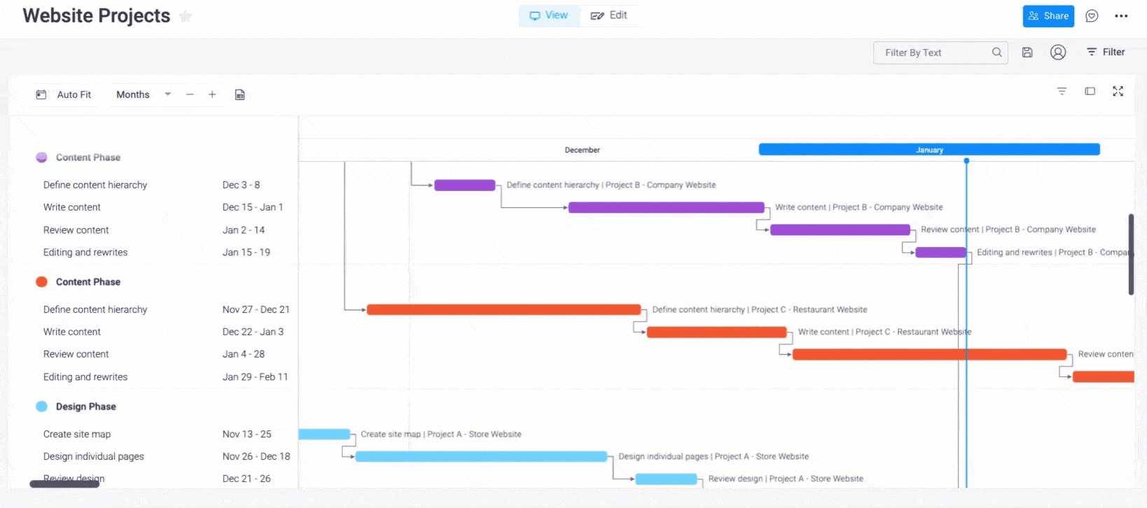
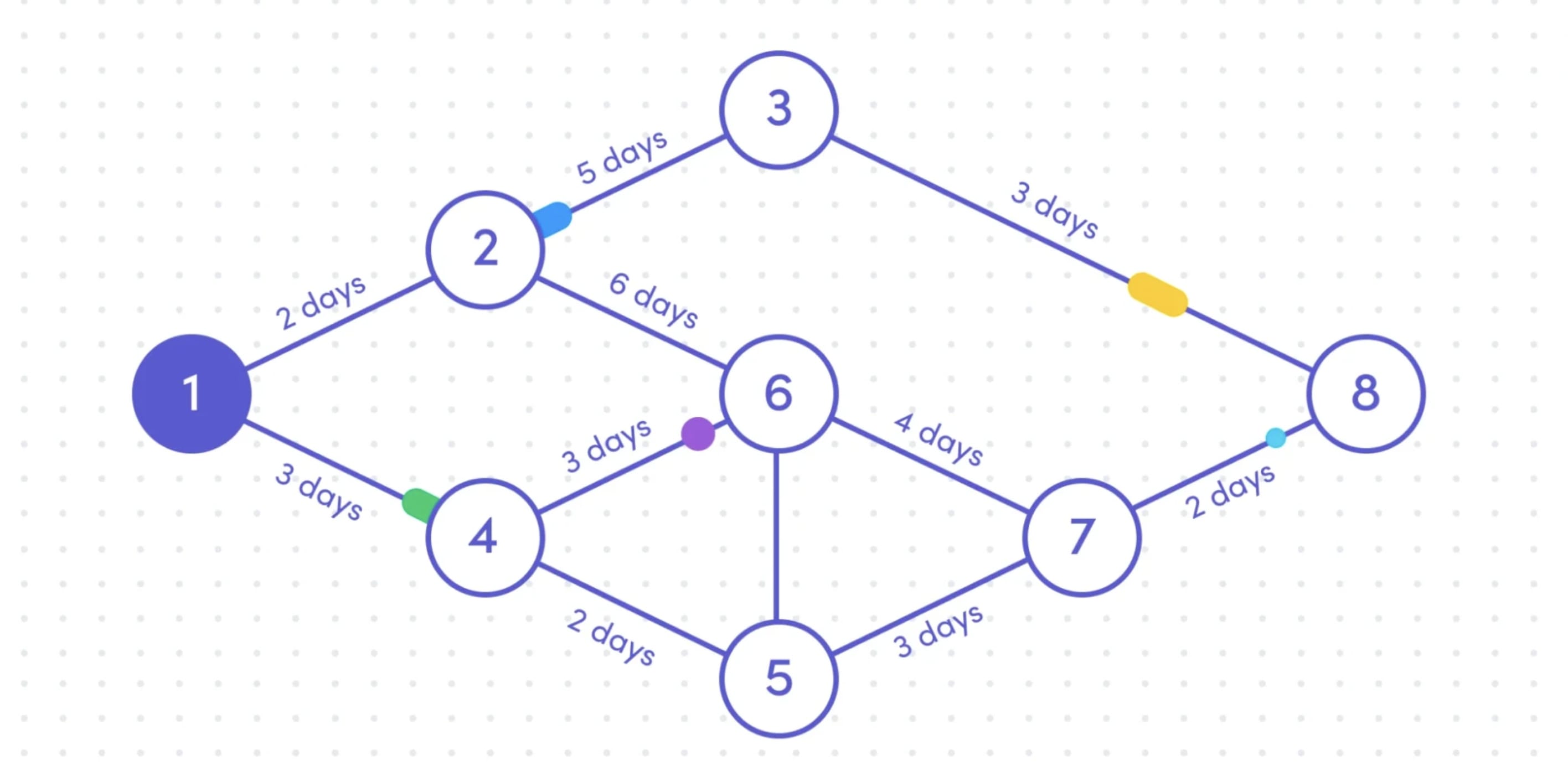
One of the standout features of a Gantt chart is its ability to show task dependencies — the relationships between tasks that affect the project’s flow. For example, if Task B cannot start until Task A is completed, the Gantt chart will visually represent this dependency.
This is crucial for managing logistics in multi-team environments, where delays in one area can impact several other tasks. By visualizing these connections, teams can prevent bottlenecks and keep projects on track.
Tracking project progress and adjusting plans
Gantt charts are also valuable for monitoring progress in real time. As tasks are completed and logged, project managers can quickly assess the project’s health against planned schedules. Visual indicators such as release dates, milestones, and completion percentages help teams identify potential delays early, adjust workflows, and ensure projects stay on course.
Coordinating across teams and managing resources
Gantt charts serve as a single source of truth for teams working on multi-phase or multi-team projects. They provide a clear overview of timelines, responsibilities, and objectives, making it easier to coordinate efforts and manage resources efficiently. With a Gantt chart, managers can allocate the right people to the right tasks and adjust as project needs change.
Supporting Work Breakdown Structures (WBS)
Gantt charts work well with a Work Breakdown Structure (WBS), which decomposes large goals into smaller, more manageable objectives. While a WBS outlines the scope of work, integrating it with a Gantt chart adds timelines, ownership, and dependencies, creating a comprehensive project plan that drives project success.
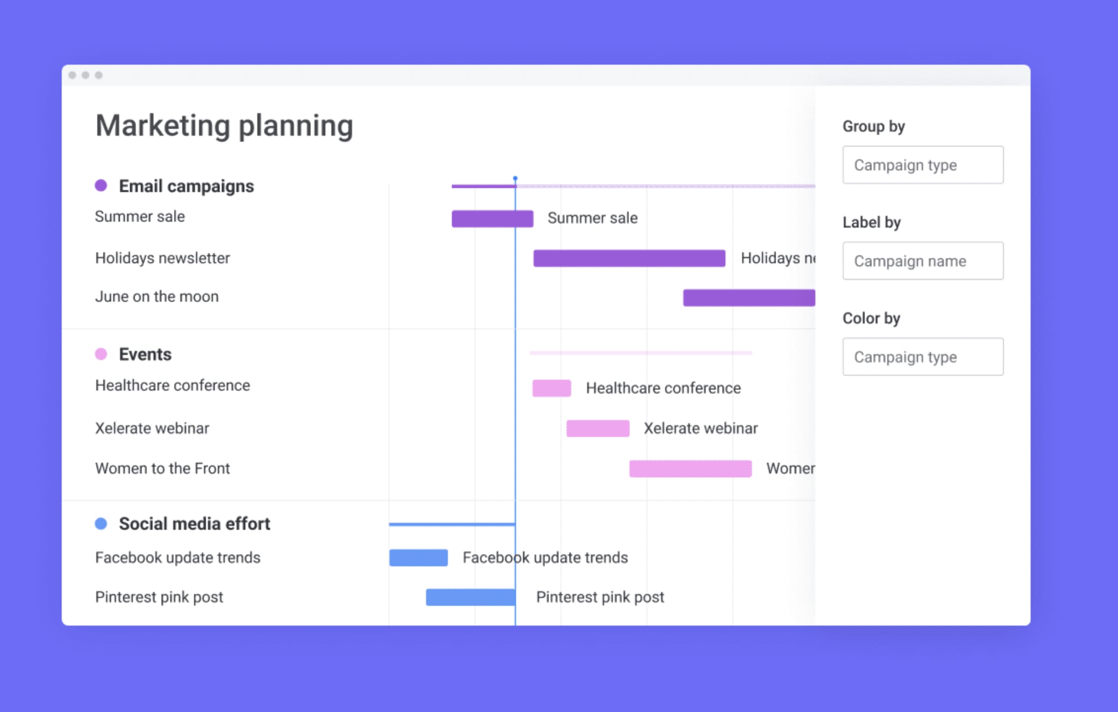
What are the components of a Gantt chart?
While every team’s project Gantt chart will look different depending on their unique workflow and critical path, there are six major components that are important to include:
- Dates/times: Gantt charts show task dates from beginning to end as well as their place on the overall project timeline to enable easier planning
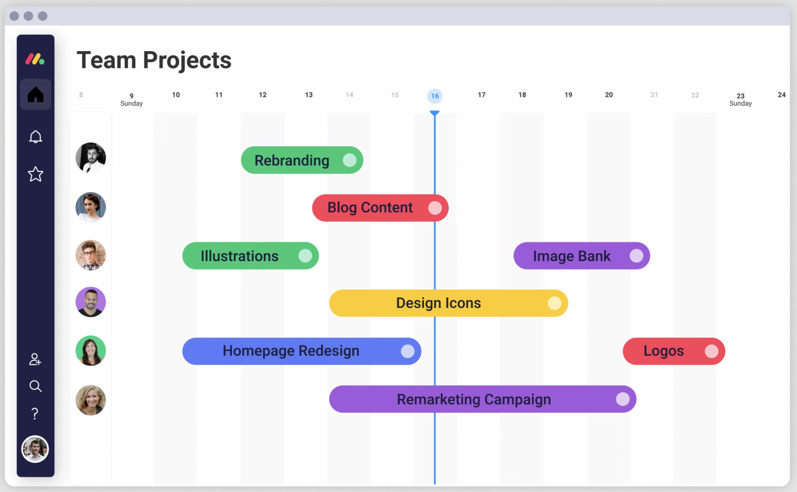
- Tasks and task bars: Tasks and sub-tasks are shown in order of what needs to be completed. Tasks are organized vertically on the left, with bars representing each task shown as a visual bar on a timeline to better view task dependencies over a project’s lifetime
- Milestones and progress: Certain points of a project are represented as milestones, which on a Gantt chart can look like tasks with a distinct marker. Progress is tracked by how close each phase is to its corresponding milestone, sometimes showing a completion percentage for an ongoing task
- Dependencies: Arrows or lines are used to denote which tasks are dependent on each other
- Vertical line markers: Vertical markers indicate the current data of a project on the chart, helping you see where your project is and how much work is left to do
- Resources: Some tasks will include resources such as tools, documents, or contacts that are helpful in completing a task
How AI can support Gantt chart planning
AI does not replace project planning, but it can make Gantt charts easier to build, update, and act on. Instead of manually reviewing every dependency, deadline, and status update, teams can use AI-powered capabilities to summarize project progress, identify tasks that may need attention, and turn project updates into clearer next steps.
In monday.com’s AI Work Platform, tools like monday sidekick, monday agents, monday vibe, AI columns, and the AI workflow builder can support different parts of the planning process. For example, teams can use AI-powered capabilities to summarize meeting notes, create action items, organize project updates, or help build workflows that connect Gantt chart timelines to the work happening across boards.
This is especially useful for projects with shifting timelines, multiple owners, and cross-functional dependencies. When AI-powered support is integrated into the same workspace where work is managed, teams can spend less time chasing updates and more time making decisions.
Who uses Gantt charts?
Gantt charts are versatile tools that are widely used by teams and professionals across various industries. From project managers and team leads to marketers and operations specialists, anyone looking to keep their projects on track can benefit from Gantt charts. They help:
- Project managers plan, schedule, and assign tasks, ensuring everyone is aligned and aware of dependent tasks and deadlines
- Marketing teams coordinate campaigns, manage resources, and track progress across multiple channels, from social media to content creation
- Product development teams visualize product roadmaps, track release timelines, and manage cross-functional workflows to bring products to market faster
- Construction managers outline project phases, track deliverables, and manage subcontractors, ensuring projects are completed on time and within budget
- Event planners map out every detail from logistics to marketing, coordinating with vendors and stakeholders to deliver successful events
- Retail teams manage store openings, promotions, and inventory planning, ensuring all activities are synchronized for maximum impact
- Media and production teams organize content calendars, coordinate shoots, and manage post-production schedules to ensure deadlines are met and content is delivered on time
No matter the field, Gantt charts provide a clear, visual way to manage complex projects and keep teams moving in the right direction.
Gantt chart examples
Gantt charts are incredibly adaptable and can be used in various industries to bring clarity, organization, and efficiency to complex projects. Let’s explore how different industries use Gantt charts to streamline their workflows and achieve their goals.
How retail companies can utilize Gantt charts
Retail companies often juggle multiple projects at once, from planning new store openings and seasonal promotions to managing inventory and visual merchandising. Gantt charts offer a clear, visual way to manage these overlapping tasks, helping retail teams streamline their workflows and hit their targets.
Use case: For launching a new store, a Gantt chart can break down every phase of the project — from securing permits and organizing inventory to training staff and rolling out marketing campaigns. Each task is plotted on a timeline, showing its start and end date, dependencies, and who is responsible.
Benefits: With a Gantt chart, retail teams can ensure tasks are completed on schedule, manage dependencies effectively, and allocate resources where they’re needed most. This level of organization keeps everyone aligned, from store managers to marketing teams, and helps prevent delays — ensuring a smooth and successful store launch.
How media teams can optimize workflows with Gantt charts
Media and production teams thrive on tight schedules, fast turnarounds, and multi-layered content calendars. Gantt charts help these teams stay on top of every phase of production, from brainstorming and scripting to shooting, editing, and distribution.
Use case: For a multimedia campaign, a Gantt chart can be used to outline all tasks, such as scriptwriting, filming, post-production, and channel-specific content distribution. This structured view allows for real-time adjustments and efficient task management.
Benefits: By using Gantt charts, media teams can instantly see where each piece of content stands in the production process, identify potential bottlenecks, and adjust schedules as needed. This not only ensures timely delivery but also reduces the risk of costly delays and helps keep the entire team in sync.
How construction projects benefit from Gantt charts
Construction projects are often complex, involving numerous stakeholders, detailed planning, and strict deadlines. Gantt charts provide construction managers with a comprehensive overview of all project phases, from site preparation to the final handover, helping them manage resources and timelines effectively.
Use case: For a commercial building project, a Gantt chart can outline tasks from pre-production to post-production, including design approvals, foundation work, structural development, and finishing touches. Each task is clearly defined with its duration and dependencies, providing a visual roadmap for the entire project.
Benefits: Gantt charts give construction managers the visibility needed to allocate resources efficiently, manage subcontractors, and monitor progress against deadlines. This helps prevent delays, manage risks proactively, and ensure that the project stays within budget and scope, leading to successful project completion.
How to create a Gantt chart
Get startedCreating a Gantt chart from scratch requires several steps, from gathering all the different tasks and subtasks to defining dependencies, and creating a horizontal timeline. While this can be done independently, it’s a lot easier to start with the help of a project management platform with built-in Gantt chart views and templates, like monday work management.
Step 1: Define your project scope and tasks
Before diving into your Gantt chart, start by outlining the entire scope of your project. Identify all the major tasks and subtasks that need to be accomplished to complete the project. Think of each phase of the project and break it down into smaller, actionable steps.
Step 2: Establish task durations and deadlines
Once you have a clear project task list, determine how long each task will take to complete. Assign start and end dates for each task based on the project timeline. This helps in setting realistic deadlines and planning resources effectively.
Step 3: Identify task dependencies
Tasks in a project are often interconnected. Use your Gantt chart to visualize which tasks depend on others. For example, task B cannot start until task A is complete. Identifying these dependencies is crucial for a smooth workflow and helps prevent bottlenecks later.
Step 4: Allocate resources and assign task owners
In monday.com’s AI Work Platform, you can assign team members to tasks directly on your Gantt chart, making ownership clear from the start.
Step 5: Build your Gantt chart timeline
Now that you have all the information ready, it’s time to visualize it. Use monday.com’s AI Work Platform to create a Gantt chart from your board and visualize tasks, durations, and dependencies in one place. Start by adding your tasks, setting durations, and linking dependencies. You’ll see your project timeline take shape, providing a clear, visual overview.
Step 6: Customize your Gantt chart view
Every project is unique, so customize your Gantt chart to fit your team’s needs. Use colors, labels, and filters to highlight important milestones, deadlines, or critical paths. With monday work management, you can add widgets to your dashboard for a high-level overview or zoom into specific tasks for more detail.
Step 7: Monitor progress and make adjustments
A Gantt chart is a living document that needs to be updated as your project progresses. Track task completion, monitor timelines, and adjust as needed if deadlines shift or new tasks arise. With monday.com’s AI Work Platform, you can add dashboard widgets for a high-level overview, zoom into specific tasks for more detail, and use AI-powered capabilities to summarize updates or surface items that may need attention.
Step 8: Share your Gantt chart with stakeholders
Finally, share your Gantt chart with team members, clients, or stakeholders to keep everyone informed and aligned. monday.com’s AI Work Platform lets you share Gantt chart views and customize what each viewer can see, helping teams and stakeholders stay aligned without exposing unnecessary details.
How to view your tasks on a Gantt chart with monday.com’s AI Work Platform
monday.com’s AI Work Platform offers multiple project views, including Gantt. Instead of creating a chart from scratch, you can build a board with the columns, owners, timelines, dependencies, and automations your project needs, then view that same work as a Gantt chart.
- Make sure your board has a Timeline Column and Dependency Column.
- In the Board View menu, select Gantt
- Your tasks are now organized in one Gantt chart and you can get more creative with on-the-fly edits and cool features like The Gantt Baseline, which allows you to visualize your current project’s progression against the planned timeline
Creating a Gantt chart from scratch requires several steps, from gathering tasks and subtasks to defining dependencies and building a horizontal timeline. While this can be done manually, it’s easier to start with a project management platform that includes built-in Gantt chart views, templates, automations, and AI-powered support, like monday.com’s AI Work Platform.
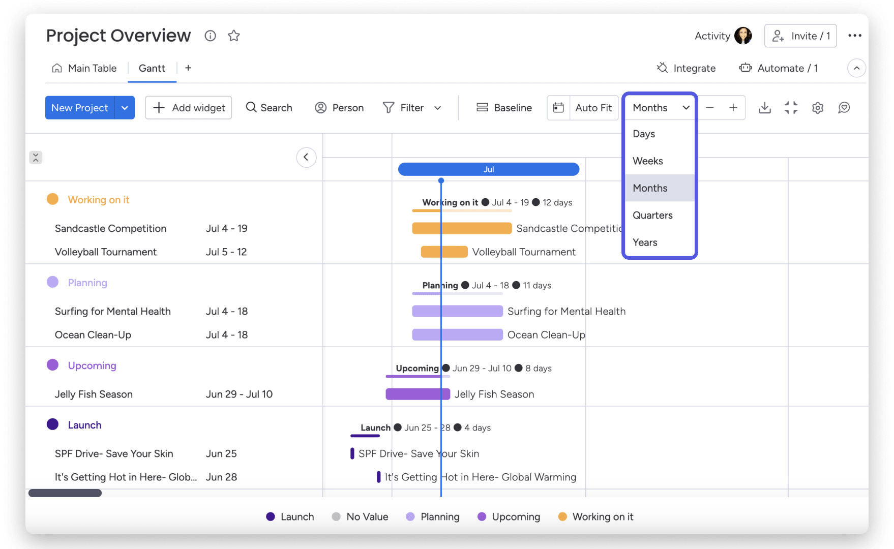
monday.com also allows you to zoom in or out of your Gantt chart by customizing the time frame. For example, you can choose to view your chart in days, weeks, months, years, or quarters, allowing you to zoom in and small tasks and then get a complete project overview in a few clicks.
With monday.com’s AI Work Platform, you get the flexibility to visualize work in the way that makes the most sense for your team. While tasks start out on a board, you don’t need to go back to the board view from your Gantt chart to continue updating your project. If you prefer working primarily with a Gantt chart, you can update items directly from the Gantt view without toggling back and forth.
How monday.com’s AI products support Gantt chart workflows
Gantt charts are most useful when they stay connected to the real work happening across your team. monday.com’s AI Work Platform helps teams go beyond static timelines by connecting Gantt views to boards, dashboards, automations, updates, and AI-powered capabilities.
Here are a few ways monday.com’s AI products can support Gantt chart workflows:
- monday sidekick can help summarize project updates, draft status notes, answer questions based on workspace context, and help teams understand what needs attention
- monday agents can support project workflows by helping teams analyze work, surface risks, summarize updates, and keep processes moving with the right context and guardrails
- monday vibe helps teams turn natural-language descriptions into apps and workflows, which can make it easier to build project trackers, launch plans, content calendars, or resource planning workflows that include Gantt views
- AI columns and the AI workflow builder can help teams add AI-powered steps to workflows, such as categorizing incoming requests, summarizing updates, extracting details, or generating action items
Together, these capabilities help teams keep Gantt charts connected to execution. Instead of treating a timeline as a static planning document, teams can use monday.com to manage the work, track progress, update stakeholders, and adapt plans as priorities change.
How to use Gantt charts to manage projects more effectively
Gantt charts are a go-to solution for keeping projects on track, boosting collaboration, and ensuring transparency across teams. Here are some best practices and tips to help you get the most out of your Gantt charts:
- Centralize communication and collaboration: Keep all project-related discussions, files, and updates in one place. Use Gantt charts to add comments directly to tasks, tag team members for quick responses, and share critical details upfront to avoid any confusion. This eliminates scattered communication and ensures everyone stays on the same page.
- Attach important files to tasks: Make sure all the necessary documents are easy to find by attaching them directly to relevant tasks. This can include briefs, mockups, design files, or client feedback. Having everything in one place saves time and reduces the risk of working with outdated versions.
- Visualize project dependencies and prevent bottlenecks: Use your Gantt chart to map out project and task dependencies and visualize the sequence of work. This helps you anticipate potential roadblocks and adjust schedules proactively, ensuring smooth transitions from one task to the next.
- Monitor project progress in real-time: Keep an eye on task completion and milestone achievements. Regularly updating your Gantt chart allows you to track progress in real-time, spot delays early, and make informed decisions to keep the project moving forward.
- Share your Gantt chart with stakeholders: Transparency is key to building trust and ensuring alignment. Share your Gantt chart with external stakeholders, like clients or contractors, by granting them guest access, sending a view-only link, or exporting it as a PDF. This allows them to stay updated without overwhelming them with unnecessary details.
- Use visual elements to enhance clarity: Leverage color-coding, labels, and icons to highlight critical paths, deadlines, or priority tasks. Visual cues make it easy for team members to quickly grasp key information and understand what requires immediate attention
- Set clear task ownership and accountability: Assign tasks to specific team members and set deadlines. Clearly defined responsibilities help eliminate ambiguity, keep everyone accountable, and ensure that no task falls through the cracks
- Incorporate regular check-ins and updates: Use your Gantt chart during team meetings to provide status updates and adjust timelines. This fosters a collaborative environment where everyone can contribute to solving challenges and keeping the project on track
- Leverage automations and AI-powered support to streamline processes: Automate repetitive tasks such as status updates, notifications, and dependency-related reminders. AI-powered capabilities can also help summarize updates, organize information, and surface tasks that may need attention, reducing manual effort and helping teams focus on higher-impact work
The pros and cons of using a Gantt chart in project management
There are many reasons why project managers would turn to a Gantt chart for organizing projects. Gantt charts provide teams with a number of benefits that make collaborating on tasks and getting project updates easier. Let’s take a look at a few of the benefits of using a Gantt chart in project management:
- Gantt charts help teams understand a critical path by identifying task dependencies
- Project managers can better allocate resources effectively by viewing the start and end date of each task and identifying conflicts in in resource scheduling
- Gantt charts provide team members with a clear and visual representation of a project and its schedule, helping everyone with project schedule management
- Track the progress of multiple tasks and compare them against the planned schedule to identify potential delays or bottlenecks and improve time management
- Task ownership is more apparent as team members are assigned tasks and know their responsibilities and deadlines
- Project managers can identify potential risks and create measures accordingly by visualizing task dependencies and critical paths
- Gantt charts facilitate communication with team members, clients, and stakeholders and help manage expectations while providing a clear overview of project progress
Drawbacks of Gantt charts
While the benefits of Gantt charts are undeniable, they’re not always the best fit for every team or project. Additionally, Gantt charts also have a few drawbacks that are important to be aware of:
- Gantt charts can get complex and challenging when it comes to larger and more detailed projects with many tasks.
- Maintaining an up-to-date Gantt chart can be cumbersome and time-consuming when changes arise. Without careful management of resources, Gantt charts can potentially overload team members with multiple tasks
- Team members who aren’t familiar with Gantt charts may experience a somewhat steep learning curve to be able to fully understand and use them effectively. Some Gantt charts may not include all necessary information for tasks, such as descriptions or required resources, which can lead to delays
There are several Gantt tools to view a project and its tasks, and depending on factors such as your team size, timeline, and project nature, you might want to consider a Gantt chart alternative.
Not sure which Gantt chart software is right for you? We’ve compiled a list of the best Gantt chart software options to help you find the perfect fit. Each one offers unique features and capabilities to cater to different team needs, so you can choose the tool that aligns best with your workflow and goals.
Get startedGantt chart alternatives
While Gantt charts can be beneficial for many types of projects, they’re not always the best option for every team. There are many other types of project management charts, boards, and tools, each with a unique approach to project visualization and management. Some popular alternatives include:
- Kanban board: Kanban boards rely on cards to visually represent tasks and columns as stages of a workflow. Team members move the cards from one column to another as tasks progress, providing a clear overview of status and workflow
- Scrum board: Used in Agile project management, Scrum boards are designed for iterative development. They visualize user tasks in a backlog and display their progress through different stages during each sprint
- Timeline chart: Project timeline charts provide a simple and linear representation of tasks and events over a set time. While less detailed than Gantt charts, they provide a quick overview of a project’s significant milestones
- Project checklist: Project checklists are simple, straightforward, and have no learning curve, making them easily adaptable to any team. They can be used on their own or in conjunction with other charts and boards
Pert chart vs Gantt chart
Platforms like monday.com’s AI Work Platform allow teams to choose from multiple project views, so they are not limited to a single way to plan, track, or review work. While both Gantt and PERT charts are important project management tools, there are some key differences between the two, such as where they focus, task dependencies, complexity, and critical path.
Overall, PERT charts better depict task interdependencies and the critical path for complex projects, while Gantt charts emphasize task scheduling and progress tracking across a range of project sizes and types. That’s not to say both charts can’t be applied to the same project, but in general, PERT charts are ideal for the planning phase, while Gantt offers more flexibility and adaptability throughout project implementation.
More flexible solutions, like monday.com’s AI Work Platform, offer Gantt views alongside customizable automations, dashboards, integrations, flexible project views, and AI-powered capabilities that help teams move from planning to execution.
So, if you’re looking for a visual way to manage projects, track dependencies, and keep stakeholders aligned, monday.com gives you a connected workspace for building and managing Gantt chart workflows.
Get startedStart creating your Gantt chart
To wrap things up, you can see that Gantt charts present a useful way to visualize projects, and with the advent of Gantt chart software, they can take your team’s processes to the next level.
However, not all project management software solutions are created equal.
The most sophisticated solutions offer advanced features like different chart views, customizable automations, integrations, and the ability to filter the information you included.
So, if you are looking for a visual solution that can manage projects of all sizes and industries, plus a robust Gantt chart, you may find monday.com is just what you’re looking for.
Be sure to check out our easy-to-use Gantt chart template!
FAQs
What is a Gantt chart?
A Gantt chart is a project management tool that shows tasks on a timeline. It helps teams see when each task starts and ends, how tasks depend on each other, who owns each piece of work, and how the overall project is progressing.
Is a Gantt chart a timeline?
While used for similar functions, the main difference between the two is that a timeline organizes events in a single line and a Gantt chart is two-dimensional and includes details like dependencies. However, they both provide stakeholders with high-level overviews of start and end dates and key milestones in a project.
What should be included in a Gantt chart?
A Gantt chart should include tasks, start dates, end dates, task durations, owners, milestones, dependencies, and progress updates. More detailed Gantt charts may also include resources, priority levels, status labels, and critical path information.
What is the difference between a Gantt chart and a timeline?
A timeline shows events or milestones in chronological order, while a Gantt chart shows tasks, durations, dependencies, and progress across a project schedule. A timeline is usually simpler, while a Gantt chart is better for managing complex projects with multiple moving parts.
Are Gantt charts still useful?
Yes, Gantt charts are still useful, especially for projects with clear timelines, dependencies, milestones, and multiple contributors. Modern Gantt chart tools make them more flexible by connecting timelines to dashboards, automations, task updates, and team collaboration.
How does monday.com help with Gantt charts?
monday.com’s AI Work Platform helps teams create Gantt views from project boards, assign task owners, map dependencies, update timelines, track progress, and share project plans with stakeholders. Teams can also use automations and AI-powered capabilities to summarize updates, surface risks, and keep Gantt chart workflows connected to execution.