
Have you ever reviewed a quarterly financial report and questioned how revenue has shifted so dramatically? Or maybe you’ve looked at a department budget and wondered where the resources were allocated.
Revenue, costs, and investments are constantly fluctuating in business. But without the context behind these movements, executives can struggle to interpret the numbers and make proactive decisions.
That’s where the waterfall chart comes in. It bridges the gap between starting and final figures, offering a clear, step-by-step visualization of how different factors contribute to the result. This guide explores the waterfall chart in more detail, including how it works, what to use it for, and how to create yours in tools like monday work management.
What is a waterfall chart?
A waterfall chart is a bar graph that demonstrates how one value changes into another over time. This type of data visualization connects the dots between an initial and final value by showing all the contributing factors. Businesses often use this chart to provide a clear, step-by-step breakdown of financial changes, performance metrics, or other cumulative data over time.
The name “waterfall” comes from how the bars visually resemble cascading steps. They start from a zero baseline, move up and down with various contributing factors, and finally arrive at a total.
While sharing the same name, a waterfall chart is not related to the Waterfall project management methodology. The Waterfall method refers to a linear, sequential approach to managing projects, whereas a waterfall chart is purely a data visualization tool used to track changes between two points.
How does a waterfall chart work?
A waterfall chart uses various components which each play a key role in telling the full story behind the data:
- Baseline or starting value: The first bar represents the initial quantity of whatever you’re measuring, for example, revenue, expenses, or headcount. Your baseline establishes the starting point before any changes occur.
- Interim values or contributing factors: The middle section consists of shorter bars that rise and fall based on different factors. These could be increases like revenue growth or decreases like expenses or losses. Each interim value is color-coded for clarity.
- Final bar or end value: The last bar represents the final total after all adjustments. It visually reconnects to the baseline, showing the net impact of all changes.
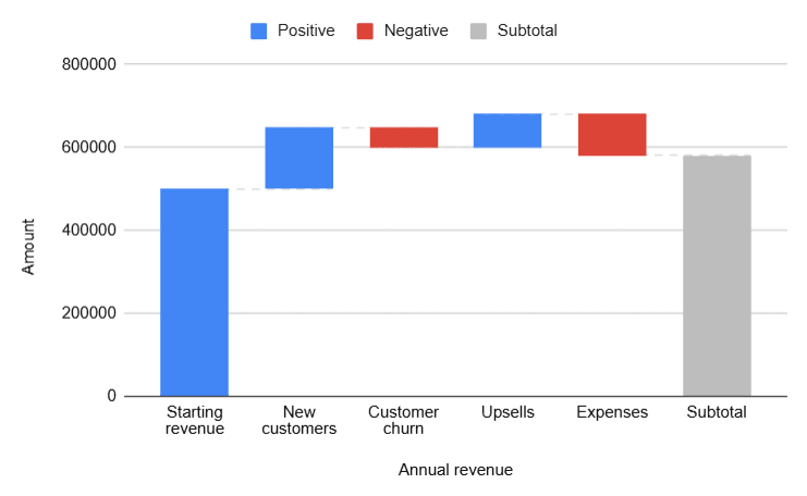
Example: Imagine a company starts the year with $500,000 in revenue and finishes the year with $580,000. A company executive or financial manager would want to understand everything that had happened to end the year on a high. The waterfall chart would depict the following:
- A gain of $150,000 from new customers
- A loss of $50,000 due to customer churn
- A gain of $80,000 from upsells
- A loss of $100,000 in expenses
What is a waterfall chart used for?
Waterfall charts are a useful data visualization tool for multiple business functions. Let’s look at some examples of how waterfall charts are used for financial services, HR, project management, and manufacturing.
Financial services: Credits, debits, and profitability
Waterfall charts are widely used in financial services to break down complex financial data and provide a clear picture of changes in investments, profits, and losses over time. The charts are commonly used in:
- Portfolio performance tracking (gains and losses from different investments)
- Stock market analysis (tracking the impact of individual stock movements on total portfolio value)
- Risk management (visualizing the effects of asset allocation shifts)
Example: An investment firm starts the quarter with a $5 million portfolio. Over the quarter, they experience $1.2M gains from stocks, $500K losses from bonds, $800K gains from real estate investments, and $600K in market downturn losses. At the end of the quarter, the portfolio is valued at $5.9M.
Marketing and sales: Revenue growth and customer retention
Sales and marketing teams use waterfall charts to analyze:
- Customer acquisition vs. churn (new customers gained vs. lost over a period)
- Marketing campaign ROI (cost vs. impact)
- Lead conversion funnel data (leads, MQLs, SQLs, closed deals)
Example: A company starts with 10,000 customers. Over a quarter, they gain 2,500 new customers but lose 500 due to churn, resulting in a net customer base of 12,000. A waterfall chart visualizes which segments contribute most to customer growth or loss.
Human Resources: Employee growth and attrition
Waterfall charts enable HR teams to visualize workforce changes over time by tracking:
- Employee hires vs. attrition to see net workforce growth
- Recruitment activity (e.g., new hires, promotions, retirements, resignations)
- How training and development influences employee retention
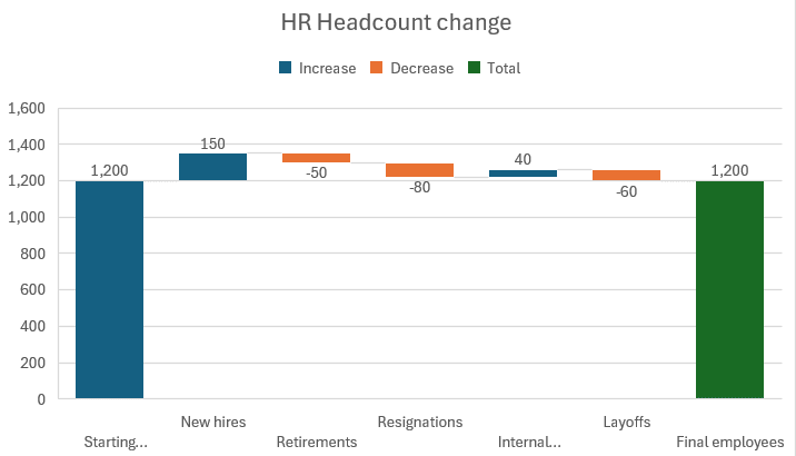
Example: A company starts the year with 1,200 employees but experiences 150 new hires, 80 resignations, 50 retirements, 60 layoffs, and 40 internal promotions, resulting in a net workforce of 1,200 employees. Even though the business starts and ends the year with the same headcount, a waterfall chart illustrates the flow of workforce movement behind the turnover.
Project management: Budget and timeline tracking
Project managers leverage waterfall charts to monitor project phases and budget fluctuations, including:
- Budget allocation and spending (planned vs. actual costs)
- Task completion tracking (milestones achieved vs. delays)
- Scope changes over time
Example: A project has an initial budget of $100,000. Throughout execution, costs increase by $20,000 due to added scope but decrease by $10,000 due to efficiency improvements, leading to a final budget of $110,000.
Manufacturing and supply chain: Inventory and cost analysis
Manufacturing and logistics teams use waterfall charts to:
- Track raw materials inventory (inputs vs. outputs)
- Analyze supply chain disruptions (delays, shortages, cost fluctuations)
- Measure cost efficiency in production
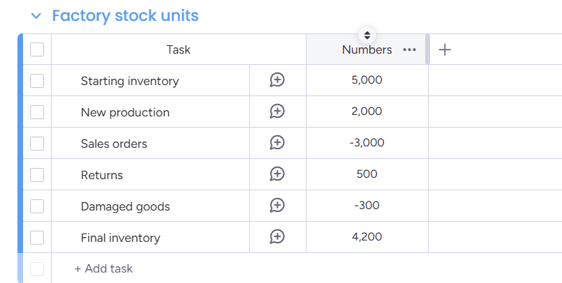
Example: A factory starts with 5,000 units in inventory. Over time, it produces 2,000 new units but sells 3,000, leaving a final inventory of 4,000 units. The waterfall chart shows where inventory changes occur and identifies bottlenecks in supply chain movement.
Pros and cons of waterfall charts
Waterfall charts are a valuable tool, but like any data visualization method, they have both advantages and drawbacks. Understanding their strengths and weaknesses will help you decide when they’re the right choice for your business.
Pros of waterfall charts
- Clear, visual storytelling: Breaks down complex data into easy-to-understand steps, showing how each factor contributes to the final result
- The ability to track trends and patterns over time: Tracks cumulative changes across different periods, making it useful for financial and operational analysis
- A view of positive and negative changes: Separates gains and losses, making it easier to see what drives growth or decline
- Data-driven decision-making: Helps teams and stakeholders quickly grasp key insights without sifting through spreadsheets
Cons of waterfall charts
- Cluttered data points: Too many steps or categories can make the display cluttered and harder to interpret
- Hard to compare multiple categories: Works best for sequential changes but struggles with side-by-side comparisons
- Not a good fit for certain data types: Performs best with datasets that have a clear starting and ending point but is less effective for unstructured data
- Bar charts may be better: Struggles to convey key information as effectively as a basic bar or column chart
5 best practices for creating waterfall charts
If a waterfall chart is the best way to visualize your data, it’s worth designing it in a way that tells a story to help your audience understand insights at a glance. Follow these best practices to ensure your waterfall chart is visually appealing, informative, and easy to interpret.
1. Choose the right start and end values
Every waterfall chart begins and ends with a total, so these values must be accurate and meaningful. Your starting value should reflect the true baseline of your data, and your final value should summarize all intermediate values.
2. Use consistent colors for positive and negative values
Color is a powerful visual tool, so use it wisely. Positive values, such as revenue growth or customer gains, should be one color, while negative values, like expenses or losses, should be another. This contrast enables viewers to immediately distinguish between gains and declines.
Typically, increases on waterfall charts are colored in green, and decreases are in red. But any other high-contrast color scheme, like purple and yellow or blue and orange, will also work, so long as you keep it consistent across all charts.
3. Keep it simple
Just because you can break down your data into 20+ intermediate steps doesn’t mean you should. A waterfall chart is most effective when it highlights only the most important changes. Too many data points will distort the visualization and dilute your message.
Stay focused on the key drivers and avoid adding every minor fluctuation just for the sake of completeness. If it doesn’t add insight, leave it out.
4. Add labels and data points
Your audience should be able to glance at your waterfall chart and instantly understand what each bar represents. They shouldn’t ever have to guess what the bars mean or calculate the differences between them manually.
Instead, clear labels and numerical values make your waterfall chart actionable and easy to interpret.
5. Check your bars connect logically
The data in a waterfall chart should flow smoothly, with each bar logically building on the one before it. If your bars seem disjointed or inconsistent, it can confuse your audience instead of clarifying insights.
Before presenting your chart, check that you’ve arranged your data in a logical order so viewers can easily follow the progression from start to finish.
3 step-by-step ways to create a waterfall chart
You’ve got your data, and now it’s time to turn those numbers into a clear, compelling visualization. Here are the simple steps to create a waterfall chart from scratch in Microsoft Excel, Google Sheets, and monday work management.
1. How to create a waterfall chart in Excel
- Open your Excel spreadsheet and create 2 columns for the X and Y axis. In the X-axis column, you might have Category labels for your data points, such as “Starting Value,” “Increases,” “Decreases,” and “Final Value.” The Y-axis column could be labeled Amount and contain numeric values, with positive numbers for increases and negative numbers for decreases.
- Type your values into the spreadsheet.
- Highlight the data you want to insert into your waterfall chart, including the column headers.
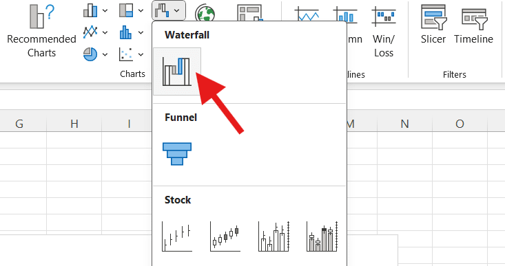
- Click Insert > Charts > Waterfall and watch your chart populate.
- Customize your chart by adjusting your colors for extra clarity, renaming elements of your chart, or resizing it.
2. How to design a waterfall chart in Google Sheets
- Create a spreadsheet in Google Sheets and create 2 columns for the X and Y axes. For example, you might have “Category” on the X-axis and “Amount” on the Y.
- Type your data into the cells.
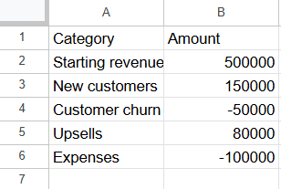
- Highlight the data you want to display in a waterfall chart, including the column headers.
- Click on Insert > Chart.
- In the Chart Editor on the right-hand side of the screen, click on the dropdown menu for Chart Type, and you’ll see the waterfall image beneath the “Other” category. Select that image and sit back as your waterfall chart springs to life.
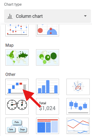
- From here, you can edit elements of the chart, such as the axes names and colors.
3. How to make a waterfall chart with monday work management
- Create a new board on monday work management. Create a column for the category of data you want to visualize and a number column to display the value.
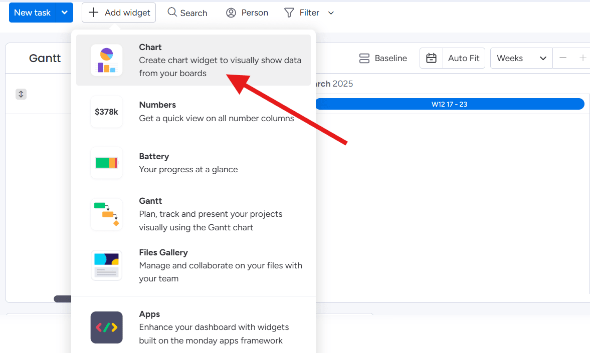
- Click on Gantt, and then Add Widget. Select the Chart widget to visually show data from your boards.
- Configure your chart by adjusting the colors to differentiate between positive and negative values.
Why monday work management is the best choice for data visualization
Traditional spreadsheets may work for simple charts, but they lack the power, flexibility, and communication features needed for fast-moving organizations, especially at the enterprise level. With monday work management, teams can visualize, track, and optimize work processes in real time — all while aligning cross-functional efforts and making strategic decisions with confidence.
Here’s what you can expect when you depend on monday work management for your data visualization needs:
Access real-time updates with interactive dashboards
Keep a pulse on your data by gaining an instant overview of your organization’s key metrics, whether you’re tracking budgets, inventory, or team capacity. Dashboards in monday work management support 36 column types, 25+ widgets, and 25 customizable views, making it easy for enterprise leaders to monitor performance at scale and make informed decisions without digging through static reports.
Streamline workflows with powerful integrations
Connect monday work management with 72+ other tools you already use, like Microsoft Teams, Slack, Salesforce, and Jira, to create a seamless workflow. From here, you can use no-code building blocks to automate your data syncing across business units and pull in updates from multiple platforms to present in your waterfall charts.
Make smarter decisions with AI-powered insights
Identify trends, predict outcomes, and surface critical insights with monday AI assistant. This feature surfaces essential patterns of data so enterprise leaders can act quickly.
Instead of sorting through spreadsheets, you’ll get instant insights that highlight risks and support faster, more confident decisions at scale.
Enhance collaboration with built-in team communication
Your waterfall chart is just the starting point for meaningful discussions and enterprise visibility. With monday work management, your teams can comment, tag colleagues, and share insights directly within dashboards, so all data-driven discussions happen in real time, right where the work is happening.
If your current data visualization method doesn’t give you the depth of insights you require, or the option to act and collaborate on the data, then monday work management is the platform you need to elevate your decision-making. Get a free trial today.
FAQs
What is the difference between a bar chart and a waterfall chart?
A bar chart compares individual values across different categories, while a waterfall chart shows how an initial value changes step by step due to positive and negative factors.
What is the purpose of the waterfall analysis?
Waterfall analysis breaks down complex data to show how different factors contribute to a final result. This analysis makes it useful for financial reports, budgeting, and performance tracking.
What is the purpose of the waterfall plot?
A waterfall plot is commonly used in scientific and medical research, particularly in clinical trials and bioinformatics, to display individual data points across a cohort. The data is typically sorted in ascending or descending order to reveal patterns. For example, in an oncology trial, a waterfall plot might show the degree of tumor shrinkage or growth per patient, helping researchers visualize response variability across the study group.
Can I create a waterfall chart in PowerPoint?
- Create the chart in Excel, then copy and paste it into PowerPoint. Once pasted, the chart becomes static, so you’ll need to make any updates in Excel and re-copy them over.
- Create the chart in PowerPoint by adding a new slide and clicking the Chart icon in the center. From here, select Waterfall from the chart options. PowerPoint will open a linked Excel spreadsheet where you can enter your data.
Is a waterfall chart the same as a bridge chart?
Yes, a waterfall chart is the same as a bridge chart. In both, the initial and final values start from a baseline of zero on the horizontal axis. The intermediate values are represented as floating columns between A and B, which resemble a waterfall or a bridge.
What are some other names for the waterfall chart?
A waterfall chart is also known as a cascade chart, flying bricks chart, Mario chart (a nod to the bricks suspended in the air in Nintendo's "Super Mario" games), bridge graph, or floating bar chart.
What are some alternatives to waterfall charts?
These 3 alternatives to waterfall charts might provide a clearer, more effective representation of the story you want to tell:
- A Pareto chart combines a bar chart and a line graph to highlight the most critical factors affecting a total value, for example, the top reasons for customer churn or the most frequent product defects.
- A line chart is best for showing trends over time, such as sales growth, website traffic, or temperature changes. It provides a clear picture of the overall direction of change, rather than breaking it into individual steps.
- A bar or column chart groups data into segments within each bar, making it ideal for comparing multiple categories side by side.