
A marketing team just wrapped up a major campaign launch. The CEO wants to know whether it delivered results. Sales is asking about lead quality, while finance needs clear ROI numbers. At the same time, data lives across multiple platforms, spreadsheets, and tools, making it difficult to answer critical questions quickly.
Marketing dashboards address these challenges by centralizing performance data across channels into a single, visual view. Instead of switching between platforms or compiling reports by hand, teams gain immediate visibility into what is working, what needs attention, and where to act next.
This easy-to-follow guide breaks down what separates high-performing marketing dashboards from cluttered reporting views. Explore more than 15 real-world examples built for different roles, uncover the metrics that drive smarter decisions, and see how automation and AI are reshaping modern dashboard design.
Key takeaways
- Marketing dashboards centralize decision-critical data: They replace scattered tools and spreadsheets with a single, real-time view of performance across channels, enabling faster and more confident decisions.
- Effective dashboards are built around action, not vanity metrics: The most valuable KPIs directly answer “what should we do next?” by linking performance changes to clear operational responses.
- Dashboards must be designed for specific audiences: Executives need high-level ROI and revenue impact, while managers and specialists require granular, filterable metrics to optimize daily work.
- Automation and AI elevate dashboards from reporting to prediction: Alerts, anomaly detection, and predictive insights help teams respond to risks early and continuously optimize spend and performance.
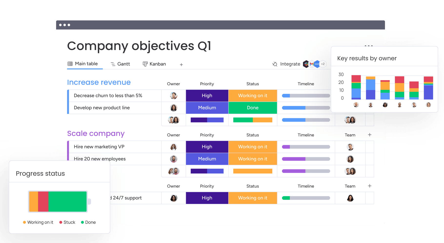
- Connecting dashboards to work execution closes the insight-to-action gap: Integrated platforms such as monday work management allow teams to turn performance signals into workflows, ownership, and outcomes without leaving the system.
What is a marketing dashboard?
A marketing dashboard is a visual interface that brings together data from multiple marketing channels into a single, centralized view. It aggregates information from social media, email campaigns, website analytics, and CRM systems so teams can track performance without switching between platforms.
Much like a car dashboard, it surfaces the most important signals at a glance, without requiring a deeper technical dive.
Marketing teams use dashboards to track key performance indicators against defined targets in real time. Instead of managing disconnected spreadsheets or jumping between tools, a marketing manager can understand campaign health in seconds.
Marketing dashboard vs marketing report
Although both rely on data, marketing dashboards and marketing reports serve really distinct roles within the marketing workflow. Understanding how they differ makes it easier to select the right format for each decision or audience.
| Aspect | Marketing dashboard | Marketing report |
|---|---|---|
| Timing | Real-time or near real-time data updates | Static snapshot of a specific past period |
| Interactivity | Dynamic; users can drill down, filter, and segment live data | Fixed; data is presented in a final, non-editable format |
| Purpose | Monitoring, immediate decision-making, and course correction | Analysis, historical record, and stakeholder justification |
| Format | Visual interface with live charts, gauges, and heatmaps | PDF, slide deck, or spreadsheet with commentary |
| Orientation | Forward-looking (what is happening now and what will happen) | Backward-looking (what happened and why) |
As the table illustrates, dashboards function as a live monitoring system that supports continuous optimization. A report, by contrast, provides a retrospective view used for evaluation and accountability. Most marketing organizations rely on both, as each supports a different stage of the decision-making process.
Real-time marketing data visualization
Real-time data visualization converts raw metrics into immediate, actionable insight, helping teams identify trends and irregularities as they emerge. In fast-moving markets where audience behavior can shift within hours, waiting for periodic reports can lead to missed opportunities or inefficient spend.
Live visualization supports agility in several critical scenarios:
- Campaign optimization: Performance changes become visible immediately, allowing teams to pause or adjust underperforming campaigns before budget is wasted.
- Crisis response: Sudden shifts in sentiment or engagement can be detected early, giving teams time to respond before issues escalate.
- Budget reallocation: High-performing channels stand out quickly, enabling teams to redirect resources while campaigns are still active.
By making performance visible in real time, marketing dashboards help teams move from reactive reporting to proactive decision-making, strengthening both speed and impact.
Why every marketing team needs dashboards
Marketing dashboards have evolved from convenient accessories into essential business operating systems. By centralizing data, organizations move away from intuition-based decisions and toward a culture of precision, visibility, and accountability. The value of a dashboard is not defined by the design of its charts, but by the business outcomes it accelerates for executives, managers, and teams.
When performance data is accessible and aligned, leaders gain clarity instead of noise. Dashboards make it easier to understand what is working, what is not, and where to act next. This shared visibility turns marketing from a support function into a measurable growth driver.
Step 1: slash manual reporting time
Manual reporting consumes more time than most teams realize. Senior marketers often spend hours pulling numbers from disconnected platforms, exporting spreadsheets, reconciling mismatched data, and validating formulas. A single reporting error can undermine confidence and delay decisions.
Automated dashboards remove this friction by syncing data directly from source platforms through API integrations. What once took an entire morning can be replaced by a short review of a live dashboard. Over a year, this shift returns hundreds of hours to the team, allowing focus to move toward strategy, creative work, and optimization instead of maintenance.
Step 2: make faster data-driven decisions
Dashboards reduce reaction time from days to minutes. When insights are scattered across tools, trends surface too late to influence outcomes. A unified view presents performance signals clearly, without interpretation delays or manual aggregation.
For example, when a competitor launches a flash sale, a dashboard tracking market share and competitive activity can surface the change immediately. Teams can respond within the hour, rather than waiting for a scheduled review. Faster access to insight directly translates into competitive advantage.
Step 3: prove marketing ROI with confidence
Demonstrating marketing impact to executive leadership has historically been difficult. Dashboards address this by connecting activity metrics to revenue, pipeline, and customer growth. When performance is clearly tied to outcomes, budget conversations become more grounded and productive.
By automatically calculating metrics such as customer acquisition cost and return on ad spend across channels, dashboards provide a reliable foundation for forecasting. When requesting additional budget, leaders can point to current performance trends and show how incremental investment is expected to generate measurable returns.
Step 4: unite teams with shared metrics
Disconnected reporting creates disconnected teams. When sales, marketing, and customer success rely on different systems, discrepancies in numbers quickly erode trust. A shared dashboard establishes a single source of truth across departments.
With aligned visibility, every team works from the same data. If lead quality declines, both sales and marketing see the shift at the same time. This shared understanding encourages collaboration and problem-solving instead of debate over whose numbers are correct.
5 essential components of marketing dashboards
While every industry tracks different indicators, effective dashboards share lots of common foundations. These components explored below transform fragmented data into actionable insight and ensure dashboards support decisions rather than distract from them.
Component 1: Multi-channel data integration
Strong dashboards remove barriers between platforms by consolidating data into one view. Social performance, email engagement, paid media spend, website traffic, and CRM activity become part of a connected narrative instead of isolated metrics.
Without integration, teams miss relationships across channels. For example, a brand awareness campaign on LinkedIn may influence organic search weeks later, but the connection is invisible without unified data.
Modern platforms like monday work management support this integration through connectors and APIs, enabling clearer attribution and more accurate customer journey analysis.
Component 2: Marketing KPIs and performance metrics
Dashboards only create value when they track the right metrics. High-performing teams design tiered views so each audience sees information relevant to their role, without unnecessary detail or distraction.
- Executive tier: High-level indicators such as total revenue, marketing ROI, and customer acquisition cost.
- Manager tier: Operational measures including campaign click-through rate, cost per lead, and conversion rate by channel.
- Specialist tier: Detailed metrics such as keyword rankings, email open rates, and ad frequency.
This structure prioritizes actionable signals that reflect performance health over vanity metrics that offer limited insight.
Component 3: Interactive data visualizations
Visualization helps teams process complex information quickly. The effectiveness of a dashboard depends heavily on selecting the right chart for the insight being communicated.
- Trend lines: Show performance movement over time.
- Pie or donut charts: Illustrate composition and distribution.
- Bar charts: Support side-by-side comparison.
Interactivity adds depth without clutter. Users can hover for precise values or select segments to explore underlying data, allowing deeper analysis without leaving the dashboard.
Component 4: Custom filters and segments
Static dashboards provide limited context. Filters allow users to adjust views and answer specific questions, transforming high-level reporting into a diagnostic tool.
By filtering by time period, region, campaign, or audience segment, teams uncover insights that would otherwise remain hidden. Overall traffic may decline while high-value segments grow, and filters make those patterns immediately visible.
Component 5: Smart alerts and automation
Effective dashboards continue working even when no one is actively reviewing them. Automated alerts ensure critical changes trigger attention before issues escalate.
- Threshold alerts: Notify teams when metrics like cost per acquisition exceed defined limits.
- Anomaly detection: Flags unexpected drops or spikes that deviate from historical trends.
- Goal notifications: Automatically celebrate milestones such as hitting quarterly revenue targets.
Together, these capabilities turn dashboards into proactive systems that support timely action and sustained performance.
Try monday work management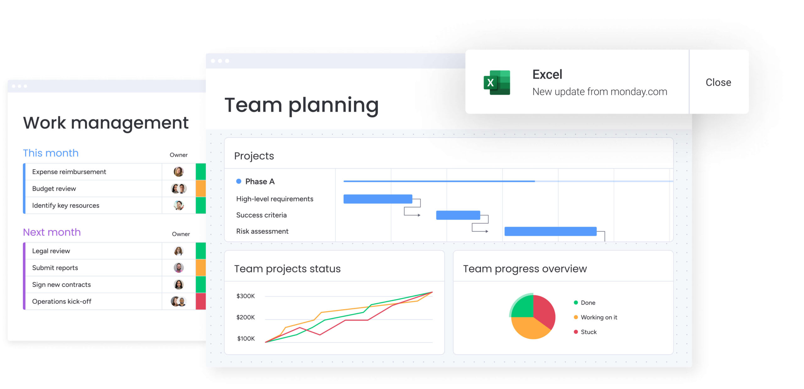
Marketing dashboard examples for every goal
Not every team needs the same view of marketing performance. A CMO looks for the big picture, while an SEO specialist needs visibility into keyword-level detail. Understanding how different teams structure dashboards makes it easier to design one that fits a specific role.
The examples below show how real marketing teams build dashboards for different goals and responsibilities. Each section highlights what to track, why it matters, and how the dashboard supports better decisions.
Marketing performance dashboard
This comprehensive dashboard acts as a central command center for marketing directors and managers. It offers a balanced, cross-channel view of performance and is typically updated daily or weekly.
Key metrics include:
- Total spend vs budget: How actual marketing spend compares against planned allocation.
- Overall ROI: The total return generated from marketing investments.
- Total leads generated: The volume of new leads created across all channels.
- Marketing qualified leads (MQLs): Leads that meet predefined quality criteria.
- Aggregate conversion rate: The percentage of users moving from interest to action.
This dashboard essentially helps leadership allocate resources dynamically, highlighting which channels drive results and which require optimization.
CMO executive dashboard
Designed for the C-suite, this next dashboard removes tactical detail and focuses on strategic impact and financial efficiency. It connects marketing performance directly to business outcomes.
Key metrics include:
- Marketing contribution to revenue (%): The portion of revenue influenced by marketing.
- Customer acquisition cost (CAC): The average cost to acquire a new customer.
- Customer lifetime value (LTV): The projected revenue from a customer over time.
- LTV:CAC ratio: The balance between long-term value and acquisition cost.
- Market share: The brand’s relative position within the competitive landscape.
The dashboard answers a board-level question: whether marketing drives sustainable revenue growth. Visuals remain simple, trend-focused, and outcome-driven.
Digital marketing dashboard
This dashboard concentrates on online engagement and the brand’s digital footprint. It links website performance with user behavior across channels.
Key metrics include:
- Website sessions: The total volume of visits to digital properties.
- Bounce rate: The percentage of visitors who leave without interacting.
- Goal completions: Completed actions such as signups or purchases.
- Top landing pages: Pages that attract and convert the most traffic.
- Traffic source breakdown: How visitors arrive, including organic, paid, and referral.
It tracks the digital customer journey from the first interaction through conversion.
SEO and content marketing dashboard
Focused on organic growth, this dashboard measures visibility, authority, and content effectiveness. It also supports long-term brand health and sustainable traffic growth.
Key metrics include:
- Organic traffic: Visits generated through unpaid search results.
- Keyword rankings: Search positions for priority terms.
- Backlink profile growth: The increase in referring domains and links.
- Domain authority: An indicator of overall site credibility.
- Time on page: How long users engage with content assets.
Content and SEO teams use this dashboard to identify high-performing topics and uncover technical optimization opportunities.
Social media marketing dashboard
Consolidate performance across platforms such as LinkedIn, Instagram, X, and TikTok with this insightful dashboard that provides a clear view of audience engagement and brand presence.
Key metrics include:
- Total reach or impressions: The number of times content is displayed.
- Engagement rate: Interactions relative to audience size.
- Follower growth: Changes in audience size over time.
- Click-through rate: The percentage of users who click shared links.
- Share of voice: The brand’s visibility compared to competitors.
Email marketing dashboard
This dashboard measures the effectiveness of direct communication and the health of the email database, supporting continuous optimization of campaigns.
Key metrics include:
- Open rate: The percentage of recipients who open emails.
- Click-through rate: Engagement with links inside messages.
- Unsubscribe rate: How often recipients opt out.
- List growth rate: Expansion of the subscriber base over time.
- Revenue per email sent: Financial impact of email campaigns.
Lifecycle marketers rely on this view to test subject lines, refine timing, and maintain list quality.
PPC and paid media dashboard
Designed for performance marketers, this dashboard tracks paid campaign efficiency and budget pacing on a daily basis.
Key metrics include:
- Cost per click: The average price paid for each ad click.
- Click-through rate: Ad relevance and message effectiveness.
- Conversion rate: The percentage of clicks that result in action.
- Return on ad spend: Revenue generated relative to ad spend.
- Quality score: Platform-specific relevance and performance rating.
Marketing attribution dashboard
This advanced dashboard visualizes how customers interact with multiple touchpoints before converting. It assigns value across the buyer journey.
Key metrics include:
- First-touch attribution revenue: Value credited to the initial interaction.
- Last-touch attribution revenue: Value assigned to the final interaction.
- Multi-touch attribution: Revenue distributed across multiple touchpoints.
- Assisted conversions: Interactions that support, but do not finalize, conversion.
The dashboard also reveals the contribution of top-of-funnel channels that influence outcomes without closing the sale.
Lead generation dashboard
This view focuses on the quantity and quality of the sales pipeline generated by marketing efforts. It helps demand generation teams monitor funnel health.
Key metrics include:
- Total leads: The volume of leads generated within a period.
- Cost per lead: Spend required to generate each lead.
- Lead velocity: The speed at which new leads enter the funnel.
- Lead quality score: An assessment of fit and intent.
- Lead-to-customer conversion rate: The percentage of leads that become customers.
In a nutshell, it identifies which campaigns consistently deliver high-quality prospects.
Campaign performance dashboard
Created for a specific initiative, this temporary dashboard tracks results for launches, promotions, or seasonal campaigns.
Key metrics include:
- Campaign reach: The size of the exposed audience.
- Campaign-specific leads: Leads generated directly from the initiative.
- Budget utilization: How spend aligns with planned investment.
- Campaign ROI: The return generated during the campaign window.
This focused view enables real-time adjustments while the campaign is active.
Customer journey dashboard
This dashboard maps how users move through the full lifecycle, from awareness to advocacy. It highlights friction points across stages.
Key metrics include:
- Awareness impressions: Initial exposure to brand messaging.
- Consideration visits: Engaged site or product interactions.
- Decision actions: Events such as demo requests or purchases.
- Advocacy signals: Referrals, reviews, or repeat engagement.
Teams use the funnel visualization to pinpoint where prospects stall or drop off.
Marketing ROI dashboard
Strictly financial, this dashboard ties marketing investment directly to revenue outcomes. It is often used during planning and budget reviews.
Key metrics include:
- Net marketing revenue: Revenue attributed to marketing activities.
- Marketing expense to revenue ratio: Cost efficiency across channels.
- Payback period: Time required to recover marketing spend.
- ROI by channel: Comparative returns across initiatives.
It provides a clear financial justification for ongoing and future investments.
ABM marketing dashboard
Used by B2B teams, this dashboard tracks engagement within a specific list of high-value target accounts.
Key metrics include:
- Target account penetration: Reach within selected accounts.
- Account engagement score: Aggregated activity across stakeholders.
- Pipeline velocity for target accounts: Speed of deal progression.
- Deal size: Average contract value within the ABM program.
The dashboard aligns sales and marketing around priority accounts showing buying intent.
Ecommerce marketing dashboard
Built for online retailers, this dashboard links marketing activity directly to shopping behavior and revenue.
Key metrics include:
- Total online sales: Revenue generated through digital channels.
- Average order value: Revenue per transaction.
- Cart abandonment rate: Percentage of incomplete purchases.
- Repurchase rate: Frequency of repeat customers.
- Product views: Interest levels for individual items.
It shows the immediate commercial impact of traffic and campaigns.
Marketing agency dashboard
Designed for agencies managing multiple client accounts, this dashboard provides transparency and proof of value.
Key metrics include:
- Client budget pacing: Spend relative to agreed budgets.
- Goal completion vs. target: Performance against defined KPIs.
- Billable hours vs. outcomes: Efficiency of effort.
- Client satisfaction: Qualitative or survey-based feedback.
Account managers use this view to demonstrate results and maintain trust.
Try monday work management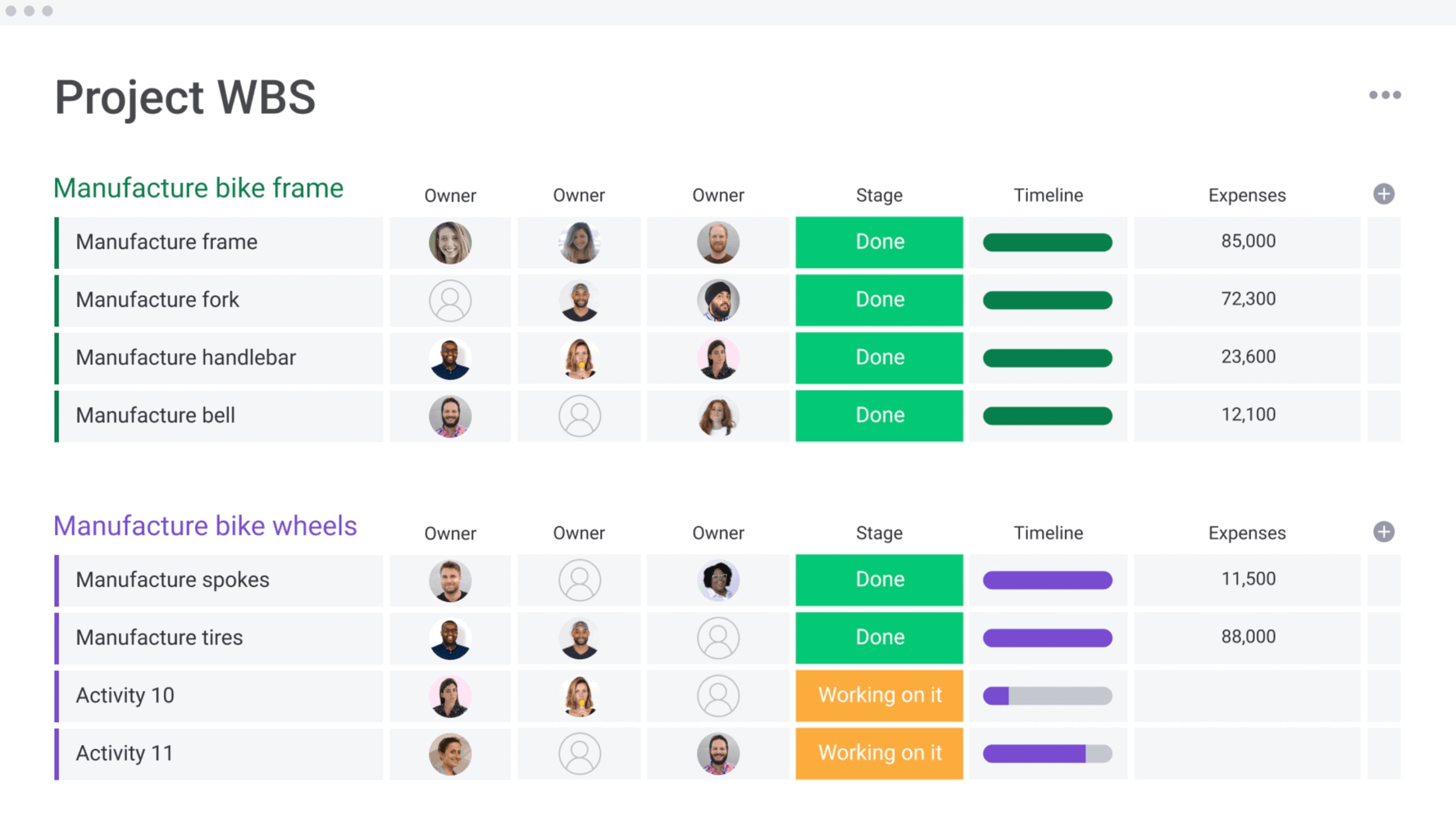
Choose the right marketing KPIs for your dashboard
Dashboards overloaded with metrics reduce clarity rather than improve it, so it’s vital to prioritize a small set of indicators tied directly to business goals.
The right KPIs depend on objectives, audience, and funnel stage. Metrics should support action, not observation, ensuring insights lead to informed decisions.
Awareness metrics that matter
Awareness metrics measure brand visibility and market presence. They answer whether the audience recognizes the brand.
Core indicators include:
- Share of voice: Brand visibility compared to competitors.
- Brand mentions: Volume of online conversations.
- Reach or impressions: Total exposure to brand content.
These metrics are tracked over time to assess top-of-funnel health rather than short-term ROI.
Consideration stage KPIs
Consideration metrics signal active interest and engagement. They indicate that prospects are exploring solutions.
Key indicators include:
- Content engagement: Time on page, scroll depth, and video completion.
- Soft conversions: Downloads, signups, and registrations.
- Returning visitors: Repeat traffic showing growing intent.
Strong performance suggests messaging resonates and nurtures prospects effectively.
Conversion and revenue metrics
Conversion metrics connect marketing activity to revenue and growth. These indicators matter most to leadership.
Critical measures include:
- Conversion rate: The percentage of visitors completing a desired action.
- Cost per acquisition: The investment required to gain a customer.
- Sales qualified leads: Leads ready for sales engagement.
- Revenue attribution: Revenue directly linked to marketing efforts.
They demonstrate how marketing contributes to business outcomes.
Customer retention indicators
Retention metrics capture long-term customer value and loyalty. For subscription and SaaS models, they often outweigh acquisition metrics.
Key indicators include:
- Churn rate: The percentage of customers who leave.
- Customer lifetime value: Total expected revenue per customer.
- Upsell and cross-sell rate: expansion success among existing customers.
- Net promoter score: Customer satisfaction and referral likelihood.
Together, these metrics reflect the durability and profitability of customer relationships.
4 ways to build your marketing dashboard
The right marketing dashboard depends on your organization — including team size, budget constraints, technical capabilities, and the problems you are trying to solve.
Unfortunately, there’s no universal solution, only approaches that align better with different stages of growth. The sections below explore four common methods and explain when each makes the most sense.
Method 1: DIY with spreadsheets
For early-stage startups and very small teams, spreadsheets often serve as the first version of a marketing dashboard. They provide a simple way to centralize metrics before more advanced systems are required.
Pros:
- Low cost: Requires minimal financial investment beyond existing tools.
- High familiarity: Most teams already understand how to use spreadsheets.
- Complete control over calculations: Formulas and logic can be fully customized.
Cons:
- Manual data entry or fragile plugins: Updates often rely on human input or unstable connectors.
- Lack of real-time visualization: Insights are delayed and require manual refreshes.
- breaking easily with large datasets: Performance and accuracy degrade as data volume grows.
This approach works best for solopreneurs or very small teams with limited budgets and relatively low data complexity.
Method 2: Business intelligence tools
Business intelligence platforms are designed for advanced analytics and large-scale reporting across an organization. They support complex data models and highly customized dashboards.
Pros:
- Infinite customization: Dashboards can be tailored to highly specific reporting needs.
- Ability to handle massive datasets: Suitable for organizations with extensive historical data.
- Advanced data modeling: Supports sophisticated analysis across multiple sources.
Cons:
- Expense: Licensing and implementation costs are often significant.
- steep learning curve: Teams need time and training to use the platform effectively.
- Often requiring a dedicated data analyst to maintain: Ongoing ownership is necessary to keep dashboards accurate.
This method is best suited for enterprise organizations with dedicated data teams and complex, non-standard reporting requirements.
Method 3: Marketing dashboard software
Purpose-built marketing dashboard platforms focus specifically on reporting across marketing channels. They emphasize speed, presentation quality, and ease of setup.
Pros:
- Pre-built templates for marketing channels: Common metrics are available immediately.
- Easy setup: Minimal configuration is required to get started.
- Visually polished out of the box: Dashboards are presentation-ready without design effort.
Cons:
- Often lacking flexibility for non-marketing data: Cross-functional reporting can be limited.
- Can be expensive per user: Costs increase quickly as teams grow.
- Remains a view-only platform separate from project management: Insights are disconnected from execution.
This option fits agencies or mid-sized marketing teams that need professional-looking reports quickly and consistently.
Method 4: Integrated marketing platforms
Integrated work management platforms combine analytics with execution, connecting performance data directly to the workflows that drive campaigns. Platforms like monday work management follow this model by linking dashboards with day-to-day marketing operations.
Benefits:
- Data lives where the work happens: Insights are directly tied to active campaigns and processes.
- Performance issues surface alongside workflows: Declines are visible where teams can act immediately.
- Unified workspace: Collaboration, reporting, and execution stay connected in real time.
Consideration:
- Requires migrating work processes to the platform: Full value comes from adopting the system across teams.
This approach works best for growth-stage companies and enterprises looking to close the gap between strategy, execution, and analytics.
Try monday work managementAI-powered marketing analytics dashboard features
Artificial intelligence is transforming dashboards from static reports into systems that support proactive decision-making. Within modern platforms, AI enhances analysis by identifying patterns, predicting outcomes, and surfacing insights that would be difficult to uncover manually.
Rather than reflecting only past performance, AI-driven dashboards help marketing teams anticipate risks, optimize campaigns, and adjust strategy in real time.
Predictive risk detection for campaigns
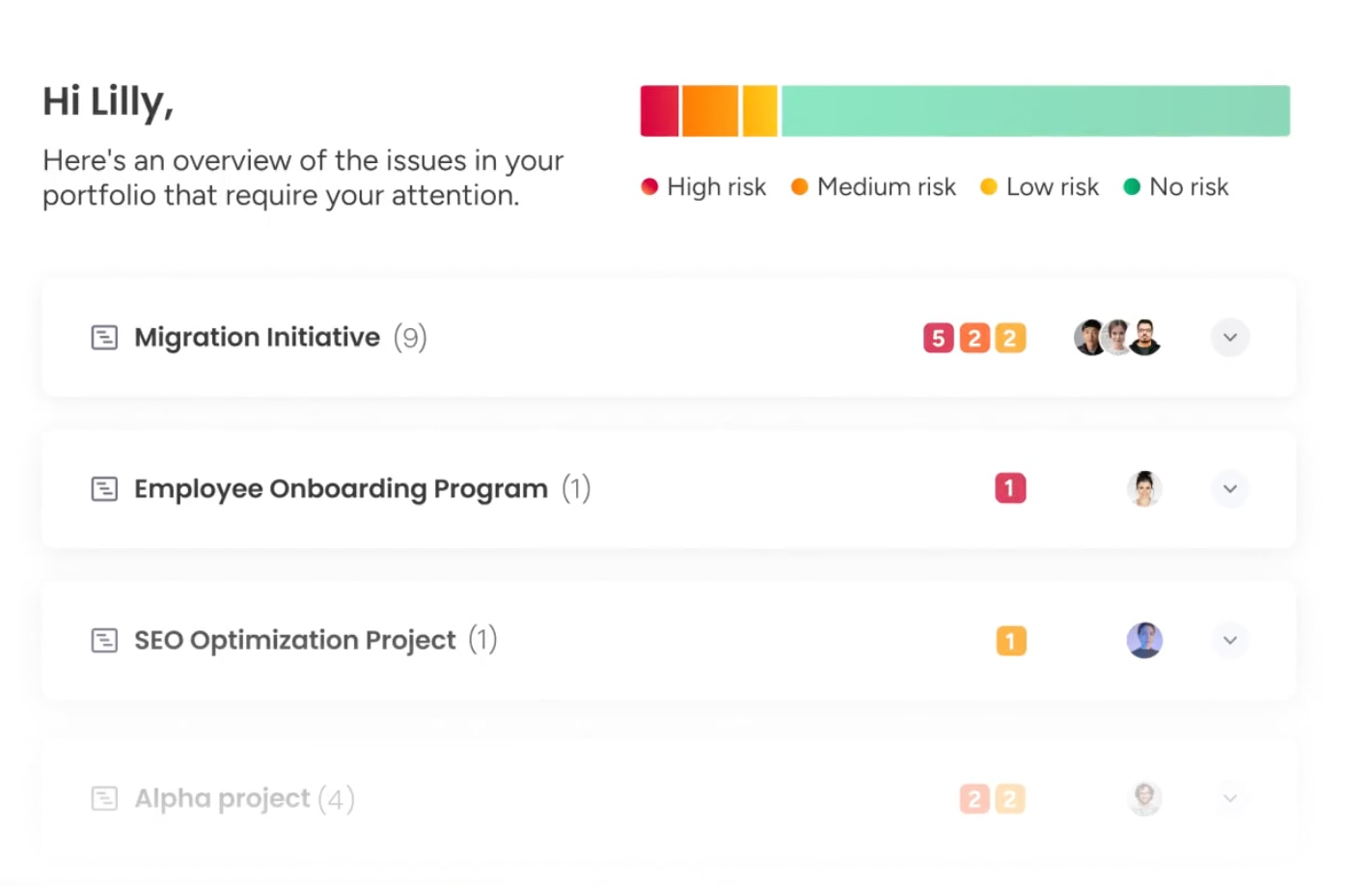
AI analyzes historical performance trends and current signals to forecast potential outcomes. Instead of identifying failure after it occurs, the system highlights campaigns that are likely to underperform based on early indicators.
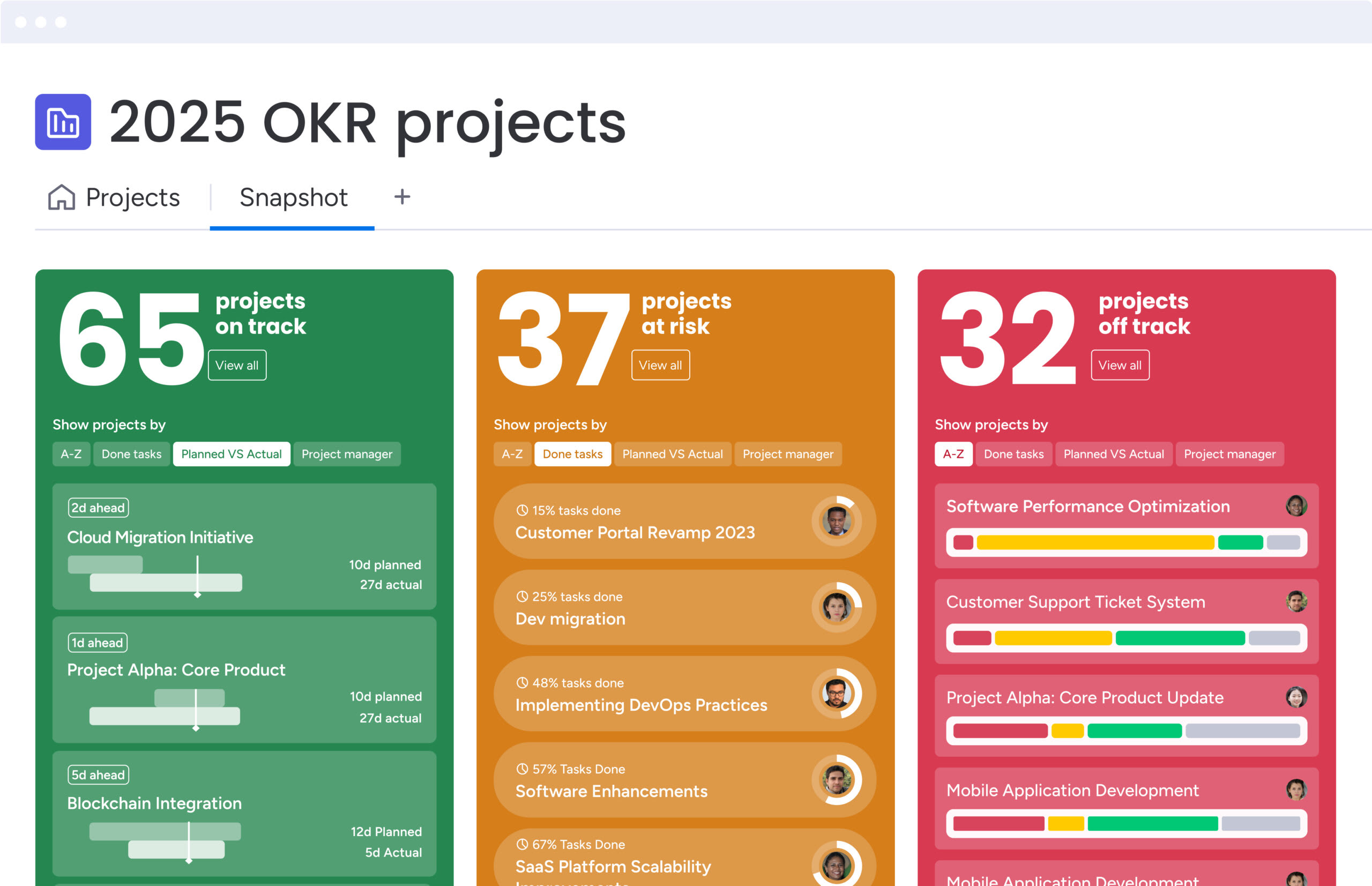
Portfolio Risk Insights on monday work management scans all project boards, quickly flagging potential issues by severity. This approach can identify issues such as audience fatigue weeks earlier than traditional spreadsheet reviews, giving teams time to adjust plans and reduce wasted spend.
Automated performance optimization
Beyond detection, AI supports ongoing optimization by analyzing large volumes of campaign data and recommending improvements. Capabilities such as AI Blocks help teams categorize results, summarize information, and extract insights from unstructured content.
These insights can guide decisions like reallocating budget between ad sets based on conversion probability or identifying creative elements that consistently correlate with higher performance, informing future production.
AI-driven budget allocation
AI also improves budget planning by removing much of the guesswork. By factoring in seasonality, historical performance, and current conditions, the system recommends how to distribute spend more effectively.
Dashboards can suggest how to allocate a quarterly budget across channels such as search, social, and display to maximize ROI based on prior results. As new data becomes available, recommendations update continuously, allowing budget strategy to evolve alongside the market.
Marketing dashboard best practices
A marketing dashboard functions as a system, and like any system, its effectiveness depends on how it is designed, governed, and maintained over time. Strong dashboards balance thoughtful structure with reliable data connections to support confident decision-making.
When built intentionally, dashboards become trusted operational tools rather than sources of misalignment or noise.
Practice 1: Design for your audience first
Effective dashboards begin with a clear understanding of who will use them and what decisions they need to make. Designing for audience-specific cognitive load ensures that insights are easy to absorb and act on.
Different roles require different dashboard experiences:
- Executive view: At-a-glance performance using traffic light indicators and high-level metrics that fit on a single screen.
- Practitioner view: Detailed analysis using tables, granular trend lines, filters, and drill-down capabilities.
Clear information hierarchy is essential. The most critical decision-driving metrics should appear in the top-left area of the dashboard, with supporting context flowing logically from there.
Practice 2: Focus on actionable marketing metrics
Every metric should pass the “so what” test. If a change in performance does not lead to a clear next step, the metric is likely decorative rather than useful.
The difference between actionable and vanity metrics is defined by response:
- Actionable: Cart abandonment rate increases by 10% — the team investigates checkout performance and page load speed.
- Vanity: Total page views increase — the signal lacks context unless tied to quality, intent, or conversion.
High-performing dashboards prioritize metrics that directly inform decisions, trigger follow-up actions, or initiate established workflows.
Practice 3: Establish dashboard governance rules
Trust in data is fragile. Without governance, even accurate dashboards can lose credibility over time. Clear ownership and shared definitions protect dashboards as a reliable source of truth.
Strong governance includes:
- Clear definitions: Shared terminology for metrics such as leads or conversions to prevent cross-functional confusion.
- Ownership: Assigned accountability for each dashboard to ensure issues are resolved and data sources remain current.
- Access management: Permission controls that protect sensitive information while ensuring visibility for the right stakeholders.
Practice 4: Schedule regular performance reviews
Dashboards should evolve alongside business priorities. Static dashboards quickly lose relevance as goals, channels, and strategies shift.
Ongoing optimization relies on:
- Regular audits: Quarterly reviews to confirm alignment with current OKRs and strategic priorities.
- User feedback: Input from dashboard users to identify ignored metrics or missing insights.
- Continuous iteration: S
Marketing dashboards are more than reporting layers. At their best, they function as decision engines that guide revenue strategy, resource allocation, and execution priorities.
That shift happens when dashboards stop living in isolation. Instead of sitting separate from campaigns and workflows, performance data connects directly to the work itself. When insights and execution share the same environment, teams move from simply reviewing results to actively improving them.
This is where monday work management supports modern marketing teams. By bringing reporting and workflows into one workspace, performance insights can immediately translate into next steps, ownership, and progress.
Strong dashboard strategies focus on metrics that drive action, designs built around the people who use them, and governance that protects data accuracy. Teams that build with these principles make faster decisions, stay aligned, and close the gap between strategy and delivery.
mall, consistent improvements that keep dashboards relevant and valuable.
Connect marketing dashboards to work execution
Most analytics platforms stop at insight delivery. They surface performance data but do not support execution. Operational impact comes from closing the gap between identifying issues and resolving them through connected workflows.
Link dashboard insights to team workflows
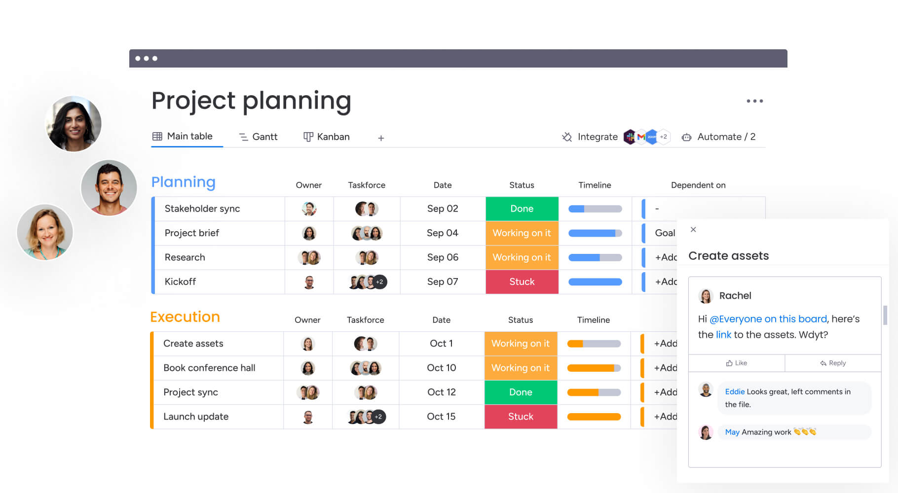
When a dashboard lives on the same platform as the project management board, the friction between insight and action disappears. Teams can respond to performance changes without switching tools or losing context.
For example, a campaign board can include live widgets displaying spend and ROI. When performance dips, managers can create linked work items, assign owners, and reference the relevant metric directly within the workflow.
Automate actions from performance triggers
Automation transforms dashboards from passive monitoring tools into active management systems. Threshold-based triggers ensure that performance changes receive immediate attention.
Modern platforms like monday work management support automated responses such as:
- Status updates: Changing a campaign to at risk when CPA exceeds a defined limit.
- Notifications: Alerting performance leads through connected communication channels.
- Follow-up creation: Generating sub-items for audits or corrective actions.
These automations reduce response times and ensure that critical signals never depend solely on manual oversight.
Balance team workload with campaign data
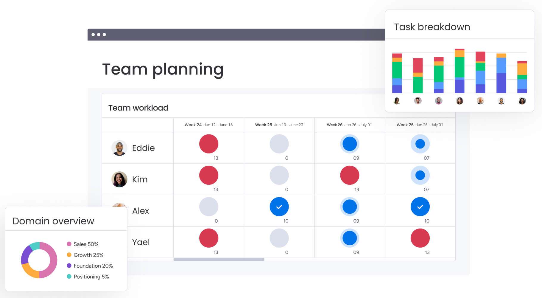
Marketing performance is closely tied to team capacity. Dashboards that combine performance and resource data help leaders understand the human impact behind results.
When output targets increase, workload views can immediately highlight capacity constraints. Leaders can then use performance data to justify hiring, rebalancing workloads, or adjusting timelines before quality or results decline.
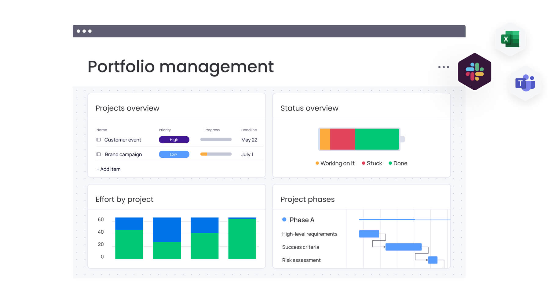
Track projects and performance together
Viewing delivery timelines alongside campaign results reveals the operational drivers of success or failure. This visibility helps teams connect execution discipline with market outcomes.
For example, delayed project delivery may directly affect campaign launch windows and revenue performance. Integrating these views encourages accountability and strengthens alignment between operations and analytics.
Build marketing dashboards that drive real results
Marketing dashboards are more than reporting layers. At their best, they function as decision engines that guide revenue strategy, resource allocation, and execution priorities.
That shift happens when dashboards stop living in isolation. Instead of sitting separate from campaigns and workflows, performance data connects directly to the work itself. When insights and execution share the same environment, teams move from simply reviewing results to actively improving them.
This is where monday work management supports modern marketing teams. By bringing reporting and workflows into one workspace, performance insights can immediately translate into next steps, ownership, and progress.
Strong dashboard strategies focus on metrics that drive action, designs built around the people who use them, and governance that protects data accuracy. Teams that build with these principles make faster decisions, stay aligned, and close the gap between strategy and delivery.
Frequently asked questions
How do marketing dashboards integrate with work management platforms?
Dashboards pull data directly into the workspace using native integrations and APIs. This allows teams to turn insights into actionable workflows, automate responses to performance changes, and manage projects alongside relevant metrics.
Can AI predict which marketing campaigns will underperform?
Yes, AI analyzes historical performance and current trends to detect patterns indicating a campaign is at risk. These patterns include audience fatigue or declining engagement, often alerting marketers before significant budget is lost.
How often should marketing dashboard data refresh?
The ideal refresh rate depends on the metric's volatility. Tactical dashboards for active ad campaigns benefit from real-time updates, while executive dashboards tracking brand health or market share typically require daily or weekly refreshes.
What's the difference between a marketing dashboard and reporting tool?
A marketing dashboard is a dynamic, real-time interface designed for continuous monitoring and immediate decision-making. A reporting tool generates static, retrospective documents for in-depth analysis and historical record-keeping.
How do you ensure data privacy in marketing dashboards?
Strict governance policies maintain data privacy. This includes role-based access controls, encryption of data in transit and at rest, and ensuring integrations comply with regulations like GDPR and CCPA.
Which marketing dashboard KPIs do executives care about most?
Executives focus on high-level financial and strategic metrics that show business impact, such as marketing ROI, customer acquisition cost, revenue attribution, and customer lifetime value.