
When a high-stakes project is on the line, relying on single-point time estimates is like navigating without a map. For complex or innovative projects, this approach often leads to missed deadlines and eroded stakeholder confidence.
For a more sophisticated way to navigate uncertainty, use PERT — the Program Evaluation and Review Technique. Offering a statistical approach to this challenge, PERT transforms uncertainty into a structured framework for building project plans that are not only ambitious but also achievable.
This guide explains how PERT works, from identifying your critical path to calculating probable timelines. We’ll explore how to build a PERT chart, compare PERT to other methods like CPM, and show how platforms like monday work management automate the calculations.
Try monday work managementKey takeaways
- PERT (Program Evaluation and Review Technique) is a statistical project management method that uses 3 time estimates per task to create realistic timelines that account for uncertainty.
- The method identifies your project’s critical path by mapping task dependencies and calculating which sequence of activities determines your minimum project duration, helping you focus attention where delays matter most.
- PERT works best for uncertain, first-time projects like software development or research initiatives, while CPM (Critical Path Method) suits routine, predictable work with fixed time estimates.
- Automating PERT calculations and updating your project network in real time using monday work management eliminates manual spreadsheet work while providing visual dependency mapping and intelligent alerts when critical activities fall behind.
What is PERT in project management?
The Program Evaluation and Review Technique (PERT) is a statistical method for analyzing project tasks and timelines. It’s a type of flowchart or network diagram that displays project tasks, connects dependencies, and helps managers identify potential obstacles. This means you can map out all the work needed to complete a project while accounting for uncertainty in how long each activity will take.
The U.S. Navy created PERT in the 1950s to manage the Polaris submarine project, which required coordinating thousands of contractors and handling unpredictable research timelines. Today, project managers use PERT when they can’t be certain how long activities will take.
Here’s what makes PERT different from basic project scheduling:
- More time estimates per task: Instead of guessing one duration, you estimate using optimistic, most likely, and pessimistic timeframes.
- Statistical calculations: PERT uses formulas to turn those 3 estimates into realistic timelines.
- Focus on dependencies: The method shows which tasks must finish before others can start.
- Critical path identification: You can see which sequence of tasks determines your minimum project duration.
Think of PERT as your project’s reality check. While other methods assume you know exactly how long tasks will take, PERT acknowledges that project work — especially for new or complex initiatives — is unpredictable.
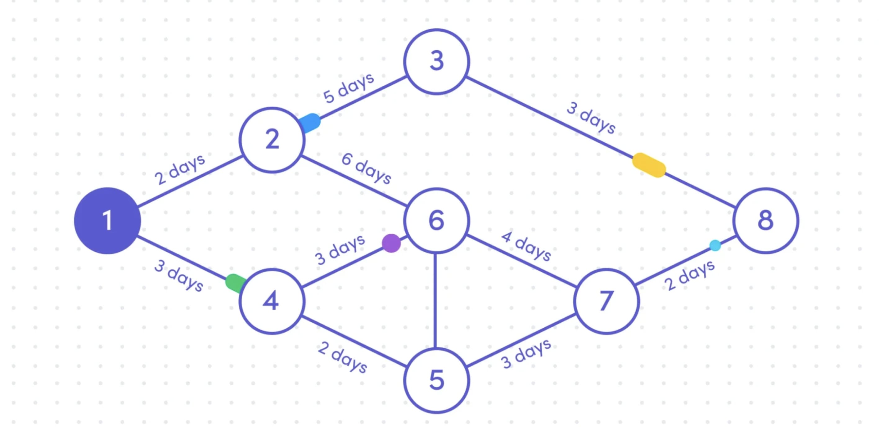
3 core components of PERT
PERT breaks down into 3 essential components that work together. Understanding these building blocks helps you create accurate project timelines and spot potential delays before they happen.
1 . Events and activities
These form your project’s skeleton. An event is a milestone is a specific point in time when something is complete, and an activity is the actual work that happens between events.
For example, in a website project, the event is the mockup being approved, and the activity is creating the website mockups. Or, when finalizing database design, the event would be completing the design, and the activity is the actual process of designing the database structure.
2. Time estimates
Time estimates are the engine behind PERT’s statistical accuracy. For every activity in your project, you’ll generate 3 distinct duration estimates to capture the full spectrum of possible outcomes.
This isn’t about wild guesses — it’s about structured thinking that captures real project uncertainty. Here’s how to think about each:
- Optimistic time (O) assumes ideal conditions. Resources are available immediately, approvals happen instantly, and no rework is needed. This might happen once in twenty attempts.
- Most likely time (M) reflects normal conditions with typical challenges. You’ll face typical delays, standard revision cycles, and usual resource constraints. This should match your experience.
- Pessimistic time (P) accounts for significant problems — but not catastrophes. Think vendor delays, multiple revision rounds, or key team members getting sick. Again, this might occur once in twenty attempts.
3. Dependencies and critical path
Dependencies define which activities must finish before others can start, and the critical path is your longest chain of dependent activities — any delay here pushes back your entire project. Essentially, dependencies and critical path show the journey of your project.
If you’re looking for an easy way to visualize these components automatically, monday work management lets you input your activities and estimates, and the platform calculates timelines while highlighting your critical path in real time.
Try monday work management7 steps for creating a PERT chart
Creating a PERT chart transforms your project from a vague idea into a structured plan. Follow these steps to build one that actually helps you manage work.
Step 1: Identify all project activities
List every piece of work needed to complete your project, breaking large tasks into smaller, measurable activities. Each activity should have a clear deliverable and someone responsible for it.
Pro tip: Don’t go overboard with detail. Aim for activities that take days or weeks — not hours.
Step 2: Determine activity dependencies
Map out which activities depend on others. Most dependencies follow a finish-to-start pattern, meaning one task must end before the next begins. But you might also have:
- Start-to-start is when 2 tasks begin together
- Finish-to-finish is when tasks must end simultaneously
- Start-to-finish is when one task can’t end until another starts (rare, but possible)
Step 3: Estimate activity durations
Gather the 3 time estimates for each activity by asking the people doing the work — they know the realistic timelines. If possible, base estimates on past projects and, if you get stuck, use this approach to estimating:
- Optimistic: What if everything goes right?
- Most likely: What usually happens?
- Pessimistic: What if multiple things go wrong?
Step 4: Build the network diagram
Draw your activities as a flowchart showing all dependencies. You can use boxes for activities and arrows for dependencies, and the diagram should flow from left to right, showing your project’s logical sequence.
Given that 82% of employees now rely on work management software, it’s no surprise that many platforms now offer built-in PERT visualization features. To work faster and smarter, be sure you’re using a platform like monday work management to streamline your workflows.
Step 5: Calculate critical path and slack
Find your critical path by identifying the longest sequence of dependent activities. Calculate slack (also called float) for non-critical activities, which shows how much delay you can afford without affecting the project end date.
Activities with zero slack are on your critical path, and these need your closest attention.
Step 6: Review and validate the chart
Next, share your PERT chart with stakeholders and team members. They’ll spot missing activities, unrealistic estimates, or incorrect dependencies. This is a crucial step because it prevents surprises during execution.
Pay special attention to activities with high uncertainty, because these often hide risks.
Step 7: Monitor and update continuously
Your PERT chart isn’t a one-and-done document. Update it as work progresses and estimates become clearer. This is a critical step in change management at a time when perceptions of success vary widely between the 45% of senior leaders and 23% of individual contributors who feel change is managed “very well.”
Track actual durations against your estimates to improve future planning, and lean on real-time platforms that make this monitoring automatic, flagging when critical path activities fall behind.
How PERT scheduling works
PERT scheduling converts your 3 time estimates into a single, realistic duration using a specific formula used to calculate time estimates based on probability theory. The formula weights your most likely estimate more heavily because normal conditions occur more often than extremes.
Based on the Optimistic, Most likely, and Pessimistic time estimates, the basic PERT formula is:
(O + 4M + P) ÷ 6
Why does this work? The formula assumes task durations follow a beta distribution — most outcomes cluster around the middle with fewer extremes. By multiplying the most likely estimate by 4, you acknowledge that typical conditions happen about 4 times more often than best or worst case scenarios.
Let’s say a task has the following time estimates:
- Optimistic time: 3 days
- Most likely time: 5 days
- Pessimistic time: 13 days
Here’s our equation:
(3 + (4×5) + 13) ÷ 6
This means the expected estimate is 6 days.
You can also use PERT to measure uncertainty with variance and standard deviation, which show how much actual durations might vary from your estimate. While the formulas are simple, monday work management can calculate them for you automatically — no spreadsheet needed.
Try monday work managementPERT vs. CPM: what's the difference?
PERT and CPM (Critical Path Method) both map project networks, but they serve different purposes. Choosing the right method depends on your project’s predictability and your planning needs. Here’s a quick comparison of PERT vs. CPM:
| Aspect | PERT | CPM |
|---|---|---|
| Time estimates | 3 estimates per activity | 1 fixed estimate |
| Best for | Uncertain, first-time projects | Routine, predictable work |
| Focus | Managing uncertainty | Optimizing time and cost |
| Calculation complexity | Higher (statistical formulas) | Lower (simple addition) |
| Use cases | Software dev sprints, research projects, marketing campaigns, product development | Construction, manufacturing processes, Event planning, routine maintenance |
Differences in time estimation in PERT vs. CPM
PERT’s 3-point estimates acknowledge that you can’t always predict task durations accurately. This approach helps when you’re doing something new or working with unknowns.
CPM assumes you know how long tasks will take based on experience. This works well for repetitive projects where you’ve done similar work before.
Project uncertainty and variation in PERT vs. CPM
Does your project involve research, creative work, or new technology? PERT’s statistical approach helps you plan despite uncertainty. The method quantifies risk and shows which activities have the most variability.
Working on your tenth office building or hundredth product launch? CPM’s straightforward approach focuses on optimization rather than uncertainty.
Streamline PERT with monday work management's AI and automation features
Manual PERT calculations once required spreadsheets, constant updates, and complex formulas. Now, intelligent platforms like monday work management transform PERT into a dynamic, automated process that adapts as your project evolves.
Create custom columns for your 3 time estimates, then use formula columns to calculate expected durations automatically. The platform’s Timeline and Gantt views display your PERT network with dependencies clearly marked.
Plus, your PERT chart updates in real time as estimates change or work completes. This ensures your project plan remains a living, accurate resource from start to finish.
Get real-time updates with smart automation
Set up automations that respond to PERT calculations. When an activity’s expected duration changes significantly, notify the project manager. If a critical path activity falls behind, alert stakeholders immediately.
These automations eliminate the manual monitoring that made traditional PERT time-consuming. Your team stays informed without constant check-ins or status meetings.
Schedule faster with integrated AI Blocks
With enhanced AI capabilities, monday work management streamlines PERT planning in several ways:
- Historical analysis: AI examines past projects to suggest more accurate time estimates.
- Risk detection: Identify activities with unusual variance patterns that might indicate hidden risks.
- Smart scheduling: AI can recommend schedule adjustments when critical path activities show delays.
The platform’s AI blocks can also summarize project status, extract key insights from team updates, and categorize risks by severity to support smarter PERT implementation.
Try monday work managementPut PERT into action for smarter project management
PERT transforms uncertainty from a project killer into manageable information. Instead of pretending you know exactly how long activities will take, you acknowledge reality and plan accordingly.
The method’s statistical foundation provides several advantages:
- Realistic timelines: Stakeholders get honest assessments rather than optimistic guesses.
- Risk visibility: You know which activities have the most uncertainty.
- Informed decisions: Trade-offs become more defined when you understand probabilities.
For executives, PERT offers something invaluable: credible commitments. When you say a project will take 6 months, you can explain the reasoning and confidence level behind that estimate.
With monday work management, you can get the benefits of PERT without the complexity. With visual boards, automated calculations, and intelligent alerts, teams skip the complexity and dive straight into delivering high-impact work.
Try monday work managementFAQs
Can PERT be used with Agile or hybrid project management methods?
Yes, PERT can complement Agile and hybrid approaches, especially when estimating timelines for uncertain or experimental work within sprints or project phases. While Agile favors adaptability over rigid schedules, PERT’s statistical estimates can help teams forecast sprint durations, identify dependencies, and proactively manage risk in hybrid environments.
How accurate is PERT compared to other project scheduling methods?
PERT is generally more accurate for projects with high uncertainty, as it factors in a range of outcomes with its three-point estimation technique. Compared to single-point estimation methods like CPM, PERT reduces the risk of over-optimism or underestimation, though its accuracy still depends on the quality of your input estimates and historical data.
Can I use PERT for ongoing operational work?
PERT is best suited for unique, complex, or first-time projects where task durations are uncertain. For ongoing, repetitive operational work with stable processes, simpler scheduling methods like CPM or basic Gantt charts may be more efficient and easier to maintain.
How do I choose between PERT and CPM for my project?
Choose PERT if your project involves many unknowns, innovation, or research, and precise durations are hard to predict. Opt for CPM if your work is routine, well-defined, and based on repeatable processes with fixed timelines.
Does monday work management automate PERT chart creation?
Absolutely. With monday work management, you simply input your optimistic, most likely, and pessimistic estimates, and the software automatically calculates expected durations, critical paths, and updates your PERT chart in real time — eliminating manual calculation headaches.
Is PERT suitable for small projects?
While PERT is most valuable for large or complex projects with significant uncertainty, you can use it for smaller initiatives if variability is high or dependencies are critical. For straightforward, low-risk tasks, a simpler method may be faster and just as effective.
How does a PERT chart differ from a Gantt chart?
PERT charts are designed to emphasize the logical sequence and dependencies between tasks, mapping out which activities must precede or follow others while using probability-based calculations to estimate the overall project duration. In contrast, Gantt charts represent project plans as a timeline, using horizontal bars to visually display when each task starts and ends, making it easy to see overlaps, durations, and overall progress at a glance.