As a kid, whenever I was on a long trip with my parents, I wouldn’t stop asking the annoying question, “Mom, are we there yet?”
Not because I expected a positive answer, but because I wanted to know how much time was left until our arrival. I was bored and couldn’t stand the uncertainty of not knowing what to expect.
You see, that’s exactly how project managers, teams, and stakeholders can feel without a well-defined timeline.
As we’ll see later, timeline charts help you understand how you’re doing against your baseline project plan and visualize how much work is left.
Today, we’ll explore everything you need to know about timeline charts, starting with the most basic question.
What’s a timeline chart?
Let’s say that you’re the owner of a software development company and one of your clients wants to know how things are progressing.
You have 2 options:
- Call your client by phone and simply tell them what you’ve done so far, what’s left, and whether you’re on the right track.
- Create a detailed timeline chart and SHOW them your progress.
Which option is better?
In our biased opinion, we think the second one.
Timeline charts aim to describe the chronological order of past and future events on a time scale. In project management, this type of chart is often used to oversee team workload and understand the overall progress of a specific project.
Besides, timeline charts highlight specific events and milestones and help you visualize who’s working on what and when.
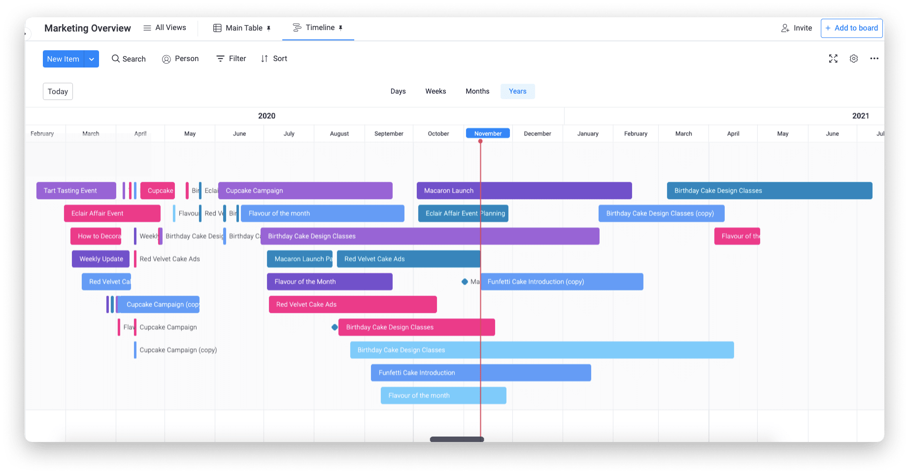
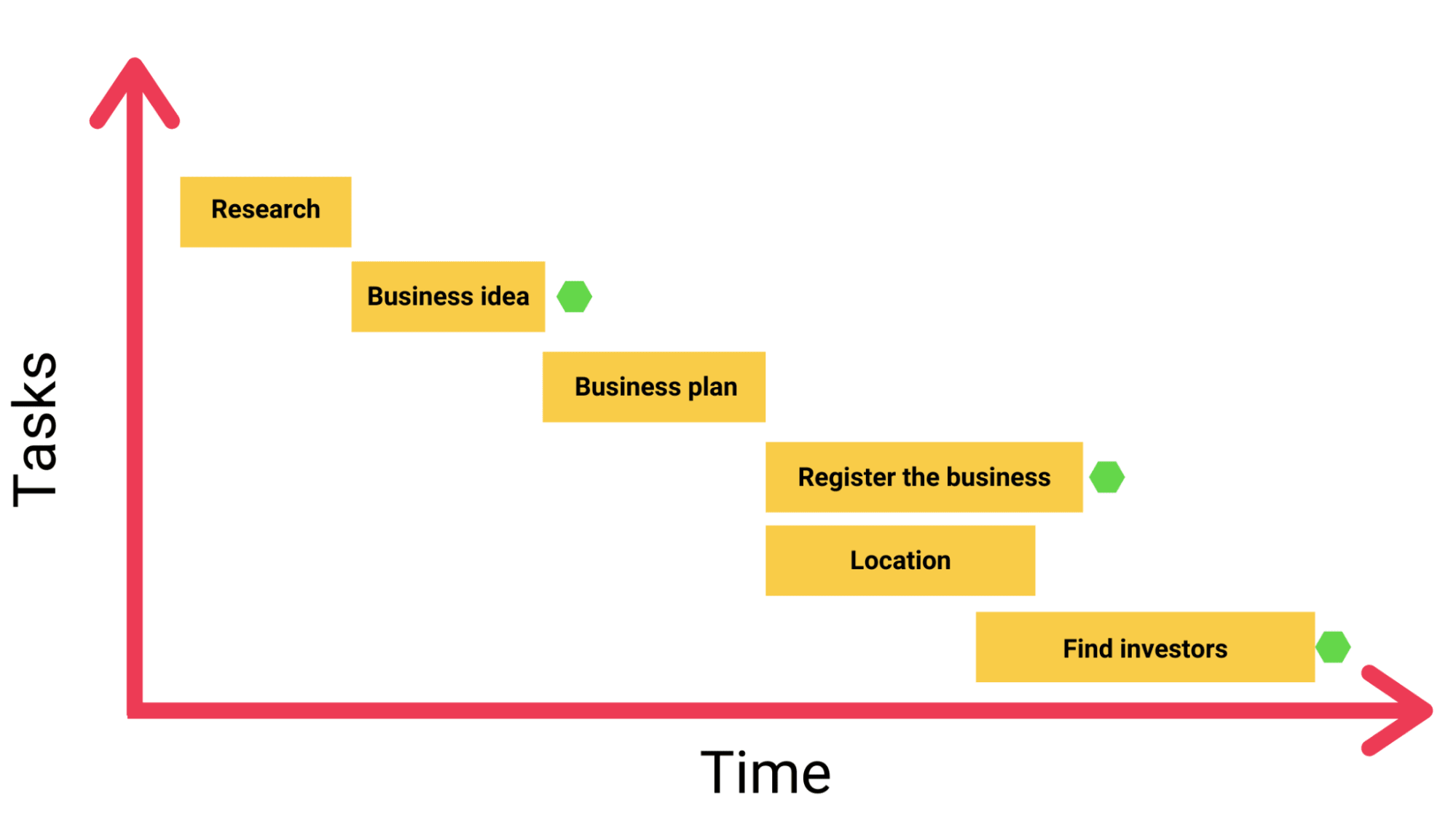
For example, a typical project timeline chart might look something like this:
Commonly, timeline charts are presented horizontally, marking units of time and important events, tasks, and activities from left to right.
A project timeline chart makes it easier for stakeholders to understand what needs to be done, how long it may take, and what they should expect in the future.Since timeline charts document every step in the process, you can avoid potential problems and misunderstandings about how long a project should take.
Why do you need a timeline chart to manage a project?
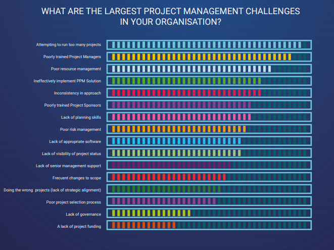
Poor resource management, inconsistency in approach, and lack of planning skills are among the biggest challenges faced by organizations.
Even though a timeline chart wouldn’t solve all of those problems, per se, it’ll definitely help.
For example, by understanding the scope of your project, you can better manage your capital and resources. Or being aware that you’re totally off-track could help you make the appropriate changes in time to avoid bigger issues.
Timeline charts are more than just a graphical representation of your project scope — they foster transparency and increase team accountability, as everyone knows exactly what needs to be done and when.
Other benefits of timeline charts include:
- A deeper understanding of progress: get a visual, simple, and intuitive way to measure your progress and forecast future events.
- Better collaboration: keep everyone in your team informed on progress, workload, and major changes in a project.
- Fewer bottlenecks and less resource overload: spot potential delays or issues before they start snowballing.
- Improved time management: better understand your activities and manage your time accordingly.
Now, before we step into the actual process of creating your timeline chart, let’s answer a common question.
What are the differences between a Gantt chart and a timeline chart?
At first glance, both timeline and Gantt charts might seem pretty similar, but each of them showcases slightly different information.
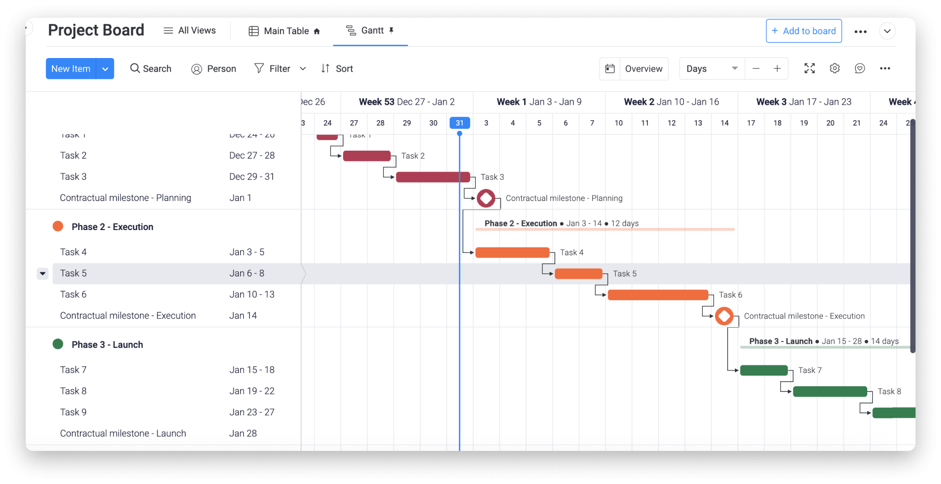
For instance, here’s a typical Gantt chart:
If you pay attention, you’ll notice that Gantt charts not only describe the sequence of events within a project, but also the chronology of tasks with dependencies and team responsibilities. That is, the relationship between tasks and activities.
On the other hand, timeline charts aim to give a more general overview of the project scope and workload, as well as the most important milestones.
So, when should you use one or the other?
While the answer depends on your goals, Gantt charts can be more complex and messy than a typical timeline, especially if you’re handling a large project. Unless you need to track dependencies, a timeline chart might be a simpler way to monitor your progress.
Fortunately, modern project management systems help you implement both charts in just a couple of clicks.
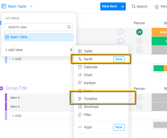
For example, with monday.com, you can turn the information of any project into a Gantt or timeline chart, as well as 6+ other data views, by simply selecting the chart type in the main “Views” menu.
What are the essential elements of a timeline chart?
Now that you understand what timeline charts are and why they matter, let’s cover a simple process to create yours.
First, timeline charts are made up of 4 elements:
- Tasks: the activities you’ll represent in your chart
- Task duration: how long it’ll take to complete each task
- Milestones: any important event or achievement in your project
- Colors: while optional, colors make a timeline chart more visually appealing and easier to understand
That said, here’s how to create your chart:
Step 1: Create a list of activities and milestones
Schedule a meeting with your team and create a list of all the activities, tasks, events, and milestones involved in the lifecycle of your project.
For example, imagine that you want to start a business. In that case, your activities might include:
- Create a business plan
- Find investors
- Research the market
- Choose a location
- Design a business model
- Choose a name
- Get customers
- Register the business
- Get tax IDs
At this point, don’t worry about organizing this information. Focus on coming up with all the activities and important events related to every stage of your project, from initiation to closeout.
Step 2: Place your activities in chronological order
Once you have a list of all your activities, it’s time to organize them against a time scale. This scale should follow a logical sequence.
Following the previous example, it wouldn’t make sense to find investors before researching the marketing and coming up with an idea. Or you couldn’t get your tax IDs before registering your business, right?
Think of the chronological sequence your activities should follow and assign each task a specific start date and deadline.
In a typical timeline chart, the vertical axis represents your activities, whereas the horizontal axis represents time. If you’re using bars to define activities, the length of each bar will determine how long a given task should take.
Besides, you can add a symbol to represent milestones and give more clarity on how your project should progress. In the timeline shown above, for example, we used a hexagon to represent key milestones.
You can also play with colors and shapes to better understand your timeline, especially for complex projects where you may run multiple tasks in parallel.
How to create a timeline chart with monday.com
In today’s day and age, creating a timeline chart shouldn’t be hard.
Instead of creating your timeline chart in Excel or Google Sheets, dive into the 21st century and give project management software a whirl — it’ll make your life so much easier.
As we stated earlier, the right platform can help you turn your data into a timeline chart without much thinking.
Here’s where monday.com might help.
What’s monday.com?
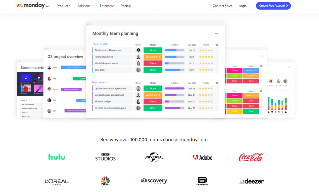
monday.com is a powerful Work OS where you can build a custom digital workspace for your team. More than 100,000 organizations — including Coca-Cola, Adobe, and Universal Studios — trust us to manage their work.
Some of our core features include:
- Data visualizations: visualize any monday.com board from 8+ different angles and perspectives, including Gantt, Timeline, Map, Calendar, Workload, and more
- Project management: manage the entire project life cycle and improve your efficiency
- Task management: assign tasks, organize your workflow, and measure progress with ease
- Team collaboration: bring in your entire team to the platform and centralize your work into a single place
- Integrations: integrate 40+ of your favorite tools and apps in just a couple of clicks
- Automations: get access to over 250,000 automation recipes to automate your most repetitive work
To get a full understanding of our platform, we suggest you visit our product overview page.
But you’re here to learn about timeline charts, right?
So let’s quickly cover how easy it is to create yours with monday.com.
Introducing monday.com’s Timeline column
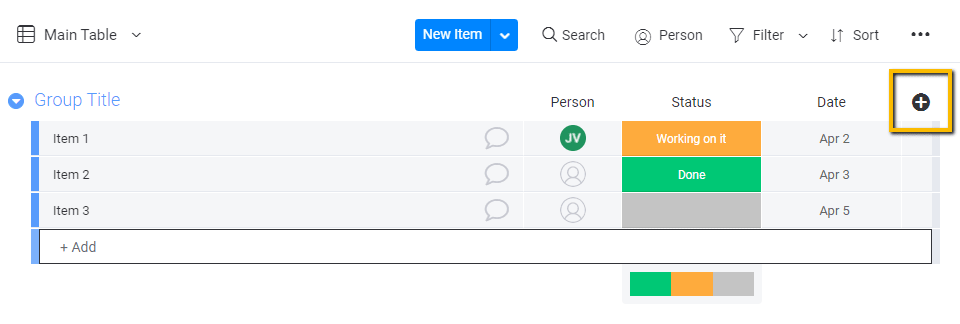
With our Timeline column, you can turn any board into a timeline automatically. To add this column, simply click the plus icon located at the right end of your item group.
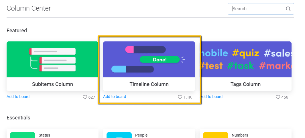
Then select the “Timeline” column.
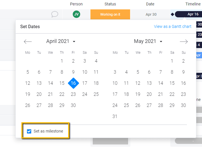
Once you install the column, simply add a start and end date to each item in your board. You can also set a specific item as a milestone by selecting the “set as milestone” option displayed in the Timeline column calendar.
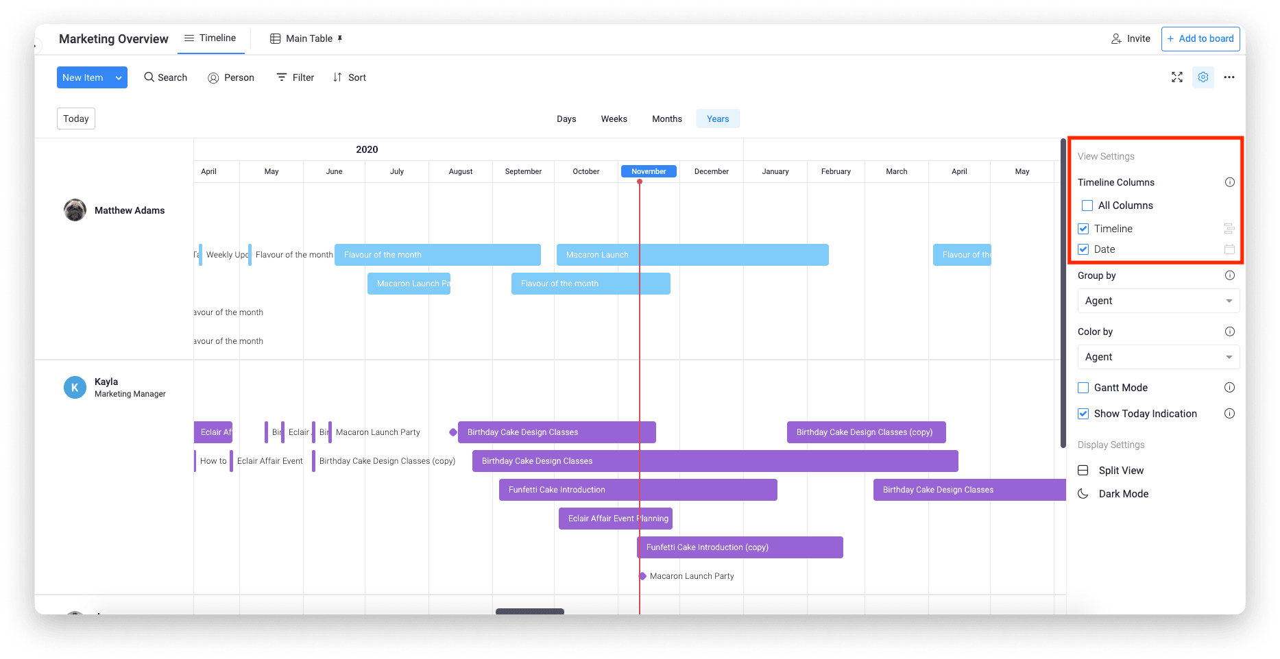
Finally, to turn your board into a timeline, click the “Views” menu located at the upper left corner in your main dashboard, select “Add view,” and then click “Timeline.”
You’ll then see something like this:
And that’s pretty much the thick of it.
By following this simple process, you can create a visually appealing and accurate timeline chart in a couple of minutes.
To get a more complete overview of our timeline view, we suggest you watch this short video:
Your turn
Timeline charts help you oversee your entire project and visualize progress at a glance. Now you have enough information to create your own.
And if you want to speed up the process while improving the quality of your work, then monday.com might be right for you.
With our Timeline view, you can turn the information of any project into a timeline in just a few clicks.
To get started with your next project, why don’t you try our fully customizable project planning template? It’s the best way to start off on the right foot.

