


Project timelines often look solid during planning, with work items mapped out, dependencies accounted for, and Gantt charts presenting a path from start to finish. A Gantt chart — a horizontal bar chart that maps activities against a timeline, showing durations, dependencies, and milestones — remains one of the most recognized project scheduling formats. But once work begins, priorities shift, teams need different ways to stay aligned, and stakeholders want updates that are easy to understand without digging through complex schedules.
This gap between planning and execution is why many teams are moving beyond traditional Gantt charts and adopting more flexible ways to visualize work. Below, you’ll find 10 practical alternatives to Gantt charts, a framework for deciding when each one works best, and how AI-powered visualization is changing the way teams plan and deliver work. With monday.com’s AI Work Platform, teams can access all of these visualization options in a single workspace, making it easier to match the right view to every project.
Key takeaways
- Match visualization to your work style: Choose Kanban boards for task flow, timeline views for deadlines, or workload views for resource planning instead of forcing complex Gantt charts on every project.
- Boost team engagement with intuitive views: Teams participate more actively when they can understand project status at a glance, leading to stronger data accuracy and collaboration.
- Access 15+ visualization options with monday.com’s AI Work Platform: Switch between Kanban boards, timelines, dashboards, and other views within one platform, with AI-powered view recommendations from monday sidekick to help teams pick the right visualization for each situation.
- Combine multiple views for a complete project overview: Use different visualizations for different stakeholders: Kanban for daily work, dashboards for executives, timelines for client communication.
- Expand beyond traditional alternatives: Milestone charts, project network diagrams, and AI-assisted planning give teams even more options for visualizing work beyond the standard Gantt chart alternatives.
Why do teams choose Gantt chart alternatives?
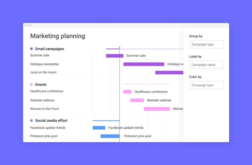
Teams are turning away from Gantt charts for three simple reasons: they’re too complex, team members avoid using them, and they don’t match how work actually flows. Understanding these drivers helps teams identify which visualization methods will serve them most effectively.
Teams aren’t abandoning Gantt charts on a whim, but rather responding to how dramatically work has changed. According to PMI’s 2025 Pulse of the Profession report, projects with structured, well-matched management approaches are significantly more likely to succeed. Teams need visualization methods that match their pace, support their workflows, and engage every team member without requiring extensive training or setup.
Simplify complex project visualization
Traditional Gantt charts display every activity, dependency, milestone, and resource allocation simultaneously. This creates information overload that obscures project status rather than clarifying it.
Consider these common scenarios where complexity becomes counterproductive:
- Marketing teams: Planning a product launch doesn’t require seeing every dependency relationship when they simply want to know which deliverables are due this week.
- Support teams: Mnaging ongoing tickets gains little from timeline bars when they need to visualize work stages and bottlenecks.
- Operations teams: Daily workflow management becomes cumbersome when buried under complex dependency mapping.
Simpler visualization methods help teams focus on the information that matters most for their specific work type. A Kanban board shows work progression through stages without timeline complexity, while calendar view highlights deadlines without dependency chains. Additionally, workload view reveals team capacity without Gantt chart overhead.
With a flexible platform like monday.com’s AI Work Platform, teams can access 15+ visualization options, choosing the right level of detail for each situation. Executives use dashboards for high-level insights while individual contributors rely on detailed task lists. This flexibility ensures everyone gets the view they need without unnecessary complexity.
Increase team adoption and engagement
How can you ensure your project chart is something your team actually wants to use? Many professionals find Gantt charts intimidating or difficult to interpret, leading to poor data accuracy and disengagement from project planning processes.
When team members struggle to understand how their work fits into the broader project timeline, several problems emerge:
- Status updates stop: Team members avoid updating progress in complex interfaces.
- Dependencies get missed: Critical relationships between work items become invisible.
- Isolation increases: People work without understanding broader project context.
When people can view their work in a format that feels intuitive, engagement rises naturally. Here are a few examples:
- Content creators: Editorial calendars make more sense than Gantt charts with publishing dependencies.
- Developers: Sprint boards feel more intuitive than timelines showing every code review relationship.
- Operations teams: Workload views reveal capacity issues that Gantt charts hide.
Adapt to Agile and hybrid workflows
Today’s work requires flexibility, rapid iteration, and constant adaptation, which calls for more dynamic visualization methods than rigid Gantt charts.
Agile methodologies require rapid iteration and frequent priority changes that make traditional Gantt charts cumbersome to maintain. Cross-functional teams collaborating on multiple initiatives simultaneously need views that support parallel work streams rather than sequential activity chains.
- Where Gantt charts excel: Fixed-scope projects with defined beginning and end dates.
- Where they struggle: Daily priority adjustments, sprint-based work, or non-linear progression.
Alternative visualization methods adapt to these workflows:
- Sprint boards: Support iterative development cycles.
- Kanban views: Accommodate continuous delivery processes.
- Timeline views: Allow quick date adjustments without recalculating complex dependency chains.
When do alternative views outperform traditional Gantt charts?
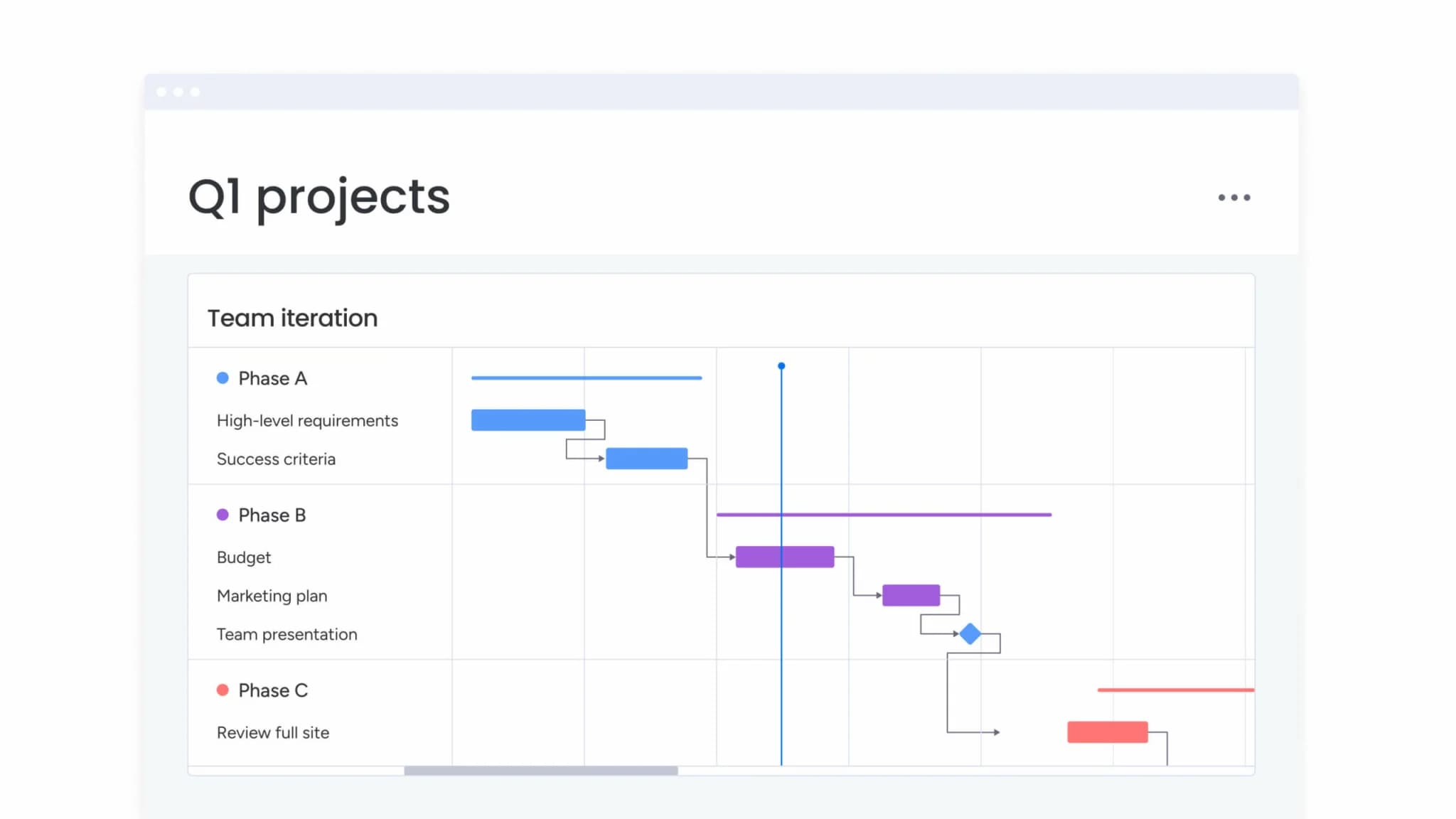
Gantt charts still play an important role in project planning, but they aren’t always the right fit for how teams work day to day. Factors like team size, project length, rate of change, and stakeholder expectations all influence whether a detailed, dependency-driven view adds value or creates friction.
In many common scenarios, lighter and more flexible visualizations make it easier for teams to move quickly, stay aligned, and keep information up to date. The comparison below highlights when traditional Gantt charts are most effective and when alternative views tend to deliver stronger results.
| Project characteristic | Use Gantt charts when | Use alternatives when |
|---|---|---|
| Team size | Large teams (20+) with specialized roles and complex coordination needs | Small to medium teams (2–20) with overlapping responsibilities and direct communication |
| Project duration | Long-term projects (6+ months) with sequential phases and fixed milestones | Short-term projects (1–12 weeks) with rapid iteration and changing priorities |
| Complexity level | High interdependency between activities requiring detailed dependency mapping | Independent or loosely coupled activities that can progress in parallel |
| Stakeholder needs | External stakeholders requiring traditional project management documentation | Internal teams prioritizing speed, flexibility, and collaborative planning |
| Change frequency | Stable scope with infrequent changes to timeline or deliverables | Dynamic scope with daily or weekly adjustments to priorities and deadlines |
| Methodology fit | Waterfall or phased approaches with sequential task dependencies | Agile, Scrum, or hybrid methodologies requiring frequent reprioritization |
Fast-moving Agile projects
Agile methodologies require rapid iteration and frequent priority changes that make traditional Gantt charts cumbersome to maintain. As Harvard Business Review explains, managing unpredictability in complex projects requires visualization methods that support continuous adjustment. When a product team discovers new user feedback mid-sprint, they need to reorganize their backlog immediately.
Sprint boards and Kanban views support this flexibility by visualizing work as movable cards that teams can reprioritize with simple drag-and-drop actions. Development teams working in continuous delivery environments benefit from views that show current work status rather than long-term timelines.
Key benefits for Agile teams include:
- Immediate reorganization: Sprint boards display what’s in progress, what’s blocked, and what’s ready for review.
- Momentum maintenance: Developers get the information they need without timeline complexity.
- Rapid adaptation: Teams respond to changing requirements without dependency recalculation.
Resource-heavy operations
Projects focused on resource allocation and workload balancing need specialized views that highlight capacity and availability. For example, a creative agency managing multiple client projects simultaneously needs to see which designers have capacity for new work, not just when deliverables are due.
Traditional Gantt charts show task timelines but obscure the resource utilization patterns that prevent burnout and optimize team productivity. Workload views provide visual capacity indicators that help managers balance assignments across team members.
Resource management advantages include:
- Capacity visibility: When a project manager sees that one designer is at 120% capacity while another is at 60%, they can redistribute work before deadlines slip.
- Quality protection: Teams identify and address workload imbalances before they impact project delivery or team morale.
- Proactive planning: Resource insights remain hidden in traditional Gantt chart views.
Cross-departmental collaboration
Projects involving multiple departments with different working styles benefit from flexible visualization options customized for each stakeholder group’s needs. For instance, a product launch involving marketing, sales, product, and support teams requires different views for each department.
In this example, it’s vital to consider the specific needs of each team:
- Marketing: Content calendar for campaign coordination.
- Sales: Timeline of enablement deliverables.
- Product: Sprint board for feature development.
- Support: Task list of documentation requirements.
Rather than forcing all departments to work within a single Gantt chart view, platforms like monday.com’s AI Work Platform allow each team to visualize the same project data in the format that matches their workflow. This flexibility increases cross-departmental engagement and ensures every team has the visibility they need without learning unfamiliar visualization methods.
10 Gantt chart alternatives that transform how teams work
Project management offers diverse visualization methods that address specific work styles, team dynamics, and project requirements. Each alternative provides unique strengths that traditional Gantt charts simply cannot match.
Before diving into each option, here’s a quick comparison to help you identify which alternatives fit your team’s needs. The table below summarizes each visualization method’s primary strength and relative complexity.
| Alternative | Best for | Complexity level |
|---|---|---|
| Kanban boards | Visual task flow and continuous delivery | Low |
| Timeline views | Simplified scheduling and campaign planning | Low |
| Calendar views | Deadline-focused planning and coordination | Low |
| Workload views | Resource allocation and capacity management | Medium |
| Dashboard views | Executive insights and portfolio tracking | Medium |
| Task lists | Focused daily execution and simple tracking | Low |
| Sprint boards | Agile iteration management and velocity tracking | Medium |
| Mind maps | Strategic planning and brainstorming | Low |
| Milestone charts | Tracking key deliverables and executive reporting | Low |
| Project network diagrams | Complex dependency mapping and critical path analysis | High |
These 10 alternatives represent the most effective visualization methods for different types of work. Understanding when and how to use each option will help your teams choose the right approach for their specific needs.
1. Kanban boards: Visual task flow management
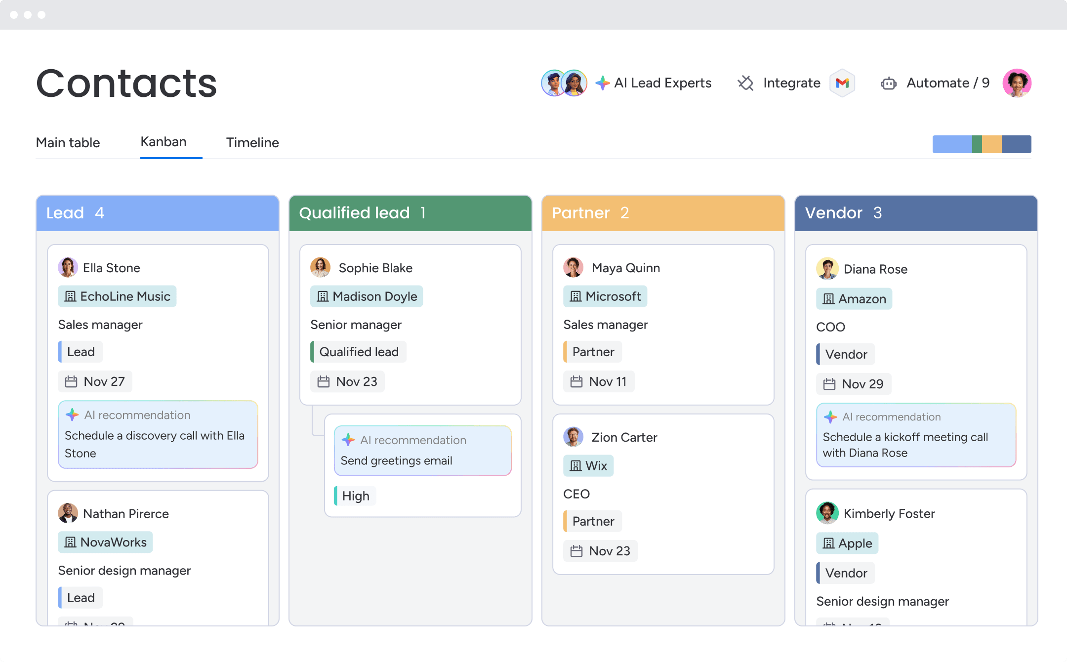
Kanban methodology originated in Toyota’s manufacturing processes and has become a cornerstone of knowledge work management. A Kanban board visualizes work as cards moving through columns that represent stages of completion.
Teams typically start with “To Do,” “In Progress,” and “Done” columns, then customize stages to match their specific workflows. How does this compare to a traditional Gantt chart? Where Gantt charts emphasize when work items happen, Kanban boards emphasize where work items are in the process, making them ideal for teams that prioritize flow over scheduling.
Kanban boards excel in these scenarios:
- Support teams: Managing incoming tickets through triage, investigation, resolution, and verification stages.
- Editorial teams: Tracking articles through ideation, drafting, editing, approval, and publishing stages.
- Professional services: Managing client projects through discovery, execution, review, and delivery phases.
Implementation benefits:
- Visual bottleneck identification: When one column accumulates significantly more cards than others, teams immediately recognize process constraints.
- Rapid reprioritization: Dragging cards up or down within columns takes seconds, supporting quick changes without timeline recalculation.
- Sustainable pace: Teams set work-in-progress limits to prevent overload and maintain quality.
Getting started with Kanban:
- Start with three basic columns and add stages as your process matures.
- Set work-in-progress limits based on team capacity, typically 1–2 active items per team member.
- Review your board daily in stand-up meetings to identify blockers and maintain flow.
2. Timeline views: Streamlined project scheduling
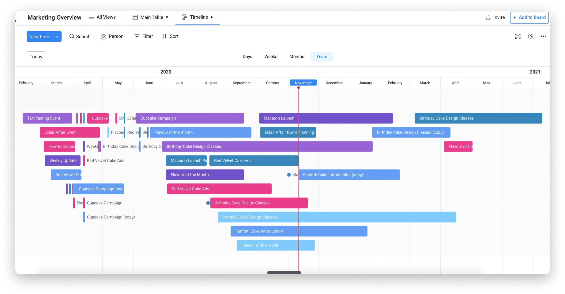
Timeline views offer simplified project scheduling that captures the essential elements of Gantt charts without the complexity of detailed dependency mapping. A timeline displays activities as horizontal bars across a calendar, showing when work starts and ends without requiring teams to define every relationship between activities. For a deeper dive into timeline-based planning, see our guide to creating a project timeline.
Timeline views prove particularly valuable for:
- Marketing campaigns: Visualizing when each component goes live across email, social media, content, and events.
- Event planning: Tracking venue booking, vendor coordination, promotion, and logistics.
- Content calendars: Scheduling blog posts, videos, webinars, and social content across weeks or months.
Practical advantages:
- Quick schedule adjustments: Dragging task bars to new dates takes seconds, supporting rapid changes without dependency recalculation.
- Universal understanding: Timelines provide intuitive visual communication that non-project-managers understand immediately.
- Focus on priorities: Key deadlines and deliverables stand out visually, helping teams maintain focus on critical dates.
3. Calendar views: Deadline-focused planning
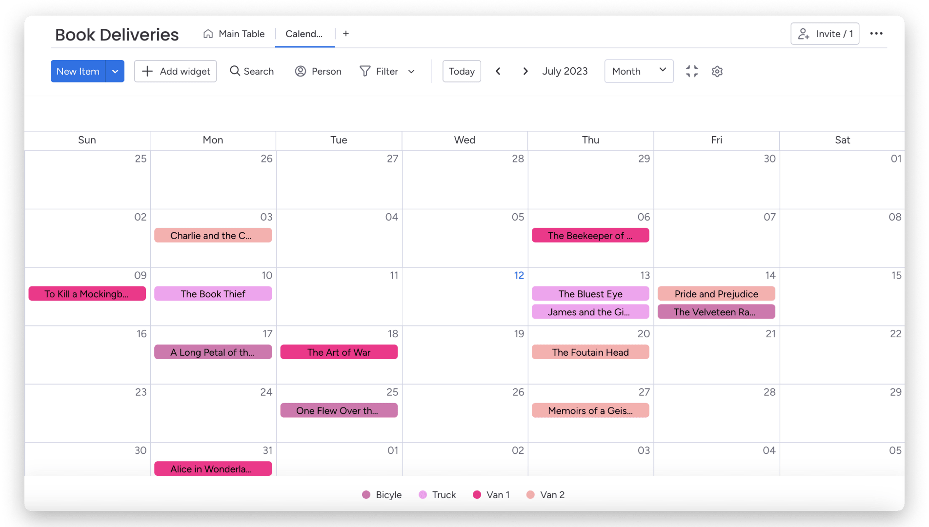
Calendar-based project visualization transforms task lists into familiar date-based interfaces that everyone already knows how to use. A well-designed project management calendar brings deadlines, dependencies, and team capacity into a single view. A calendar view displays tasks on the dates they’re due, providing intuitive deadline management that requires no training or explanation.
Calendar views work exceptionally well for:
- Publishing teams: Scheduling content across multiple channels while maintaining consistency.
- Event coordination: Managing multiple events, meetings, and deadlines on a single calendar.
- Deadline tracking: Visualizing all deadlines across multiple projects in calendar format.
Immediate value creation:
- Calendar integration: Calendar views typically sync with Google Calendar, Outlook, and other project scheduling tools, creating a single source of truth for all deadlines.
- Natural interaction: Dragging tasks to new dates feels natural to anyone who has used a digital calendar.
- Conflict identification: Overlapping deadlines and resource conflicts become immediately visible when multiple tasks appear on the same date.
4. Workload views: Smart resource allocation

Workload planning visualization shifts focus from task timelines to team capacity. These views display how work is distributed across team members and highlight potential overallocation or underutilization.
A workload view shows each person’s assigned work and total capacity, typically using visual indicators like progress bars or capacity percentages.
Workload views address critical resource management needs:
- Project managers: Balancing work across team members to see who has capacity for new assignments.
- Department leaders: Planning quarterly initiatives based on team availability.
- Team leads: Monitoring workload distribution to prevent quality issues or turnover.
Resource decision advantages:
- Instant assessment: Color-coded capacity bars provide immediate evaluation of team health.
- Data-driven assignments: mManagers make assignment decisions based on actual capacity data rather than assumptions about availability.
- Proactive balance: Teams identify and address workload imbalances before they impact project delivery or team morale.
5. Dashboard views: Executive-level project insights
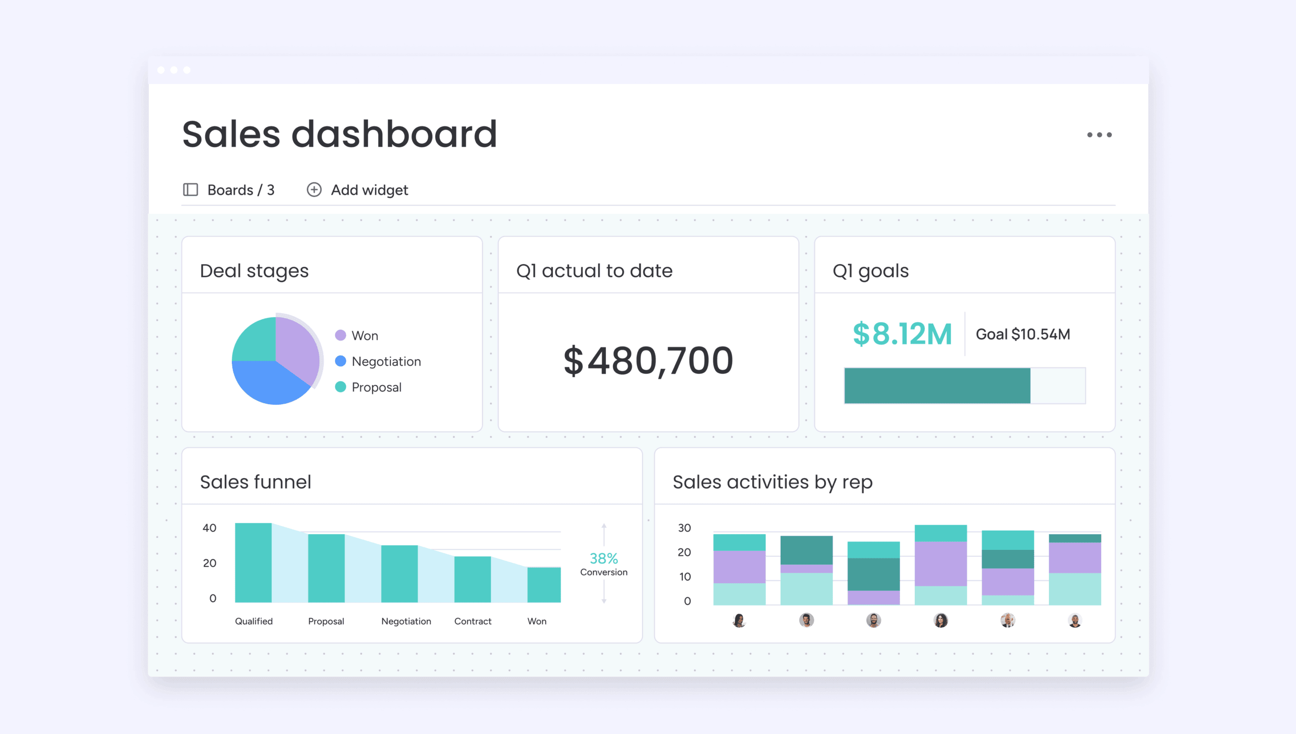
Dashboard visualization provides high-level project insights by aggregating data from multiple projects into customizable widgets. These widgets display key metrics, status summaries, and trend analysis.
A dashboard transforms detailed project data into executive-friendly insights that support strategic decision-making without requiring leaders to dig through task-level details.
Dashboards serve specific leadership needs:
- PMO leaders: Overseeing multiple projects with consolidated visibility into portfolio health.
- Senior executives: Requiring high-level status updates focused on outcomes and strategic alignment.
- Department heads: Monitoring performance indicators like on-time delivery rate and resource utilization.
Customization delivers targeted value:
- Relevant KPIs: Teams build dashboards that display the specific metrics that matter most to their stakeholders.
- Visual variety: Choose from various chart types to maintain engagement — bar charts for comparisons, line charts for trends, pie charts for distributions.
- Real-time accuracy: Dashboards pull data directly from underlying projects, ensuring executives always see current information without manual reporting.
6. Task lists: Focused daily execution
Simple list-based views help teams focus on immediate priorities without visual complexity. Task lists display work in straightforward rows that can be sorted, filtered, and organized by various criteria.
A task board strips away timelines, dependencies, and visual elements to present pure project information in scannable format.
Task lists optimize daily work management:
- Individual contributors: Planning their workday with simple lists sorted by priority or due date.
- Knowledge workers: Managing responsibilities with clean task lists over complex visualizations.
- Small projects: Tracking work with minimal dependencies using well-organized task lists.
Simplicity enables quick action:
- Instant updates: Checking off completed items or updating status takes seconds in list format.
- No learning curve: Lists require no interpretation or training.
- Flexible organization: Teams can instantly reorganize lists by due date, priority, assignee, or custom criteria to focus on what matters most.
7. Sprint boards: Agile team iteration management
Sprint-based visualization supports Agile development cycles by organizing work into time-boxed iterations. Sprint boards show the current sprint’s backlog, work in progress, and completed items, with separate views for sprint planning, daily standups, and retrospectives.
Sprint boards enable Agile teams to:
- Engineering teams: Plan iterations, track progress, and maintain velocity using Scrum frameworks.
- Product teams: Release features in regular cycles aligned with product roadmaps.
- Cross-functional teams: Work in fixed-duration cycles for marketing, design, or research sprints.
Agile practice reinforcement:
- Velocity tracking: Teams measure how much work they complete per sprint, using historical data to improve future sprint planning accuracy.
- Meeting support: Sprint boards facilitate backlog grooming, sprint planning meetings, and capacity-based commitment decisions.
- Focus maintenance: By limiting visible work to the current sprint, teams avoid distraction from future backlog items and maintain execution focus.
8. Mind maps: Strategic planning and brainstorming
Mind mapping visualization helps teams explore project relationships and dependencies by displaying information in radial, hierarchical structures. A mind map starts with a central idea and branches outward to show related tasks, decisions, and dependencies in a format that supports creative thinking and strategic planning.
Mind maps excel at:
- Brainstorming: Capturing ideas and relationships without forcing premature structure.
- Strategic planning: Mapping organizational goals, initiatives, and dependencies.
- Problem-solving: Identifying root causes, potential solutions, and implementation paths.
Non-linear structure benefits:
- Exploration encouragement: Mind maps support ideation without the constraints of traditional project plans.
- Relationship visibility: Connections between ideas become explicit, helping teams understand how different project elements influence each other.
- Goal alignment: Mind maps naturally show relationships between high-level goals and detailed implementation tasks.
9. Milestone charts: tracking key project checkpoints
A milestone chart plots significant project events like deliverables, approvals, and go-live dates on a timeline without showing individual activity durations. It answers “what needs to happen and when” without the complexity of a full Gantt chart.
Where Gantt charts display every task and dependency, milestone charts strip the view down to the moments that matter most. This makes them ideal for communication with stakeholders who care about outcomes, not task-level detail.
Milestone charts work well for:
- Client-facing project updates: Showing key deliverable dates without overwhelming non-technical stakeholders with activity-level granularity.
- Executive status reporting: Highlighting whether the project is on track to hit its critical checkpoints.
- Phase-gate projects: Visualizing approval points and decision gates that determine whether work advances to the next stage.
Why teams choose milestone charts over Gantt charts:
- Focused communication: Stakeholders see the five dates that matter, not the 50 work items behind them.
- Faster to build and maintain: No dependency mapping or resource allocation required.
- Complementary to other views: Teams often use a milestone chart alongside Kanban boards or timelines for day-to-day execution.
On monday.com’s AI Work Platform, teams can mark milestones as a native feature within Gantt charts and timeline views, then filter the view to display milestones only, giving stakeholders a focused checkpoint view from the same project data.
10. Project network diagrams: Mapping dependencies and critical paths
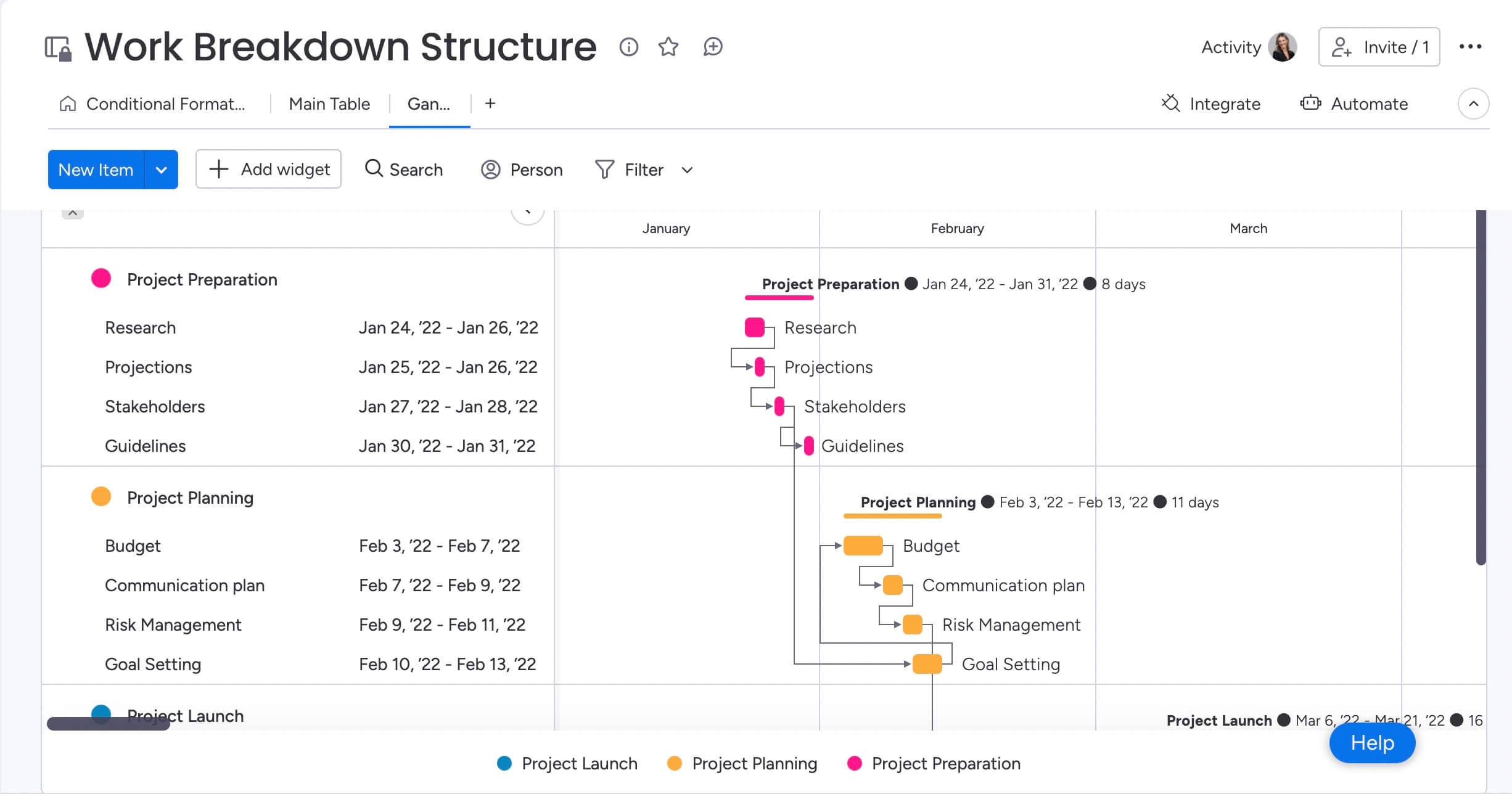
Network diagrams, including PERT charts and Critical Path Method (CPM) diagrams, display activity relationships as nodes connected by arrows. They show the sequence of dependent activities and identify the critical path: the longest chain of tasks that determines the minimum project duration.
Unlike Gantt charts, which emphasize activity duration on a timeline, network diagrams prioritize the logical relationships between activities. This makes them essential when understanding “what must finish before what” matters more than knowing exactly when each task starts.
Network diagrams are valuable for:
- Complex engineering and construction projects: Where dozens of interdependent tasks must execute in strict sequence.
- Software releases with hard dependencies: Identifying which development, testing, and deployment tasks gate the release date.
- Risk assessment: Pinpointing which delays would push the entire project timeline, and which tasks have float to absorb schedule slippage.
Related techniques worth knowing:
- PERT charts: Estimate task duration using optimistic, pessimistic, and most likely scenarios, which is useful when past project data is limited and estimates are uncertain.
- Work breakdown structure (WBS): A hierarchical decomposition of deliverables into manageable work packages, often used as the foundation for building network diagrams.
On monday.com’s AI Work Platform, the Gantt chart includes a critical path overlay and cross-project dependencies, giving teams that need network-diagram-level dependency analysis a more visual, interactive interface without switching to specialized diagramming software.
Get StartedHow AI revolutionizes project visualization
Artificial intelligence is changing how teams work with project data. As organizations increasingly treat projects as the primary engines of value creation, AI helps keep visualizations accurate, surfaces risks earlier, and reduces the time spent maintaining plans. These capabilities work across different project views, supporting smarter decisions without adding extra administrative effort.
Automatic view selection based on work type
AI examines team size, project duration, task dependencies, and update frequency to suggest whether a Kanban board, timeline view, or sprint board will serve teams most effectively. This reduces decision fatigue and improves productivity by eliminating guesswork around which view to use.
With the AI Work Platform, monday sidekick analyzes project patterns and recommends visualization approaches that match proven success patterns. Meanwhile, monday agents operate in the background, flagging opportunities to switch views when project conditions change.
Predictive risk analysis across all views
AI-powered risk detection analyzes completion rates, deadline proximity, resource allocation patterns, and historical project data to flag risks before they become problems. These insights appear directly within whatever visualization method the team is using, whether Kanban cards, timeline tasks, or dashboard widgets.
On the AI Work Platform, Portfolio Risk Insights provides proactive risk monitoring across entire project portfolios, surfacing at-risk projects automatically so leaders can take corrective action before deadlines slip.
Smart automation that replaces manual updates
AI automates the tedious work of maintaining project data accuracy across different visualization views. AI Blocks automatically organize work items by type, priority, or department and generate project status updates from task-level data. monday agents continuously identify work items needing attention, update status based on activity patterns, and notify relevant team members when action is required.
Beyond day-to-day automation, monday MCP connects the monday.com workspace to external AI assistants like Claude, ChatGPT, and Copilot, while monday vibe enables teams to build custom visualization apps by describing what they need in natural language. These AI capabilities work across all visualization methods, providing intelligent assistance whether teams are using Kanban boards, timelines, dashboards, or any other view.
Visualize every project with monday.com's AI Work Platform
Visualize every project with monday.com’s AI Work Platform
Teams that embrace visualization flexibility gain significant advantages over those locked into single-view approaches. When teams can switch between views based on what they’re doing, who they’re communicating with, and where they are in the project, everyone stays engaged, decisions improve, and results follow.
monday.com’s AI Work Platform gives teams the freedom to visualize work in whatever way makes the most sense for each situation. Whether you’re managing a complex product launch, coordinating cross-functional initiatives, or tracking daily operations, the platform adapts to your workflow instead of forcing you into rigid structures that slow teams down.
AI-powered view recommendations
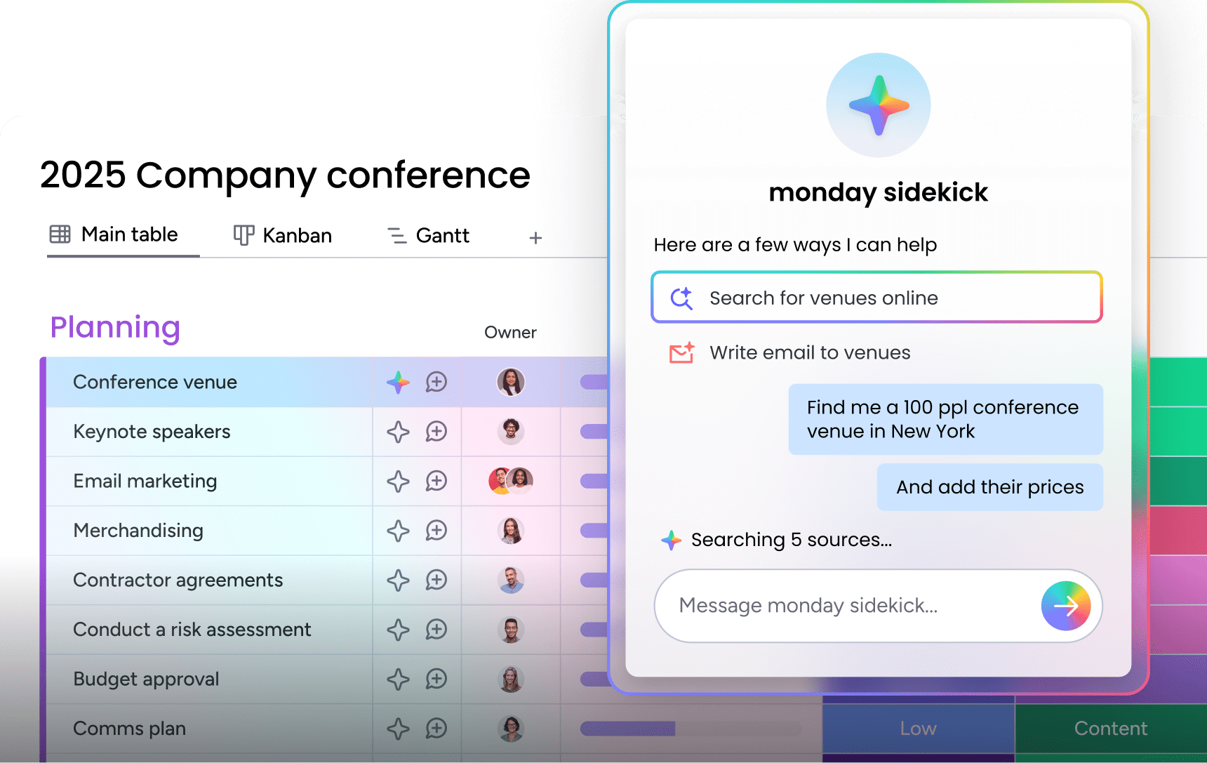
monday sidekick analyzes your project characteristics like team size, task dependencies, and update frequency to recommend the most effective visualization method for each situation. The AI assistant learns from your team’s patterns and suggests when to switch from a Kanban board to a Timeline View, or when a dashboard would serve stakeholders better than a detailed Gantt chart. This eliminates guesswork and helps teams choose the right view without trial and error.
Intelligent risk detection across all views
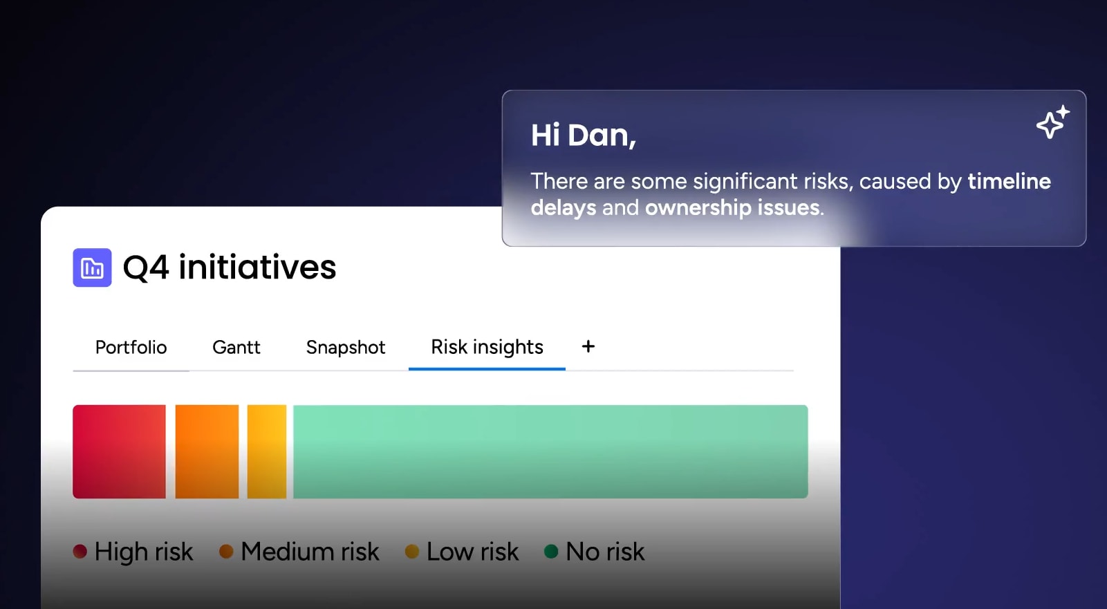
Portfolio Risk Insights uses AI to monitor project health across your entire workspace, automatically flagging at-risk initiatives before deadlines slip. The system analyzes completion rates, resource allocation patterns, and historical data to surface potential problems directly within whatever view you’re using, whether that’s a Kanban card, timeline task, or dashboard widget. Teams get proactive alerts that help them take corrective action early, reducing manual risk management effort significantly.
Automated project maintenance with AI agents
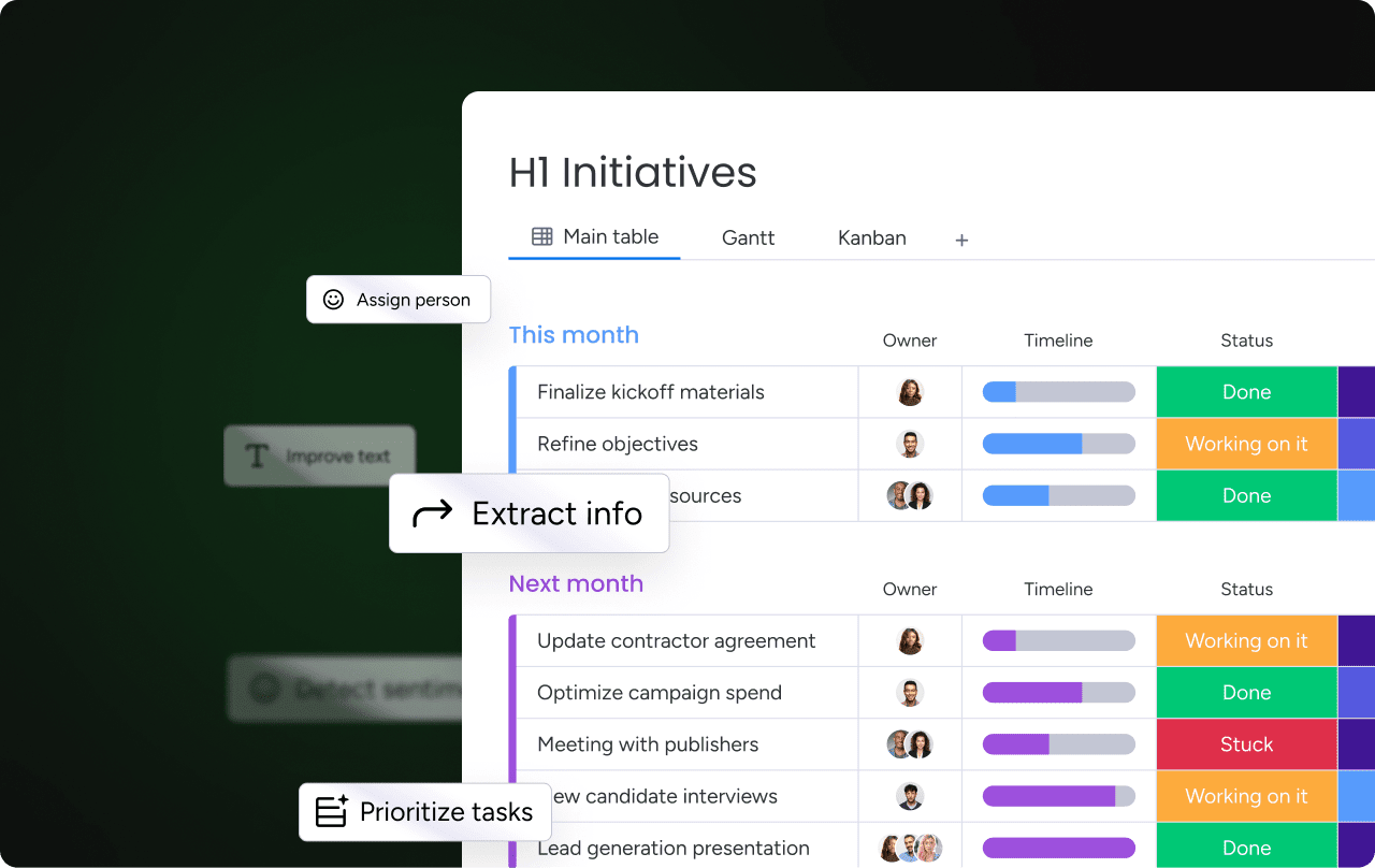
monday agents operate continuously in the background, keeping your project data accurate without manual updates. These AI agents flag work items needing attention, update status based on activity patterns, and notify relevant team members when action is required. Combined with AI Blocks for categorization and summarization, the platform handles routine project maintenance automatically, freeing teams to focus on execution rather than administrative overhead.
15+ visualization options in one workspace

Access the complete range of project visualization methods within a single platform, from Kanban boards and Timeline Views to Gantt charts, Workload Views, Dashboard views, Calendar Views, and more. All views display the same underlying project data, eliminating the need to duplicate information or switch between separate systems. Teams can also build custom visualization apps using monday vibe by describing what they need in natural language, or connect external AI assistants like Claude and ChatGPT through monday MCP for seamless data access.
Choose the right view for every project
Project visualization isn’t about finding one perfect method that works for everything. It’s about matching the right view to the specific work at hand, whether that’s a Kanban board for daily task flow, a timeline for campaign planning, or a dashboard for executive reporting. Teams that embrace this flexibility move faster, communicate more clearly, and keep everyone engaged regardless of their role or technical background.
The platform you choose should adapt to how your team actually works rather than forcing rigid structures that slow you down. With monday.com’s AI Work Platform, teams access 15+ visualization options in a single workspace, with AI-powered recommendations that help you pick the right view for each situation. Start with the views that match your current needs, then expand as your projects grow and evolve.
Get StartedFAQs
What can you use instead of a Gantt chart?
Teams can use Kanban boards for visual task flow, timeline views for simplified scheduling, calendar views for deadline management, workload views for resource allocation, dashboard views for executive insights, task lists for focused execution, sprint boards for Agile development, mind maps for strategic planning, milestone charts for tracking key checkpoints, and project network diagrams for complex dependency mapping. monday.com's AI Work Platform provides all 10 alternatives in one workspace.
What are the disadvantages of Gantt charts?
Gantt charts are time-consuming to set up and maintain, struggle to surface priorities among hundreds of tasks, overwhelm non-technical stakeholders with dependency complexity, and don't fit Agile workflows requiring frequent reprioritization. As projects grow, long horizontal bars and overlapping timelines create visual clutter. Alternatives like Kanban boards, timeline views, and workload views provide focused visualization without dependency overhead.
What is the difference between a Gantt chart and a Kanban board?
A Gantt chart displays tasks as horizontal bars on a timeline, emphasizing duration, sequence, and dependencies. A Kanban board organizes tasks as cards moving through columns representing workflow stages, emphasizing flow and current status. Gantt charts work for fixed-scope, long-term projects with many dependencies. Kanban boards suit ongoing work with changing priorities where teams need to see what's in progress at a glance.
What is the best Gantt chart alternative for Agile teams?
The best Gantt chart alternative for Agile teams is a sprint board combined with Kanban views. Sprint boards organize work into time-boxed iterations, supporting velocity tracking, backlog grooming, and capacity-based sprint planning. Kanban views visualize work flow through stages, helping teams identify bottlenecks and maintain sustainable pace. monday.com's AI Work Platform lets teams use both views simultaneously with AI-powered sprint planning.
Is there a free alternative to Gantt charts?
Free alternatives to Gantt charts include basic Kanban boards, simple task lists, and calendar views available in most project management platforms. These visualization methods require no setup complexity and provide immediate value for tracking work. monday.com's AI Work Platform offers a free plan with multiple visualization options, so teams can start with Kanban boards and timelines, then scale to advanced views as needs grow.
How does monday.com's AI Work Platform help teams visualize projects?
monday.com's AI Work Platform provides 15+ board views including Kanban, timeline, Gantt, calendar, workload, and dashboard views, all displaying the same project data from a single source of truth. Teams switch between views instantly to match different workflows, stakeholder needs, and project phases. AI capabilities like monday sidekick recommend the right view for each situation, while monday agents monitor projects and flag risks automatically.

 Get started