
Organizational charts help teams understand how a company is structured, who reports to whom, and how different departments connect. For HR leaders, executives, and managers, an org chart is a practical tool for workforce planning, onboarding, restructuring, and keeping teams aligned as the business grows. The U.S. Office of Personnel Management describes workforce planning as a process for analyzing the workforce, identifying gaps, and planning workforce actions, which is exactly where a clear org chart can support better decision-making.
An organizational chart template makes it easier to build that structure without starting from scratch. Instead of manually designing boxes, arrows, and reporting lines, you can use a ready-made framework and customize it with your company’s roles, departments, and employee details.
In this guide, we’ll explain what an organizational chart template is, why HR teams use them, and which types of org charts work best for different companies. We’ll also show how monday.com’s AI Work Platform helps teams create, update, and share organizational charts in one connected workspace.
Key takeaways
- An organizational chart template helps HR teams map reporting lines, departments, roles, and company structure without starting from scratch
- Org charts are useful for onboarding, workforce planning, restructuring, hiring, and clarifying who owns what across the business
- Free tools like Word, Excel, and Google Docs can work for simple org charts, but they often become harder to maintain as teams grow
- A digital organizational chart is easier to update, share, and connect to related documentation, workflows, and employee information
- monday.com’s AI Work Platform helps teams build more connected org charts by bringing people, workflows, dashboards, and updates into one shared workspace
What is a free organizational chart template?
An organizational chart template is a customizable document, diagram, spreadsheet, or digital workspace that helps you create an org chart from a predefined structure.
Most org chart templates include boxes for employees or roles, plus lines or arrows that show reporting relationships. For example, a marketing manager may report to a VP of marketing, while several specialists report to that manager. The chart turns those relationships into a visual map that is easier to understand than a long list of names and job titles.
Org chart templates are commonly used by:
- HR teams
- People operations teams
- CEOs and founders
- Department heads
- Operations leaders
- Recruiters
- Finance teams
- Project managers
- Executive assistants
- Internal communications teams
At a basic level, an org chart helps answer one simple question: how is the company organized?
But in practice, a good org chart can answer much more than that. It can show who manages each team, where departments sit in the larger business, which roles are open, where reporting lines are unclear, and how future hiring plans might change the structure.
Because org charts show reporting lines and team structure, they often support broader HR processes like workforce planning, hiring plans, internal mobility, succession planning, and organizational design. SHRM’s HR tools and resources are a useful place to link when discussing the broader HR processes that org charts support: SHRM HR tools and resources.
A good organizational chart template can help you answer questions like:
- Who reports to whom?
- Which roles sit within each department?
- Which positions are currently open?
- Where are there gaps in the current structure?
- Which teams are growing fastest?
- Which managers have too many direct reports?
- Where are there dotted-line reporting relationships?
- Who needs to be involved in approvals or decision-making?
- How will a restructure affect reporting lines?
- What will the organization look like after the next hiring phase?
For HR teams, this is especially useful because organizational structures often change. Employees join, leave, move departments, or take on new responsibilities. A digital org chart template makes it easier to keep that information accurate and accessible.
Why use a free organizational chart template?
The main reason leaders use organizational chart templates is efficiency. Rather than starting from scratch when mapping the company’s management and reporting structure, a template allows managers to add employee names, roles, and departments into a ready-made format.
Templates also make the process more consistent. Instead of each department creating its own version of the company structure, HR can use one shared template that keeps reporting lines, role titles, and department structures clear.
That consistency matters more as a company grows. In a small team, everyone may already know who does what. But once the company reaches multiple departments, locations, managers, and functions, informal knowledge is no longer enough. Employees need a reliable place to understand how the business is structured.
A free organizational chart template can help teams save time when building or updating an org chart, create a clear visual structure for employees and leaders, and improve onboarding by helping new hires understand the company. It also supports workforce planning and hiring decisions, helps prepare for company restructures or department changes, and reduces confusion around reporting lines. Beyond that, a good template can identify unclear ownership across teams, show open roles or planned hires, help managers understand their span of control, and share the company structure with stakeholders in a professional format.
There’s also a design benefit. Organizational charts can quickly become messy, especially in larger companies with multiple departments, dotted-line reporting, and cross-functional teams. A template gives you a clean starting point so your chart stays readable and useful.
But static templates have limits. When an org chart lives in a slide, spreadsheet, or document, it can quickly become outdated. That’s why many HR teams use a connected platform like monday.com to keep organizational information easier to update and share.
What should an organizational chart include?
A useful organizational chart should include enough information to make the company structure clear without overwhelming the reader.
At a minimum, most org charts include:
- Employee names
- Job titles
- Departments
- Managers
- Reporting lines
- Leadership hierarchy
Depending on the company, an org chart may also include:
- Open roles
- Location
- Employment type
- Team ownership
- Dotted-line reporting relationships
- Department goals
- Contact information
- Start dates
- Links to job descriptions
- Links to team documentation
- Hiring priorities
- Succession planning notes
The right level of detail depends on the purpose of the chart. An org chart used for onboarding may focus on names, roles, departments, and reporting lines. An org chart used for workforce planning may include open headcount, planned roles, future departments, or expected hiring timelines.
For example, a people operations team may use one internal org chart that includes sensitive workforce planning details, while sharing a simpler version with the broader company. A leadership team may use a strategic version that includes hiring plans, while new hires may only need a basic department-level chart.
The goal is not to include every possible detail. The goal is to make the chart useful for the audience who will rely on it.
What are some examples of free organizational chart templates?
Free organizational chart template for startups
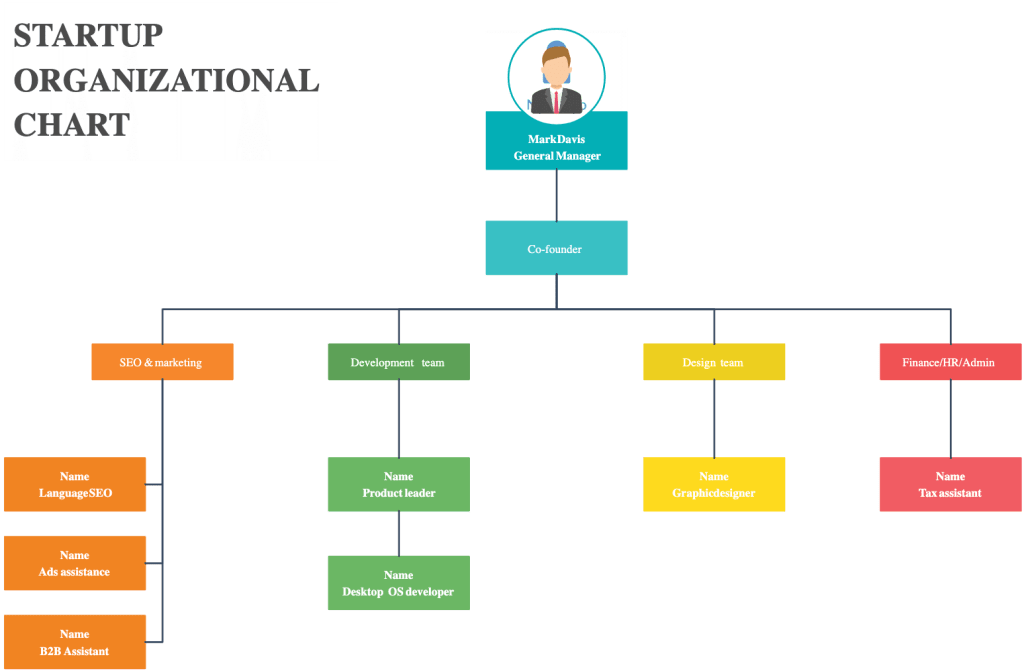
When preparing to launch or scale a new company, it’s often helpful to lay out an organizational chart that shows your current team and the roles you plan to hire for next.
A startup org chart template can help founders and early leaders identify which roles are already covered, where responsibilities overlap, and which key hires are still needed.
At an early-stage startup, one person may cover several functions. The founder may oversee sales, product, and finance. A marketing lead may also manage content, paid acquisition, events, and partnerships. A startup org chart can make these overlaps visible and help the team decide when to create new roles.
For instance, if the same person owns content marketing, social media, product launches, and demand generation, the org chart may show that marketing needs more support. If the head of operations is also handling HR, vendor management, and finance operations, the chart may reveal where the next hire should sit.
If your startup structure looks similar to a standard software company structure, you can add your existing team members’ names, assign open roles, and use the chart to guide hiring and workforce planning.
This type of org chart is also helpful for showing how the company may evolve. You can create one version for the current team and another version for the target structure after the next funding round or hiring phase.
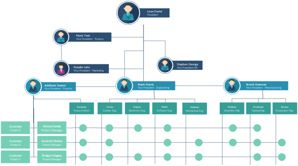
Free organizational chart template for established companies
Established companies usually need more detailed organizational charts. These charts may include multiple layers of leadership, department heads, managers, individual contributors, and cross-functional relationships.
For example, an established company’s org chart may show standard reporting lines, such as department VPs reporting to the company president or CEO. It may also include additional relationships between leaders who work closely together, such as finance and marketing, operations and HR, or product and customer support.
This type of template is useful for:
- Mapping complex reporting structures
- Planning reorganizations
- Supporting leadership alignment
- Clarifying department ownership
- Helping employees understand where their team fits
- Identifying gaps, overlaps, or bottlenecks
- Showing dotted-line reporting relationships
- Supporting succession planning
- Reviewing manager capacity
- Understanding department growth
For larger companies, it’s especially important that the org chart is easy to update. A static chart can become outdated whenever someone joins, leaves, changes roles, or moves teams.
This is where a connected digital template becomes valuable. Rather than maintaining several disconnected files, HR teams can manage one source of truth and create different views for different audiences.
Free hierarchical organizational chart template
A hierarchical org chart is the most common type of organizational chart. It shows a top-down structure, starting with the CEO, founder, or executive leader at the top and moving down through senior leaders, managers, and employees. This format works well for companies with clear reporting lines and a traditional management structure.
A hierarchical org chart is useful for showing leadership structure, manager relationships, department ownership, direct reports, escalation paths, and approval chains.
For example, a simple hierarchical chart might start with the CEO at the top. Under the CEO, there may be leaders for marketing, sales, finance, operations, product, and HR. Under each leader, there may be managers, specialists, coordinators, analysts, and other team members.
The benefit of this structure is clarity. Employees can quickly see who reports to whom and where each team sits in the larger company.
The downside is that a strict hierarchy may not show cross-functional work very well. If an employee reports to one manager but works closely with another department, that relationship may not be obvious. In those cases, you may need a matrix or dotted-line chart.
Free matrix organizational chart template

A matrix org chart shows employees who report to more than one manager or work across multiple functions. This is common in companies where people are assigned to both a functional department and a project, region, product line, or client account.
For example, a designer may report to the head of design but also work closely with a product manager on a specific product team. A sales operations analyst may report to operations but support several regional sales leaders. A project manager may report to the PMO but coordinate work across marketing, product, finance, and customer success.
A matrix org chart can help clarify these relationships.
This type of chart is useful for cross-functional teams, project-based organizations, agencies, consulting firms, product-led companies, global teams, and organizations with dotted-line reporting.
The benefit of a matrix org chart is that it reflects how work actually happens. Many companies do not operate in perfectly neat department silos. A matrix chart can show the difference between formal reporting relationships and day-to-day collaboration.
The challenge is complexity. Matrix charts can become difficult to read if they include too many lines, arrows, or relationships. To keep them useful, use clear labels, simple formatting, and color coding.
Free flat organizational chart template

A flat org chart works best for smaller companies or teams with fewer management layers. Instead of showing a hierarchy, it shows a more horizontal structure where employees have greater direct access to leadership.
This is common in startups, small businesses, agencies, and creative teams.
A flat org chart is useful for showing:
- Small team structure
- Department ownership
- Role responsibilities
- Team collaboration
- Direct access to leadership
For example, a small company may have a founder, a head of operations, a marketing lead, a product lead, and several employees who work across functions. A flat org chart can show this structure without adding unnecessary hierarchy.
The benefit of a flat chart is simplicity. It is easy to read and easy to update.
The downside is that as the company grows, a flat chart may no longer reflect how decisions are actually made. At that point, the company may need a more detailed hierarchical or department-based chart.
Free divisional organizational chart template

A divisional org chart organizes the company by product line, region, market, customer segment, or business unit rather than by traditional functions. For example, a global company may structure its org chart by region, with separate divisions for North America, Europe, Asia-Pacific, and Latin America. Each region may have its own sales, marketing, operations, and customer support teams.
A product company may structure its org chart by product line, creating divisions for Product A, Product B, Product C, the platform team, and shared services.
A divisional chart is useful for global companies, multi-brand companies, product-led organizations, franchise businesses, companies with regional teams, and companies with multiple business units.
The benefit of a divisional chart is that it clearly shows ownership. Leaders can see who is responsible for each market, region, or product line.
The challenge is that some shared services, such as finance, HR, legal, or IT, may support several divisions. In that case, the chart may need to show both divisional ownership and shared service relationships.
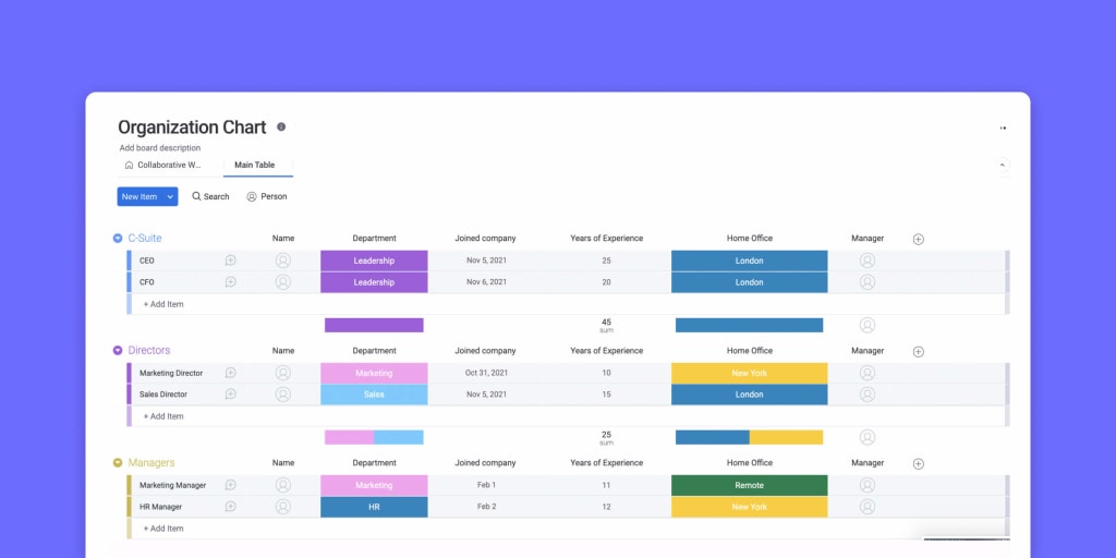
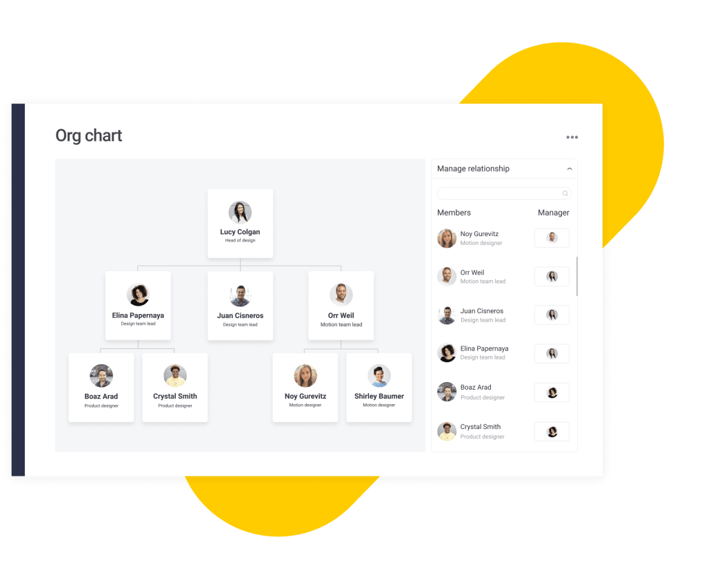
monday.com’s free organizational chart template
Many organizational chart templates are helpful, but they often lack one important feature: connectivity.
A static org chart can show your structure at a single moment in time, but it does not always connect to the work, people, workflows, and updates happening across the organization. monday.com’s AI Work Platform helps teams create a more connected organizational chart that can sit alongside the workflows, dashboards, and team information they already manage in monday.com.
An org chart is not just a diagram. It often connects to real HR and business processes like hiring, onboarding, workforce planning, role changes, team restructuring, manager approvals, internal mobility, headcount planning, succession planning, and department reporting.
When those processes are spread across disconnected files, the org chart can quickly fall behind reality. A new hire may be added to the onboarding tracker but not the org chart. A manager change may be reflected in HR records but not in a department chart. An open role may be approved in a hiring plan but not visible in the company structure.
monday.com helps bring those pieces closer together
Here are a few capabilities that make monday.com’s organizational chart template useful for HR teams and business leaders:
- Drag-and-drop structure: Instead of manually resizing boxes or adjusting arrows, teams can use a more flexible setup to organize roles, departments, and reporting lines
- Connected employee data: Because monday.com brings work and team information into one platform, HR teams can connect organizational structure to relevant employee details, team ownership, and workflow context
- Dashboards and visibility: Teams can share org chart information through dashboards, giving leaders and employees a clearer view of the company structure
- Collaboration: HR teams, managers, and leadership can work from a single source of truth rather than passing around outdated files
- Integrations: monday.com connects with tools teams already use, helping keep organizational information closer to the workflows where decisions happen
- AI-powered support: As part of monday.com’s AI Work Platform, teams can use AI-powered capabilities to reduce manual work, summarize updates, and support processes around team planning and organizational changes
For HR teams, the value lies in keeping the company structure aligned with the work, workflows, and decisions that depend on it.
How to create an organizational chart
Group employees with the same job title
While the primary goal of an organizational chart is to create a visual representation of the entire team structure, it’s also important to keep charts concise and easy to understand. Larger companies are likely to have many employees with the same job title. In this case, create one box with the position title, and then group several employee names below it, like the example on the right:
Creating an organizational chart is easier when you break the process into steps. Whether you use a free template, a spreadsheet, a diagramming tool, or a connected platform like monday.com, the goal is the same: create a clear, accurate view of your company structure.
1. Define the purpose of the org chart
Before you start building, decide what the chart is for.
Consider whether it’s for onboarding, leadership planning, a restructure, hiring, helping employees understand reporting lines, executive review of department structure, or a board meeting or investor update. A chart used for onboarding should be simple and easy to understand. A chart used for workforce planning may need more detail, such as open roles, planned hires, and manager capacity.
Defining the purpose upfront helps you decide what information to include.
2. Gather employee and role information
Next, collect the information you need.
This may include employee names, job titles, departments, managers, locations, employment status, open roles, planned roles, team ownership, reporting lines, and dotted-line relationships. If your company already uses an HRIS, employee directory, spreadsheet, or people operations system, start there. HR teams should also confirm details with department heads to make sure the chart reflects reality.
3. Choose the right org chart format
Choose a format based on your company structure.
Use a hierarchical chart if your company has clear top-down reporting lines. Use a matrix chart if employees report across teams or functions. Use a flat chart for smaller teams. Use a divisional chart if your company is organized by region, product line, or business unit.
You may also choose to create more than one chart. For example, you might maintain a company-wide chart and separate department-level charts.
4. Add roles and reporting lines
Once you have the structure, start adding roles and reporting lines.
Begin with leadership, then add departments, managers, and individual contributors. Use lines or arrows to show reporting relationships. If there are dotted-line relationships, use a different line style or label to help readers distinguish them.
Keep the layout as simple as possible. If the chart becomes too crowded, break it into department-specific views.
5. Review for accuracy
Before sharing the chart, review it with key stakeholders.
This may include HR leadership, department heads, people operations, finance, executive leadership, and managers. Ask reviewers to confirm names, titles, reporting lines, open roles, and department placement. This step prevents confusion later.
6. Share the chart with the right audience
Once the chart is accurate, decide who should see it.
Some org charts are company-wide and can be shared with all employees. Others include sensitive planning information and should only be shared with HR, finance, or leadership.
If you create multiple versions, label them clearly so people know which version to use.
7. Assign an owner and update the schedule
An org chart is only useful if it stays current. Assign someone to own updates, usually HR or people operations.
Then decide when updates should happen. You might update after every new hire, departure, or manager change; monthly or quarterly; during workforce planning cycles; or before leadership meetings. A clear update process keeps the chart from becoming a stale document.
Tips and tricks for creating an organizational chart
Once you choose an organizational chart template, the next step is making sure the chart is clear, useful, and easy to maintain. These best practices can help.
Group employees with the same job title
The primary goal of an organizational chart is to create a clear visual representation of the team structure. But if your company has many employees with the same job title, showing every person as a separate box can make the chart crowded.
In larger companies, consider grouping employees with the same role under one position title. For example, instead of creating ten separate boxes for customer support specialists, you could create one “Customer Support Specialist” role and list the employees below it.
This makes the chart easier to read while still accurately showing the team’s structure.
Grouping is especially useful for departments with many employees in similar roles, such as:
- Customer support
- Sales development
- Engineering
- Operations
- Retail teams
- Field teams
- Account management
If you need to show every individual employee, consider creating a separate department-level chart rather than placing everyone on a company-wide chart.
Make the sizes and spacing of boxes uniform
A consistent design makes an organizational chart easier to understand. Try to keep boxes the same size, use consistent spacing between roles, and align departments clearly.
This may sound simple, but it makes a big difference. Uneven spacing, inconsistent box sizes, and unclear lines can make the chart harder to scan, especially for larger organizations.
A clean layout helps employees and leaders quickly understand reporting lines, team ownership, and department structure. If the chart is too difficult to read, people will stop using it. Good formatting helps the chart serve as a practical reference rather than a confusing diagram.
Use color coding to differentiate departments
Color coding can make an organizational chart easier to read at a glance. For example, you might use one color for sales, another for marketing, another for HR, and another for operations.
You can also use darker shades to indicate department leaders or managers. This helps viewers understand both hierarchy and department ownership without needing to read every label closely.
Just make sure the color system is simple and consistent. Too many colors can make the chart harder to interpret.
A good color-coding system might include:
- One color per department
- A darker shade for leadership roles
- A separate color for open roles
- A neutral color for shared services
- A distinct marker for contractors or external partners
Avoid using color as the sole means of communicating important information. Add labels as well, so the chart remains understandable for everyone.
Link out to important documentation
A digital organizational chart can do more than show names and reporting lines. You can also link to related documentation, such as job descriptions, team charters, department goals, onboarding materials, approval workflows, hiring plans, internal policies, role scorecards, performance review criteria, and employee directories. This keeps the org chart clean while still giving employees access to more context when they need it.
For example, a role in the org chart could link to the job description, while a department box could link to that team’s goals or workflow documentation.
This is especially helpful for new hires. Instead of wondering where to find team information, they can use the org chart as a starting point for understanding the company.
Keep your organizational chart up to date
One of the biggest problems with organizational charts is that they quickly become outdated. Employees join, leave, change roles, or move between departments, and the chart loses value if those changes are not reflected.
To keep your org chart accurate, assign someone to own updates. In many companies, this responsibility sits with HR or people operations.
Consider updating your organizational chart monthly or quarterly to maintain accuracy. You might also update whenever a new employee joins or leaves, whenever a manager or reporting line changes, or during workforce planning or restructuring cycles. Many teams also refresh their org charts before leadership planning sessions, board meetings, or after department reorganizations.
A digital template makes this much easier because teams can update the chart without having to redesign it from scratch.
Common mistakes to avoid when building an org chart
Even a simple organizational chart can become confusing if it is not planned carefully. Here are a few common mistakes to avoid.
Including too much information
An org chart should be useful, not overwhelming. If you include every detail about every employee, the chart may become too crowded to read.
Instead, decide what the audience needs to know. If employees only need reporting lines, keep the chart simple. If HR needs workforce planning details, create a separate version for internal planning.
Forgetting dotted-line relationships
Many employees work with leaders outside their direct reporting line. If those relationships affect approvals, priorities, or day-to-day work, include them clearly.
Use dotted lines or labels to show the difference between a formal manager and a cross-functional lead.
Not showing open roles
If the org chart is used for hiring or workforce planning, include open roles. This helps leaders see where hiring is needed and how new roles will fit into the structure.
Open roles can also help teams understand why responsibilities are currently distributed the way they are.
Failing to update the chart
An outdated org chart can create confusion quickly. If employees rely on incorrect reporting lines, they may go to the wrong manager, miss important approval steps, or misunderstand team ownership.
Assign an owner and make updates part of the HR workflow.
Using inconsistent job titles
If one department uses “manager” and another uses “lead” for similar roles, the chart may be hard to interpret. Make sure titles are accurate and consistent.
If your company is still standardizing job architecture, use the org chart as an opportunity to identify inconsistencies.
Creating too many disconnected versions
It is common for different teams to create their own org charts. But when several versions exist, people may not know which one is correct.
Whenever possible, maintain a single source of truth and create filtered or simplified views from it.
How organizational charts support HR planning
Organizational charts are often associated with reporting lines, but their value goes far beyond structure. For HR teams, an org chart can support many parts of the employee lifecycle.
Hiring planning
An org chart can show which roles are filled, which roles are open, and which roles may be needed in the future. This helps HR and leadership prioritize hiring based on team structure instead of isolated requests.
For example, if the marketing team has several execution roles but no operations support, the org chart may reveal why campaigns are difficult to coordinate. If several managers have too many direct reports, it may show where an additional team lead is needed.
Onboarding
New hires often need help understanding how the company works. An org chart gives them a visual starting point. They can see who their manager is, who sits on their team, which departments they may work with, who owns different business areas, and where leadership fits into the company. This can reduce confusion during the first weeks of employment.
Restructuring
During a restructure, leaders need to understand the current state before they design the future state. Org charts help show what exists today and what may need to change.
HR teams can create “before” and “after” charts to compare reporting lines, manager capacity, department ownership, and role changes.
Succession planning
Succession planning requires visibility into leadership roles and potential successors. An org chart can help leaders see where critical roles sit, which employees may be ready for growth, and where the company may have gaps.
Manager capacity planning
A manager with too many direct reports may struggle to provide enough support. An org chart can make this visible.
HR teams can review the span of control across departments and identify where management layers may need to change.
Internal mobility
Org charts help employees understand where growth opportunities may exist. If employees can see different departments and roles, they may better understand possible career paths.
This can support retention by helping people imagine a future inside the company.
Build a clearer organizational chart with monday.com
An organizational chart is only useful if it stays accurate, accessible, and easy to understand. For small teams, a static template may be enough. But as your company grows, your org chart needs to keep up with new hires, department changes, reporting updates, and cross-functional collaboration.
monday.com’s AI Work Platform helps teams manage organizational information in a more connected way. HR teams can create org charts, link roles to relevant documentation, collaborate with managers, and share updates from one workspace.
Instead of treating the org chart as a one-time document, monday.com helps turn it into a living source of truth for company structure, team ownership, and workforce planning.
For example, HR teams can use monday.com to:
- Track employee information
- Manage onboarding workflows
- Coordinate hiring plans
- Organize department structures
- Share dashboards with leadership
- Connect org chart information to related workflows
- Track approvals for role changes
- Maintain visibility into open positions
- Keep managers aligned on team updates
This connected approach is especially helpful when the company structure changes frequently. Instead of updating a document manually and hoping everyone uses the latest version, teams can work from one platform where updates, workflows, and planning information are easier to manage.
As part of monday.com’s AI Work Platform, teams can also use AI-powered capabilities to summarize updates, reduce manual work, and support planning workflows. The goal is not just to create a cleaner chart. It is to help people work with more clarity as the company changes.
Get started with monday.comFAQs about free organizational chart templates
What is an organizational chart template?
An organizational chart template is a pre-built framework for mapping company structure. It usually includes boxes for roles or employees and lines that show reporting relationships between managers, departments, and teams.
What should an organizational chart include?
An organizational chart should include employee names, job titles, departments, managers, and reporting lines. Depending on your needs, it may also include open roles, dotted-line relationships, locations, team ownership, or links to job descriptions and internal documentation.
Why do HR teams use organizational charts?
HR teams use organizational charts to support workforce planning, onboarding, restructuring, hiring, and internal communication. A clear org chart helps employees understand reporting lines, managers see team structure, and leaders plan for growth.
What are the main types of organizational charts?
The main types of organizational charts include hierarchical, matrix, flat, and divisional. A hierarchical chart is the most common and shows reporting lines from leadership down through departments and teams. A matrix chart shows employees who report to more than one manager or function.
How often should an organizational chart be updated?
An organizational chart should be updated whenever employees join, leave, change roles, move departments, or start reporting to a new manager. Many HR teams also review org charts monthly or quarterly to make sure they reflect the current company structure.