
Burndown charts help Agile teams and project managers track remaining work over time and stay aligned throughout sprints and releases. Whether you call it a burndown chart, burn down chart, burndown graph, or burn chart, the goal is the same: monitor progress and spot issues early. Smart tools with AI-powered automation now update these charts in real time, reducing manual effort and improving accuracy.
This guide covers what burndown charts are, how to read and create them, and how monday dev streamlines the entire process.
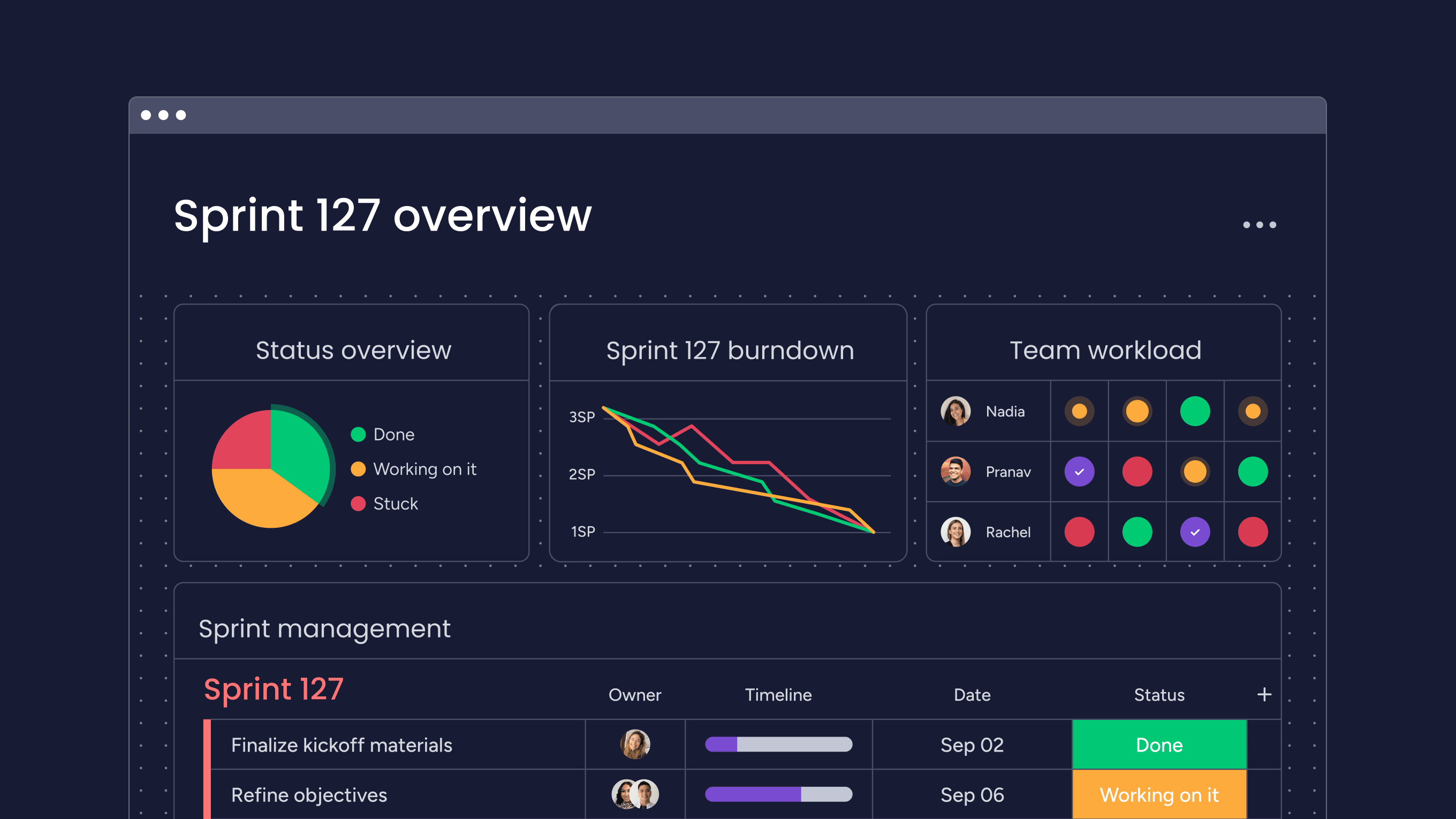
Try monday devKey takeaways
- Burndown charts visually track remaining work and progress, helping teams predict timelines and align on goals.
- They help Agile and non-Agile teams spot bottlenecks, improve transparency, and make data-driven decisions.
- Popular chart types include sprint, release, epic, and product burndown charts, each serving different project needs.
- Following best practices — like daily updates, clear task definition, review during stand-ups, and leveraging automation — maximizes chart value and project success.
- Using monday dev automates burndown chart creation, provides real-time updates, drives AI-powered insights, and enables seamless sharing.
What is a burndown chart?
A burndown chart is a straightforward graph that visualizes the amount of work remaining in a project over time. It tracks progress by plotting tasks or story points left to complete across the project’s timeline, helping teams quickly spot trends, predict deadlines, and stay aligned toward goals. Burndown charts are popular in Agile, but can benefit any project-driven team.
What are the key components of an Agile burndown chart?
The key components of an Agile burndown chart include:
- X-axis: Represents the project timeline, typically shown as days within a sprint or release
- Y-axis: Indicates the amount of work remaining in the project, measured in task estimates or story points
- Start point (estimated work): Represents the total number of tasks or work estimated at the beginning of the project
- Finish point (estimated time): Predicts when all tasks will be completed based on estimates and team efficiency factors
- Ideal burndown line: A straight, downward-sloping line from the start point to the projected completion, indicating the optimal rate of progress needed to finish on time
- Actual progress line: A plotted line showing the real amount of work remaining at each checkpoint, allowing teams to track their performance against estimates
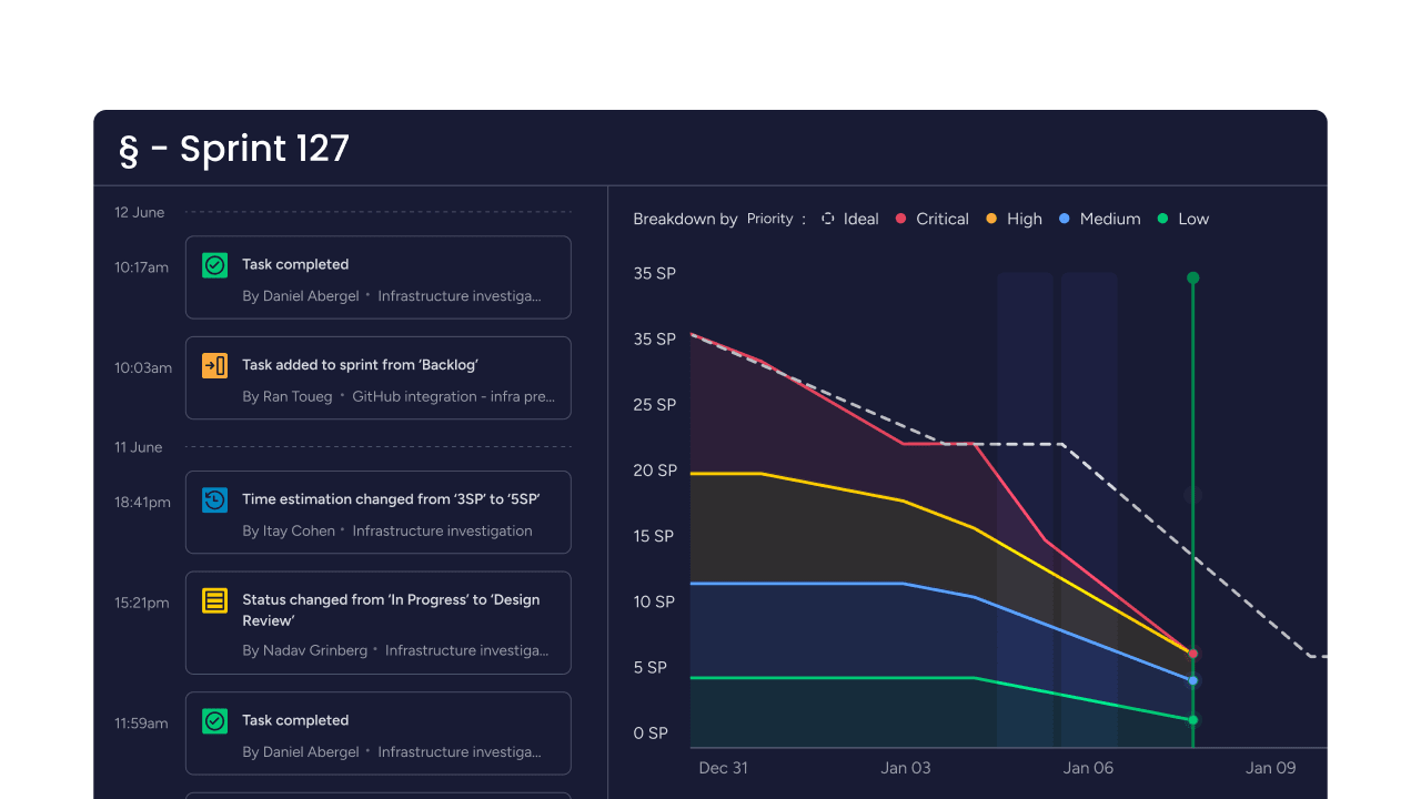
- Milestone markers (optional): Used to indicate important checkpoints or deadlines along the timeline
Types of burndown charts
There are several common types of burndown charts used across Agile projects:
- Sprint burndown chart: Tracks the amount of work remaining in a single sprint or short iteration; widely used to monitor daily progress and forecast sprint completion.
- Release burndown chart: Measures work left for a larger release, helping teams predict when product milestones will be ready for delivery.
- Epic burndown chart: Visualizes progress on long-term initiatives or epics, letting teams track multiple sprints’ work toward a strategic goal.
- Product burndown chart: Illustrates the whole project’s workload over the duration of product development, providing a high-level view of progress from start to finish.
How to read a burndown chart
Reading a burndown chart is straightforward.
The horizontal (X) axis shows time, such as days in a sprint or project. And the vertical (Y) axis shows the total work remaining, often measured in story points or tasks.
The ideal burndown line slopes down steadily, showing the daily progress needed to finish on time. The actual progress line shows real work completed each day.
If the actual line stays close to or below the ideal line, your team is on track. But if the actual line is above, you may be behind schedule and should investigate for blockers.
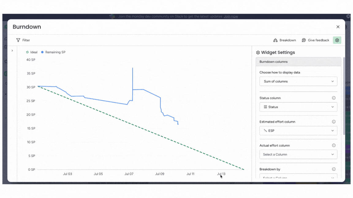
Burndown charts in monday dev automatically update these components with real-time data, making it easy for teams to visualize and interpret these trends instantly.
How to create a burndown chart
Follow these 6 steps to create a burndown chart.
- Define your project scope: List all tasks, user stories, or work items to be completed in the sprint or project.
- Estimate effort: Assign a measurable value, like story points or hours, to each work item.
- Set a timeline: Determine your sprint or project duration and mark each time interval on the X-axis.
- Set up the Y-axis: Plot your total estimated work at the top of the Y-axis.
- Draw the ideal burndown line: Create a straight line from total work down to zero, ending where the timeline finishes.
- Track daily progress: Update the chart each day by plotting remaining work. The actual progress line forms as you record updates.
For even faster setup, use a platform like monday dev, which lets you automate burndown chart creation and updates, so your team always has up-to-date, visual insights into progress.
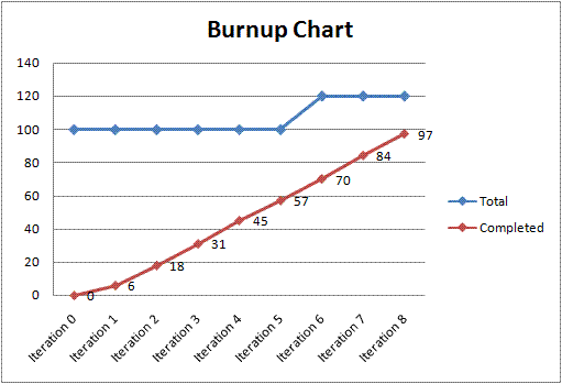
Burndown chart vs. burnup chart
The main differences between burndown and burnup charts lie in how they represent project progress:
| Burndown chart | Burnup chart | |
|---|---|---|
| Representation | Downward line showing work remaining | Upward line(s) showing work completed and total scope |
| Focus | Emphasizes the remaining work to be done within a fixed timeframe or project scope | Highlights the progress made and the total work completed, regardless of changes in scope or added tasks |
| Best for | Fixed-scope projects, daily sprint tracking | Projects with changing scope, visualizing completed vs. total work |
Burnup charts are handy if your project scope might change, while burndown charts are often preferred for straightforward tracking against fixed goals.
(Source)
Benefits of using burndown charts in Agile
The benefits of using a burndown chart include:
- Early warning system: Highlights deviations from the plan so teams can react before delays escalate
- Decision impact: Shows the effect of decisions made during the project and informs future decision-making
- Communication: Facilitates progress communication within the team and stakeholders, ensuring everyone is informed
- Estimation: Helps estimate when work will be completed based on current progress and trends
- Motivation: Encourages team members to perform better by showing progress and providing performance feedback
- Transparency: Enhances transparency by clearly comparing planned and actual progress
- Collaboration: Promotes effective collaboration by keeping everyone on the same page regarding project status and goals
5 best practices for burndown chart success
By following these practices, teams get the most insight and value — making it easier to spot trends, stay accountable, and deliver projects on time.
- Update charts daily: Keep your burndown charts up to date by recording progress each day. This ensures the team always sees an accurate snapshot.
- Define clear tasks: Break work into specific, measurable items so your chart reflects real progress, not just general effort.
- Keep scope stable: Avoid adding or changing work once the sprint begins, or clearly document any scope changes to keep charts meaningful.
- Review in daily stand-ups: Use burndown charts as a focal point for team discussions to quickly identify and address obstacles.
- Leverage automation: Use a platform like monday dev to automatically update, share, and analyze your burndown data — saving time and reducing errors.
How monday dev transforms burndown chart management
Built on monday.com Work OS, monday dev takes burndown chart management to the next level with powerful automation and AI-driven insights.
Automatic updates
Charts refresh in real time as team members complete tasks, removing manual data entry and ensuring accurate, up-to-date progress tracking.
AI-powered predictions
Built-in AI can analyze historical sprint data to forecast potential delays or risks, helping teams address issues before they impact delivery.
Custom dashboards
Visualize burndown charts alongside other key project metrics, giving every stakeholder a personalized, single source of truth.
Effortless sharing
Instantly share charts with the whole team, clients, or execs with just a click — keeping everyone aligned without extra effort.
Flexible integrations
Sync data from your favorite tools, like GitHub or GitLab, and adapt burndown charts to fit Agile, Waterfall, or hybrid workflows.
With monday dev, burndown chart management becomes smarter, more visual, and seamlessly integrated into your team’s daily work, freeing your teams to focus on building great products instead of tracking progress manually.
Ready to see how burndown charts, custom dashboards, and AI-powered insights can transform your Agile projects? Try monday dev free for 14 days.
Try monday devFAQs
How often should you update a burndown chart?
You should update a burndown chart consistently to keep it relevant and accurate. The frequency of updates can vary depending on the project's complexity and the team's preferences. Some teams prefer daily updates during stand-up meetings, while others may opt for weekly updates or updates at specific project milestones.
Who uses a burndown chart?
Various Agile teams and individuals — including Scrum masters, product owners, project managers, team leaders, and development team members — use burndown charts to monitor sprint or project progress. They are also used by stakeholders who want a transparent, visual overview of how work is progressing toward deadlines.
What is the difference between a burn chart and a burndown chart?
A burn chart typically tracks work completed (work “burned up”) over time, while a burndown chart displays the work remaining (“burning down”) toward project completion. Both visualize progress, but burndown charts make it easier to see how much work remains before a deadline.
Can burndown charts work for non-Agile teams?
Yes, burndown charts can benefit non-Agile teams in any project-driven environment. They offer a clear, visual method to track progress against goals, spot bottlenecks, and manage timelines, regardless of whether Agile methodologies are in use.
What does a healthy burndown chart look like?
A healthy burndown chart shows a steady decline from the top left to the bottom right, following or closely approaching the ideal burndown line. Minimal spikes or stalls indicate that the team is meeting its goals without major roadblocks or sudden scope changes.
How do you calculate the ideal burndown line?
You calculate the ideal burndown line by dividing the total amount of work (such as story points or tasks) by the number of working days in the sprint or project. This creates a straight line showing the pace needed to finish on time.
What burndown chart software works best for development teams?
Leading platforms for development teams include monday dev, Jira, and ClickUp. However, monday dev stands out with its flexible automations, intuitive dashboards, and AI-powered reporting, helping teams visualize, update, and analyze burndown charts seamlessly throughout the project.