Work today is fragmented. Your tasks live on project boards. Deadlines sit in shared timelines. Updates come through email and chat. Performance metrics hide in separate reports. By the time you’ve gathered everything you need to prioritize your day, you’ve already lost momentum.
A personal dashboard changes all that.
Instead of chasing context across tools, you see your work, priorities, and performance in one focused view. You know what needs attention, what’s at risk, and how your daily execution connects to larger business goals — all without switching tabs.
In this guide, you’ll learn what makes a personal dashboard effective, which metrics actually matter, and how to build one step by step. You’ll also explore how AI and automation turn dashboards from static reports into proactive, decision-ready workspaces that scale across teams.
If you want more clarity, faster decisions, and measurable control over your work, it starts with a better dashboard.
Key takeaways
- Personal dashboards centralize fragmented work information: Bringing tasks, deadlines, and metrics into one view reduces context switching and helps individuals focus on priorities that matter most.
- The right metrics turn dashboards into decision tools: Tracking workload, progress, risks, and outcomes ensures dashboards support action rather than passive reporting.
- Role-specific templates improve relevance and adoption: Dashboards tailored to functions such as project management, marketing, operations, or leadership make insights easier to interpret and apply.
- Automation and AI increase accuracy and foresight: Real-time data updates, predictive workload insights, and intelligent alerts help surface issues before they escalate.
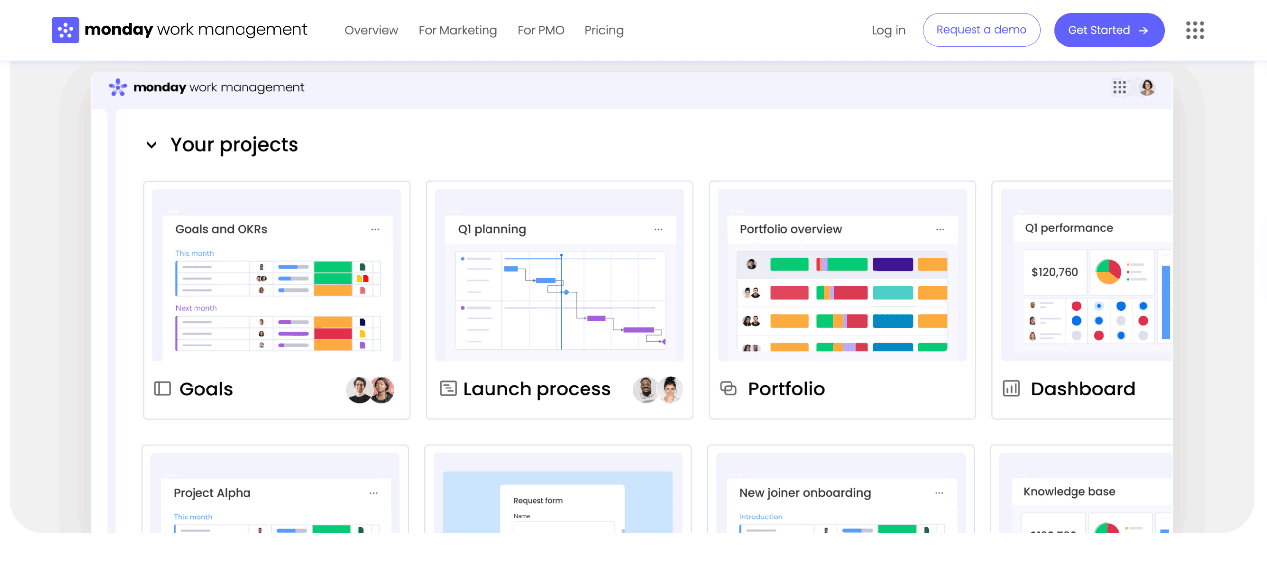
- Modern work management platforms enable scalable dashboard ecosystems: Powerful solutions like monday work management connect personal dashboards to live workflows, allowing individual views to roll up into team and executive visibility without manual reporting.
What is a personal dashboard?
A personal dashboard is a centralized work workspace that brings together workflows, metrics, and priorities in a single view. It provides a real-time snapshot of what matters most, including project deadlines, capacity indicators, performance metrics, and individual goals, all visible on one screen.
Rather than tracking information across multiple boards or systems, a personal dashboard consolidates relevant data into a focused, role-specific perspective. This approach supports faster understanding of current responsibilities while maintaining alignment with broader organizational objectives.
Unlike team or department dashboards that track collective progress, personal dashboards also filter information to show only what is relevant to an individual’s scope of work: they translate dispersed operational data into clear insights that support daily execution without losing strategic context.
The real value of personal dashboards further lies in their ability to connect individual execution with team and company goals. Seeing how day-to-day work contributes to department objectives clarifies priorities and reinforces purpose.
Organizations using monday work management often build personal dashboards as tailored layers on top of complex organizational data, preserving focus while maintaining visibility into the bigger picture.
Professional dashboards vs personal life tracking
Professional and personal dashboards do very different things, even though both organize information visually. Here’s how they compare:
| Feature | Professional work dashboard | Personal life tracking |
|---|---|---|
| Primary goal | Optimize business performance and decision-making | Improve personal habits and wellness |
| Data sources | Automated feeds from CRMs, ERPs, and project boards | Manual entry or wearable device syncing |
| Stakeholders | Managers, cross-functional teams, executives | The individual user only |
| Metrics | ROI, resource utilization, project milestones | Steps taken, hours slept, water intake |
| Security | Enterprise-grade encryption and access control | Standard consumer-level privacy |
Professional dashboards require integration with enterprise systems, adherence to security protocols, and alignment with organizational KPIs. They pull live data from multiple apps so you can make faster decisions and use your resources smarter.
On the other hand, personal life trackers focus on habit formation through manual logging and subjective measurements.
Core elements of work management dashboards
Great work dashboards aren’t just reports, they’re workspaces where you actually get things done. Here’s what your dashboard needs to drive action, not just show data:
- Real-time data visualization: Data updates instantly from your work boards, so you always see what’s happening right now, no more outdated spreadsheets.
- Customizable widgets: Drag and drop charts, numbers, or progress bars to fit your workflow, no developer needed.
- Automated data refresh: Metrics update automatically as items change status or new data enters the system, keeping decisions based on current information.
- Role-based permissions: Advanced governance controls ensure you view personal metrics while accessing only authorized organizational data.
- Integration capabilities: Connect with email, development repositories, or design software to centralize work streams into one view.
Connecting individual performance to team goals
Personal dashboards create a clear link between individual execution and organizational outcomes. This connection provides context for daily priorities and reinforces how individual contributions support shared objectives.
For example, a content marketer may track articles published on a personal dashboard. That metric rolls up into the marketing team’s lead generation KPI, which supports a broader revenue growth objective. Similarly, a developer’s issue resolution rate contributes to the product team’s stability and reliability indicators.
This layered visibility helps maintain alignment at every level. Organizations using monday work management often structure dashboards so personal views aggregate into team dashboards, department summaries, and executive overviews. The result is transparency across the organization while preserving focus on role-specific responsibilities.

Organizations using monday work management often build personal dashboards as tailored layers on top of complex organizational data, preserving focus while maintaining visibility into the bigger picture.
5 reasons you need a personal work dashboard
Modern work does not slow down. Priorities shift, requests stack up, and expectations keep rising. Without a clear system to see what matters most, it becomes easy to react instead of lead.
A personal dashboard creates that clarity. It brings structure to the noise and turns scattered updates into focused insight. Instead of juggling tools and piecing together context, you start your day with a real-time view of your priorities, progress, and performance.
Here’s why that matters:
1. Make faster data-driven decisions
When data lives in three different spreadsheets, an email thread, and a chat application, you spend more time gathering context than analyzing it, preventing data-driven decisions. A personal dashboard fixes this by putting everything you need in one place.
Picture a project manager deciding whether to approve a new feature request. Instead of hunting through multiple sources, they instantly view current resource capacity, budget burn rate, and timeline impact on one screen. You can make decisions right away instead of waiting for someone to pull a report.
2. Track progress against business objectives
Daily execution can obscure long-term progress. A personal dashboard continuously reflects how current work aligns with quarterly or annual goals, reinforcing accountability and focus.
This visibility is especially important for distributed teams, where outcomes matter more than activity. Progress indicators reveal performance trends and highlight where attention is required.
3. Reduce information overload
Work environments generate large volumes of data. Effective dashboards filter information based on relevance and urgency, highlighting only what requires action.
A designer’s dashboard, for example, may surface items assigned to them, overdue work, and pending approvals. This focused view minimizes cognitive load and enables sustained attention on meaningful work.
4. Identify issues before they escalate
Reactive work patterns often lead to stress and inefficiency. Dashboards make emerging risks visible through status changes and capacity thresholds, allowing for earlier intervention.
An operations manager may notice processing times increasing week over week on a monitoring dashboard. Addressing the trend early supports smoother execution and more predictable outcomes.
5. Demonstrate your impact
Quantifying individual contribution can be challenging in collaborative environments. Personal dashboards capture performance data over time, supporting objective discussions during reviews or planning cycles.
A customer success manager, for example, can reference improvements in resolution time across a quarter, grounding performance conversations in clear evidence.
7 essential metrics for an effective personal dashboard
The right metrics turn your dashboard from a pretty display into something that actually helps you decide what to do. These seven categories cover what you need to stay effective, no matter what your role is.
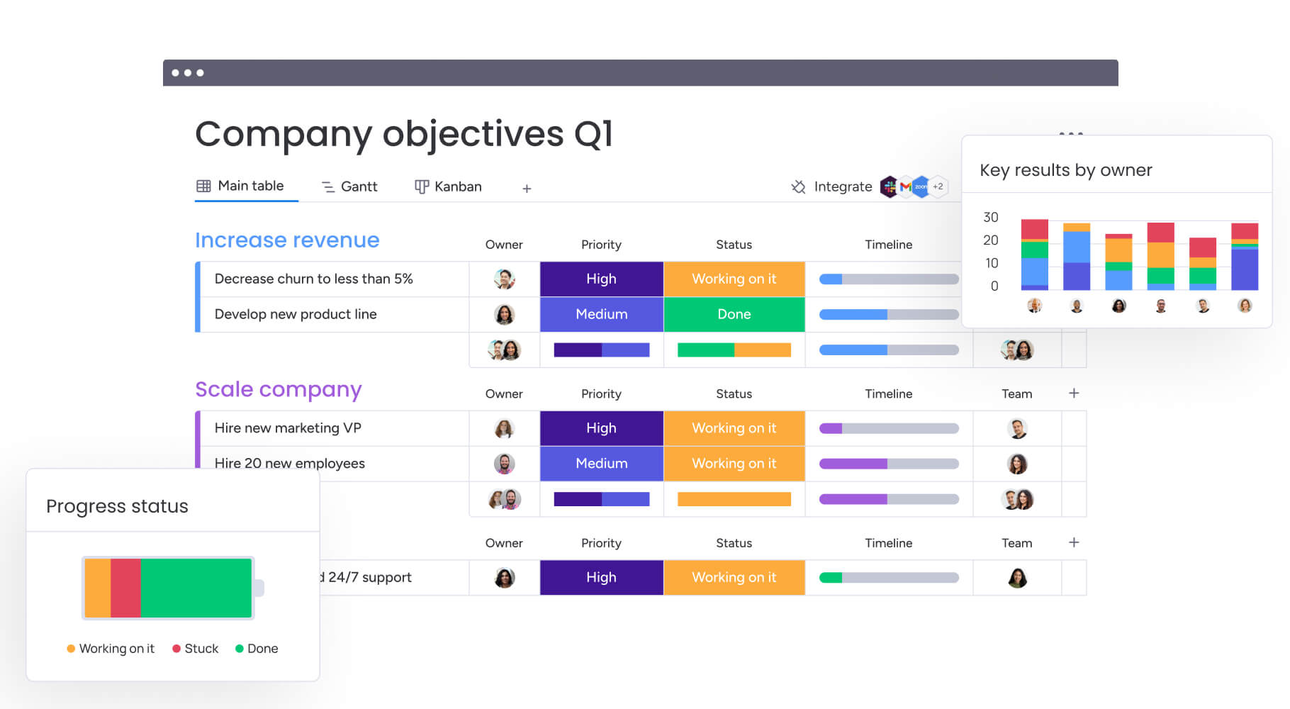
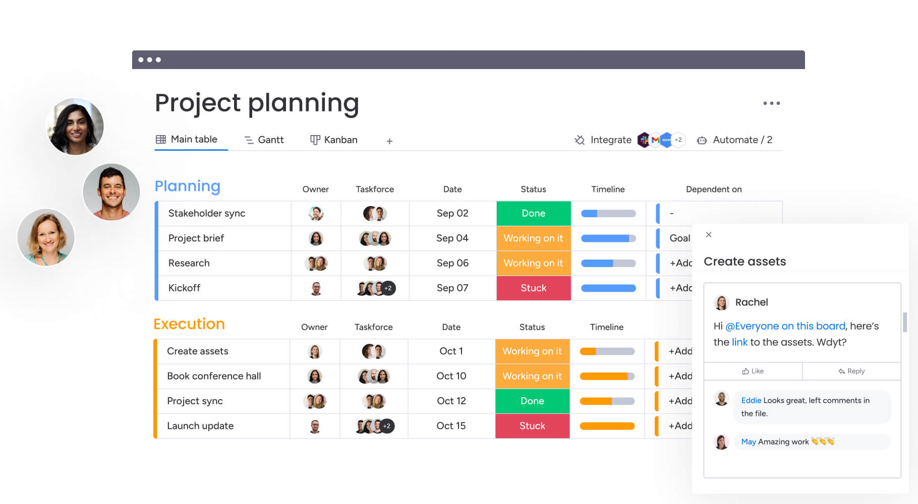
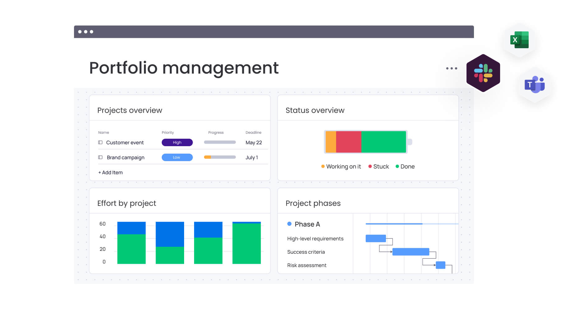
1. Project status and milestones
Tracking the heartbeat of active initiatives keeps work on schedule. This metric visualizes the lifecycle of projects from kickoff to completion.
- Metric value: Prevents deadline slippage and manages stakeholder expectations proactively.
- Visualization: Battery widgets showing percentage complete, Gantt charts for timeline overlap, or status columns indicating “on track,” “at risk,” or “stuck”.
2. Resource utilization rates
Understanding bandwidth prevents overcommitment. This metric quantifies current workload against total capacity.
- Metric value: Essential for preventing burnout and justifying headcount requests based on data rather than feeling.
- Visualization: Workload widgets showing hours allocated versus hours available per week.
3. Task completion metrics
Velocity tracking enables accurate planning. This involves monitoring the volume of work completed over specific timeframes.
- Metric value: Establishes productivity baselines and helps estimate future project timelines more accurately.
- Visualization: Number of items completed per week, average cycle time per item, or backlog reduction rates.
4. Time distribution analysis
This metric reveals where effort actually goes versus where it should go.
- Metric value: Highlights inefficiencies like excessive administrative work versus strategic work, prompting workflow adjustments.
- Visualization: Pie charts categorizing time by project, client, or work type (admin, creative, strategy).
5. Budget performance tracking
Real-time spend visibility ensures fiscal discipline for roles with financial responsibility.
- Metric value: Enables agile fund reallocation before budgets overrun.
- Visualization: Bar charts comparing “budget allocated” versus “actual spend” with variance indicators.
6. Team workload balance
Understanding team context improves collaboration, even on personal dashboards.
- Metric value: Identifies opportunities to support colleagues or delegate items, fostering balanced team environments.
- Visualization: Heatmaps showing team capacity or list views of unassigned items available for pickup.
7. Risk and issue indicators
This metric highlights friction points threatening success.
- Metric value: Shifts focus from status reporting to blocker removal, maintaining momentum.
- Visualization: Counters for “high priority bugs,” “blocked items,” or “overdue items”.
How to build your personal dashboard in 5 steps
uilding a personal dashboard is not about adding more charts. It is about designing a system that helps you think clearly and act faster.
The most effective dashboards are intentional. They reflect what success looks like in your role, pull from the right data sources, and present information in a way that makes priorities obvious. When built correctly, your dashboard becomes a daily control center, not just a visual summary.
Follow these five steps to create a dashboard that supports real decisions, not passive reporting.
Step 1: Define your success metricis
Start by identifying the three to five key performance Indicators that directly reflect your professional impact. These metrics should be actionable, meaning you can influence them, and aligned with broader company goals.
Ask yourself: what’s the one number my manager cares about most? What early warning sign would save me the most time? Pick metrics that help you make decisions, not ones that just look impressive but don’t actually guide what you do.
Step 2: Connect your data sources
Map out where relevant information lives, whether in work management boards, external CRMs, or time-tracking software. Bringing these sources together means your dashboard becomes the one place where you see accurate, up-to-date information.
Connect your tools so data updates automatically, freeing you up to focus on more strategic work. Teams using monday work management connect boards, automations, and external apps to create dashboards that update instantly as work progresses.
Step 3: Design visualizations that drive action
Data presentation determines usability. Select the right visual metaphor for each data point:
- Deadlines: Work best on calendars or timelines.
- Budgets: Shine as bar charts or numbers widgets.
- Process flows: Excel as Kanban views.
Follow the hierarchy principle: place the most critical information largest and at the top left, with supporting data following. Cut anything that clutters your view, your dashboard should be easy to scan at a glance.
Step 4: Automate data refreshing
To ensure you can always trust your dashboard, set up mechanisms for automatic updates so it reflects reality at 9:00 a.m., not yesterday afternoon.
Organizations leverage monday work management’s automation capabilities to trigger status changes, move items between boards, and update calculation columns instantly. This ensures dashboards stay current without manual intervention.
Step 5: Set up smart notifications
Finally, dashboards need an active component to alert you when you’re not looking. Configure conditional alerts based on thresholds, like notifying when “budget used” exceeds 80% or when a “high priority” item remains stuck for more than 24 hours.
The most effective dashboards are intentional. They reflect what success looks like in your role, pull from the right data sources, and present information in a way that makes priorities obvious. When built correctly, your dashboard becomes a daily control center, not just a visual summary.
Personal dashboards by role and responsibility
A personal dashboard should reflect how you make decisions, not just what data exists.
Each role operates at a different altitude. A project manager needs coordination visibility. A marketer needs performance feedback. An executive needs strategic clarity. The structure of your dashboard should match the cadence, risks, and outcomes tied to your function.
Here’s how dashboard priorities shift by role.
Project management dashboards
Project managers need air traffic control visibility. The primary focus centers on coordination, timeline adherence, and risk mitigation across multiple initiatives.
Key elements:
- Portfolio view: Shows all active project statuses at a glance.
- Resource workload widget: Identifies bottlenecks before they impact delivery.
- Timeline view (Gantt): Visualizes dependencies and critical paths.
Workflow support: This layout enables instant identification of slipping projects, resource reallocation without leaving the screen, and confident status reporting to stakeholders.
Marketing analytics dashboards
Marketing analytics dashboards need views that connect creative output to quantitative results. This dashboard bridges the gap between activity and measurable impact.
Key elements:
- Campaign performance charts: Track impressions, clicks, and conversions in real-time.
- Content calendar view: Visualize upcoming publications and deadlines.
- Budget tracker: Monitor ad spend against allocated resources.
Workflow support: This configuration enables real-time campaign optimization, ensuring budget flows toward high-performing channels while keeping the content pipeline full.
Operations monitoring dashboards
Operations roles require dashboards focused on efficiency, quality, and throughput. The goal is maintaining stability while optimizing processes.
Key elements:
- Ticket resolution times: Track support efficiency and identify trends.
- Inventory or asset utilization levels: Monitor resource allocation.
- Quality assurance pass/fail rates: Ensure standards remain consistent.
Workflow support: Visualizing process health helps operations managers spot anomalies like support ticket spikes or production speed drops, enabling immediate investigation.
Executive summary dashboards
Executive summary dashboards need high-level, aggregate views that strip away granular detail to reveal organizational health and strategic progress.
Key elements:
- Revenue versus target: Track financial performance against goals.
- Progress on strategic initiatives (OKRs): Monitor company-wide objectives.
- High-level risk indicators: Surface critical issues requiring attention.
Workflow support: This 30,000-foot view supports rapid decision-making regarding resource allocation and strategic pivots without getting lost in daily work details.
Team performance dashboards
Team leads need dashboards that balance empathy with output, focusing on capacity and individual development.
Key elements:
- Work distribution per team member: Ensure balanced workloads.
- Overall team velocity: Track collective productivity trends.
- “Stuck” item counters: Identify blockers requiring leadership intervention.
Workflow support: This view helps managers prevent burnout by redistributing work before team members become overwhelmed while identifying coaching opportunities.
Enhance your dashboard with AI capabilities
Artificial Intelligence transforms dashboards from passive displays into proactive engines of insight. By integrating AI, dashboards process vast amounts of data to surface patterns and predictions that human analysis might miss.
Automated insight discovery
AI algorithms scan underlying dashboard data to identify correlations and anomalies automatically. Instead of manually digging through rows to find why a project is delayed, AI highlights that “items assigned to the design team are taking 20% longer than average this month.”
This capability accelerates the path from data to understanding, allowing professionals to focus on solving problems rather than finding them.
Predictive workload forecasting
Using historical performance data, AI predicts future trends to aid planning. Dashboards equipped with predictive capabilities forecast that based on current velocity and upcoming deadlines, the team will reach capacity in three weeks.
This forward-looking view allows managers to hire freelancers or adjust timelines proactively, preventing bottlenecks before they occur.
Intelligent alert prioritization
AI enhances notification systems by understanding context and urgency. Rather than treating all “overdue” notifications equally, an AI-driven system distinguishes between a low-impact internal item and a critical client deliverable.
The system prioritizes alerts based on business impact, ensuring your attention goes to matters requiring immediate intervention.
AI-generated recommendations
Beyond identifying problems, AI suggests potential solutions. If a dashboard detects a budget overrun trend, AI might recommend specific cost-saving measures or highlight areas where spend can be optimized based on past successful projects.
AI enhances notification systems by understanding context and urgency. Rather than treating all “overdue” notifications equally, an AI-driven system distinguishes between a low-impact internal item and a critical client deliverable
How to scale personal dashboards organization-wide
Individual dashboards deliver value, but organization-wide adoption multiplies that impact. Successful scaling requires balancing consistency with individual autonomy while maintaining data integrity.
Balance standardization with flexibility
The most effective organizations establish dashboard templates as starting points for different roles. These templates ensure core company metrics are tracked consistently, everyone measures “time to value” the same way.
However, the system must allow individuals to add their own widgets and views. This hybrid approach guarantees leadership gets standardized reporting while employees get customized workspaces.
monday work management enables this balance through customizable templates that maintain governance while preserving individual flexibility.
Create connected dashboard networks
Dashboards shouldn’t exist in isolation. In mature work management environments, data flows vertically and horizontally:
- Individual item updates feed into team dashboards.
- Team Dashboards aggregate into department dashboards.
- Department Dashboards roll up to executive dashboards.
This connected network ensures changes at the execution level instantly reflect at the strategic level, maintaining total organizational alignment without manual report compilation.
Enable cross-department visibility
Breaking down silos requires dashboards that include relevant data from other functions. A sales manager’s dashboard should include widgets showing the product team’s “feature release roadmap.” A customer success manager needs visibility into the finance team’s “billing status” for their clients.
This cross-pollination of data fosters empathy and collaboration, as teams gain visibility into the dependencies and realities of their colleagues.
Measure dashboard impact and ROI
To justify investment in dashboarding initiatives, organizations must track effectiveness. Success metrics include:
- Dashboard adoption rate: Daily usage across the organization.
- Time saved in reporting: Reduction in manual report generation.
- Decision velocity: Speed of approval cycles and strategic pivots.
Demonstrating correlation between dashboard usage and improved business outcomes solidifies the value of the platform and encourages continued investment.
Build smarter personal dashboards with monday work management
A dashboard should not just show progress. It should help you move it forward.
monday work management is designed to make dashboards interactive, not observational. Instead of acting as a separate reporting layer, dashboards sit directly on top of live workflows. That means the same space you use to monitor performance is the space where you adjust timelines, reassign ownership, and resolve blockers.
The table below outlines how dashboards on monday work management differ from traditional BI tools and standard project platforms.
| Feature | monday work management | Traditional BI tools | Standard project tools |
|---|---|---|---|
| Ease of setup | Low-code, drag-and-drop interface | Requires data analysts/SQL | Rigid, pre-set views |
| Actionability | Click-to-edit underlying data | Read-only reports | Limited to item lists |
| Customization | Highly flexible per user role | High effort to customize | Low flexibility |
| Connectivity | Native integrations with 200+ apps | Complex API connectors | Limited integrations |
| AI capabilities | Integrated workflow AI | Analysis-focused AI | Basic or non-existent |
The difference is practical. Dashboards are fully clickable. You can drill down into any metric, open the underlying items, and make updates instantly. Insight and execution happen in one continuous flow.
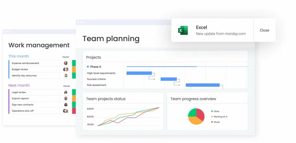
More than 30 customizable widgets — including Battery, Gantt, Workload, Numbers, and Chart views — connect directly to active boards. Every percentage complete, capacity indicator, and budget figure updates in real time as work progresses.
Built-in AI capabilities add another layer of intelligence. Teams can summarize complex updates, detect patterns across projects, and extract actionable insights automatically. At the same time, enterprise-grade permissions ensure the right people see the right data without compromising control.
Centralizing data from development, sales, marketing, and operations within the monday.com Work OS keeps personal dashboards accurate and aligned with daily execution. Instead of acting as passive monitors, dashboards become active workspaces that drive measurable progress.
“monday.com has been a life-changer. It gives us transparency, accountability, and a centralized place to manage projects across the globe".
Kendra Seier | Project Manager“monday.com is the link that holds our business together — connecting our support office and stores with the visibility to move fast, stay consistent, and understand the impact on revenue.”
Duncan McHugh | Chief Operations OfficerStart building your personal dashboard today
As work becomes more distributed across tools, teams, and timelines, professionals face growing challenges in maintaining clarity, alignment, and momentum. Information silos, manual reporting, and delayed visibility make it harder to connect daily execution with broader business objectives.
monday work management helps resolve these challenges by turning personal dashboards into connected, actionable workspaces that stay aligned with real-time execution and organizational priorities.
- Connects daily work to strategic goals: Personal dashboards roll up live task and project data into team and executive views, ensuring individual effort directly supports company objectives.
- Reduces manual reporting and context switching: Automated data updates and integrations eliminate the need to chase updates across tools, saving time and reducing errors.
- Supports smarter decisions with real-time visibility: Up-to-date metrics, workload insights, and risk indicators help individuals and leaders act with confidence.
- Scales across teams without added complexity: Flexible templates and role-based permissions enable consistency at the organizational level while preserving individual focus.
- Enhances alignment through shared data: Connected dashboards improve cross-team transparency and coordination without introducing additional meetings or reporting layers.
By transforming personal dashboards into dynamic, data-connected workspaces, teams gain greater efficiency, stronger alignment, and measurable strategic impact, all without increasing operational overhead.
Frequently asked questions
What is the difference between personal dashboards and team dashboards?
The primary difference between personal and team dashboards is their focus. Personal dashboards filter data to show only metrics and items relevant to an individual's specific role, while team dashboards aggregate collective performance data to track shared goals and group progress.
How much time does it take to build a personal dashboard?
The time it takes to build a personal dashboard can be very short. With a low-code platform like monday work management, you can configure a functional personal dashboard in less than 30 minutes. Refining it to perfectly match evolving workflows is an ongoing, agile process.
Can I view my personal dashboard on mobile devices?
Yes, modern work management platforms offer fully responsive mobile applications. This allows professionals to access real-time dashboard insights and update statuses from anywhere.
Which work applications can connect to personal dashboards?
Personal dashboards typically integrate with a wide ecosystem of applications. These include CRM dashboards (Salesforce), development platforms (Jira, GitHub), communication apps (Slack, Microsoft Teams), and file repositories (Dropbox, Google Drive).
How do I keep my dashboard data secure?
Data security is managed through role-based access controls and enterprise-grade encryption. This ensures that while users can visualize data on their dashboard, they can only access information their permissions explicitly allow.
What makes a personal dashboard effective for work management?
An effective dashboard displays real-time data that directly informs daily decisions and aligns individual output with high-level business objectives. It must be relevant, actionable, and connected to the systems where work actually happens.