


A significant portion of projects exceed their original budgets or miss their scheduled deadlines. The root cause isn’t always poor planning. It’s often a lack of real-time visibility into how a project is actually performing against its baseline. Without a reliable way to compare planned versus actual progress, teams are left reacting to problems instead of anticipating them.
An S-curve is a cumulative line chart that plots project metrics like cost, labor hours, or earned value against time. The name comes from its characteristic shape: progress starts slowly during initiation, accelerates steeply during execution, and then tapers off as the project approaches completion. When you overlay planned, earned, and actual cost curves on the same chart, the gaps between them reveal exactly where a project is ahead, behind, or over budget. This guide covers the S-curve’s mathematical foundations, six specific types, step-by-step construction, and a look at how monday.com’s AI Work Platform can automate the manual effort.
Key takeaways
- An excel summary template is a pre-built spreadsheet with defined columns, formulas, and formatting that turns raw data into a structured report you can reuse.
- The primary benefit is consolidation: one template pulls figures from multiple sources into a single, scannable view that saves hours of manual assembly.
- Multiple template types exist for different reporting needs, including financial summaries, project status updates, expense tracking, sales performance, and weekly team reports.
- Building a template manually requires defining your reporting scope, setting up source sheets with consistent formatting, and applying formulas like SUMIF, COUNTA, and AVERAGEIF.
- Teams with complex reporting needs often outgrow spreadsheets and benefit from a platform like monday.com’s AI Work Platform, which offers live dashboards, automations, and 200+ integrations for real-time reporting.
What is an Excel summary template?
An Excel summary template is a pre-formatted spreadsheet designed to collect, organize, and display data from one or more sources in a concise, repeatable layout. Think of it as the reporting skeleton you build once and reuse every week, month, or quarter without rebuilding column headers, formulas, or formatting from scratch.
A summary sheet is a single tab within a workbook that aggregates data from other tabs. A summary template goes further: it includes predefined column headers, built-in formulas, conditional formatting rules, and a consistent structure you can duplicate for future reporting cycles. The template does the structural thinking so you only need to supply the raw numbers.
Who uses them? Finance teams roll up revenue and expense data across business units. Project managers consolidate milestone status across multiple workstreams. Operations leads track KPIs from different departments in a single view. Sales directors combine pipeline numbers from regional teams into one forecast. If your job involves turning scattered figures into a single story for leadership, you’ve almost certainly needed one of these.
The key difference between a blank spreadsheet and a proper template is reusability.
A template includes the logic, formatting, and structure that makes each new report consistent with the last. That consistency isn’t just about aesthetics; it means your stakeholders always know where to look for the numbers they care about.
How to create an Excel summary report: 5 steps
Ready to build your own excel report template from scratch? What does a solid setup process actually look like? Follow these five steps and you’ll have a reusable reporting framework in under an hour.
Step 1: Define your reporting scope
Start by answering three questions: What data are you summarizing? Who will read the report? How often will it run? A weekly team update has very different requirements than a quarterly financial rollup for the board.
Write down the specific metrics you need to track, the time period each report should cover, and who your audience is. An executive summary for the C-suite requires high-level totals and trend indicators, while a departmental report may need line-item detail. Getting the scope right prevents you from building a template that’s either too granular or too high-level for its intended readers.
Step 2: Set up your source sheets
Organize your raw data into dedicated tabs within the same workbook. Each source sheet should follow a consistent structure: one header row, one data type per column, no merged cells, and no blank rows in the middle of your dataset.
Consistent formatting across source sheets prevents formula errors later. If every regional sales sheet uses column A for dates, column B for product names, and column C for revenue, your summary formulas can reference the same cell ranges across all tabs. If you’re also tracking project timelines alongside your summary, Gantt chart templates in Excel can help you visualize dependencies in a separate tab while keeping your data structure intact.
Step 3: Create a summary tab with output columns
Add a new sheet labeled “Summary” or a name that matches your specific report type (like “Q2 Financial Summary” or “Weekly Status”). Build your column headers to reflect exactly what stakeholders need to see: category names, totals, period-over-period changes, status indicators, and variance calculations.
Keep the layout scannable by grouping related metrics together. Place the most important numbers in the first few columns so readers get the headline view without scrolling. Consider adding a “Notes” column at the end for context that numbers alone can’t convey.
Step 4: Use summary formulas
This is where the template earns its value. Use SUMIF to total values by category, COUNTA to count completed items, and AVERAGEIF to calculate conditional averages. We’ll break down each of these formulas in the dedicated section below.
Link every calculation back to your source sheets so data updates flow automatically when source data changes. Avoid hardcoding any values in your summary tab. If a number appears in the summary, it should be calculated from source data, not typed in manually. This single habit eliminates the most common source of reporting errors.
Step 5: Apply formatting, freeze headers, and save as template
Add conditional formatting to flag outliers and draw attention to values that need action. Red for over-budget items, green for completed milestones, yellow for at-risk deadlines. Freeze the top row so headers stay visible while scrolling through large datasets.
Apply number formats (currency, percentages, dates) consistently across the entire template. Then save the file as an Excel template (.xltx) so every new report starts from the same foundation — Microsoft’s official Excel template guide walks through this process in detail. This way, your original template stays untouched while each new report becomes its own file.
How to create a summary report from multiple Excel tabs

Pulling data from several sheets into one summary is one of the most common Excel challenges. How do you aggregate numbers from five regional reports, ten project trackers, or a dozen department budgets into one consolidated view? There are two reliable approaches, plus a more advanced option for larger datasets.
3D references let you sum identical cells across multiple sheets with a single formula. The syntax =SUM(Sheet1:Sheet5!B2) adds up cell B2 from every sheet between Sheet1 and Sheet5. This works well when all tabs share the same layout, such as regional sales reports with identical column structures. The main requirement is that sheet names must be contiguous in the workbook’s tab order.
INDIRECT formulas give you more flexibility when tab structures vary. By combining INDIRECT with CONCATENATE or ampersand operators, you can dynamically reference different sheet names stored in a cell. For example, =SUM(INDIRECT("'"&A1&"'!B2:B50")) pulls data from whichever sheet name appears in cell A1. This is especially useful when tab names change each reporting period, like “January Sales” becoming “February Sales.”
Power Query handles the heavy lifting when you’re combining dozens of tabs or pulling from external files. It lets you define transformation steps once (filtering, renaming columns, changing data types), then refresh the entire summary with a single click. For recurring reports that draw from multiple workbooks or CSV exports, Power Query reduces manual work significantly and handles data cleanup that formulas can’t.
Where does this approach break down? When multiple people edit source sheets simultaneously, version conflicts appear fast. When data needs to update in real time rather than on manual refresh, spreadsheets can’t keep pace. And when stakeholders need filtered, view-only access to specific slices of the data, sharing a single Excel file becomes a coordination headache that grows with every new person who needs access.
Get started4 summary formulas every Excel user should know
Formulas transform a static excel sheet template into an automated reporting engine. Without them, you’re just copying and pasting numbers manually. Here are the four you’ll rely on most when building summary reports, each with its syntax, purpose, and a practical example.
SUMIF
Adds values that meet a specific condition. Syntax: =SUMIF(range, criteria, sum_range). If you want the total revenue for “North Region” across a sales data sheet, use =SUMIF(A2:A100,"North Region",C2:C100). This formula scans column A for rows matching “North Region” and sums the corresponding values in column C. It’s the backbone of most financial and sales summary templates because it lets you total figures by category without filtering or sorting your source data.
COUNTA
Counts non-empty cells in a range. Syntax: =COUNTA(range). Use it to track how many items have been assigned, how many clients have submitted forms, or how many line items exist in a dataset. For example, =COUNTA(D2:D500) tells you exactly how many entries exist in a status column. Simple but essential for any status-based summary where you need to know completion counts at a glance.
AVERAGEIF
Calculates the average of values that meet a condition. Syntax: =AVERAGEIF(range, criteria, average_range). Need the average deal size for enterprise accounts only? =AVERAGEIF(B2:B200,"Enterprise",D2:D200) handles it. Pair this with SUMIF for a complete statistical picture that includes both totals and averages segmented by any criteria you choose.
INDIRECT
Returns a reference specified by a text string. Syntax: =INDIRECT(ref_text). This formula is especially powerful in multi-tab summaries because it lets you build dynamic references that change based on cell values. Combine it with dropdown lists and you can create a summary that switches between data sources without editing any formulas. For example, if cell A1 contains a month name, =SUM(INDIRECT("'"&A1&"'!C2:C50")) pulls totals from whichever month the user selects.
5 types of Excel summary templates for business
Not all summary reports serve the same purpose, and using the wrong format wastes time and confuses your audience. Here are five excel report template formats that cover the most common business scenarios, along with what each should include and when to use them.
Financial summary template
A financial summary template consolidates revenue, expenses, and profit data into a period-over-period view that finance teams can present to leadership. Finance managers use it for monthly close reporting, quarterly board updates, and annual budget reviews. It’s the template most likely to end up in front of executives, so accuracy and formatting both matter.
- Revenue breakdown: totals segmented by product line, region, or business unit so leadership can see where growth is coming from
- Expense categories: fixed costs, variable costs, and one-time charges separated so budget variances are easy to identify
- Variance columns: budget vs. actual with percentage differences highlighted through conditional formatting
- YTD totals: running sums that update automatically as new months are added to the workbook
- Trend indicators: period-over-period arrows or color coding that show whether metrics are improving or declining
For a more comprehensive financial reporting setup, a financial statement template can complement your summary with income statements and balance sheet views that give the full picture.
Project status summary template
A project status summary template gives stakeholders a single-page view of progress across all active projects. It’s used in weekly standups, steering committee meetings, and portfolio reviews where leaders need to quickly assess which projects are on track and which need attention. Here’s what to include:
- Project name and owner: accountability at a glance so everyone knows who to follow up with
- Status indicator: on track, at risk, or delayed, with color coding for instant recognition
- Milestone completion: percentage or count of completed deliverables against the total planned
- Key blockers: one-line description of current obstacles preventing progress
- Next steps: upcoming actions with target dates and responsible owners
Pairing this with a business executive summary template helps you tailor the level of detail to different audiences, from tactical project leads to strategic executives.
Expense report summary template
An expense report summary template tracks and categorizes business spending across teams, projects, or time periods. It’s essential for reimbursement workflows, budget monitoring, and audit preparation where every dollar needs documentation and approval. Make sure to include:
- Expense categories: travel, software, supplies, meals, and miscellaneous, with room for custom categories specific to your business
- Submitter details: name, department, date submitted, and approval status to track the reimbursement pipeline
- Receipt tracking: columns for receipt numbers, attachment references, or links to scanned documents
- Category totals: SUMIF formulas that auto-calculate spending by type so you can spot trends before they become problems
- Policy compliance flags: conditional formatting that highlights expenses exceeding per-diem limits or requiring additional approval
For a ready-made version with built-in calculations and formatting, check out this Excel spreadsheet for business expenses that you can customize to match your organization’s expense policies.
Sales summary template
A sales summary template aggregates pipeline data, closed deals, and rep performance into a digestible format that sales directors can use for forecasting and performance management. It’s the template that answers “How are we tracking against quota?” every week. Here’s what you need to include:
- Pipeline stages: deals grouped by qualification, proposal, negotiation, and closed-won, with weighted values for forecasting
- Revenue by rep: individual performance against quota with percentage-to-goal calculations
- Win/loss ratio: conversion rates across the funnel that reveal where deals are stalling
- Average deal cycle: days from first contact to close, segmented by deal size or product type
- Forecast accuracy: comparison of predicted vs. actual close rates from prior periods
Weekly team report template
A weekly team report template summarizes completed work, in-progress items, and upcoming priorities for a specific team. Managers use it to keep leadership informed and maintain accountability without scheduling extra status meetings that pull people away from their work. Be sure the template covers:
- Completed this week: deliverables finished with links to outputs or documentation where applicable
- In progress: active items with expected completion dates and current percentage complete
- Blocked items: anything stalled, with a description of the blocker and who can resolve it
- Next week’s priorities: top 3-5 focus areas ranked by business impact or deadline urgency
- Team capacity notes: PTO, resource constraints, or upcoming deadlines that could affect delivery
The benefits of using an Excel summary template
Beyond saving time on initial setup, excel summary templates deliver specific operational benefits that compound over every reporting cycle. What makes them worth the upfront investment in building and maintaining?
- Consistency across reporting cycles: Stakeholders know exactly where to find key numbers when every report follows the same structure. PMI research on project reporting confirms consistent formats reduce interpretation time. After three months, leadership can scan summaries in seconds instead of re-learning layouts each week.
- Reduced formula errors: Pre-built formulas are tested once and reused indefinitely, eliminating accidental cell reference mistakes or misapplied conditions. This is especially valuable for financial summaries where a single error can cascade through dependent calculations.
- Faster onboarding for new team members: New hires don’t need to reverse-engineer the reporting process. The template documents the structure, formulas handle the math, and training time drops from hours to minutes.
- Cross-team standardization: When all departments use the same format, comparing data becomes straightforward. Leadership gets an apples-to-apples view without reconciling different layouts, naming conventions, and calculation methods.
- Audit trail for compliance: Version-controlled naming and consistent formatting make it simpler to trace reporting history during audits. For teams managing compliance risks, a risk register template pairs well with summary reporting to track mitigation actions alongside operational data.
When Excel summary templates fall short
Excel summary templates work well for individual contributors and small teams with straightforward reporting needs. But as your organization scales, certain limitations become impossible to work around. Are spreadsheets really the right foundation for your growing reporting requirements?
- Multiple contributors and version conflicts: When several people edit the same file, changes get overwritten. Even with cloud-based Excel, simultaneous editing creates merge conflicts that risk replacing approved data with draft versions.
- Real-time data needs: Excel summaries are snapshots that age the moment you close the file. Manual refreshes can’t keep pace when teams need live figures for fast decisions.
- Cross-department summary management: Consolidating reports from multiple departments means chasing different file owners on different timelines. When one department changes their format, summary formulas break.
- Stakeholder view-only access: Sharing Excel files with executives means either locking permissions (and fielding access requests) or risking accidental edits to formulas and formatting.
- Recurring automated reports: Excel requires manual intervention or complex macros to deliver scheduled reports. There’s no built-in way to automate generation and distribution.
How monday.com handles reporting beyond Excel
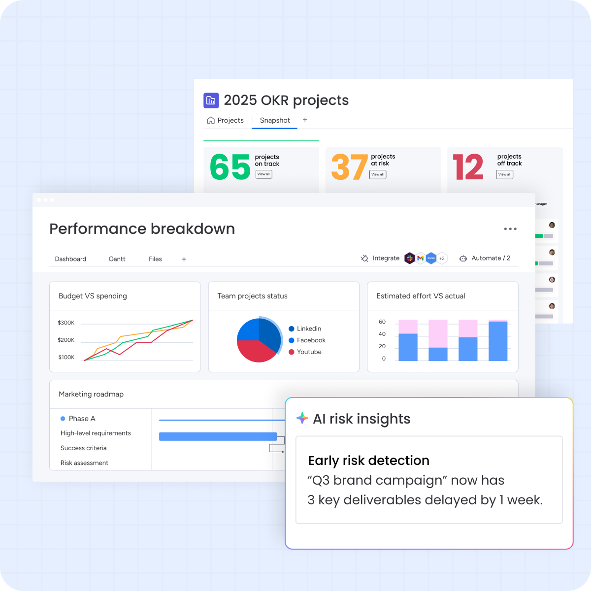 When your reporting needs outgrow spreadsheets, monday.com’s AI Work Platform provides a structured environment where data flows in real time, reports generate themselves, and every stakeholder sees the latest numbers without anyone clicking refresh. The platform eliminates the manual assembly work that eats up hours every reporting cycle, replacing it with automated workflows that keep summaries current as work progresses.
Instead of chasing down updates across multiple files and departments, you get a single source of truth that connects to the systems your teams already use. Real-time dashboards, intelligent automations, and AI-powered features handle the repetitive parts of reporting so you can focus on what the numbers actually mean and what actions they require.
AI-powered dashboards with drag-and-drop widgets
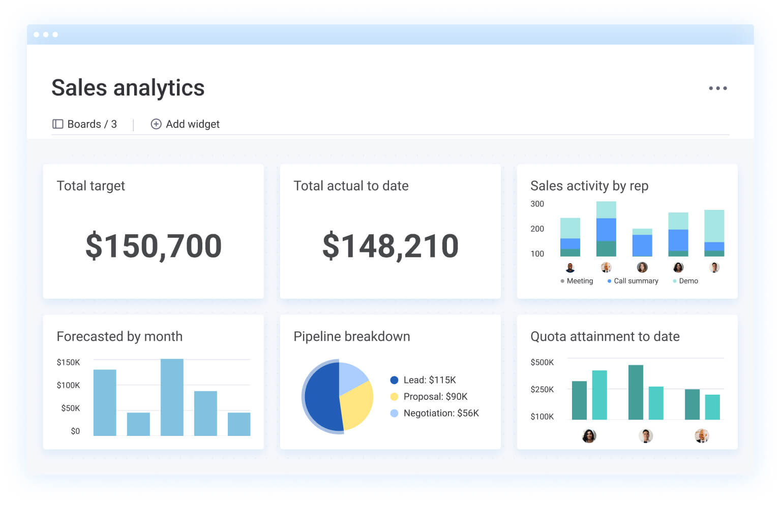
Build custom dashboards using 10+ widget types, including charts, number summaries, timeline views, battery indicators, and workload breakdowns. Every widget pulls live data directly from your boards, so the dashboard is always current the moment you open it. No formulas to maintain, no manual refreshes, no risk of stale data. Drag a battery widget onto your dashboard and instantly see project completion percentages across every active initiative, or add a chart widget to visualize spending trends by department, all updating in real time.
Intelligent automations for recurring reports

Set up automations that generate and distribute reports on any schedule you choose, without writing a single macro. “Every Friday at 3 p.m., send a project status summary to the steering committee.” “When a budget line exceeds its threshold, notify the finance lead immediately.” “When all items in a group reach ‘Done’ status, update the project milestone and alert the project sponsor.” You configure the logic once and it runs on its own, indefinitely.
AI assistant for instant insights

Ask questions in plain language and get immediate answers pulled from your actual project data. “Which projects are over budget this quarter?” “Show me completion rates by team.” “What’s blocking the product launch?” The AI assistant analyzes your boards, surfaces patterns, and delivers insights without requiring you to build formulas or pivot tables. It turns hours of manual analysis into seconds of conversation.
200+ integrations for automated data flow

Connect QuickBooks for financial data, Salesforce for pipeline metrics, Google Sheets for collaborative inputs, and Slack for instant notification delivery. Data flows into your boards automatically, which means your dashboards and summaries stay accurate without manual imports or copy-paste workflows. The platform connects to the systems your teams already use, pulling data into one place instead of asking you to manually export and reconcile.
Explore monday.com’s AI Work Platform to see how these capabilities work together for your reporting needs. If you’re looking for a head start, grab a free project management template that includes built-in dashboards and automations ready to customize. And for teams already tracking expenses in spreadsheets, you can compare your current process against a purpose-built expense tracking solution to see the difference live data makes.
From spreadsheets to smarter reporting
An excel summary template is a practical starting point for consolidating data into repeatable, professional reports.The formulas, structures, and template formats covered in this guide give you the foundation to build summaries that save hours every reporting cycle and keep your stakeholders consistently informed.
But as teams grow and stakeholders demand real-time insights, file-based reporting often becomes a friction point that slows down decisions. When you’re ready to move beyond spreadsheets, platforms like monday.com’s AI Work Platform offer live dashboards, intelligent automations, and seamless integrations that turn scattered data into confident decisions, faster.
Get startedFAQs
What is an Excel summary sheet?
An Excel summary sheet is a single tab within a workbook that consolidates key data points from multiple source sheets into one organized view, typically using formulas like SUMIF and COUNTA to aggregate figures automatically.
How do I make a summary in Excel?
To make a summary in Excel, define your reporting scope, set up source data sheets with consistent formatting, create a summary tab with output columns, apply aggregation formulas like SUMIF and AVERAGEIF, and then format the layout for readability before saving as a reusable template.
How do I create a summary report in Excel from multiple tabs?
To create a summary report from multiple tabs, use 3D references like =SUM(Sheet1:Sheet5!B2) for identically structured sheets, or use INDIRECT formulas for dynamic sheet name references. Power Query is the preferred option when combining dozens of tabs or external data files.
How do I use summary formulas in Excel?
Summary formulas in Excel include SUMIF for conditional totals, COUNTA for counting non-empty cells, AVERAGEIF for conditional averages, and INDIRECT for dynamic cell references. Apply each formula in your summary tab, referencing source data sheets so calculations update automatically when inputs change.
Can monday.com's AI Work Platform replace Excel summary templates?
Yes. The AI Work Platform offers live dashboards with 10+ widget types, 27+ project views, automations for scheduled reporting, and 200+ integrations that pull data from systems your teams already use. It handles multi-contributor workflows, real-time updates, and stakeholder access controls that spreadsheets can't match.
Where can I find free Excel summary templates?
Microsoft provides a library of free Excel templates through Office.com. Navigate to the Templates section, filter by Excel, and browse categories like finance, project management, and budgets to find a starting point for your summary reports.

 Get started