Workflow charts are a way of visualizing complex information involved in each step of a process with the overall goal of making things easier to understand.
This method isn’t so different from the way we learned in our school days, whether it was the scientific management of an experiment’s process, or referring to a poster that shows the steps of gathering information to take an idea from brainstorm to final essay. When you create a workflow diagram or chart, you’re essentially executing a process to improve your final outcome.
In this article, brush up on the basics workflow charts, including definition, examples, and how to draw inspiration from unified modeling language to map out and streamline your processes.
What is a workflow chart?
A workflow chart or diagram exists to visualize a process. It uses well-known symbols and shapes to identify different stages of a process, and arrows to connect them all. The end result is a picture that allows you to see how you’ll progress from start to finish.
Workflow charts are used to help team members understand where their tasks fit into the big picture. Once created, you have a sort of map that gives you an overview of a business process. While they do have standardized symbols in place to help you best understand a process’s steps, they aren’t always the best representation of a business process.
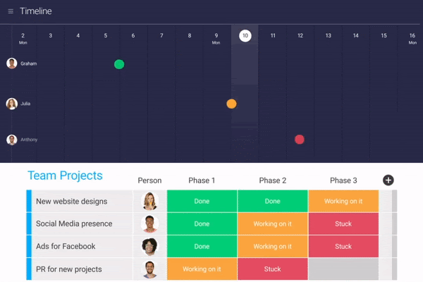
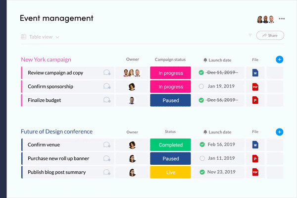
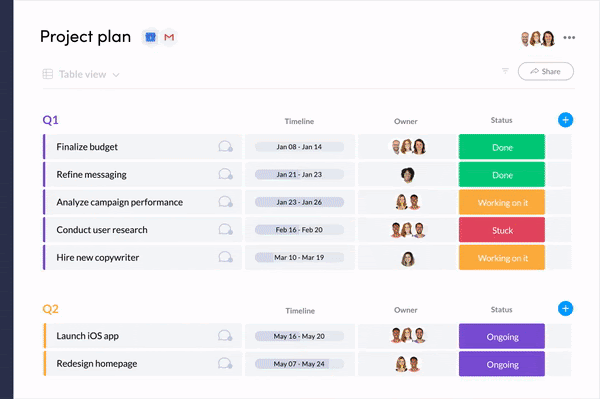
In fact, there are many other visual tools that make workflow management a lot easier—like dynamic tables, Gantt charts, timelines, and Kanban boards:
In fact, 76% of executives say project management tools like monday.com will be the new normal for businesses in the future. To better understand how a workflow chart could be an excellent foundation for your team, let’s explore more.
Workflow chart: terms to know
Here are a couple of terms that will be helpful when preparing your workflow chart.
- Process Documentation
- Business Process Mapping
What’s the difference?
Documentation usually focuses more on the step-by-step details. It’s often used to provide training materials for new hires, so they can follow every step in a process. Process mapping tends to be more about the flow. It covers less of how to do each step and more about the sequence of steps and how they all fit together. It’s good for identifying bottlenecks and potential for improvements.
Workflow chart vs. diagram, data flow diagram, and flowchart
There are a lot of terms that describe a workflow chart, including flowchart and data flow diagram. A flowchart simply leads you through the steps. It’s built on basic cause and effect. Once A happens, B will happen next, and so on. Data flow diagram (DFD) takes into account the bigger picture. It leads you through the steps, while also taking into account where things come from, where they end up, and whether or not steps will need to be repeated.
How do you create a workflow chart?
The creation of a workflow chart follows the same basic steps as the creation of any workflow:
- Define the goal of your chart template: Whether you’re looking to communicate business processes to management or how tasks will move through a team, pick your audience before you start.
- Define your start and end point: These pillars will ensure that you’re capturing the whole process — as long as they’re accurate. For example, if you’re working to ship a new product, where does that project end? At beta? At the first sale?
- Collect data from your team: They’ll likely have a lot of great information on how you can eliminate inefficiencies and repetitive work that they’ve experienced in the past.
- Design the workflow: We’ll discuss the symbol structure in the next section, but now’s the time to get the basic steps in order.
- Analyze results: Once your plans are in motion, collect feedback and data that you can use to gain insights and make data-driven decisions.
Want to create workflows automatically and manage them all in one platform? You need a workflow automation software.
Understanding the symbols and shapes of a workflow chart
In a workflow chart, the shapes are meaningful — not just pretty. Here’s the standard lexicon:
- Oval: Your start and end points.
- Rectangle: Instructions or actions on behalf of a team.
- Diamonds: Decisions, which typically lead to a yes or no, and create a fork in the chart at horizontal or vertical points.
- Arrows: What connects actions and decisions.
- Circles: Connectors used to bypass other steps, and also explain why.
You can of course define the meaning of your own shapes if it makes more sense for your project. We’ll walk you through some examples so you can see how the shapes all fit together.
Types of workflow diagrams (with templates and examples)
There are several types of workflow charts or diagrams, some of which allow for more detail for particularly complex projects. Here are some of the most common, with examples and templates that you can use to get started.
Process flow
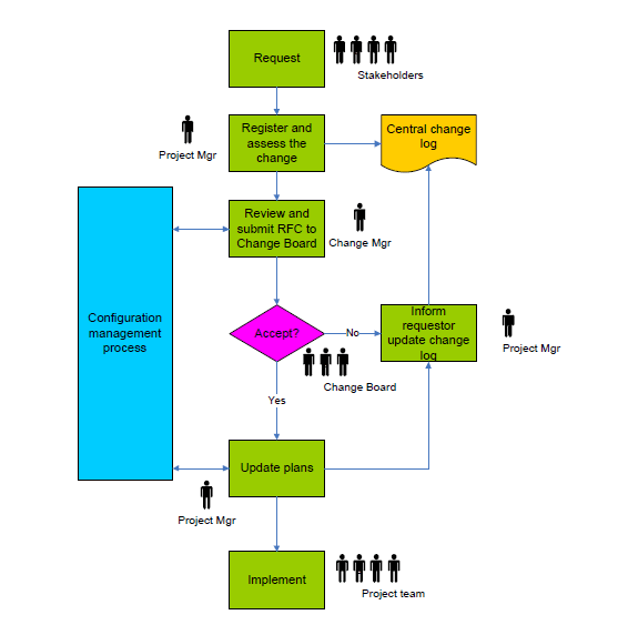
This type of workflow chart is the most commonly used to make sure team members are kept on track when there are multiple people (or even teams) that need to take part in a single project.
In this example, you can see the process from request to implementation, including the review of the request and what happens if it’s not approved. Download the template here.
Swim lane diagram
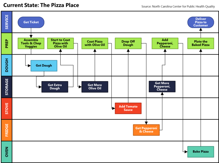
A swim lane flowchart is built as a metaphorical pool, where every step stays in its “lane.” These lanes add another layer of organization. For instance, you could have steps in a process, and each “lane” is dedicated to a particular employee or team.
The following example uses a swim lane diagram to depict the process of creating a pizza, while adding another layer of organization by attributing an area of the kitchen to each “lane.”
Business Process Modeling Notation (BPMN)
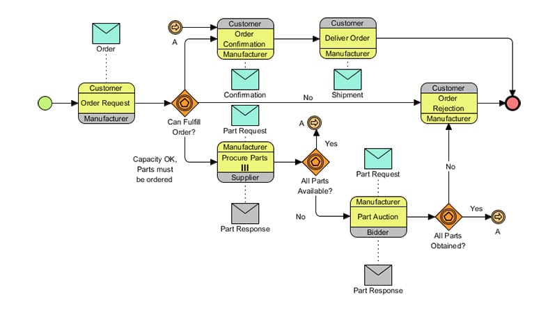
A BPMN is a detailed version of a flow chart or swim lane chart that follows a very specific set of rules put in place by the Object Management Group (OMG), which is currently the standard for business modeling. The following depicts a white-label example of how a company might handle the sale of product from order, to manufacturing, to shipment:
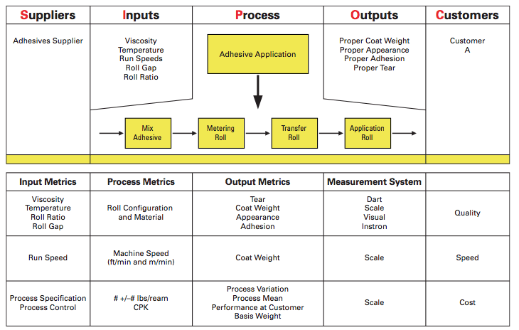
Suppliers Inputs Processes Outputs Customers (SIPOC)
A SIPOC specifically focuses on the inputs and outputs of a business process. When complete, it looks like a hybrid between a flowchart template and a swim lane diagram, only the lanes are always used to organize the process by supplier, input, process, output, and customer.
It’s most typically used in manufacturing, like the following example, which depicts the process to create a paint product from supplier to the customer:
No matter what type of flowchart you use, they’re all static images that make it hard to drill down into specific tasks, or to see how a particular project is progressing in real time. monday.com is the remedy to this challenge.
Replace your workflow chart with monday.com
monday.com Work OS provides project managers with everything they need to be successful, including creating a dynamic and visual breakdown of their projects like:
- 11+ views
- Customizable colors
- 34+ columns
- Multiple assignees
- monday workdocs
- Dynamic dashboards and widgets
All of these — and more! — combine to form a easy-to-use and beautiful user interface (UI) that your team will be excited to log into every day. monday.com can eliminate time wasted having to constantly refer to a hard copy to see who is in charge, or nudging someone to take the next step. Our boards allow you to quickly see owners and even set up automations according to date or status change to send helpful notifications and reminders.
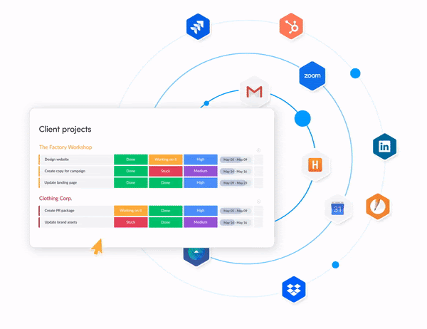
You can also integrate with tons of other tools and platforms so that operations run smoothly within your tech stack.
The best part, which is consequently the hardest part of working with a workflow chart, is that making changes on the go is incredibly easy and non-disruptive. Our drag and drop interface means that you don’t have to reinvent the wheel if you realize along the way that tweaking your process will make you more efficient. You can even create your own templates to be used again and again or get started with one of 200+ we offer in our Template Center.
Workflow charts for the future of work
The workflow chart is a traditional — but outdated — way to visualize your business processes. If you’re considering a workflow chart to streamline your projects, there’s a better way that won’t require recreating an image every time you need to make a change.
Consider embracing a Work OS like monday.com so that your process, work management, reporting and communication can all live under one happy roof. If you want something that goes (way) beyond a workflow chart and well-beyond traditional project management tools, we’ve got the work management support you’re craving.

