
A significant portion of projects exceed their original budgets or miss their scheduled deadlines. The root cause isn’t always poor planning. It’s often a lack of real-time visibility into how a project is actually performing against its baseline. Without a reliable way to compare planned versus actual progress, teams are left reacting to problems instead of anticipating them.
An S-curve is a cumulative line chart that plots project metrics like cost, labor hours, or earned value against time. The name comes from its characteristic shape: progress starts slowly during initiation, accelerates steeply during execution, and then tapers off as the project approaches completion. When you overlay planned, earned, and actual cost curves on the same chart, the gaps between them reveal exactly where a project is ahead, behind, or over budget. This guide covers the S-curve’s mathematical foundations, six specific types, step-by-step construction, and a look at how monday.com’s AI Work Platform can automate the manual effort.
Key takeaways
- Visual performance tracking: An S-curve is a cumulative performance chart that plots cost, hours, or earned value against time, making budget and schedule variances visible at a glance.
- Six curve types: There are six types of S-curves, each tracking a different project dimension: Baseline cost, actual cost, earned value, labor hours, progress percentage, and quality maturity.
- Reading the gaps: Reading an S-curve correctly involves comparing the gaps between the planned value (PV), earned value (EV), and actual cost (AC) curves to identify schedule or cost variances early.
- The 50/70 benchmark: If your project hasn’t earned 70% of its planned value by the 50% schedule mark, corrective action is likely needed.
- Automated tracking: monday.com’s AI Work Platform automates S-curve tracking through Chart Widgets, Gantt baselines, Workload Views, and automations that replace manual spreadsheet updates.
What is an S-curve in project management?
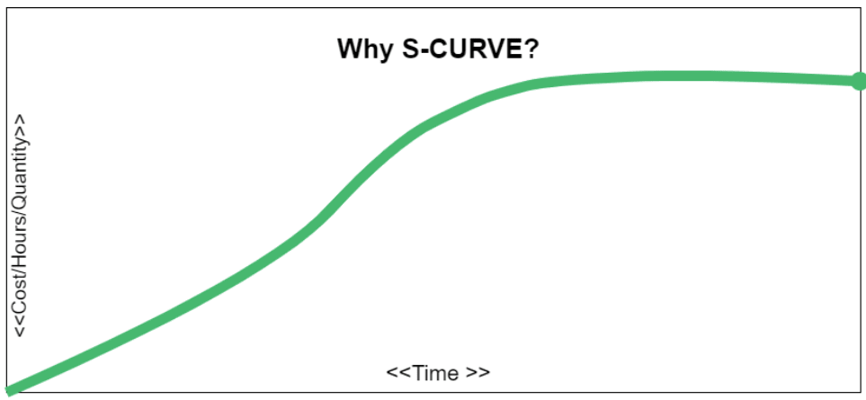 An S-curve is a mathematical representation of cumulative data plotted over time. In project management, that data is typically cost, labor hours, or earned value. The horizontal axis represents the project timeline, and the vertical axis represents the cumulative total of your chosen metric.
When you connect the project timeline and cumulative total data points, the resulting curve takes on a characteristic S shape.
The three phases of an S-curve map directly to how projects typically unfold. During the initiation phase, progress is slow as teams mobilize resources, finalize requirements, and set up infrastructure. The curve stays relatively flat. In the execution phase, activity ramps up sharply as multiple work packages run in parallel. This steep middle section is where most of the budget gets consumed and most of the deliverables get produced. The closure phase sees the curve flatten again as remaining punch-list items and closeout activities taper off.
The inflection point, where the curve shifts from concave to convex, marks the period of peak resource consumption. It’s the moment when the project is burning through budget and hours at its fastest rate. Recognizing this point helps project managers anticipate when demand on their teams will start declining.
S-curves are deeply connected to Earned Value Management (EVM), a methodology endorsed by PMI for measuring project performance. EVM uses three core metrics, each of which produces its own S-curve when plotted cumulatively over time:
- Planned Value (PV): The budgeted cost of work scheduled to be completed by a given date.
- Earned Value (EV): The budgeted cost of work actually completed.
- Actual Cost (AC): The real cost incurred for the work completed.
When you overlay all three curves on one chart, the visual distance between them tells you whether your project is on schedule, over budget, or both. That’s what makes the S-curve such a powerful diagnostic instrument for portfolio management and individual project oversight alike.
The 6 types of S-curves and when to use each
Not every S-curve tracks the same thing. Depending on your project’s priorities, you might focus on cost, effort, quality, or physical progress. Each type of S-curve answers a different question about project health, and experienced project managers often use several in combination to get a complete picture.
Here’s a breakdown of the six most common types:
| Type | What it tracks | When to use it | Key signal |
|---|---|---|---|
| Baseline / Planned Value (PV) | Cumulative budgeted cost of scheduled work | At project kickoff to establish the performance measurement baseline | Sets the reference line all other curves are compared against |
| Actual Cost (AC) | Cumulative real expenditure to date | Throughout execution to monitor spending | AC rising faster than EV signals cost overruns |
| Earned Value (EV) | Cumulative budgeted cost of completed work | Alongside PV and AC for full EVM analysis | EV below PV indicates schedule delay; EV below AC indicates cost overrun |
| Labor Hours | Cumulative person-hours consumed | On labor-intensive projects (construction, manufacturing) | Divergence from planned hours reveals staffing inefficiencies |
| Progress (% Complete) | Cumulative physical completion percentage | When stakeholders need a simple progress view without dollar values | Flat progress curve during mid-project signals stalled execution |
| Quality Maturity | Cumulative defect closure rate | Software development and QA phases | Slow defect closure late in the schedule signals testing bottlenecks |
The Baseline/PV curve is your starting point. It’s created during planning and represents the ideal spending trajectory. Once execution begins, the Actual Cost curve tracks what you’re really spending, while the Earned Value curve shows how much value you’ve delivered for that spend. Comparing all three on a single chart is the foundation of EVM analysis.
The Labor Hours curve is especially useful for construction and engineering projects where effort tracking matters as much as dollar tracking. The Progress curve strips away financial complexity and shows stakeholders a straightforward view of physical completion. The Quality Maturity curve is a specialized variant used in software development: it plots cumulative defect closures over time, and when the curve flattens prematurely, it often indicates that the testing team is finding defects faster than they can be resolved.
How to create an S-curve step by step
Building an S-curve from scratch requires structured project data and a systematic approach. Here are five steps that take you from a work breakdown structure to a fully plotted performance chart.
- Define your WBS and scope. Start by decomposing your project into a Work Breakdown Structure (WBS). Every deliverable should be broken into work packages small enough to assign, schedule, and measure. The WBS is the backbone of your S-curve because it determines which activities get budgeted and tracked.
- Assign time-phased budgets or hours to each work package. For every work package in your WBS, distribute the budget or planned hours across the periods when the work will occur. If a $30,000 work package spans three months, you might allocate $5,000 in month one, $15,000 in month two, and $10,000 in month three, based on the expected effort distribution. This time-phasing is what produces the curve’s shape.
- Calculate cumulative Planned Value for each period. Add up the time-phased budgets period by period. Month one’s cumulative PV is just month one’s budget. Month two’s cumulative PV is month one plus month two. Continue through the full project timeline. The resulting series of cumulative values forms your baseline S-curve.
- Record Actual Cost and calculate Earned Value. As the project progresses, record what you’re actually spending each period (AC). Simultaneously, assess the percentage complete for each work package and multiply it by the work package’s total budget to get its earned value. EV = % complete x Budget at Completion (BAC). Sum these cumulatively just as you did with PV.
- Plot all three curves on one chart. Using your cumulative PV, EV, and AC series, plot them on a single chart with time on the horizontal axis and cumulative dollars (or hours) on the vertical axis. The visual separation between the curves immediately reveals schedule and cost performance.
You can build a basic S-curve in Excel using a stacked area or line chart, but maintaining it manually requires updating every period and recalculating cumulative totals. On monday.com, much of this effort is automated: budget columns, progress tracking, and Chart Widgets update in real time as your team logs actual work, removing the spreadsheet maintenance burden entirely.
How to read an S-curve: What the shape tells you
![]() An S-curve becomes a powerful diagnostic when you know what to look for. The key is comparing the three EVM curves: PV, EV, and AC. The vertical gap between any two curves at a given point in time represents a variance, and the direction of that gap tells you whether the variance is favorable or unfavorable.
An S-curve becomes a powerful diagnostic when you know what to look for. The key is comparing the three EVM curves: PV, EV, and AC. The vertical gap between any two curves at a given point in time represents a variance, and the direction of that gap tells you whether the variance is favorable or unfavorable.
When EV sits above PV, you’re ahead of schedule: you’ve completed more work than planned for this point in time. When EV falls below PV, you’re behind schedule. On the cost side, when EV exceeds AC, you’re under budget: the work completed cost less than its budgeted value. When AC exceeds EV, you’re over budget.
The shape of the curves matters just as much as the gaps between them. A healthy project S-curve should show a gradual steepening as execution ramps up, followed by a gradual tapering as the project closes out. Abnormalities in the shape often signal problems before the numbers make them obvious.
Here’s a reference table of common warning signs:
| Warning sign | What it means | Suggested response |
|---|---|---|
| Flat EV curve at project midpoint | Work has stalled; deliverables aren't being completed despite time passing | Investigate resource bottlenecks, scope ambiguity, or blocked dependencies |
| AC rising steeply while EV stays flat | Money is being spent but no value is being earned; potential rework or waste | Audit recent expenditures and check for unauthorized scope changes |
| EV curve never steepening past initiation | Project never transitioned into full execution; mobilization issues | Review resource management and staffing plans |
| PV and EV curves converging at the end while AC is far above | Work finished on schedule but significantly over budget | Conduct cost variance analysis; update estimates for future phases |
| All three curves bunched together with no separation | Possible data quality issue; actuals may not be captured accurately | Verify time and cost reporting processes |
| EV exceeding PV early in the project | Scope creep may be inflating earned value, or the baseline was too conservative | Re-baseline if the original plan is no longer valid |
| Sudden vertical jump in AC with no corresponding EV increase | Large unplanned expenditure (e.g., expedited materials, emergency subcontracting) | Document the cause and assess impact on the Estimate at Completion (EAC) |
S-curve worked example: Tracking a construction project
Consider a 12-month office fit-out project with a Budget at Completion (BAC) of $600,000. The baseline S-curve was established during planning, distributing the $600,000 across 12 months based on the expected execution profile. At the month 6 checkpoint, the project manager pulls three numbers from the tracking system:
- Planned Value (PV): $300,000 (the team was supposed to have completed half the budgeted work by now)
- Earned Value (EV): $240,000 (actual work completed has a budgeted value of $240K)
- Actual Cost (AC): $270,000 (the team has spent $270K to deliver that $240K in work)
From these three values, two critical performance indices emerge:
- Cost Performance Index (CPI): EV / AC = $240,000 / $270,000 = 0.89
- Schedule Performance Index (SPI): EV / PV = $240,000 / $300,000 = 0.80
This is a double-unfavorable signal. The CPI of 0.89 means the project is getting only $0.89 of value for every dollar spent. The SPI of 0.80 means the project has only earned 80% of the work it should have completed by now. Visually, on the S-curve chart, you’d see the EV curve sitting below the PV curve (behind schedule) and the AC curve sitting above the EV curve (over budget).
At this point, the project manager can apply the 50/70 rule as a secondary check. At the 50% schedule mark (month 6 of 12), the project should have earned at least 70% of PV to be considered healthy. That threshold is $300,000 x 0.70 = $210,000. The actual EV of $240,000 exceeds this floor, which suggests the schedule delay may be recoverable. However, the cost overrun still demands attention, as the CPI below 1.0 will compound over the remaining months if left unaddressed.
The 50/70 rule: A project performance benchmark
The 50/70 rule is a heuristic aligned with PMI project performance analysis. It states that by the time a project reaches 50% of its scheduled duration, it should have earned at least 70% of its cumulative Planned Value. If the project hasn’t reached that threshold, the odds of recovering without corrective action drop significantly.
Why does this rule matter for S-curve interpretation? Because S-curves can sometimes mask early underperformance. During the initial flat portion of the curve, small variances don’t look alarming on a chart. The 50/70 rule forces a quantitative check at the project’s midpoint, when there’s still enough remaining schedule to implement corrections.
When a project violates the 50/70 threshold, the appropriate response depends on severity. If EV is slightly below the 70% mark, accelerating a few critical-path activities may be sufficient. If EV is well below 70%, a formal re-baseline or scope reduction conversation is usually warranted. The key is that this rule creates a decision trigger rather than letting the team drift into the second half of the schedule hoping the numbers will self-correct.
5 advantages of using S-curves for project tracking
S-curves have remained a staple of project performance management for decades, and for good reason. They offer a combination of visual immediacy and analytical depth that few other single-chart formats can match.
- Early warning system: S-curves make variances visible long before they show up in end-of-month reports. A widening gap between your PV and EV curves signals schedule trouble weeks earlier than traditional status updates, giving you time to intervene before small issues become large ones.
- Stakeholder communication: A single S-curve chart can communicate project health to executives, clients, and team leads in seconds. Instead of walking stakeholders through spreadsheets, you present a visual story where the distance between curves tells them everything they need to know about schedule and cost performance.
- Data-driven forecasting: CPI and SPI values derived from S-curve data feed directly into Estimate at Completion (EAC) calculations. This means your forecasts are grounded in actual performance trends, not optimistic assumptions.
- Cross-project comparison: When multiple projects plot their S-curves using the same EVM methodology, leadership can compare performance across an entire portfolio. This is especially valuable for organizations managing dozens of concurrent initiatives.
- Automated tracking with monday.com: S-curves become even more powerful when the underlying data updates automatically. On monday.com’s AI Work Platform, budget columns, progress percentages, and timeline data feed into Chart Widgets without manual recalculation, ensuring your S-curve always reflects the latest project status.
Limitations of S-curves and how to address them
Despite their strengths, S-curves aren’t a universal solution. Understanding their limitations helps you use them more effectively and pair them with complementary methods where needed.
- Manual construction is time-consuming: Building and maintaining S-curves in spreadsheets requires updating cumulative data every reporting period. Automating data capture through a platform like monday.com eliminates most of this overhead.
- Shows what, not why: An S-curve will tell you that the project is behind schedule, but it won’t explain the root cause. Pair S-curve analysis with risk registers, issue logs, and team retrospectives to diagnose the reasons behind variances.
- Not ideal for agile workflows: S-curves are built for projects with defined scope and sequential scheduling. In agile environments where scope evolves sprint by sprint, traditional S-curves can produce misleading readings. Burn-down or burn-up charts are often a more natural fit for iterative delivery.
- Requires an accurate WBS: The quality of an S-curve depends entirely on the quality of the underlying Work Breakdown Structure and time-phased budget. If work packages are poorly defined or budgets are padded, the baseline S-curve won’t reflect reality.
- Hides sub-project variance: A portfolio-level S-curve can look healthy even when individual projects within it are in trouble, because overperformance on one project can mask underperformance on another. Always drill down to the project level when the aggregate curve looks too smooth.
S-curve vs. banana curve: How they work together
The banana curve is a scheduling visualization that plots two S-curves on the same chart: one representing the earliest possible schedule (all activities starting at their earliest start dates) and one representing the latest possible schedule (all activities starting at their latest start dates without delaying the project). The space between these two curves forms a banana-shaped envelope that represents the project’s total scheduling float.
Where an S-curve shows cumulative performance at a single point in time, a banana curve shows the range of acceptable scheduling outcomes. If your actual progress curve falls inside the banana envelope, the project has schedule flexibility remaining. If it drifts outside the envelope on the late side, critical-path activities are at risk.
The two visualizations serve complementary purposes. Use the S-curve to monitor real-time cost and schedule performance through EVM metrics. Use the banana curve during planning and scheduling to understand how much flexibility exists in your project timeline and which activities consume that flexibility when delayed. Together, they give project managers both a performance view and a scheduling risk view in a single analytical framework.
How monday.com automates S-curve tracking
Manually maintaining S-curves in spreadsheets introduces lag, data entry errors, and the constant risk of working from outdated numbers. monday.com’s AI Work Platform replaces that manual process with live, connected data that updates as your team works.
The platform transforms S-curve tracking from a periodic reporting exercise into continuous performance monitoring. By connecting project schedules, budgets, and progress tracking in one system, it gives project managers the visibility that S-curve methodology promises without the spreadsheet overhead that has historically limited its adoption.
Chart Widget and dashboards

Build cumulative cost and progress charts directly from your project boards. The Chart Widget aggregates budget columns and progress percentages across work packages, producing a live S-curve visualization that refreshes automatically as statuses and numbers change. Pin these charts to dashboards for instant access during status meetings, ensuring stakeholders always see the latest performance data without manual exports or updates.
Gantt Baseline tracking
The built-in Gantt view provides time-phased baseline visualization that makes schedule variance immediately visible. With the Gantt Baseline feature, you can compare your current project progression against the original planned timeline, making it straightforward to spot schedule slippage and identify which work packages are driving the variance. This eliminates the need to maintain separate baseline versions in spreadsheets.
Workload View for labor hours

The Workload View tracks team capacity and actual effort allocation across projects in real time. For labor-hours S-curves, this replaces manual time-sheet aggregation with a live view of who is working on what, how many hours are being consumed, and where over-allocation creates risk. The visual capacity planning helps you anticipate resource bottlenecks before they flatten your earned value curve.
AI-powered automations and alerts

Set threshold-based triggers that fire when budget consumption exceeds a percentage, when a work package falls behind its baseline date, or when actual costs surpass earned value by a defined margin. These automations push alerts to the right people at the right time, turning passive S-curve monitoring into active performance management. monday sidekick takes this further by letting you ask natural-language questions about project performance. Instead of building a pivot table, you can ask “Which projects are over budget this quarter?” or “What’s the schedule variance on the construction phase?” and get answers drawn directly from your live project data.
Here’s how these capabilities compare to a traditional spreadsheet approach:
| Capability | Manual (Excel) | monday.com's AI Work Platform |
|---|---|---|
| Data entry | Manual input every reporting period | Automatic from board updates |
| Cumulative chart generation | Formula-driven, error-prone | Chart Widget with live aggregation |
| Baseline comparison | Separate tab or frozen column | Built-in Gantt Baseline feature |
| Labor hours tracking | Separate time-sheet system | Workload View with real-time allocation |
| Variance alerts | None (requires manual review) | Threshold automations with instant notifications |
| Stakeholder reporting | Export and email static charts | Shared dashboards with live data access |
| Natural-language querying | Not available | monday sidekick for on-demand performance insights |
From spreadsheets to intelligent project performance monitoring
The S-curve has endured as a project management staple because it compresses complex performance data into a single visual that anyone can read. Whether you’re tracking a $600,000 construction fit-out or a multi-year enterprise program, the principles remain the same: plot your planned, earned, and actual values cumulatively, watch the gaps, and act when they widen.
What’s changing is how that data gets captured and visualized. AI-powered platforms like monday.com’s AI Work Platform are eliminating the manual effort that once made S-curve tracking impractical for all but the largest projects. By connecting your project schedules, budgets, resource allocations, and progress tracking in one platform, it gives every project manager the visibility that S-curve methodology promises without the spreadsheet overhead that has historically limited its adoption.
Get startedFAQs
What does an S-curve show in project management?
An S-curve in project management shows the cumulative progress of a project metric, such as cost, labor hours, or earned value, plotted against time. It reveals whether the project is tracking ahead of, behind, or on schedule and budget by comparing the planned baseline to actual performance data.
What is the 50/70 rule in project management?
The 50/70 rule in project management states that by the time a project reaches 50% of its scheduled duration, it should have earned at least 70% of its cumulative Planned Value. If it hasn't reached that threshold, the project is unlikely to recover without corrective action.
How do you read an S-curve?
You read an S-curve by comparing the gaps between the three EVM curves: Planned Value (PV), Earned Value (EV), and Actual Cost (AC). EV below PV indicates a schedule delay, AC above EV indicates a cost overrun, and a flat EV curve in mid-project signals that work has stalled.
What are the types of S-curves?
The types of S-curves include six main variants: Baseline (Planned Value), Actual Cost, Earned Value, Labor Hours, Progress (% Complete), and Quality Maturity. Each type tracks a different dimension of project performance and is used depending on whether the focus is cost, effort, completion rate, or quality.
Can monday.com's AI Work Platform generate S-curves automatically?
The AI Work Platform can generate cumulative performance charts that function as S-curves by using the Chart Widget to aggregate budget, progress, and timeline data directly from project boards. These charts update automatically as teams log work, eliminating the need for manual spreadsheet calculations.
What does a flat S-curve mean in the middle of a project?
A flat S-curve in the middle of a project means that cumulative progress has stalled during the execution phase, when it should be at its steepest. This typically signals resource bottlenecks, blocked dependencies, scope ambiguity, or a breakdown in the work execution process that requires immediate investigation.