
When work is scattered across countless spreadsheets and disconnected platforms, decision-making falters. It’s a common struggle that leads to gut-feel choices and a constant chorus of, “Where do we actually stand on this project?”
Your team generates plenty of data, but turning it into a reliable picture of progress can feel impossible. Smart reporting tools solve this by acting as your team’s single source of truth — and with built-in AI, they don’t just show you what’s happening, they explain why it’s happening and predict what’s coming next.
By connecting execution directly to insights, the right work management platform moves you from reacting to problems to proactively shaping outcomes. We’ve done the heavy lifting to identify the solutions that truly deliver on this promise. This guide walks you through the top options, helping you find the right fit to align your team, accelerate execution, and build confidence with every decision.
Try monday work managementWhat are reporting tools?
At their core, reporting platforms serve one primary function: to consolidate disparate work data into a coherent, centralized view so you can see what’s really going on. They automatically transform raw information from all your different platforms into clear, visual dashboards — often enhanced with AI that surfaces patterns, anomalies, and recommendations — giving you instant insights without the manual grunt work.
This process brings everything together to reveal powerful patterns and trends you’d otherwise miss. By analyzing and visualizing your data in real-time, these tools empower your team to understand performance at a glance and focus on the work that matters most.
Relying on gut feelings or outdated spreadsheets leads to missed targets and slows your team down. With a single source of truth, everyone can make faster, smarter decisions, spot opportunities early, and confidently adjust strategy before small issues become big problems.
Try monday work managementHow to turn your data into your biggest advantage
The true power of your team’s work lies within its data, yet this information is often fragmented across CRMs, spreadsheets, and other platforms. A great work platform doesn’t just show you charts; it unifies that scattered information in one place. This creates a single source of truth, ensuring everyone is working with the same real-time information and finally ending the copy-paste marathon.
Static reports are obsolete the moment they’re created. Imagine, instead, live dashboards that not only show you what’s happening right now but also use AI to forecast trends, flag risks, and even generate plain-language summaries tailored to each stakeholder — from executives to frontline teams. Better yet, you can automate these reports to land in the right inbox at the right time, freeing your team from manual busywork to focus on the insights that matter.
Of course, none of this works without trust, which is why strong security and governance are non-negotiable for ensuring the right people see the right data. When these pieces come together, your data stops being a chore and starts being your competitive edge. This shift is how you move faster and make smarter decisions. Ultimately, it builds confidence across your entire organization.
| Feature | Small teams | Midsize companies | Enterprise |
|---|---|---|---|
| Data integration | Basic connectors | Multiple source integration | Enterprise-wide data fabric |
| Customization | Template-based | Moderate flexibility | Fully customizable |
| Automation | Basic scheduling | Workflow automation | AI-powered intelligence |
| Security | User permissions | Role-based access | Advanced governance |
| Scalability | Limited | Departmental | Organization-wide |
10 top reporting tools for transforming business intelligence
Here’s a quick side-by-side look at the top reporting tools, so you can find the best fit — fast. Whether you’re just getting started with basic KPIs or need advanced analytics at scale, these platforms combine intuitive dashboards with powerful features.
| Platform | Use case | Free plan? | Notable feature | Starting price |
|---|---|---|---|---|
| monday work management | Unified project & KPI dashboards for all teams | Yes | AI-powered, no-code dashboards | $9/user/mo |
| Microsoft Power BI | Advanced analytics for Microsoft-centric enterprises | Yes | Deep Microsoft integration & DAX modeling | $14/user/mo |
| Tableau | Visual analytics for all team sizes | No | Intuitive drag-and-drop dashboards | $15/user/mo |
| Domo | Real-time, mobile-first analytics for distributed teams | Trial | 1,000+ data connectors | Contact sales |
| Zoho Analytics | Affordable self-service analytics for SMBs | Yes | AI-powered natural language queries | $24/mo |
| Looker | Enterprise-grade governance & real-time analytics | No | Centralized semantic layer (LookML) | Contact sales |
| Sisense | Embedded analytics for large datasets | No | In-memory analytics engine | Contact sales |
| Qlik Sense | Associative analytics for complex data exploration | No | Associative Engine for flexible discovery | $200/mo |
| Looker Studio | Free, Google-integrated dashboards for small teams | Yes | GA4 predictive analytics connectors | Free |
| Smartsheet | Spreadsheet-style reporting with automation | Trial | Familiar interface + AI features | $9/user/mo |
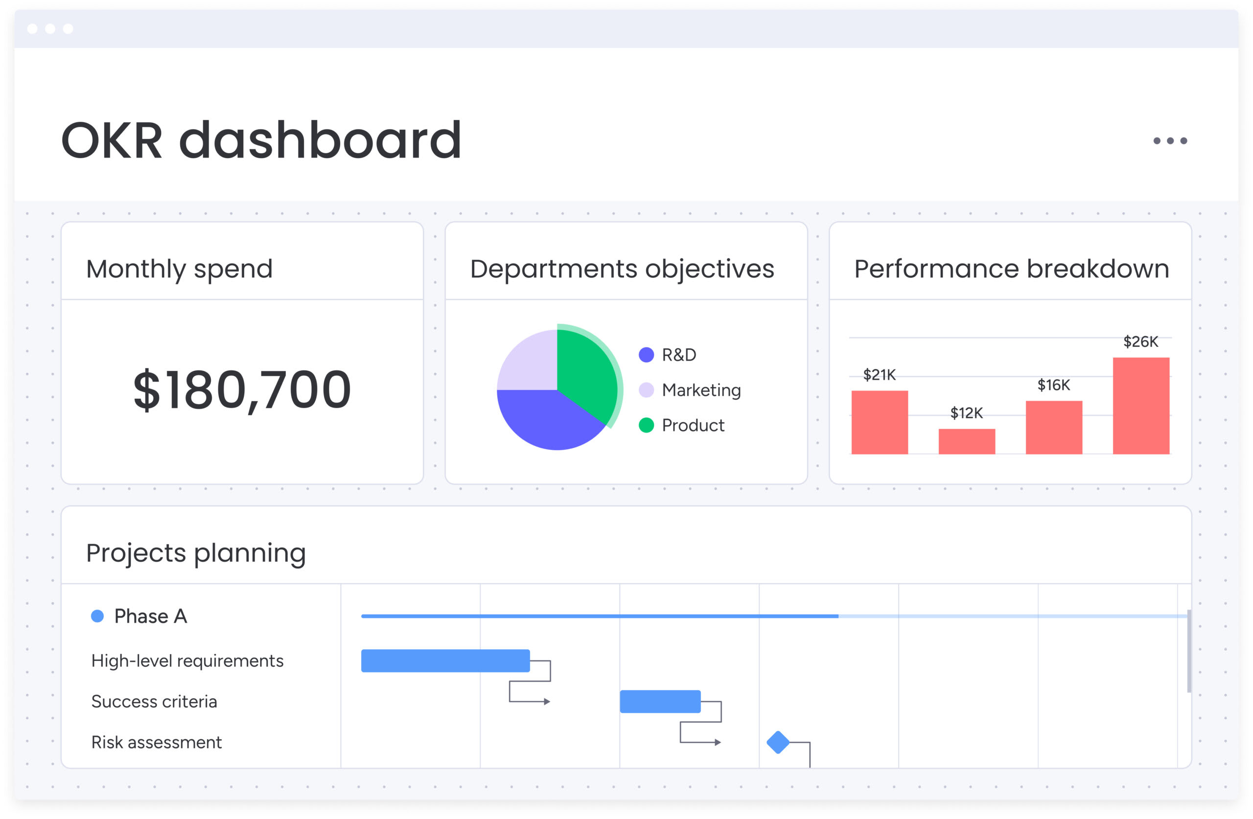
1. monday work management
By integrating work management with AI-enhanced reporting, monday work management provides a unified workspace where teams can execute projects and track progress simultaneously. Its built-in AI dashboard tools help automate updates, generate plain-language summaries of project status, and surface predictive insights — making it the go-to choice for teams that need both execution and intelligence in one place.
Use case: Global businesses seeking an easier way to manage cross-departmental projects while tracking KPIs in one unified dashboard
Key features
- Visual dashboards with over 30 customizable widgets that transform project data into real-time insights. The number of boards you can combine into a single dashboard varies by plan (1, 5, 20, or 50)
- Workload management widgets that provide instant visibility into team capacity, resource allocation, and potential bottlenecks
- AI-enhanced, real-time updates ensure reports always reflect the current project status and even flag risks or workload conflicts before they impact delivery
Pricing
- Free: $0 forever (up to 2 seats, 3 boards, basic dashboards)
- Basic: $9/seat/month (minimum 3 seats, unlimited items, 5GB storage, dashboards from 1 board)
- Standard: $12/seat/month (timeline views, guest access, dashboards combining up to 5 boards, includes AI credits)
- Pro: $19/seat/month (advanced features, time tracking, dashboards combining up to 20 boards, more AI credits)
- Enterprise: Custom pricing (advanced reporting & analytics, dashboards combining up to 50 boards)
Why it stands out
- Seamlessly integrates work management and reporting in one platform, so you don’t have to switch between different tools
- No-code dashboard creation empowers anyone to build sophisticated reports without IT dependency
- Real-time data updates ensure reports always reflect the current project status, making it ideal for dynamic work environments
- Its most advanced reporting features are part of higher-tier plans, allowing teams to scale up as their needs grow more complex
2. Microsoft Power BI
Microsoft Power BI excels at weaving raw data into compelling visual narratives, making it a powerhouse for organizations deeply integrated into the Microsoft ecosystem. The platform specializes in seamless Microsoft integration and powerful data modeling capabilities.
Use case: Large enterprises that need advanced analytics and AI-powered insights across hundreds of data sources within the Microsoft ecosystem
Key features
- Advanced data modeling with DAX (Data Analysis Expressions) for custom calculations and complex business logic
- Native integration across Microsoft ecosystem including Excel, Teams, SharePoint, and Azure services
- AI-powered insights with natural language Q&A and automated pattern recognition
Pricing
- Free Account: Create interactive reports with visual analytics at no cost
- Power BI Pro: $14/user/month for publishing and sharing reports with collaboration features
- Power BI Premium Per User: $24/user/month for enterprise-scale features and advanced capabilities
- Power BI in Microsoft Fabric: Variable pricing with ability to share reports without requiring paid licenses
Considerations
- Power BI Desktop is only available for Windows, limiting accessibility for macOS and Linux users
- Advanced features like DAX formulas require significant learning investment for non-technical users
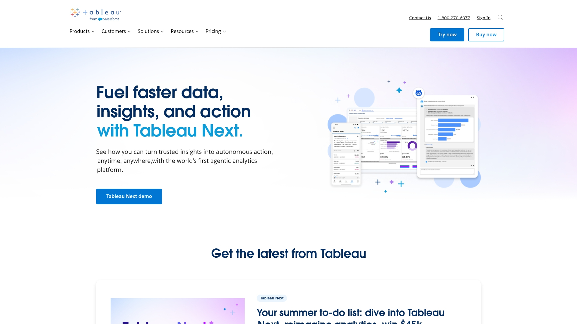
3. Tableau
Renowned for its intuitive drag-and-drop interface, Tableau empowers organizations to translate complex datasets into interactive dashboards and visual reports. Beyond visualization, Tableau’s AI features like Explain Data and Ask Data help teams uncover hidden patterns, run predictive models, and explore insights using natural language — making sophisticated analysis accessible to a broad audience.
Use case: Organizations of any size looking for highly interactive, visual dashboards that make complex datasets accessible to non-technical users
Key features
- Drag-and-drop interface that makes complex data visualization accessible to non-technical users
- Connects to hundreds of data sources including databases, spreadsheets, and cloud applications
- Interactive dashboards with real-time filtering, drill-down capabilities, and dynamic data exploration
Pricing
- Tableau Viewer: $15/user/month (billed annually)
- Tableau Explorer: $15/user/month (billed annually)
- Tableau Creator: $42/user/month (billed annually)
- Tableau+ (premium): $75/user/month (billed annually)
- Enterprise Creator: $59/user/month (billed annually)
- Enterprise Explorer: $35/user/month (billed annually)
- Enterprise Viewer: $21/user/month (billed annually)
- Tableau+ Enterprise: $105/user/month (billed annually)
- New customers save 20% on Enterprise edition licenses through January 31st, 2026
- Resource Blocks add-on: $250/resource block/month for Tableau Cloud Enterprise and Tableau+
Considerations
- High licensing costs can be prohibitive for smaller organizations, especially compared to alternatives like Power BI
- Steep learning curve for mastering advanced features, despite the intuitive basic interface
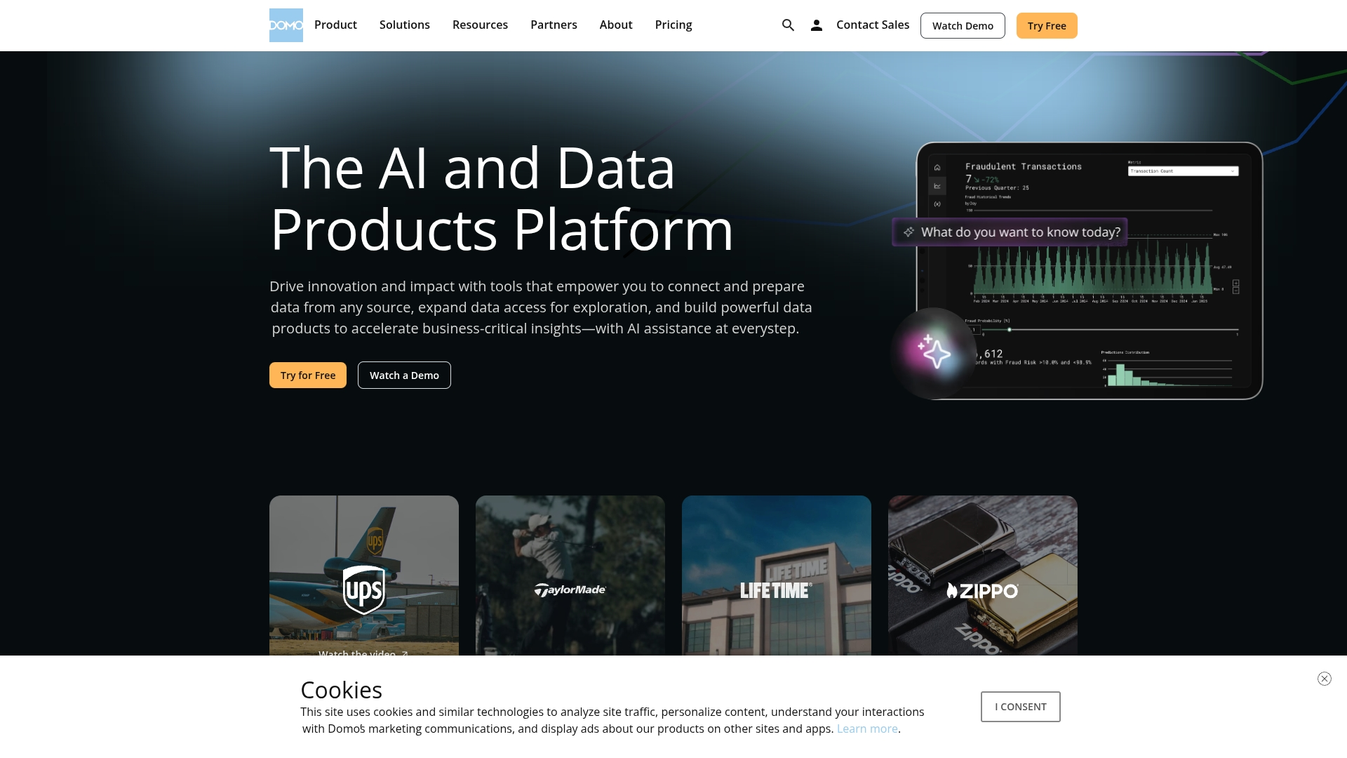
4. Domo
As a cloud-native business intelligence platform, Domo is engineered to connect an extensive array of disparate data sources, delivering real-time, mobile-first analytics for enterprise teams. It excels at providing comprehensive reporting across multiple departments and locations.
Use case: Distributed enterprises needing real-time, mobile-first reporting that consolidates thousands of data sources into self-service dashboards
Key features
- Over 1,000 pre-built connectors to cloud and on-premise data sources with drag-and-drop ETL transformation
- AI-powered reporting with Domo.AI that automates report writing and delivers proactive insights through alerts
- Social collaboration features including real-time chat on data visualizations and shared dashboard creation
Pricing
- Free plan: 30-day trial with unlimited users, onboarding support, and one training session
- Paid plan: Consumption-based pricing with dedicated account team and volume discounts (contact sales for quote)
Considerations
- High cost can be prohibitive for small businesses, with complex credit-based pricing that may be difficult to predict
- Performance can slow when loading complex dashboards with large datasets, particularly affecting user experience
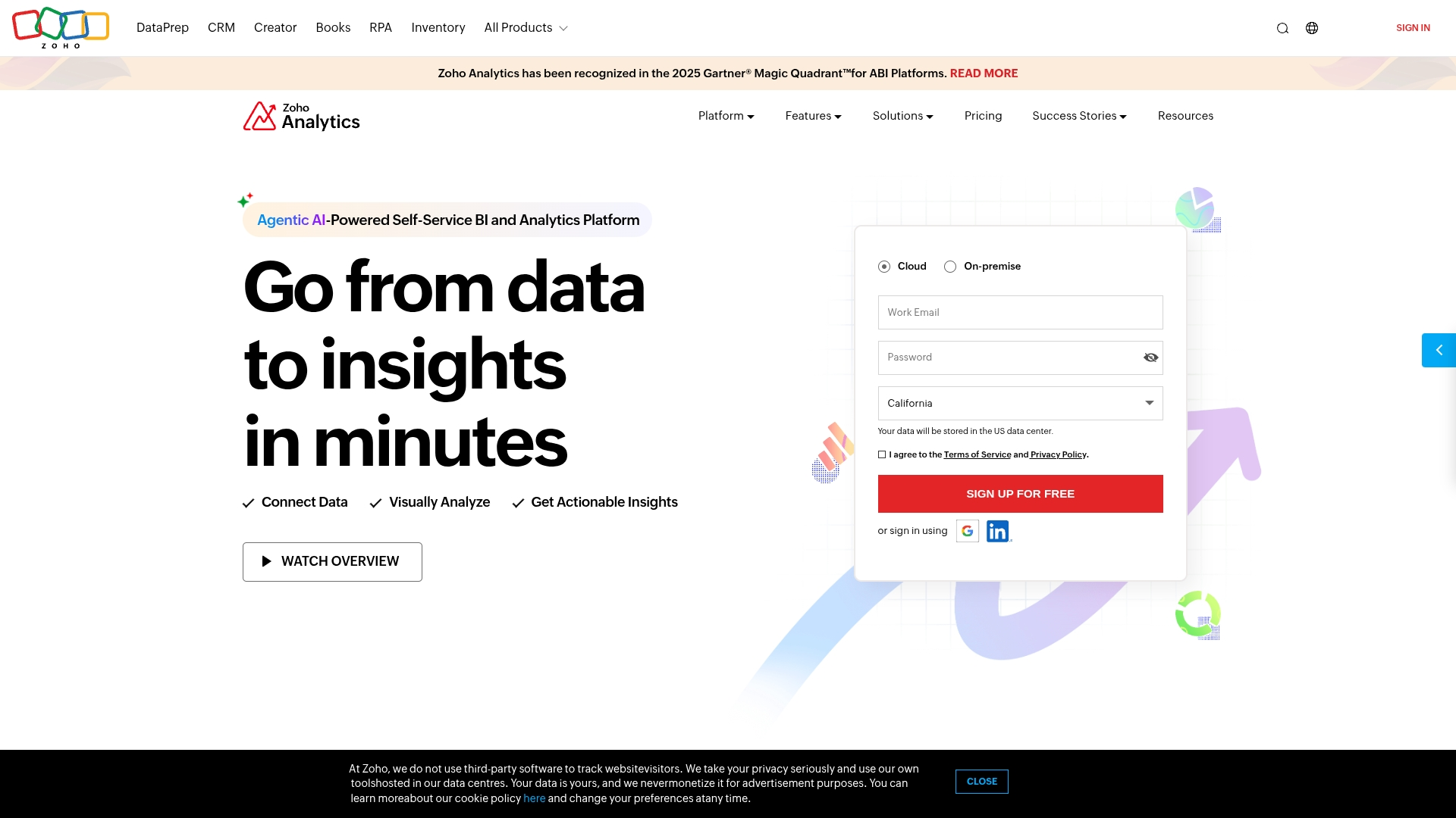
5. Zoho Analytics
Targeting small to medium-sized businesses, Zoho Analytics offers an intuitive, self-service reporting platform that delivers powerful analytics without overwhelming complexity. It is an ideal choice for teams already invested in the Zoho ecosystem.
Use case: Small to mid-sized businesses seeking affordable, self-service reporting with AI assistance and seamless integration into the Zoho suite
Key features
- Connect to over 500 data sources including files, databases, cloud storage, and business applications for comprehensive data integration
- “Ask Zia” AI assistant enables natural language queries, allowing users to ask questions and receive instant visual reports and insights
- Drag-and-drop interface with 50+ visualization types makes report creation accessible to non-technical users across all departments
Pricing
- Free Plan: 2 users, 10,000 rows, unlimited reports and dashboards
- Basic: $24/month (billed annually) for 2 users and 0.5 million rows
- Standard: $48/month (billed annually) for 5 users and 1 million rows
- Premium: $115/month (billed annually) for 15 users and 5 million rows
- Enterprise: $455/month (billed annually) for 50 users and 50 million rows
- Additional users available at $6.40 per user per month when billed yearly
Considerations
- Performance can slow significantly when working with very large datasets, potentially impacting productivity for data-heavy operations
- Advanced features require a steep learning curve, which may challenge teams looking for immediate implementation and results
6. Looker
Looker establishes a governed, real-time source of truth through its unique LookML modeling language and deep integration with Google Cloud. The platform empowers both technical data teams and business users with a centralized approach to reporting that ensures everyone works from the same trusted data. Through Google Cloud integrations, Looker can connect directly with AI and ML services like Vertex AI, enabling predictive analytics and natural language querying alongside strong governance, making it valuable for organizations that need both scalability and intelligence.
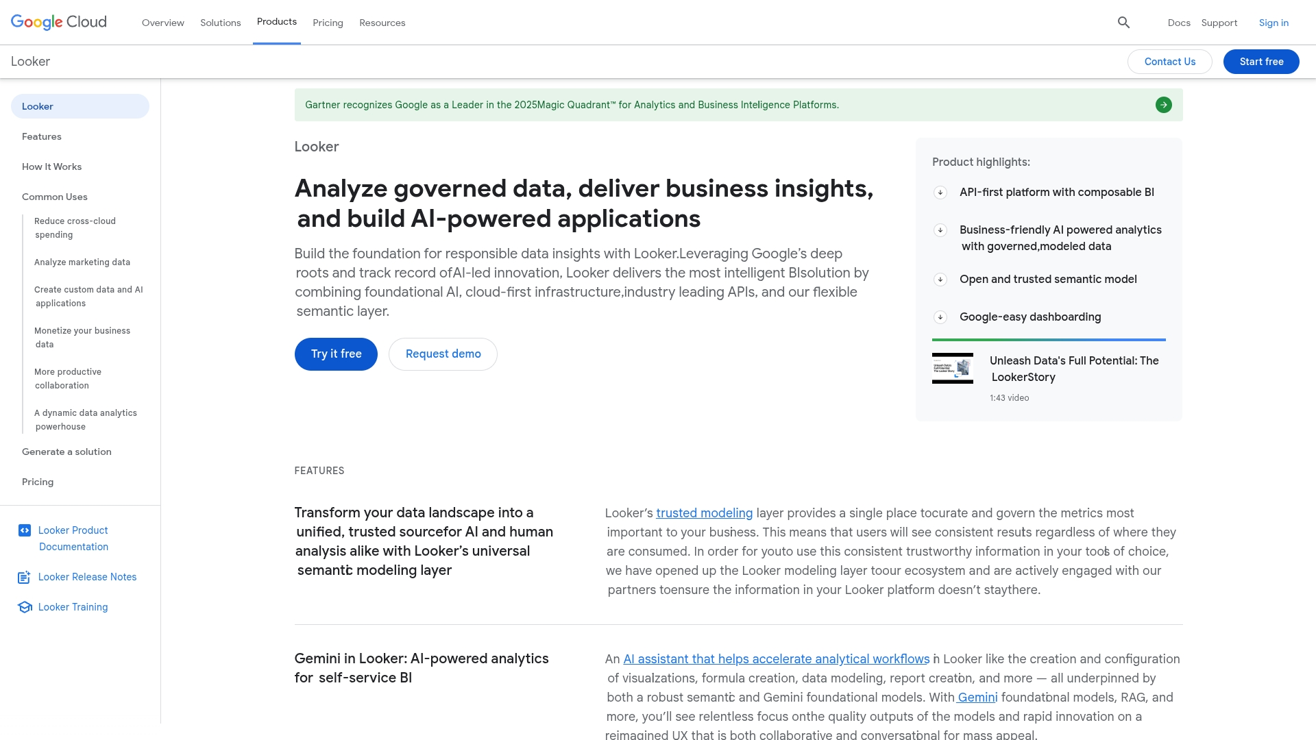
Use case: Enterprises prioritizing strict data governance and a centralized semantic layer to ensure consistency across all reporting and analytics
Key features
- LookML semantic layer that defines business logic centrally, ensuring consistent metrics across all reports and dashboards
- Direct-to-database architecture that provides real-time data access without requiring data extraction or loading
- Embedded analytics capabilities that allow you to integrate interactive dashboards directly into your own applications and websites
Pricing
Custom pricing available upon request.
Considerations
- Steep learning curve for LookML requires technical expertise, potentially creating bottlenecks if you lack skilled developers
- Higher cost compared to competitors may be difficult to justify for organizations primarily needing simple data visualization rather than complex governance
7. Sisense
With its high-performance in-memory analytics engine, Sisense is built to handle massive datasets and embed sophisticated reporting capabilities directly into enterprise applications. The platform specializes in providing actionable insights from complex data sources.
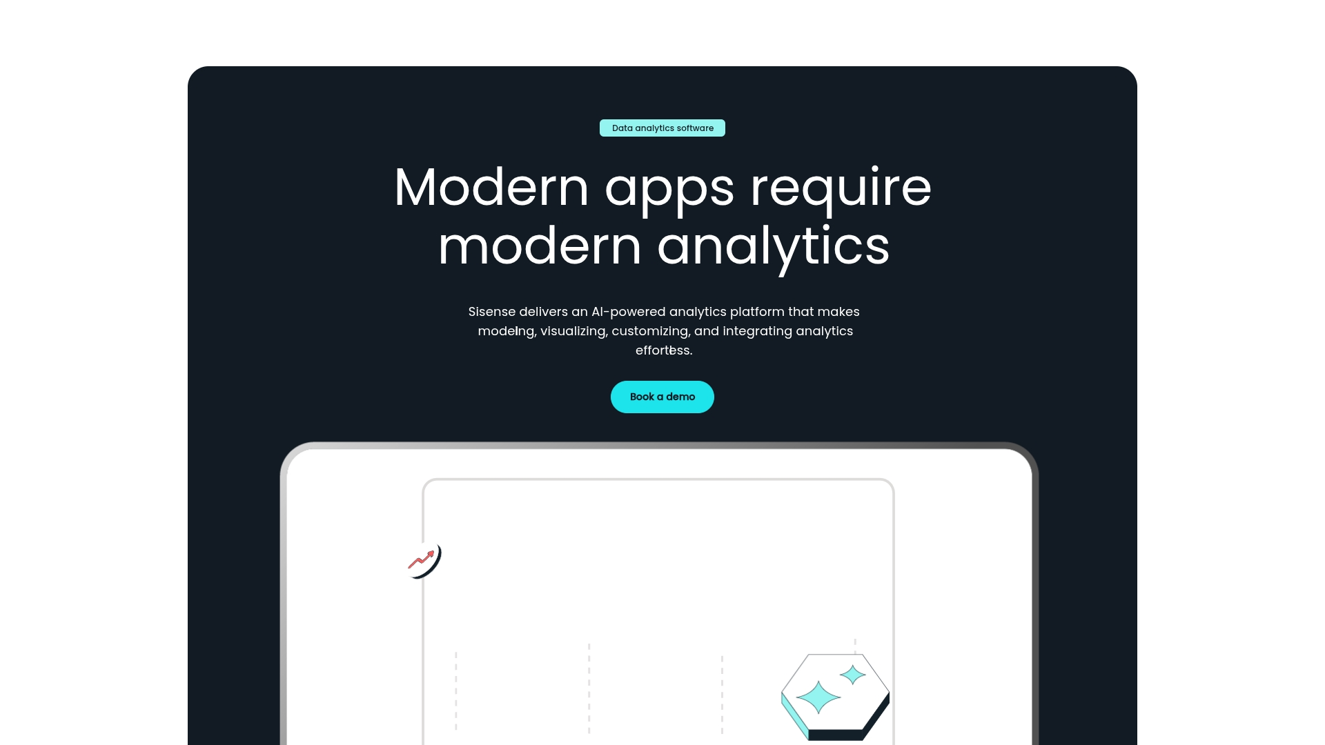
Use case: Midsize to large organizations embedding advanced analytics directly into customer-facing products or internal applications at scale
Key features
- ElastiCube technology enables lightning-fast processing of large, complex datasets through proprietary in-memory, columnar data storage
- Robust embedded analytics capabilities allow seamless integration of dashboards and reports into existing applications with extensive APIs and white-labeling options
- AI-powered Sisense Intelligence includes generative AI assistants and natural language queries to automate analytics creation and enhance data exploration
Pricing
Custom pricing available upon request.
Considerations
- Advanced customization requires JavaScript knowledge, creating barriers for non-technical users who want sophisticated visualizations
- Pricing transparency concerns with some customers finding the cost structure unclear and potentially high for smaller organizations
8. Qlik Sense
Qlik Sense stands apart with its unique Associative Engine, which allows users to freely explore data and uncover hidden connections that traditional query-based tools might miss. It combines self-service analytics with AI-powered insights, and Qlik supports your team’s growth with a strong data literacy program to help everyone become more confident with data.
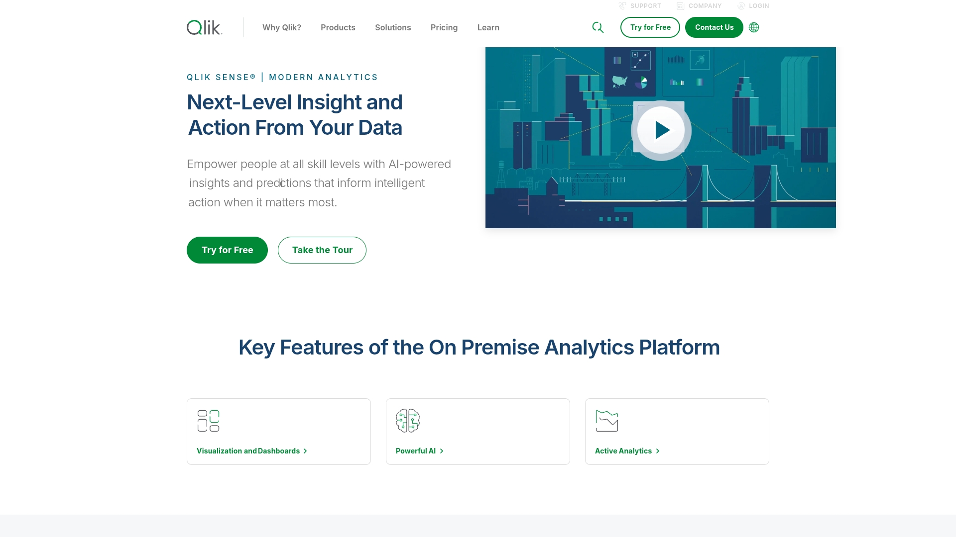
Use case: Enterprises needing associative data exploration to uncover hidden insights across complex, multi-source datasets
Key features
- Explore data in any direction and instantly see connections between different datasets without the limits of query-based tools
- Get AI-generated insights, automated chart suggestions, and conversational analytics to speed up data discovery
- Automatically generate and distribute multi-page reports from your analytics apps, included with Qlik Cloud subscriptions
Pricing
- Starter: $200/month (billed annually) for 10 users and 25 GB data capacity
- Standard: $825/month (billed annually) for 25 GB data with user access for all. Includes up to 1,000 reports/month. Additional data capacity can be purchased.
- Premium: $2,750/month (billed annually) for 50 GB data plus advanced features. Additional data capacity can be purchased.
- Enterprise: Custom pricing starting at 250 GB data capacity with personalized onboarding.
Considerations
- Creating highly formatted, pixel-perfect reports requires the Qlik NPrinting add-on
- Advanced tools like NPrinting have a steeper learning curve and are better suited for developers or users with technical expertise
9. Looker Studio
Looker Studio (formerly Google Data Studio) is Google’s free reporting tool that makes dashboard creation simple and accessible. It integrates seamlessly with Google Sheets, Analytics, and other apps, while AI-powered connectors bring GA4’s predictive analytics and automated insights into dashboards — giving even small teams powerful intelligence at no cost.
Use case: Small businesses and agencies already using Google Workspace who want a free, easy-to-use tool for client-ready dashboards and reports
Key features
- Connect to over 800 data sources through partner connectors without coding
- Build interactive reports with a wide range of chart types, including geo maps and time series
- Share dashboards with real-time collaboration and embed them on websites
Pricing
Looker Studio is free. The core platform is available at no cost and includes all the essential features for creating and sharing reports.
Considerations
- Performance can slow significantly with large datasets or complex data blending
- Limited advanced customization options compared to some premium reporting platforms
10. Smartsheet
Smartsheet leverages a familiar spreadsheet-style interface to deliver robust reporting capabilities, bridging the gap between traditional Excel workflows and modern work management. This approach makes it a particularly appealing reporting application for teams who need powerful features without abandoning their spreadsheet expertise. Smartsheet has also introduced AI features like smart formula writing, automated summaries, and predictive resource allocation, helping teams streamline reporting while reducing manual spreadsheet work.
Use case: Project-driven organizations managing portfolios at scale that need spreadsheet-style reporting with enterprise-grade automation
Key features
- Bi-directional reporting that automatically syncs updates between reports and source sheets
- Row and Sheet Summary reports that aggregate data from up to 30,000 sheets
- Advanced filtering, grouping, and summarization capabilities for customized data views
Pricing
- Pro: $9 per user/month (billed annually, 1–10 users)
- Business: $32 per user/month (billed annually, 3+ users)
- Enterprise: Custom pricing (contact sales)
- Add-ons like Dynamic View ($125/month) and Data Shuttle ($100/month) available for Business and Enterprise plans
Considerations
- Steep learning curve for advanced automation and reporting features
- Performance can slow with large datasets and complex dashboards
How to choose the right reporting platform for your team
Selecting the right reporting platform means finding a solution that matches how your team works today and how you want to work tomorrow. The right tool eliminates the scramble for data, aligns everyone around a single source of truth, and delivers insights you can act on instantly.
Start with your team’s needs
Before evaluating vendors, ask: What decisions do we need to make faster? For some teams, it’s real-time project tracking. For others, it’s uncovering trends across sales, marketing, or operations. Make sure any platform you choose integrates seamlessly with your existing tools — CRMs, project boards, cloud apps — so your team spends less time exporting spreadsheets and more time acting on insights.
Look for AI-driven advantages
AI is quickly becoming the differentiator between good reporting and transformative reporting. Modern platforms now go beyond static dashboards by:
- Natural language queries: letting anyone ask questions in plain English and get instant answers.
- Predictive insights: surfacing risks or opportunities before they happen.
- Automated narratives: generating plain-language summaries of dashboards for execs or stakeholders.
- Personalized delivery: tailoring reports and alerts to each role so the right people see the right data at the right time.
When choosing a platform, look for AI features that reduce manual work, expand access to insights, and build confidence across your organization.
Make reporting part of the workflow
A great tool should feel like a natural extension of your daily work, not another silo to manage. With monday work management, visual dashboards pull live data directly from your projects. You can automate recurring reports, connect cross-departmental workflows, and even use AI to generate summaries or spot potential roadblocks before they impact delivery. Instead of juggling systems, your team gets one place to plan, track, and analyze — with insights built right in.
Your game plan for high-impact reporting strategy
The tool is only part of the story. To get real value, start with a strategy:
- Quick wins: Launch with a simple report that solves an immediate pain point, like tracking project deadlines.
- Automate data pulls: Replace manual copy-paste with scheduled, automated reports.
- Scale insights: Layer in AI-powered dashboards that forecast trends and recommend actions.
- Share widely: Give every stakeholder access to real-time dashboards so the entire organization aligns around one version of the truth.
This approach turns reporting from a backward-looking recap into a forward-looking advantage. Meetings become more productive, decisions move faster, and your team gains the confidence to act with clarity.
Move forward with reporting built for what’s next
Your organization’s data is only going to multiply — but that doesn’t mean your headaches have to. The real opportunity is not just to keep up, but to get ahead, using reporting that does more than just recap the past. With monday work management, every piece of work, every update, and every insight comes together in one unified view. Customizable dashboards turn raw information into real-time clarity, while built-in AI features surface trends, flag risks, and even suggest your next move — all before you even know you need it.
Say goodbye to outdated, static reports and endless spreadsheet wrangling. Instead, empower your team to make faster, smarter decisions grounded in real, actionable data. The future of reporting isn’t just about seeing what’s happening — it’s about understanding why, predicting what’s next, and having the confidence to act, together.
Try monday work managementFAQs
What is the most popular reporting tool in the business intelligence market?
The most popular reporting tools in the business intelligence market include leaders like Microsoft Power BI, Tableau, and Looker. These platforms are well-regarded for their robust data visualization and analysis capabilities.
How do reporting tools differ from basic spreadsheet applications?
Reporting tools automate data connections and create interactive dashboards for dynamic analysis. Spreadsheets, by contrast, rely on manual data entry and are better suited for static data storage.
What features should I look for when selecting a reporting platform for my organization?
Look for customizable dashboards, automated report scheduling, and strong data integration capabilities. Also, confirm the platform's security controls and mobile access meet your team's specific needs.
How much do professional reporting software solutions typically cost?
Pricing for reporting software varies widely, but most use a per-user, per-month model ranging from $20 to over $100. The final cost depends on the features you choose and your data volume.
Can reporting tools integrate with my existing business systems and databases?
Yes, modern reporting tools are built to integrate with other business systems. They use a combination of native connectors and APIs to pull data from your team’s CRMs, ERPs, and databases.
How can small businesses benefit from implementing reporting tools?
Reporting tools empower small businesses to make smarter, data-driven decisions that optimize operations and unlock growth. They deliver clear performance insights without requiring a dedicated data analyst.
How does AI improve reporting tools?
AI makes reporting tools smarter by surfacing insights automatically, generating predictive forecasts, and creating plain-language summaries, so teams can act on data faster without manual analysis.