You’re three months into a reorganization, and someone still asks, “Who approves vendor contracts again?” Meanwhile, new hires spend their first week trying to figure out which Slack channels to join and who actually runs the marketing team. Sound familiar? When organizational structure exists only in people’s heads or buried in outdated PowerPoints, even simple decisions become time-consuming puzzles.
An organizational chart is a visual diagram that maps your company’s structure, showing roles, responsibilities, and reporting relationships between individuals and departments. Picture it as your operational blueprint that answers who does what, who reports to whom, and how different teams connect to form your complete organization. Today’s org charts do more than show hierarchy — they connect directly to work execution, capacity planning, and strategic decisions.
This guide covers the essential organizational chart types, real-world examples from leading companies, and practical steps for building charts that work as operational intelligence — not static reference docs. You’ll learn how to choose the right structure for your business, what information to include, and how the right platform can turn org charts into dynamic tools.
Key takeaways
- Turn org charts into operational tools: connect structure to real work, showing reporting lines alongside workloads, ownership, and active projects.
- Choose structure based on how decisions flow: hierarchical, flat, matrix, and hybrid models each shape speed, accountability, and collaboration differently.
- Go beyond names and titles: include skills, capacity indicators, and project assignments to make org charts useful in daily decision-making.
- Keep charts accurate without manual upkeep: automated updates prevent outdated structures that slow onboarding and create approval confusion.
- Manage structure dynamically with monday work management: visualize teams, capacity, and reporting relationships in one platform that evolves with your organization.

What is an organizational chart?
An organizational chart is a visual diagram that shows the structure of a company, mapping out roles, responsibilities, and reporting relationships between individuals and departments.
For organizations managing complex workflows across departments, these charts serve a critical purpose. They answer fundamental questions that keep operations running smoothly:
- Who owns this decision? Identifying the right approver or stakeholder without endless email chains.
- Where does this function sit? Understanding which department handles specific responsibilities.
- How do teams connect? Seeing cross-functional relationships and dependencies at a glance.
Org charts aren’t static diagrams anymore. They now integrate with real-time data to show who’s working on what, current capacity levels, and how work flows between teams. This shift from documentation to live intelligence helps organizations navigate growth, restructuring, and distributed teams.
Why do organizations need an organizational chart?
When employees understand reporting lines, team composition, and how their work connects to company goals, collaboration improves and decisions happen faster.
In fact, research shows that improving global employee health and well‑being through clear roles and workload visibility could unlock as much as $11.7 trillion in annual economic value, with an estimated 77% of the potential coming from productivity gains. This visibility becomes even more critical as organizations scale beyond 100 employees and workflows span multiple departments.
Here’s why org charts matter:
- Faster onboarding: new hires quickly understand where they fit and who to collaborate with.
- Reduced ambiguity: clear ownership eliminates confusion about approval chains and decision rights.
- Strategic planning: leaders visualize current structure against future needs to identify gaps.
- Resource optimization: managers spot imbalances in team capacity and skill distribution.
Without this visibility, the same problems show up everywhere: Communication breaks down when people don’t know who owns what. Projects stall waiting for approvals from unclear stakeholders. Talented employees sit underutilized while other teams burn out.
This challenge is particularly acute given that only 20% of managers strongly agree their organizations equip them to be effective people managers, underscoring the value of org charts that make reporting lines and decision rights explicit.
7 types of organizational charts every business should know
Your business model shapes your org structure. Your choice of org chart directly impacts how information flows, how quickly decisions get made, and how well teams collaborate. Understanding these options helps you pick the structure that supports your goals.
Hierarchical organizational structure
The traditional pyramid creates distinct levels of authority with vertical reporting lines. Every employee except the CEO reports to someone above them, creating an unambiguous chain of command.
This works well for large corporations and government agencies that need accountability and standardized procedures. The visual representation shows the CEO at the top, branching down through executives to middle management, then widening at the base with individual contributors.
Key benefits:
- Clear accountability: everyone knows their direct supervisor and approval chain.
- Standardized processes: consistent procedures across all levels.
- Defined career paths: obvious progression routes through management layers.
The tradeoff? Decisions slow down as approvals move through multiple layers.
Flat organizational structure
Flat structures eliminate middle management layers, bringing leadership closer to day-to-day operations. Managers oversee larger teams directly, and employees have more autonomy in their roles.
Startups and creative agencies often adopt this model because it enables rapid iteration and reduces bureaucratic friction. The chart appears wide and horizontal, with few levels between executives and individual contributors.
Key advantages:
- Faster decisions: fewer approval layers accelerate execution.
- Employee autonomy: team members take ownership of their work
- Cost efficiency: reduced management overhead.
Decisions happen faster, but team members need strong organizational and self-management skills.
Matrix organizational structure
Matrix structures create dual reporting relationships where employees answer to both a functional manager and a project manager. This grid-like arrangement enables organizations to deploy specialized expertise across multiple initiatives simultaneously.
Consulting firms and software companies frequently use matrix structures to balance deep functional knowledge with project-specific needs. The visual representation shows vertical functional lines intersecting with horizontal project lines, creating a grid where resources can shift based on priorities.
Operational benefits:
- Resource flexibility: experts move between projects based on needs.
- Knowledge sharing: cross-functional collaboration becomes standard.
- Skill development: employees gain diverse experience across projects.
This maximizes how you use resources, but you’ll need careful coordination to avoid conflicting priorities.
Divisional organizational structure
Divisional structures organize the company into semi-autonomous units based on products, markets, or geographic regions. Each division operates independently with its own resources and leadership.
Large conglomerates with diverse product lines often adopt this model. The chart shows parallel structures for each division — for instance, separate hierarchies for “North America” and “Europe” — all reporting to central headquarters.
Strategic advantages:
- Market focus: each division specializes in specific customer needs.
- Local adaptation: geographic divisions respond to regional requirements.
- Scalable growth: new divisions can be added without restructuring existing ones.
This enables market-specific strategies but often creates redundancies across divisions.
Team-based organizational structure
Team-based structures organize work around cross-functional groups rather than traditional departments. Teams form, evolve, and dissolve based on business needs, with shared leadership and collective accountability.
Agile organizations and innovation labs use this structure to maintain flexibility and speed in their workflow chart design. The visual representation shows interconnected clusters or circles representing teams, rather than rigid vertical lines.
Operational benefits:
- Rapid adaptation: teams reconfigure quickly based on priorities.
- Shared ownership: collective responsibility drives results.
- Innovation focus: cross-functional perspectives spark creativity.
This approach improves collaboration but needs strong coordination to prevent overlap.
Network organizational structure
Network structures map relationships between the core organization and external partners, contractors, and vendors. The company maintains a lean internal team while leveraging external resources for specialized capabilities.
Companies in the gig economy and manufacturing businesses with complex supply chains often adopt network structures. The chart shows a central hub connected to various external nodes, illustrating how work flows between internal teams and outside partners.
Key advantages:
- Cost flexibility: scale resources up or down based on demand.
- Specialized expertise: access specialized capabilities without hiring.
- Global reach: partner networks enable worldwide operations.
This gives you flexibility and scalability but demands strong vendor management.
Hybrid organizational structure
Hybrid structures combine elements from different models to address specific operational needs. Different departments might use different structures — sales might be hierarchical while product development uses matrix arrangements.
Large, diverse organizations often evolve toward hybrid models as they grow. The visual representation varies by department, showing hierarchical structures in some areas and matrix or team-based structures in others.
Organizations can customize their approach using platforms like monday work management to visualize and manage these complex, multi-model structures in one unified view.
Try monday work management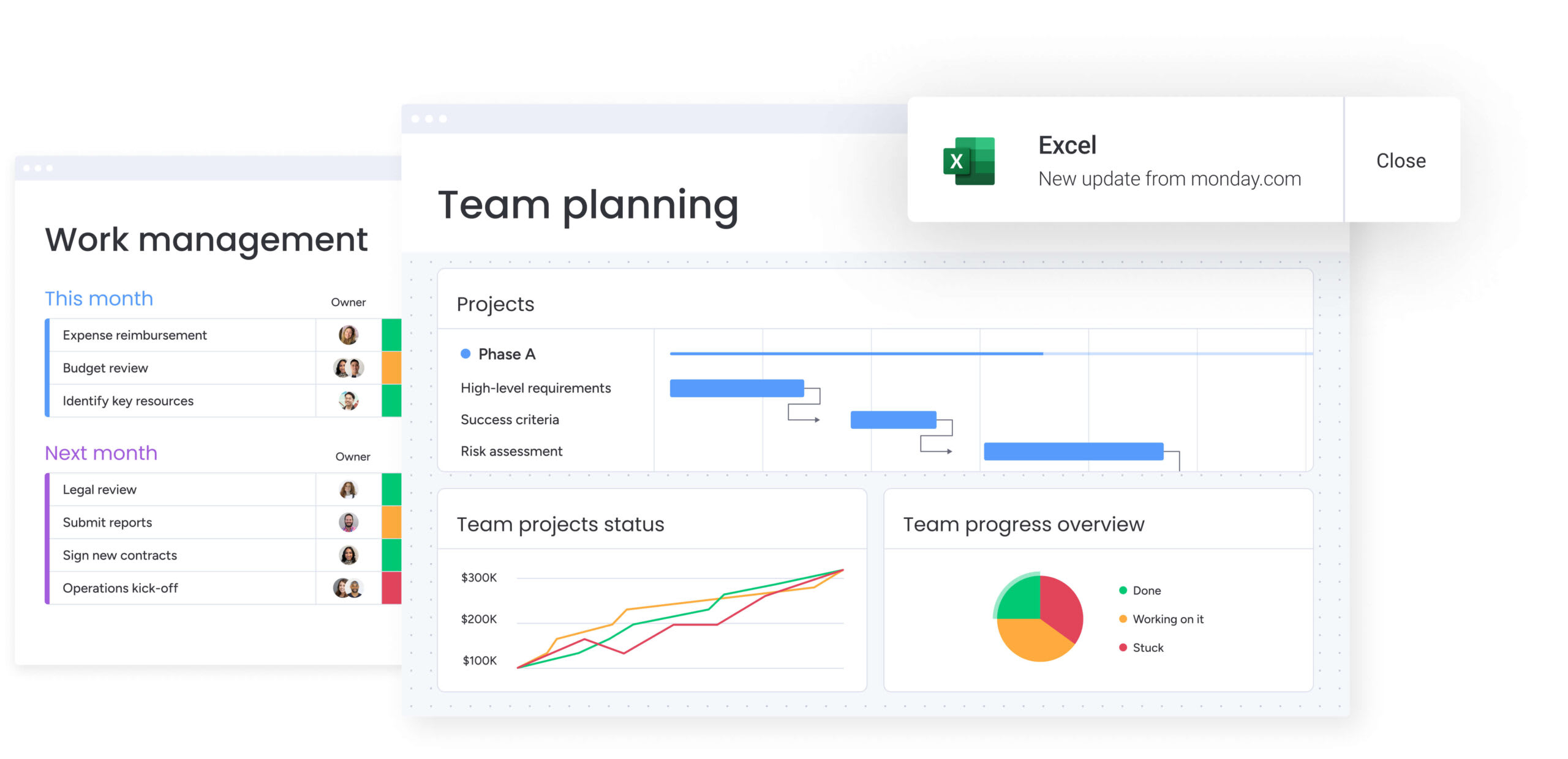
Real-world organizational chart examples from leading companies
Seeing how successful organizations structure their teams helps you design your own org chart. These examples show how structure directly enables business strategy and efficiency. Each approach reflects specific priorities and shows how org design supports results.
Technology companies and flat structures
Major technology firms leverage flat structures to maintain innovation speed. By reducing management layers, these organizations empower engineers and product teams to make technical decisions without navigating multiple approval levels.
Here’s how it plays out:
- Faster product development: features move from concept to deployment without hierarchical bottlenecks.
- Higher employee engagement: engineers feel ownership over their work and technical decisions.
- Rapid iteration: teams can pivot quickly based on user feedback or market changes.
Success depends on maintaining accountability despite fewer oversight layers. These companies do it through transparent goal-setting and peer review.
Retail organizations and divisional models
Global retail brands organize around product categories or geographic markets to maintain local relevance while preserving brand consistency. A European division can adapt pricing and inventory to regional preferences, while a home goods division focuses on category-specific supply chain optimization.
This structure lets divisions specialize without losing scale:
- Market expertise: each division develops deep knowledge of customer preferences.
- Operational efficiency: specialized supply chains and inventory management.
- Brand consistency: shared corporate resources maintain unified brand standards.
The challenge? Preventing silos. Successful retailers use cross-divisional committees and shared metrics to stay aligned.
Consulting firms and matrix approaches
Professional services firms balance industry expertise with functional specialization through matrix structures. A consultant might report to a healthcare practice leader for career development while working under a digital transformation project lead for daily execution.
This dual reporting creates multiple benefits:
- Client value: projects receive both deep industry knowledge and cutting-edge functional expertise.
- Resource efficiency: consultants move between projects based on skills and availability.
- Career development: employees gain exposure to diverse industries and capabilities.
This complexity demands sophisticated resource management. Firms that excel use integrated planning systems to track capacity, skills, and project assignments in real time.
Startups and team-based structures
High-growth startups organize around specific metrics or growth levers rather than traditional functions. A “retention team” might include members from engineering, marketing, and data science, all focused on improving customer retention rates.
This structure aligns diverse skills toward measurable outcomes:
- Outcome focus: teams optimize for specific business metrics rather than functional goals.
- Rapid experimentation: cross-functional teams can test and iterate quickly.
- Shared accountability: success metrics are transparent and collectively owned
This approach needs strong communication tools and regular check-ins to prevent duplicate work across teams. Platforms like monday work management help these organizations maintain visibility across fluid team structures while tracking progress toward shared goals.

Good org charts balance detail with clarity. The right details turn your chart from a simple directory into a management tool that drives daily work. Pick information that serves specific purposes while keeping the chart visually simple.
Here’s what to include and why:
| Element | Purpose | Implementation tip |
|---|---|---|
| Names and photos | Visual identification speeds recognition across distributed teams | Use consistent photo formats and professional headshots |
| Reporting lines | Shows supervisory authority and approval chains | Solid lines for direct reports, dotted for functional relationships |
| Department groups | Indicates functional layout and team boundaries | Apply color-coding for instant visual segmentation |
| Contact details | Enables immediate collaboration without searching | Include email, phone extension, and preferred communication channel |
| Role descriptions | Prevents overlap and identifies correct stakeholders | Add brief responsibility summaries beyond job titles |
Beyond these basics, dynamic org charts include information that reflects what’s actually happening:
- Current workload indicators: show who has capacity for new projects versus who’s at maximum utilization.
- Skills and certifications: map capabilities across the organization for project staffing and development planning.
- Location and time zone: essential for coordinating distributed teams and scheduling cross-regional meetings, especially given that international bandwidth has quadrupled since before COVID‑19, reflecting a step‑change in global connectivity and the need for org charts that map distributed teams across time zones.
- Tenure and experience level: helps identify mentorship opportunities and succession planning needs
How much detail you include depends on who’s using the chart. An org chart for external stakeholders might show only names and titles, while an internal operational version includes workload data, project assignments, and skill inventories.
Organizations using platforms like monday work management can toggle between different views, showing simplified structures for broad communication and detailed operational data for resource planning. This flexibility lets the chart work for multiple audiences without overwhelming anyone.
How to create and maintain an organizational chart
Building an org chart means doing more than mapping current roles. The process should capture how you actually work while supporting future growth. Here’s how to create a chart that stays accurate and useful — working as both a reference tool and operational asset.
Step 1: define your organizational structure goals
First, clarify who’ll use the chart and why. A chart designed for investor presentations will emphasize reporting lines and governance, while one built for internal operations needs to show workload distribution and cross-functional relationships.
Identify your key objectives:
- Improving communication paths between departments.
- Planning for restructuring or growth scenarios.
- Supporting resource allocation decisions.
- Enabling faster onboarding for new hires.
This clarity shapes every decision you’ll make about structure type, information depth, and update frequency.
Step 2: gather current employee and role data
Your chart is only as good as your data. Export information from your HR systems and validate it with department heads to capture recent changes and informal reporting relationships that might not appear in official records.
Essential data points to collect:
- Current titles and reporting relationships.
- Department and team assignments.
- Start dates and role transitions.
- Functional responsibilities beyond formal titles.
- Cross-team collaborations and dotted-line relationships.
This validation often reveals gaps between documented structure and how work actually happens. Address these early to prevent confusion later.
Step 3: choose the right organizational chart format
Pick the structure type that matches how work actually flows in your organization. Consider how decisions get made, where collaboration happens most, and what flexibility you need for future changes.
Evaluate each structure against your operational needs:
- Does your company operate with strict hierarchies, or do teams form and reform around projects?
- Do you need to show external partnerships or just internal relationships?
- How much autonomy do individual contributors have in their daily work?
The right choice supports your work patterns instead of constraining them.
Step 4: design and visualize your company hierarchy
If your chart looks confusing, people won’t use it. Create a design that’s scannable at a glance and detailed enough for practical reference. Group related functions logically, use consistent shapes and colors, and ensure reporting lines don’t create visual confusion.
Design principles for clarity:
- Consistent spacing: equal gaps between levels and positions.
- Logical grouping: cluster related departments or teams.
- Color coding: different colors for departments, locations, or role types.
- Clean lines: avoid crossing lines where possible.
Integrated work management platforms offer drag-and-drop chart builders that automatically maintain visual consistency while allowing real-time updates.
Step 5: maintain and update your organizational charts regularly
An outdated chart creates more confusion than having no chart at all. Decide who owns updates, what triggers changes, and how often you’ll review accuracy.
Create sustainable maintenance processes:
- Automated updates: connect to HR systems for automatic syncing of personnel changes.
- Defined triggers: update immediately for promotions, departures, or restructuring.
- Regular audits: quarterly reviews with department heads to validate accuracy.
- Version control: track changes over time for historical reference.
Integrated platforms automate most of this maintenance. When someone’s status changes in the HR system, the org chart updates automatically. Teams always work from current information.
Try monday work management
Good org charts do more than keep records. They become strategic assets that enable growth, improve operations, and strengthen the organization. Here’s how organizations benefit from org charts that connect structure to execution.
Enhance transparency across all levels
Org charts make company structure visible to everyone. Entry-level employees understand the leadership hierarchy, while executives see how work distributes across departments. This transparency reduces the mystery of “who does what” and enables more direct communication paths.
When everyone can see the full structure, collaboration improves:
- Faster problem resolution: teams identify the right stakeholders immediately.
- Reduced email chains: direct communication replaces lengthy approval searches.
- Improved accountability: clear ownership eliminates finger-pointing.
Problems get solved faster and communication bottlenecks disappear.
Accelerate decision-making
When authority is clear, decisions happen faster. When organizational charts show explicit ownership for different functions and approval levels, teams spend less time seeking sign-offs and more time executing. This matters most during rapid growth or transformation when roles can blur.
Decision speed improves at every level:
- Individual contributors: know exactly who to approach for approvals.
- Managers: understand their decision authority and escalation paths.
- Executives: see where decisions cluster and can delegate appropriately.
Improve cross-functional collaboration
Mapping different departments reveals natural collaboration points and potential silos. Teams can identify their counterparts in other functions, understand interdependencies, and build relationships before projects require them.
This proactive relationship building prevents the friction that typically slows cross-functional initiatives:
- Project planning: teams understand dependencies before work begins.
- Resource sharing: departments can coordinate capacity and expertise.
- Knowledge transfer: best practices flow more easily between related functions.
Support efficient onboarding and knowledge transfer
New hires orient themselves faster when they can visualize the organizational landscape. Understanding reporting structures, team compositions, and departmental boundaries accelerates their integration and productivity. The chart becomes a reference point for building internal networks and understanding how their role contributes to larger objectives.
Beyond individual onboarding, organizational charts preserve institutional knowledge:
- Succession planning: identify critical roles and potential replacements.
- Knowledge documentation: map expertise across the organization.
- Transition management: maintain continuity during personnel changes.
This continuity keeps operations running during personnel changes.
Enable smarter resource allocation
Leaders use org charts to spot imbalances in team composition and workload. Visualizing the structure reveals managers with too many direct reports, understaffed departments, and opportunities to rebalance resources.
Resource decisions shift from intuition to data:
- Capacity planning: managers see constraints before they impact delivery.
- Skill gaps: HR identifies development needs and hiring priorities.
- Budget alignment: finance aligns resources with actual organizational structure.
Connect structure to strategic objectives
Your org chart shows whether your current structure supports long-term goals. If innovation is a priority but there’s no dedicated innovation team on the chart, you’ve got a misalignment. If customer experience is critical but customer-facing teams are buried deep in the hierarchy, the structure might be working against strategy.
This check helps organizations evolve with intention:
- Strategic planning: model different structures before implementing changes.
- Growth scenarios: visualize the impact of scaling on organizational design.
- Performance tracking: link structural changes to business outcomes.
Platforms like monday work management allow organizations to connect their charts directly to strategic planning, linking positions to objectives and tracking how structural changes impact goal achievement.
The evolution of organizational charts: from static to dynamic
Traditional org charts were reference documents — updated quarterly and filed away between reviews. Today’s organizations need live structures that reflect reality and support daily operations management. This evolution transforms org charts from admin documents into intelligence tools that drive business decisions.
AI and digital workers in modern organizations
AI is changing how we think about org structure. Digital workers and AI agents now handle specific functions within workflows, requiring visualization alongside human team members. Smart organizations include these non-human entities in their charts to show where automation handles work and where humans stay in control.
This integration helps teams understand:
- Which processes run autonomously versus requiring human input.
- Where AI assists human workers versus replacing specific functions.
- How digital workers interact with different departments and roles.
Organizations using monday work management can visualize both human and digital workers in unified views, showing how AI capabilities integrate with team structures to enhance rather than replace human work.
Real-time charts connected to work systems
Modern org charts pull from live data instead of manual updates. By integrating with HR systems, project management platforms, and communication tools, charts stay current without constant maintenance. When someone joins, moves roles, or leaves, the chart updates automatically.
This real-time accuracy enables new capabilities:
- Workload visibility: see current capacity and project assignments for any team member.
- Skill mapping: search for specific capabilities across the organization instantly.
- Collaboration patterns: visualize actual working relationships beyond formal reporting lines.
Continuous synchronization keeps org visibility reliable for daily decisions.
Visualizing remote and hybrid teams
Distributed work needs richer org visualization than traditional charts offer. Modern charts show time zones, location status, and availability patterns to help global teams coordinate. This extra context helps managers schedule meetings, plan work sessions, and understand team dynamics across distances.
Key information for distributed teams:
- Location indicators: office, remote, or hybrid status for each team member.
- Time zone mapping: overlap windows for cross-regional collaboration.
- Communication preferences: preferred channels and response time expectations.
- Availability patterns: core hours and flexible scheduling arrangements.
Skills-based organizational mapping
Organizations now map capabilities and expertise alongside traditional reporting structures. Skills-based charts make team formation faster by showing who has specific certifications, project experience, or technical knowledge. This view enables resource allocation based on project needs instead of fixed departmental boundaries.
Benefits of skills-based mapping include:
- Faster project staffing: identify the right expertise quickly.
- Development opportunities: spot skill gaps and training needs.
- Career pathing: show progression routes based on capabilities.
- Succession planning: map critical skills across the organization.
Leaders can see skill gaps across the organization and make targeted hiring or training decisions. Employees can identify mentorship opportunities and career paths based on skill progression rather than just hierarchical advancement.
“monday.com has been a life-changer. It gives us transparency, accountability, and a centralized place to manage projects across the globe".
Kendra Seier | Project Manager“monday.com is the link that holds our business together — connecting our support office and stores with the visibility to move fast, stay consistent, and understand the impact on revenue.”
Duncan McHugh | Chief Operations OfficerTransform your organizational chart into a living business asset with monday work management
monday work management connects org structure directly to work execution. Instead of static diagrams, you get live visibility into how teams operate, collaborate, and deliver results. The platform turns org data into intelligence that drives better resource decisions and efficiency.
| Feature | Traditional static charts | monday work management |
|---|---|---|
| Update frequency | Manual quarterly updates | Real-time automated synchronization |
| Data context | Names and titles only | Workload, capacity, skills, and project data |
| Interactivity | View-only reference | Click through to assignments and details |
| Integration | Standalone document | Connected to workflows and HR systems |
| Strategic value | Administrative record | Operational intelligence for planning |
Move beyond static diagrams to operational excellence
The platform creates interactive org charts where clicking any position reveals current projects, workload metrics, and availability. This depth turns the chart from a reference tool into an operational dashboard.
Managers can spot capacity constraints instantly, assign work based on real availability, and balance workloads without manual analysis. The integration between structure and execution eliminates the disconnect between who’s supposed to do what and who’s actually doing it.
Connect organizational structure to project execution
monday work management connects hierarchy directly to work management systems. When the chart identifies a manager, their approval workflows, project oversight responsibilities, and team performance metrics are immediately accessible.
This connection makes sure reporting lines match actual work patterns, eliminating the gap between documented structure and reality. Teams can see not just who reports to whom, but how work flows through the organization in practice.
Visualize team workload and capacity in real time
Workload widgets show capacity color-coded indicators highlight overloaded teams, available resources, and upcoming capacity crunches.
Managers can rebalance resources immediately, preventing burnout and ensuring consistent delivery across departments. This real-time visibility enables proactive resource management rather than reactive crisis response.
Automate chart updates through smart integrations
The platform eliminates manual chart maintenance through API connections with HR platforms and identity management systems. When personnel data changes, the organizational structure updates automatically across all views and reports.
This automation ensures teams always work from current information without administrative overhead. Digital workers within monday work management can also monitor organizational health, flagging when teams exceed capacity thresholds or when structural imbalances emerge. These AI-powered insights help leaders make proactive adjustments before issues impact delivery.
Build organizational charts that drive operational excellence
An organizational chart represents more than reporting relationships — it’s the foundation for how work flows through your company. When designed thoughtfully and maintained dynamically, it provides the visibility, alignment, and agility required to navigate complex business environments.
The most successful organizations treat their charts as living assets that evolve with business needs. They connect structure to strategy, link positions to actual work, and use organizational visibility to make faster, more informed decisions about resources, priorities, and growth. This approach transforms administrative documentation into strategic business intelligence.
Make it visible, keep it current, and connect it to the work that matters. That’s how organizational charts evolve from HR documentation into strategic business assets that drive operational excellence.
Try monday work managementFrequently asked questions
What are the four types of organizational charts?
The four most common types of organizational charts are hierarchical, flat, matrix, and divisional structures. Hierarchical charts show traditional pyramid-style reporting with clear management layers. Flat structures eliminate middle management for faster decision-making. Matrix structures create dual reporting relationships for project-based work. Divisional charts organize around products, markets, or regions. Each serves different operational needs based on company size, industry, and strategic priorities.
What is an organizational chart for business?
An organizational chart is a visual diagram showing a company's structure, including roles, responsibilities, and reporting relationships between individuals and departments. It maps how authority flows and how teams connect within the business. Modern organizational charts go beyond static documentation to include real-time data about workloads, capacity, and project assignments, making them operational tools rather than just reference documents.
What does an organizational chart look like?
An organizational chart typically appears as a flow diagram with boxes representing positions or employees, connected by lines showing reporting relationships. The visual layout varies by structure type, from pyramid shapes for hierarchical models to grids for matrix organizations. Modern charts include photos, contact information, and dynamic data like current workload status. Color coding often distinguishes departments, locations, or role types for easier navigation.
What does an organization chart reveal?
An organization chart reveals the company's hierarchy, decision-making structure, span of control for managers, and departmental groupings. It also highlights communication paths, potential bottlenecks, and how different functional areas relate to each other. Advanced charts show workload distribution, skill mapping, capacity constraints, and collaboration patterns, providing insights into operational efficiency and resource allocation opportunities.
How often should you update an organizational chart?
Organizational charts should update immediately following personnel changes like new hires, promotions, or departures. Organizations should also conduct quarterly reviews to ensure accuracy and alignment with current operations. Modern platforms automate updates through HR system integrations, ensuring real-time accuracy without manual maintenance. The key is establishing clear governance for who owns updates and what triggers immediate changes.
Do modern organizational charts include AI agents?
Yes, modern organizational charts increasingly include AI agents and automated systems to show where digital labor fits into workflows. This visualization helps teams understand which processes run autonomously versus requiring human oversight. Forward-thinking organizations map both human and digital workers to show how AI capabilities integrate with team structures, enhancing rather than replacing human work while maintaining clear accountability for automated functions.