Many professionals spend more time formatting spreadsheets than analyzing what the data reveals. Multiple tabs, disconnected data sources, and manual formula corrections transform monthly reporting into a time-consuming process rather than a strategic tool for insight.
Well-designed Excel summary templates address these challenges by providing structure to complex data and automating repetitive tasks, allowing meaningful trends to emerge clearly. These templates consolidate information from multiple sources, standardize formats, and enable key metrics to update automatically.
Below, this article explores practical ways to build summary templates that update automatically, the essential formulas that make them dynamic, and best practices for keeping reports readable and scalable, helping teams move from manual grunt work to real decision‑ready insights.
Key takeaways
- Automation saves time: Well-designed Excel summary templates reduce repetitive formatting and manual calculations, allowing teams to focus on analysis rather than spreadsheet maintenance.
- Consistency across departments: Standardized templates ensure all teams interpret metrics the same way, improving cross-functional decision-making and reducing errors.
- Scalable data structure: Organizing data in clean, vertical tables with validation rules allows reports to grow with increasing data volume while maintaining accuracy.
- Dynamic reporting with advanced formulas: Functions like SUMIFS, XLOOKUP, FILTER, dynamic arrays, and Power Query enable real-time updates and actionable insights from raw data.
- Transition to collaborative platforms: When spreadsheets reach their limits, platforms like monday work management provide real-time dashboards, multi-source integration, and AI-assisted insights to enhance reporting efficiency.
What is an Excel summary template?
An Excel summary template is a pre-built spreadsheet designed to bring scattered data into one clear view. Consider it as a central command center for reporting, where insights come together so you can make informed decisions faster. Instead of juggling multiple files, the template organizes everything in one place.
These templates work through four main elements that turn raw data into actionable insights:
- Data input zones: Designated areas where you enter or import information from various sources.
- Calculation engines: Built-in formulas that process your inputs into meaningful metrics.
- Visual displays: Charts and conditional formatting that make trends instantly visible.
- Executive summaries: High-level dashboards showing only the most critical insights for leadership.
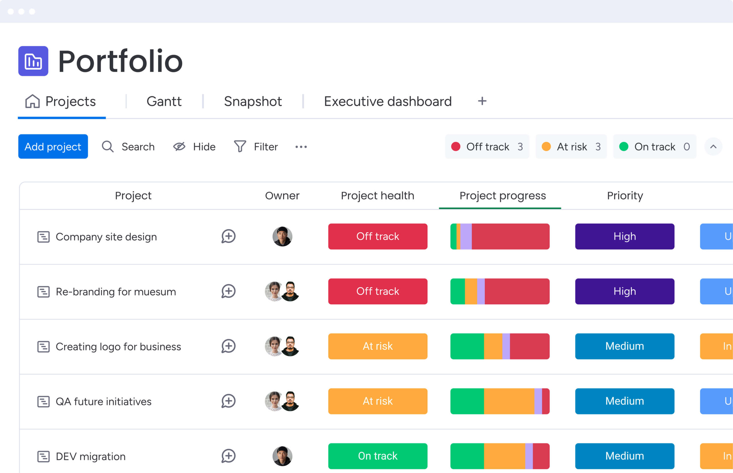
For instance, a project portfolio dashboard can combine status updates from twenty project sheets into a single view, showing budget health and timeline risks. Financial teams use templates to track real-time cash flow, while sales directors rely on pipeline overviews to identify revenue gaps quickly.
Why do Excel summary templates improve business reporting?
Summary templates shift organizations from scattered spreadsheets to structured reporting hubs. This change affects four key areas, improving how teams work and make decisions:
| Benefit | Problem solved | Business impact |
|---|---|---|
| Time efficiency | Repetitive formatting and formula rebuilding | Teams focus on analysis instead of report construction |
| Consistency | Different reporting styles across departments | Revenue and completion rates mean the same thing to everyone |
| Accessibility | Complex datasets confusing non-technical stakeholders | Data becomes digestible through visual formats |
| Decision speed | Delays between data generation and strategic action | Leaders pivot strategies and address risks proactively |
Templates save hours each reporting cycle by handling calculations and formatting automatically. In fact, HMRC’s 2026 report on the UK’s Making Tax Digital program found digital record-keeping saves businesses roughly 33 hours per year.
Standardized templates also make cross-functional reporting reliable, while consolidated views allow leaders to make decisions quickly.
7 key Excel summary templates for business teams
Different departments need dashboards that focus on their priorities. These seven templates cover the most common reporting needs:
1. Financial summary templates
Financial templates show you the numbers you need to stay solvent and grow. CFOs, controllers, and department heads use these to track financial health against targets and make smarter budget calls.
- Budget vs. actuals: Tracks planned spend against real-time expenses to identify overages immediately.
- Cash flow statement: Monitors capital inflow and outflow to ensure liquidity for operations.
- Profit margin analysis: Breaks down gross and net margins by product line or service area.
2. Project status report templates
Project managers need updates that stakeholders can understand at a glance. These templates provide clarity without overwhelming details.
- Milestone tracker: Visualizes key deliverables against critical path timelines.
- Resource utilization: Highlights team capacity and identifies bottlenecks or underutilized staff.
- Risk register: Categorizes potential project threats by probability and impact level.
3. Sales performance summary templates
Sales templates track revenue, pipeline health, and how each rep performs. Sales directors use these to forecast quarterly results and coach representatives toward their targets.
- Pipeline velocity: Measures the speed at which deals move from lead to closed-won.
- Quota attainment: Tracks individual and team progress toward revenue targets.
- Conversion rates: Analyze the percentage of leads progressing through each funnel stage.
4. Inventory summary templates
Inventory templates balance supply with demand to optimize working capital. Operations managers and supply chain leads use these to avoid stockouts without tying up too much cash in inventory.
- Stock turnover rate: Measures how frequently inventory sells and is replaced over a period.
- Reorder point alerts: Flags items that drop below safety stock levels.
- Dead stock analysis: Identifies slow-moving items that tie up capital and warehouse space.
5. HR analytics templates
HR templates put numbers on workforce trends, so you’re managing people with data instead of gut feel. CHROs and talent acquisition teams use these to improve retention and hiring efficiency.
- Headcount and turnover: Tracks total employee count and voluntary/involuntary departure rates.
- Time-to-hire: Measures average days between job posting and offer acceptance.
- Employee satisfaction score: Aggregates survey data to gauge organizational morale.
6. Marketing campaign report templates
Marketing templates connect what you spend to what you get, engagement, and conversions. CMOs and campaign managers use these to prove budget ROI and figure out which channels actually work.
- Cost per acquisition: Calculates marketing spend required to acquire a single paying customer.
- Channel ROI: Compares the effectiveness of email, social, and paid search campaigns.
- Engagement rate: Tracks likes, shares, and comments relative to total audience reach.
7. Operations dashboard templates
Operations templates track how efficiently your core processes run. COOs and operations directors use these to spot waste, tighten quality control, and make better use of resources.
- Cycle time: Measures the total time required to complete a specific process from start to finish.
- Error/defect rate: Tracks frequency of quality issues or process failures.
- Capacity utilization: Analyzes how effectively equipment and facilities are used against maximum potential.
Financial templates show you the numbers you need to stay solvent and grow. CFOs, controllers, and department heads use these to track financial health against targets and make smarter budget calls.
5 steps to create a scenario summary report in Excel
Creating a report that updates automatically and delivers insights requires structure and planning. Follow these five steps:
Step 1: structure your data sources
Clean, organized data is the foundation of any report that updates itself. Therefore, start by organizing your approach to data management:
- Separate data from presentation: Organize raw data on separate tabs from your presentation layer.
- Standardize column headers: Give every column a unique header and maintain consistent data types throughout.
- Implement data validation: Use dropdown lists for categorical inputs like “Region” or “Status” to prevent spelling errors that break formulas.
This keeps your summary stable even when your data keeps growing. Name your tabs descriptively so anyone reviewing the workbook can navigate without guidance.
Step 2: design your report layout
Sketch your summary tab layout first so information flows logically and plan your visual hierarchy strategically:
- Top section: Designated for high-level KPIs displayed as cards.
- Middle section: Place trend visualizations and charts.
- Bottom section: Reserve for detailed data tables.
Arrange information logically, start with the numbers themselves, move to trends over time, then provide contextual details. This layout guides people to what matters most, right away.
Step 3: build dynamic formulas for summaries
Next, fill summary fields with formulas that pull from your raw data tabs. Focus on creating flexible, automated calculations:
- Use SUMIFS: Aggregate values based on multiple criteria, such as total sales by region and product.
- Implement XLOOKUP: Pull specific data points associated with unique identifiers.
- Create pivot tables: Enable flexible data slicing for users to interact with summaries.
This lets users filter by timeframe or category without touching the source data.
Step 4: link multiple sheets for consolidated views
Connect your summary sheet to data sources inside your workbook or in other files. Establish robust data connections:
- Use threeD references: Sum the same cell across multiple sheets, ideal for consolidating monthly reports into quarterly views.
- Monitor for broken links: Check regularly for #REF! errors, especially when source sheets are moved or renamed.
- Maintain active connections: Ensure data flows correctly between all linked sources.
Step 5: apply professional reporting format
Finally, polish the visuals so they’re easy to read and look professional. Focus on creating a dashboard-like experience:
- Visual consistency: Use a consistent color palette aligned with company branding and remove gridlines.
- Conditional formatting: Apply green for positive trends, red for negative variances.
- Access controls: Lock summary cells to prevent accidental edits while leaving input fields accessible.
This keeps the template working correctly, no matter who uses it.
5 power formulas for Excel report templates
Advanced formulas turn static spreadsheets into reports that update themselves automatically. These five formulas carry most of the heavy lifting in professional templates, each solving a distinct reporting challenge.
This table breaks down what they do, their complexity, and the impact on your reporting:
| Formula | Complexity | Primary use | Business impact |
|---|---|---|---|
| SUMIFS | Intermediate | Multi-criteria aggregation | Calculates total revenue for specific product lines within regions |
| XLOOKUP | Intermediate | Robust data retrieval | Finds employee details or product prices from master lists |
| Dynamic arrays | Advanced | Auto-expanding lists | Creates lists that automatically update using SORT and FILTER |
| Power Query | Expert | Data transformation | Imports, cleans, and merges messy data from external sources |
| FILTER | Advanced | Real-time segmentation | Displays data subsets based on dynamic criteria |
1. SUMIFS for multi-criteria analysis
SUMIFS is ideal for summing numbers that meet several conditions at once. For example, you can calculate total sales where the region is “North” and the quarter is “Q1.” This eliminates the need for manual sub-totaling and keeps your dashboard tiles updating automatically as your data changes.
2. XLOOKUP for data retrieval
XLOOKUP replaces older lookup functions with a faster, more reliable option. It searches vertical and horizontal arrays, defaults to exact matches, and even handles errors gracefully. Instead of seeing #N/A, you can display “Not Found” or a custom message, keeping your report polished and easy to read.
3. Dynamic arrays forprecise data retrieval
Dynamic array functions like UNIQUE, SORT, and FILTER spill results into adjacent cells automatically. A single formula can generate a sorted list of all products currently out of stock. As inventory levels change, the list expands or contracts in real-time without dragging formulas down.
4. Power Query for data preparation
Power Query handles extracting, cleaning, and loading data efficiently. It connects to external sources, removes duplicates, splits columns, and delivers clean data straight into your workbook. Furthermore, automating repetitive data prep, it frees you to focus on analysis instead of manual work.
5. FILTER function for real-time updates
The FILTER function pulls records that match specific criteria into a new range instantly. In a project status report, you could display all overdue tasks dynamically. Unlike static filters, FILTER updates immediately whenever underlying data changes, keeping your dashboard current and actionable.
These five formulas carry most of the heavy lifting in professional templates, each solving a distinct reporting challenge.
3 simple Excel summary templates
Well-designed templates scale as data grows and teams rely on them for decision-making. Use these practices to ensure your reports stay reliable and readable.
1. Optimize data structure for scalability
Your template’s foundation determines whether it scales smoothly or collapses under growth. Smart data structure prevents performance issues before they start.
- Vertical growth strategy: Always let data grow down, not across. Structure source data in flat tables where each row represents a record and each column represents an attribute.
- Avoid structural limitations: Never merge cells in data storage tabs, this breaks sorting and filtering capabilities that users depend on for analysis.
2. Implement consistent naming conventions
Clear naming conventions transform chaotic workbooks into organized systems that anyone can navigate. When files and ranges have logical names, teams waste less time hunting for information.
- File and worksheet naming: Set clear naming rules for files, worksheets, and named ranges. A workbook named “2025_Q1_Financial_Summary_vtwo” is infinitely more retrievable than “Report_Final”.
- Formula readability: Use named ranges in formulas rather than cell references to make formulas readable and easier to debug when issues arise.
3. Build error-checking into templates
Templates that catch their own mistakes save hours of troubleshooting and prevent bad data from reaching decision-makers. Build validation directly into your structure rather than relying on users to spot problems.
- Self-diagnostic capabilities: Build templates that catch problems on their own. Include check cells that subtract the sum of parts from the total; if the result isn’t zero, conditional formatting turns the cell red.
- Input validation: Use data validation to restrict inputs to acceptable values, preventing user error at the source rather than fixing problems later.
4. Design for accessibility and sharing
Templates only deliver value when everyone can actually use them. Design with your entire audience in mind, from Excel experts to occasional users who just need to pull a quick report.
- Cross-platform compatibility: Make sure your templates work across different Excel versions and operating systems. Avoid using macros unless necessary, as they often trigger security warnings or fail in web-based Excel.
- User guidance: Include a “Read Me” tab with instructions on how to use the template and who to contact for support when questions arise.
When to graduate from Excel report templates?
Excel templates work great until your organization gets too complex for them to handle. Knowing these limits helps you switch to better options before slowdowns hurt your operations and decision-making.
Data volume exceeds Excel capacity
Excel performance degrades as datasets approach hundreds of thousands of rows. While the theoretical limit exceeds one million rows, calculation speed slows significantly with complex formulas referencing large ranges. When it takes minutes to open a file or change a single cell, your spreadsheet’s become a bottleneck.
Multiple teams need live access
Excel wasn’t built for teams across departments to work in it at the same time. Shared workbooks suffer from locked file errors and version control conflicts. When sales, finance, and operations all need to update reports at once, managing file access becomes more trouble than it’s worth.
Real-time reporting becomes critical
Spreadsheets are inherently static snapshots. They require manual updates or scheduled refreshes to reflect current business state. When you need real-time visibility, Excel’s delays create dangerous blind spots. Decisions based on yesterday’s data can mean missed opportunities or risks you didn’t see coming.
Governance and audit trails matter
Excel doesn’t have detailed permission controls or strong audit trails. Tracking who changed a specific cell, when they changed it, and what the previous value was proves difficult. In regulated industries or when handling sensitive financials, this creates compliance risks.
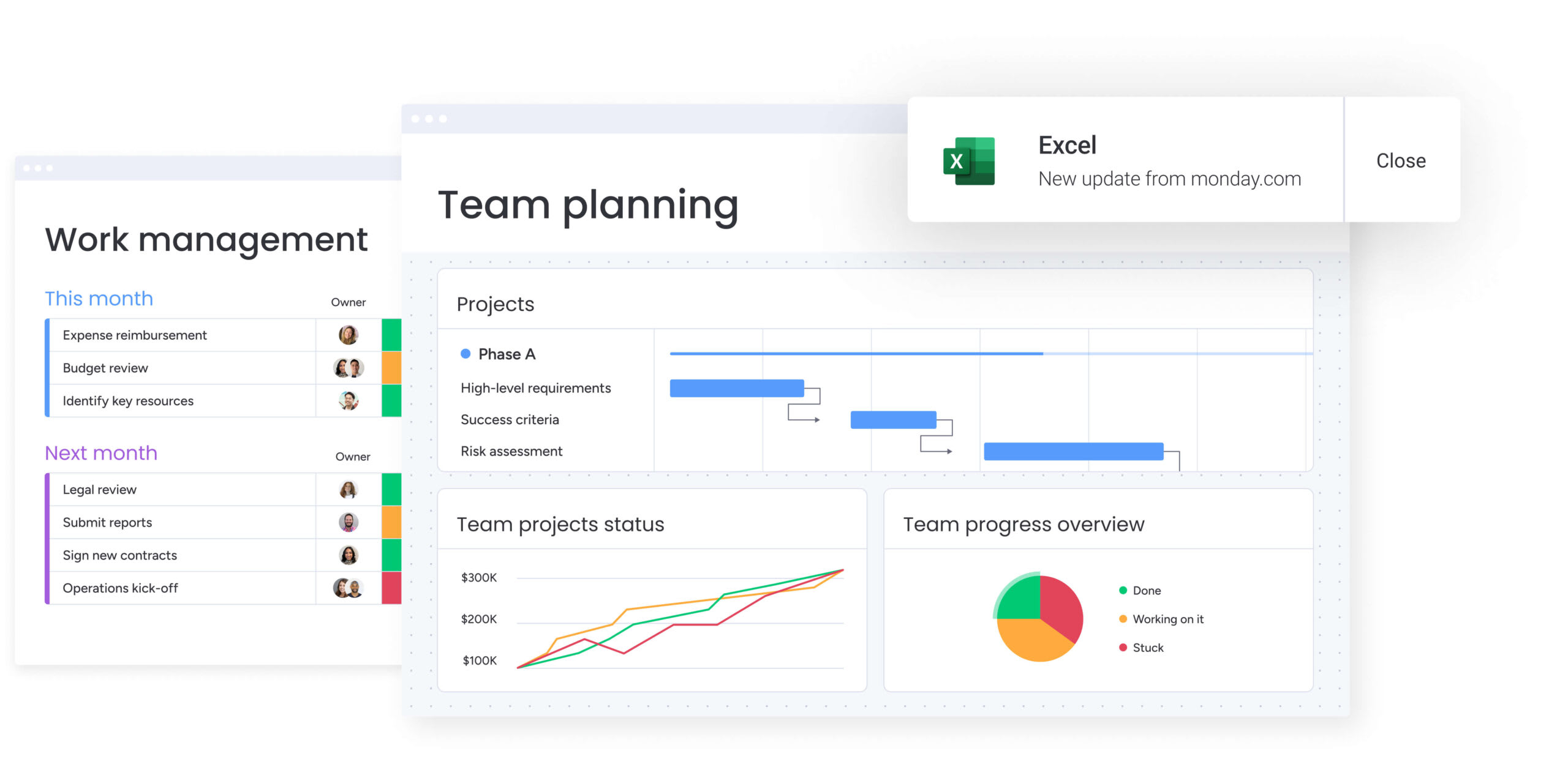
Make your Excel reports smarter with monday work management

“monday.com has been a life-changer. It gives us transparency, accountability, and a centralized place to manage projects across the globe".
Kendra Seier | Project Manager“monday.com is the link that holds our business together — connecting our support office and stores with the visibility to move fast, stay consistent, and understand the impact on revenue.”
Duncan McHugh | Chief Operations OfficerDaily work often happens in scattered spreadsheets and fragmented dashboards, making it hard for teams to see the bigger picture. monday work management connects day-to-day tasks to overarching business goals, providing a single, reliable source of truth while streamlining reporting workflows.
Key features and benefits include:
- Real-time data synchronization: Eliminates delays and manual updates, so dashboards always reflect the latest information.
- Cross-team visibility: Consolidates updates from multiple departments into a shared workspace without version conflicts.
- Automated data consolidation: Pulls information from various sources, including Excel and other apps, reducing repetitive manual work.
- AI-powered insights: Highlights trends, summarizes updates, and flags potential risks before they impact projects.
- Customizable dashboards: Provide high-level overviews for executives while allowing detailed views for team members.
By unifying work in one platform, teams spend less time wrangling data and more time making informed decisions. This approach ensures efficiency, alignment, and measurable strategic impact without adding complexity to existing workflows.
Frequently asked questions
How do you generate a summary in Excel?
To generate a summary in Excel, users utilize aggregation formulas like SUM, AVERAGE, and COUNTIF on a dedicated sheet to calculate totals from raw data tabs. Alternatively, insert a pivot table to automatically group and summarize large datasets by selecting your data range, choosing "Insert" then "PivotTable", and dragging relevant fields into the appropriate areas.
What is the XLOOKUP function used for in summary reports?
XLOOKUP retrieves specific data points from larger datasets to populate summary fields, offering a more robust and flexible alternative to older VLOOKUP functions. It searches in any direction, handles errors gracefully, and can return multiple values, making it ideal for pulling employee details, product prices, or customer information into summary dashboards.
Can Excel automatically update summary data from multiple sheets?
Excel updates summary data automatically when formulas utilize threeD references or when pivot tables are set to refresh upon opening. However, connections to external workbooks often require manual permission to update, and real-time synchronization across multiple users remains limited without cloud-based solutions.
How do you create a pivot table summary in Excel?
Users create a pivot table summary by selecting their raw data range, navigating to the "Insert" tab, choosing "PivotTable," and then dragging relevant fields into the Rows, Columns, and Values areas. This constructs the desired view, allowing for instant data grouping, filtering, and calculation without complex formulas.
What are the main limitations of Excel for enterprise reporting?
Excel struggles with enterprise reporting due to performance lag with large datasets, difficulties in simultaneous collaboration, lack of real-time data synchronization, and insufficient governance controls for sensitive data. These limitations become more pronounced as organizations scale, data volume increases, and compliance requirements tighten.
How do Excel summary templates compare to dedicated reporting platforms?
Excel templates offer flexibility and familiarity for individual use, while dedicated platforms like monday work management provide real-time collaboration, automated data integration, and scalable AI insights specifically engineered for complex business workflows. The choice depends on organizational size, collaboration needs, and the complexity of reporting requirements.