

Whether you’re managing sprints in Scrum or navigating complex projects, burnup charts offer valuable insights into efficiency, trends, and completion timelines. This simple yet powerful tool helps teams and stakeholders stay aligned on goals while adapting to changes in scope or timelines.
But they’re not the only tool available for tracking progress in development projects.
In this guide, we’ll examine the components and benefits of a burnup chart and how it differs from a burndown chart. We’ll also show you when and how to create one and highlight some additional ways to track progress with monday dev.
Try monday devWhat is a burnup chart?
A burnup chart is a visual project management tool used in Agile methodologies to track progress over time. It provides a clear overview of how much work has been completed versus the total scope of work, making it an effective way to monitor team performance and project status.
What are the components of an Agile burnup chart?
The key components of a burnup chart include:
- Time (Horizontal X-axis): Represents the timeline of the project, often divided into sprints, days, or weeks.
- Work units (Vertical Y-axis): Displays the scope of work, which you can measure in story points, tasks, or other units.
- Total work line (Scope): Represents the total planned work for the project. This line may change if scope adjustments occur during the project.
- Completed work line: Shows the cumulative progress made toward completing the project over time.
- Ideal line (optional): Some charts include a guideline to represent the ideal pace of progress needed to complete the project on time.
Together, these components provide a clear visualization of progress and scope changes in Agile projects.
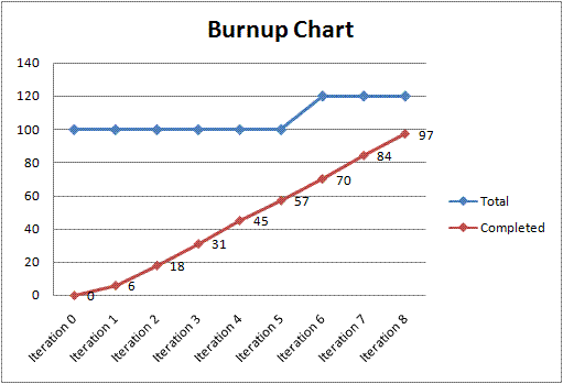
Burnup chart example
Here’s an example of a burnup chart where the blue line represents the total planned work, and the red line shows progress so far:
How do you read a burnup chart?
Once you understand the axes and lines on the burnup chart, you can interpret the elements to assess project status, identify potential delays, and communicate scope changes effectively to stakeholders.
1. Analyze progress
Compare the completed work line to the total work line:
- If the completed work line steadily rises toward the total work line, the project is on track as planned.
- If there’s a gap between the lines, it indicates remaining work.
2. Monitor scope changes
Look for shifts in the total work line:
- An upward shift means new tasks have been added (scope increase).
- A downward shift means tasks have been removed (scope reduction).
3. Predict completion
Extend the completed work line based on current progress trends to estimate when the project will be finished.
4. Evaluate team efficiency
Check for inconsistencies in progress — sudden slowdowns or accelerations in the completed work line may indicate bottlenecks or efficiency changes.
Burnup vs. burndown chart: What’s the difference?
Burnup and burndown charts are both valuable Agile project management tools, but they serve different purposes and provide distinct visualizations of progress.
Feature Burnup chart Burndown chart
Focus Work completed vs. total scope Work remaining
Lines Two: Total scope and completed work Two: Ideal progress and actual remaining work
Scope changes Easily visualized Often hidden
Visual direction Progresses upward Progresses downward
Best use case Dynamic scope projects Fixed-scope projects
Audience Experienced Agile practitioners Teams new to Agile
Here’s a detailed comparison:
1. Focus
- Burnup chart: Tracks completed work and total project scope. It shows how much work has been done and highlights any changes in scope over time.
- Burndown chart: Tracks remaining work. It focuses on how much work is left to complete the project.
2. Lines represented
- Burnup chart: Contains two lines — total project scope (which may change due to scope creep) and cumulative completed work.
- Burndown chart: Contains two lines — ideal tasks remaining and actual tasks remaining.
3. Handling scope changes
- Burnup chart: Displays scope changes through adjustments in the total scope line, making it easier to see how added or removed tasks impact progress.
- Burndown chart: Does not handle scope changes well — added tasks can make it appear as though progress is slowing, even when the team is working efficiently.
4. Visual representation
- Burnup chart: Starts at zero and progresses upward as work is completed.
- Burndown chart: Starts at the total amount of work and moves downward toward zero as tasks are completed.
5. Use cases
- Burnup chart: Best for projects with dynamic or changing scopes. It’s useful for communicating progress to stakeholders while accounting for scope adjustments and ideal for complex projects with dependencies or evolving requirements.
- Burndown chart: Best for fixed-scope projects with strict deadlines. It’s simpler to understand and use, making it suitable for quick updates or less complex projects.
6. Audience
- Burnup chart: Preferred by experienced Agile practitioners and stakeholders who need a detailed view of progress and scope changes.
- Burndown chart: Often favored by teams new to Agile or those needing a straightforward visualization of remaining effort.
Both charts are valuable tools, but their effectiveness depends on the project’s nature. Use a burnup chart for projects with evolving requirements to capture scope changes clearly, and use a burndown chart for simpler, fixed-scope projects where tracking remaining effort is sufficient.
What are the benefits of a burnup chart?
Burnup charts are an essential tool for Agile project management, particularly in dynamic environments where scope changes are common. Here are the top business benefits of using a burnup chart:
- Tracks progress clearly: Burnup charts visually represent completed work and total scope, making it easy to see how much progress has been made over time.
- Handles scope changes: Unlike burndown charts, burnup charts explicitly show scope changes by adjusting the total work line, helping teams and stakeholders understand how added or removed tasks impact timelines and workload.
- Predicts project completion: By extending the completed work line, teams can forecast approximate project completion dates based on current progress trends.
- Improves communication: Burnup charts provide a comprehensive overview of progress and scope adjustments, facilitating better communication with stakeholders and customers about delays or changes.
- Monitors team efficiency: Teams can track efficiency across sprints by analyzing changes in the completed work line and identifying bottlenecks or issues that may slow progress.
- Facilitates strategic planning: By visualizing both progress and scope changes, teams can adapt their strategies to align with project goals and stakeholder expectations and mitigate the impact before it disrupts the project timeline.
- Motivates teams: Visualizing progress can boost morale by showing accomplishments.
When should you use a burnup chart?
Burnup charts are handy in the following scenarios:
- Dynamic or evolving project scope: Use a burnup chart to anticipate frequent scope changes, such as added or removed tasks or features. It clearly visualizes these changes, making it ideal for projects where scope creep is common.
- Managing scope creep: If scope creep disrupts your project timeline, a burnup chart helps track its impact and allows teams to adjust plans accordingly. Unlike burndown charts, it explicitly shows increases or decreases in scope.
- Communicating progress to stakeholders: Burnup charts effectively share progress updates with stakeholders, providing a detailed, real-time view of completed work and scope changes.
- Forecasting completion dates: Use burnup charts to predict project completion by extending the completed work line based on current trends. They are invaluable for projects with flexible timelines.
- Projects with variable team sizes: When team sizes fluctuate during different phases of a project, burnup charts accommodate these changes without skewing progress representation.
- Scrum and Agile projects: Burnup charts are well-suited for Scrum projects and Agile planning, allowing teams to visualize progress against the total scope and adapt to dynamic workflows.
- Historical analysis and continuous improvement: Use burnup charts to analyze past projects and improve processes or forecast future tasks.
By using a burnup chart in these situations, teams can effectively manage scope changes, communicate progress, and maintain control over dynamic Agile projects.
Who should use a burnup chart?
Burnup charts are suitable for various individuals and teams involved in Agile project management or iterative workflows across industries like engineering, IT, marketing, and product development. Here’s who should use them:
1. Project managers
Burnup charts help project managers:
- Identify delays or bottlenecks
- Track progress and scope changes
- Manage scope creep effectively
- Communicate updates to stakeholders
2. Scrum masters
Burnup charts enable Scrum masters to:
- Optimize sprint planning
- Track progress across iterations
- Review team performance and identify areas for improvement during retrospectives
3. Stakeholders
Burnup charts help stakeholders:
- Visualize project progress and scope changes
- Understand timelines, issues, and budget adjustments without needing technical expertise
4. Software development teams
Burnup charts allow software development teams to:
- Track features completed versus planned
- Improve decision-making regarding delivery scope
5. Product development teams
Burnup charts help product development teams:
- Evolve product iterations based on user feedback
- Stay aligned with goals while adapting to changing requirements
6. Teams managing complex projects
Burnup charts allow teams to:
- Anticipate delays and adjust strategies accordingly
- Manage complex projects with flexible timelines, dependencies, or evolving scopes
How to create a burnup chart
Follow these steps to create a burnup chart that effectively visualizes progress and scope changes and helps teams and stakeholders stay aligned throughout the project lifecycle.
1. Define the scope
Determine the total work required for the project, such as tasks, story points, or features. This represents the total scope of the project.
2. Set up the axes
Draw your two axes:
- X-axis (Time): Represents the timeline, such as sprints, days, or weeks.
- Y-axis (Work units): Represents the amount of work, measured in story points, tasks, or hours.
3. Plot the total work (scope) line
Draw a horizontal line across the chart to represent the total planned work. Adjust this line accordingly if scope changes occur during the project, e.g. tasks get added or removed.
4. Plot the completed work (progress) line
Track the work completed regularly, e.g. at the end of each sprint or reporting period. Connect these data points to form a line showing cumulative progress over time.
5. Add milestones and annotations (optional)
Mark milestones where significant events or goals are achieved. Use annotations to explain scope changes, delays, or other factors affecting progress.
6. Update regularly
Continuously update the chart as new data becomes available. This ensures accurate tracking and helps identify trends in progress and scope changes.
7. Use tools for efficiency
While you can manually create a burnup chart using paper or Excel, software tools like monday dev provide templates and collaboration features for easier creation and sharing.
Try monday devAgile burnup charts and more in monday dev
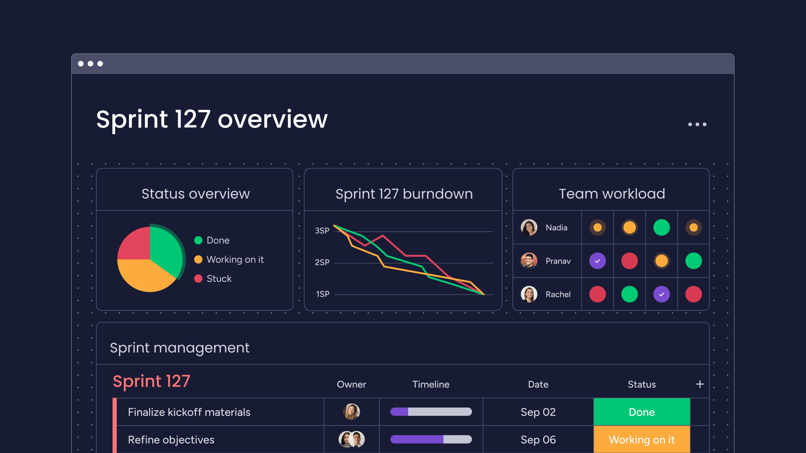
Built on monday.com Work OS, monday dev allows product and engineering teams to manage their planning, sprints, and releases from start to finish in one place. Its customizable charts, views, and dashboards provide real-time visibility into project execution, enabling managers to track progress, make informed decisions, and course-correct quickly without slowing down development. Here are five tools you could tap into:
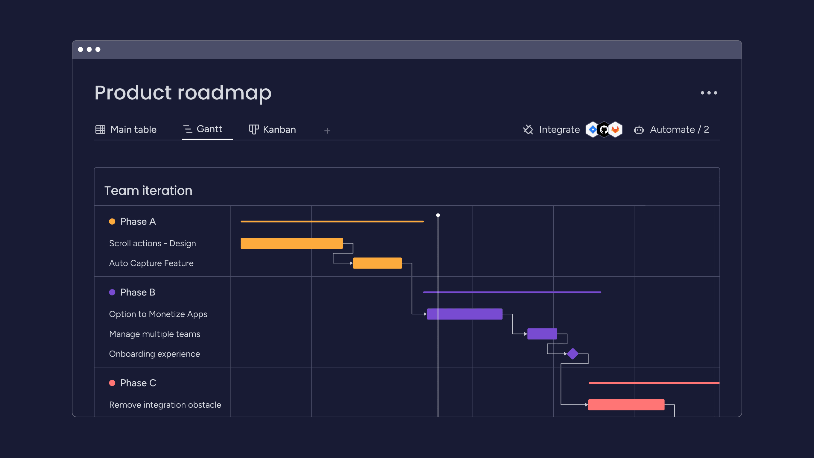
- Gantt charts: Visualize project milestones and dependencies to prioritize features, finish projects on time, check overlapping activities, and keep stakeholders aligned.
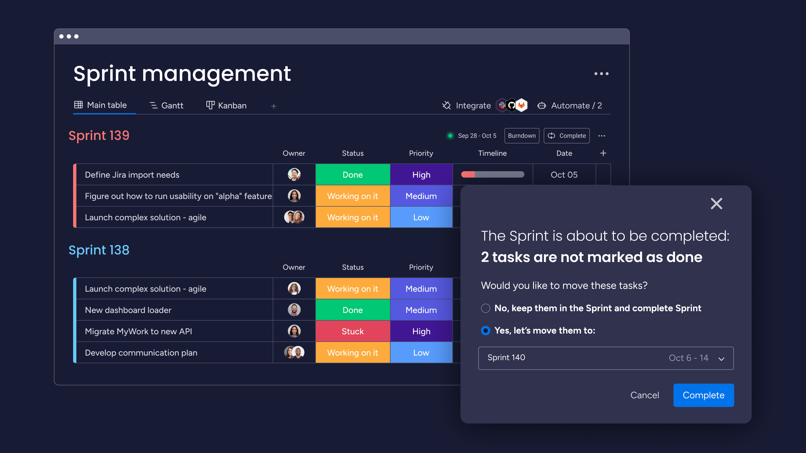
- Sprint management: Improve planning, collaboration, and productivity with flexible workflows, sprint automations, and integrated CI/CD tools.
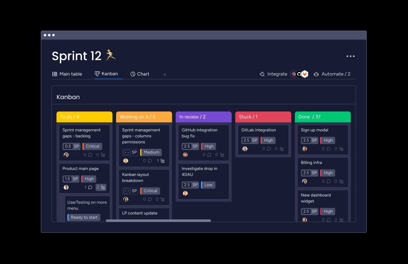
- Kanban boards: Get full transparency into your team’s development tasks with a visual Kanban view to maximize efficiency.
- Dashboards: Automatically update custom dashboards with high-level and granular insights for smarter decision-making.
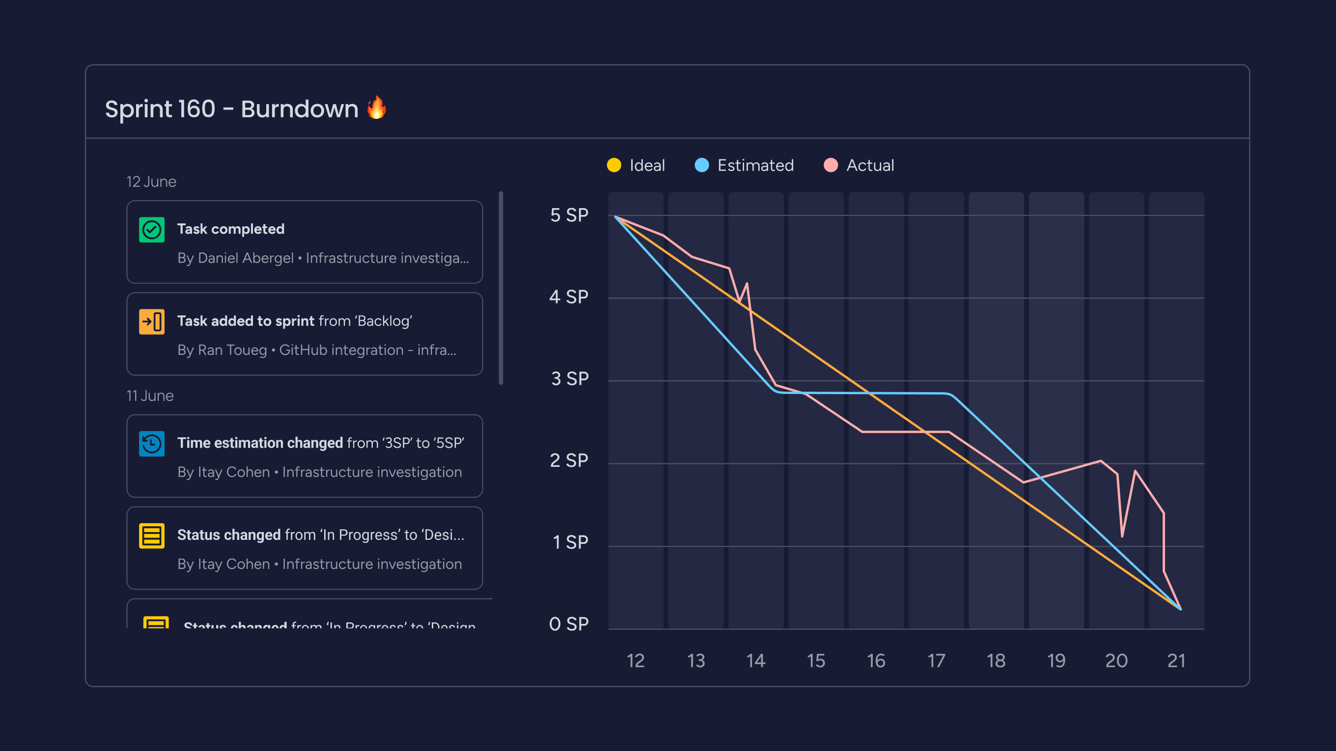
- Burndown charts: Detect potential problems or bottlenecks based on actual versus ideal progress.
All of these charts, views, and dashboards offer alternative ways to track progress, make decisions, and manage Agile projects effectively.
But don’t just take our word for it — experience monday dev yourself with a free trial and see how you can manage your product development projects in one flexible platform.
Try monday devFAQs
What does a burnup chart show?
A burnup chart visually represents the progress of a project by showing two key elements: the total amount of work planned (scope) and the cumulative work completed over time. It allows teams and stakeholders to monitor progress, identify scope changes, and predict project completion dates based on trends. It’s beneficial for Agile projects where scope adjustments may occur, as it highlights the impact of these changes on timelines and goals.
What are the most common mistakes when using burnup charts?
Common mistakes when using burnup charts include failing to update the chart regularly, which can lead to inaccurate tracking of progress and scope changes, and misinterpreting the data, resulting in poor decision-making. Teams often overcomplicate the chart by adding unnecessary details or failing to adjust the scope line when changes occur, making the chart less effective. Additionally, forgetting to save work or using incorrect data can further distort the accuracy of the chart.
How does a burnup chart differ from a burndown chart?
A burnup chart differs from a burndown chart as it tracks both the total project scope and the cumulative work completed, making it ideal for visualizing progress and scope changes. In contrast, a burndown chart focuses solely on the remaining work, providing a simpler view of how much is left to do. Burnup charts are better suited for projects with dynamic scopes, while burndown charts work well for fixed-scope projects.