
If you’re a project manager in the services world, you’re not just tracking tasks — you’re orchestrating moving parts across clients, departments, deadlines, and resource constraints. When data is scattered across spreadsheets, emails, and disconnected tools, even simple decisions slow down. Momentum stalls. Teams wait. Small issues snowball into big delays.
Dashboard software changes that dynamic entirely. Modern platforms turn fragmented information into live, visual clarity — surfacing risks early, showing where resources are stretched, and giving leaders instant visibility into project health. And today’s smartest dashboards don’t just display what’s happening; they interpret it, predict what’s coming, and highlight exactly where your attention is needed next.
If you’re ready for reporting that doesn’t require hours of manual compilation — and dashboards your team will actually use — you’re in the right place. Let’s break down what truly defines great dashboard software for services teams and how you can leverage it for faster delivery, sharper decisions, and stronger alignment across your organization.
Key takeaways
When you’re managing projects across multiple teams and departments, scattered data creates blind spots that slow down decision-making, often requiring a project management dashboard to unify information in real time. The right dashboard software transforms this chaos into actionable insights.
Here are the big insights every services project manager needs to know when choosing dashboard software:
- Streamline reporting with real-time data: Forget manual updates — the best dashboards sync directly with your workflows so insights stay accurate minute-to-minute.
- Build dashboards without IT: No-code customization means anyone can create the visibility they need, not just data specialists.
- Spot problems early with AI: Modern dashboards highlight risks, resource conflicts, and timeline pressure before they turn into blockers.
- Centralize work and reporting in one place: Dashboards work best when they pull directly from where your team executes — not from disconnected BI tools.
- Scale visibility effortlessly: From one team to an entire PMO, the right platform grows with you, keeping portfolio-wide clarity intact.
What makes project managers choose dashboard software?
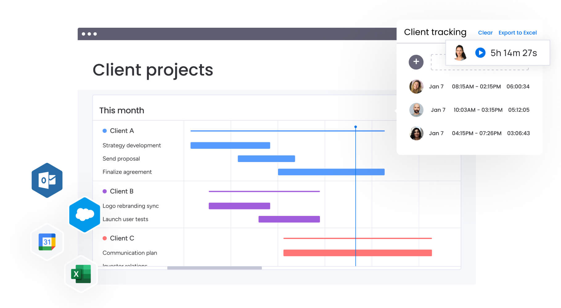
Dashboard software pulls all your scattered project pieces — data, team conversations, and visual reports — into a single home base that everyone can access. Instead of jumping between spreadsheets, email, project tracking tools, and separate reporting platforms, you get a single source of truth where everything exists together.
For PMO teams juggling 20+ client projects at once, this centralization isn’t just convenient — it’s a complete game-changer for how you work. Your customizable dashboards update in real-time as work progresses, much like real-time dashboards that deliver instant visibility into project health, resource allocation, and budget status without manual data compilation.
Key benefits include:
- Early conflict detection: identify resource conflicts before they impact delivery.
- Real-time profitability tracking: monitor project margins as work progresses.
- Role-specific visibility: share progress with clients and executives through customized dashboard views.
The impact on productivity is significant, and larger organizations can also benefit from executive dashboards that provide leadership with portfolio-level insights. When teams consolidate their work on monday.com using unified dashboards, they typically save 3+ hours per person weekly on status reporting and data compilation.
Automated workflows also handle routine notifications while real-time visibility eliminates the constant back-and-forth of status meetings.
What features should you prioritize in dashboard software?
Focus on the dashboard capabilities that will make a real difference for your specific teams, rather than getting distracted by flashy features. The features that matter most depend on your team size, project complexity, and integration needs.
Here’s how to evaluate the essential capabilities that separate basic reporting tools from comprehensive dashboard platforms.
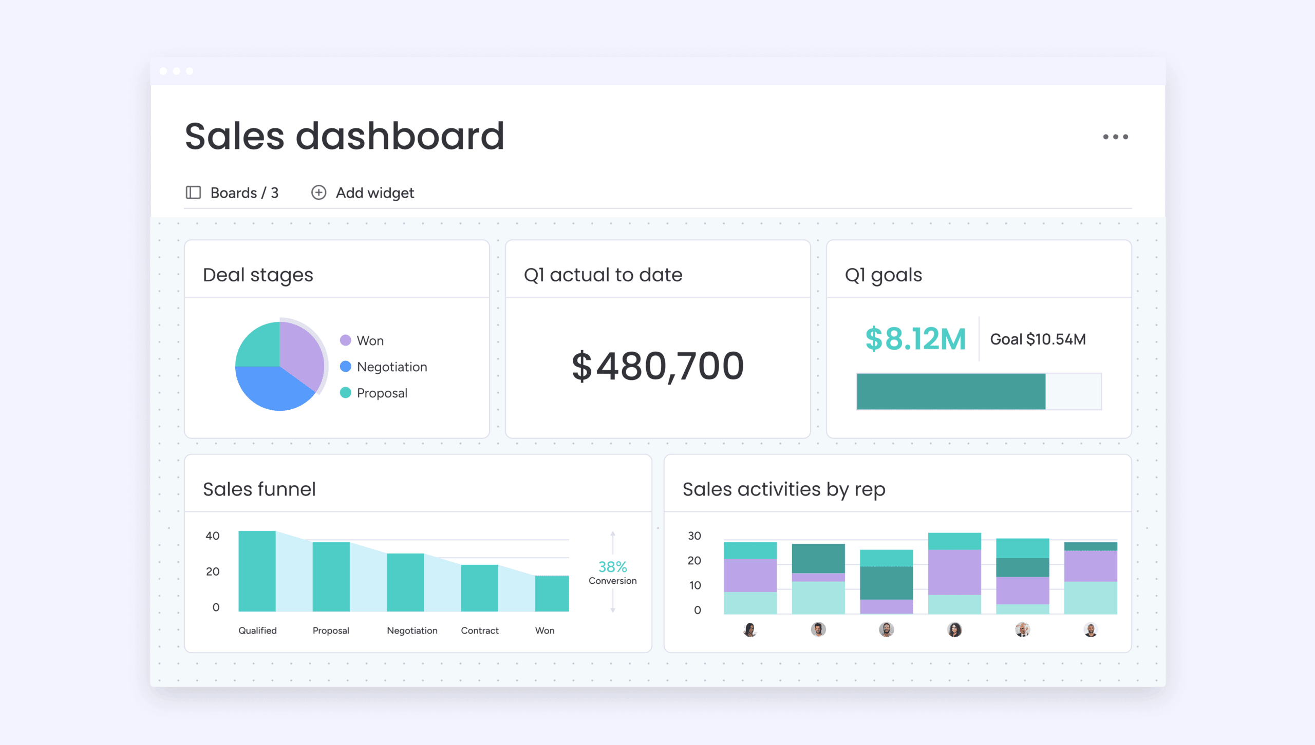
Core visualization capabilities
Let’s start with the basics: how your data looks on screen. Today’s projects require dynamic visualizations that shift and update as work evolves, moving beyond the limitations of static pie charts.
Essential visualization features include:
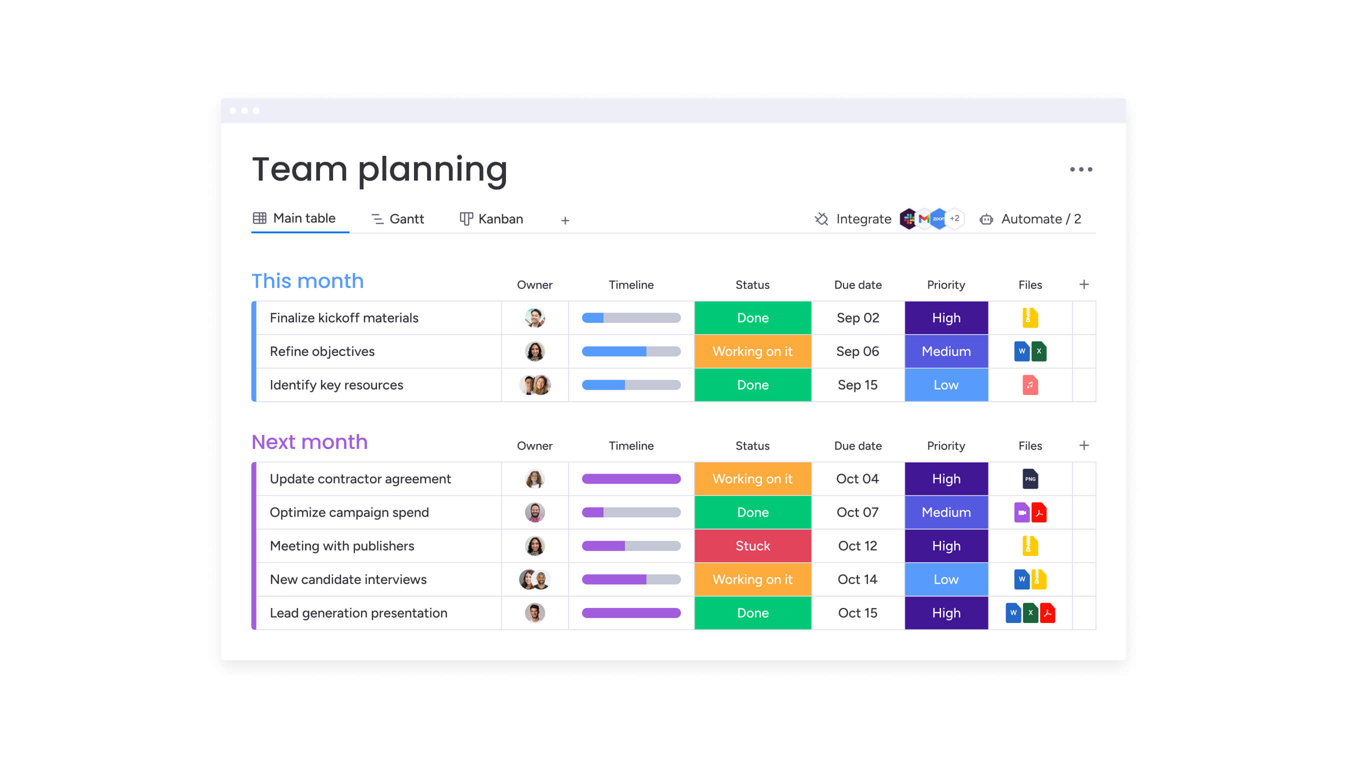
- Multiple view types: Gantt charts, Kanban boards, calendar views, and workload distributions.
- Custom widget libraries: 30+ widget types for KPIs, budgets, timelines, and metrics.
- Drill-down functionality: click through from portfolio summaries to individual project details.
- Real-time updates: data refreshes automatically as team members update their work.
Advanced automation and AI
Effective dashboards go beyond displaying numbers; they translate data into actionable recommendations, telling you what to do next., and risk management dashboards help teams proactively address potential roadblocks before they escalate. AI capabilities analyze patterns across projects to identify risks, predict delays, and surface opportunities that would require hours of manual analysis in traditional tools.
Key automation features to look for:
- Automated data aggregation: pull information from multiple projects without manual exports.
- Smart alerts: get notified when KPIs fall outside acceptable ranges.
- AI risk detection: proactively identify projects heading off track.
- Workflow automation: trigger actions based on dashboard metrics.
Enterprise-grade requirements
Organizations scaling beyond single teams need additional capabilities to maintain governance while enabling flexibility. This balance becomes critical when you’re managing dashboards across departments with different needs but shared reporting requirements.
Enterprise considerations include:
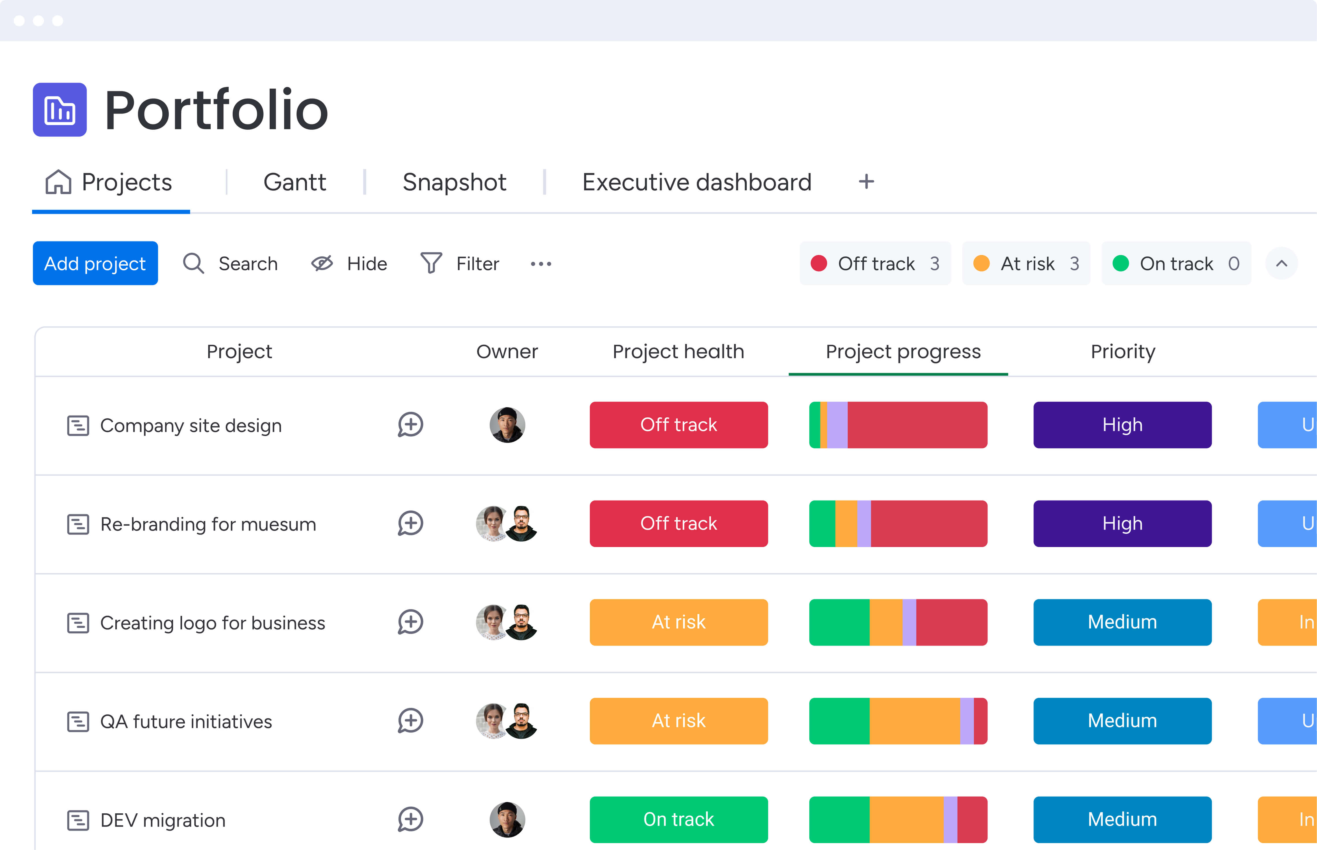
- Permission controls: granular settings for who sees what information.
- Template standardization: consistent dashboards that teams can customize.
- Cross-project visibility: portfolio views that aggregate data from hundreds of projects.
- Integration ecosystem: native connections to your existing tech stack.
Top dashboard software platforms compared
You’ll find everything from simple $10/month trackers to six-figure enterprise systems in the dashboard world — with dramatically different capabilities at each price point. Understanding where each platform excels helps you match capabilities to your specific needs.
This comparison table focuses on the key differentiators that impact real-world usage and value delivery. Below we’ll also shine a light on some of each platform’s key features in a bit more depth.
| Platform | Best For | Key Strength | Starting Price |
|---|---|---|---|
| monday work management | Unified work management with built-in dashboards | Real-time updates without manual syncing | $9/user/month |
| Smartsheet | Teams transitioning from spreadsheets | Familiar interface for Excel users | $9/user/month |
| Asana | Small to mid-size teams focused on task execution | Simple, intuitive task management | $13.49/user/month |
| Tableau | Large enterprises with dedicated analytics teams | Advanced data visualization and analysis | $75/user/month |
| Power BI | Microsoft-centric organizations | Native Microsoft integration | $10/user/month |
monday.com: unified work and dashboards
monday.com stands out by combining work execution with dashboard visualization in one platform. Your dashboards pull data directly from where work happens, eliminating the data pipeline complexity of standalone BI platforms.
The platform’s AI-powered capabilities also proactively identify risks across portfolios, while no-code builders let any team member create custom dashboards without technical expertise.
Smartsheet: spreadsheet-based dashboards
Smartsheet brings familiar spreadsheet interfaces to dashboard creation. Teams comfortable with Excel find the transition intuitive, though advanced features like portfolio rollups require higher-tier plans. The platform works well for structured project tracking but requires additional configuration for cross-functional visibility.
Asana: task-focused reporting
Asana provides solid task management with dashboard capabilities on paid plans. The platform excels at team-level project tracking but requires Business tier or above for advanced reporting features. Integration with external data sources can be limited compared to dedicated dashboard platforms.
Tableau: enterprise business intelligence
Tableau offers powerful data visualization for organizations with dedicated BI teams. The platform handles complex data analysis and creates sophisticated visualizations, but requires significant technical expertise and doesn’t include work management capabilities.
Power BI: ecosystem integration with Microsoft
Power BI integrates deeply with Microsoft tools, making it attractive for organizations already invested in that ecosystem. Like Tableau, it’s a pure BI platform that requires separate systems for work management and manual data pipeline creation.
How AI transforms dashboard capabilities
AI is the difference between a dashboard telling you ‘three projects are behind schedule’ versus ‘these specific projects will miss their deadlines unless you add resources by Friday.’ This shift from reactive reporting to proactive insights represents the next evolution in project visibility and control, driven largely by AI dashboards.
From reactive to predictive insights
Traditional dashboards display historical data — useful for understanding past performance but limited for preventing future problems. AI analyzes patterns across your entire project portfolio to surface insights that would be impossible to spot manually.
This predictive capability shows up in several ways:
- Risk identification: ai flags projects likely to miss deadlines based on current velocity.
- Resource optimization: algorithms suggest reallocation opportunities to balance workloads.
- Trend detection: pattern recognition identifies recurring bottlenecks across projects.
- Automated categorization: ai classifies and prioritizes incoming requests at scale.
Democratizing dashboard creation
AI also makes sophisticated dashboard creation accessible to non-technical users. Natural language processing lets you describe what you want to see, and AI builds the appropriate visualizations. This democratization means teams can create the dashboards they need without waiting for IT support or learning complex query languages.
For example, monday.com’s AI Blocks let you extract insights from project updates, summarize complex data into key takeaways, and automatically categorize information by urgency or sentiment — all without writing code.
5 steps to implement dashboard software successfully.
Even the perfect dashboard platform will collect digital dust if you botch the rollout. Here’s how to make sure your teams actually use what you build. These proven steps help organizations avoid common pitfalls and accelerate time-to-value.
Step 1: define your dashboard architecture
First, figure out who needs what: executives want the big-picture portfolio view, project managers care about health metrics for their projects, and team members just need to know their next tasks. Document these requirements before building any dashboards to ensure you create views that actually get used.
Step 2: establish data governance standards
Create standards for how data flows into your dashboards. Define naming conventions, status definitions, and update frequencies. This consistency ensures your dashboards provide reliable insights rather than conflicting information from different sources.
Step 3: build incrementally with pilot teams
Launch with a pilot team and a focused set of dashboards. Gather feedback, refine your approach, and expand gradually. This iterative approach helps you identify what works before rolling out organization-wide.
Step 4: enable your teams through outcome-focused training
Provide training that goes beyond features to focus on outcomes. Show teams how dashboards solve their specific challenges rather than just demonstrating functionality. Create documentation and templates that make it easy for new teams to get started.
Step 5: measure adoption and optimize continuously
Track adoption metrics and dashboard usage to understand what’s working. Regular reviews help you identify unused dashboards to retire and gaps where new visualizations could add value.
Scale dashboard insights with monday.com
monday.com transforms how organizations gain visibility into their work by combining AI-powered insights with no-code flexibility. The platform addresses the core challenge of dashboard software — connecting data to action — by keeping dashboards and work execution in the same system. This unified approach eliminates the data silos and manual syncing that plague traditional BI implementations.
Here’s how monday.com delivers enterprise-grade dashboard capabilities:
Leadership visibility at scale
The platform’s AI-powered project portfolio dashboards analyze hundreds of projects simultaneously, surfacing risks and opportunities that leadership needs to see. Portfolio Risk Insights scan project updates to flag issues by severity, while automated reports keep executives informed without manual compilation. These capabilities give leaders instant visibility into progress and risks throughout the portfolio.
Standardization with flexibility
Managed templates ensure consistent dashboard creation across departments while allowing teams to customize views for their specific needs. This balance between standardization and alignment means organizations can scale dashboard practices without forcing rigid structures that teams resist.
Cross-project dependencies and resource optimization features further connect work across teams, ensuring dashboards reflect the full picture of organizational capacity.
Intelligent automation
AI Blocks and Digital Workers take dashboard functionality beyond visualization. They automatically categorize project requests, extract key information from documents, and suggest next steps based on data patterns. The platform’s resource directory and capacity manager optimize talent allocation across the organization, similar to how resource management dashboards provide real-time insight into workload distribution.
These capabilities come together to create a comprehensive visibility and governance layer that brings leadership insights, team alignment, and workforce optimization directly into the flow of work — all underpinned by scalable architecture and AI-driven insights.
Transform scattered data into strategic advantage
Dashboards used to be static end-of-week summaries. Now they’re real-time command centers that show what’s happening across your entire services portfolio — and more importantly, what needs attention next. The right platform turns disconnected data into clear, actionable insight, without the manual compilation that slows teams down.
When your dashboards pull information directly from where work happens, visibility becomes automatic. No syncing. No exporting. No version confusion. Just live insights that help your teams make faster, more confident decisions.
Here’s what separates dashboards that drive impact from those that collect dust:
- Dashboards connected to execution: reporting needs to live in the same place as the work so data stays accurate and adoption stays high
- Insights that go beyond the past: AI-powered predictions help teams fix issues early instead of reacting to problems too late
- Visibility that scales cleanly: dashboards should support dozens or hundreds of projects without adding reporting overhead
- Views tailored to each role: executives, PMs, and delivery teams all need different levels of visibility from the same data
- Clarity that reduces noise: fewer status meetings, fewer email threads, and fewer blind spots slowing teams down
monday.com unifies dashboards and execution into one system, so your data updates the instant your team does. That’s how scattered information becomes a strategic asset — and how teams finally get the clarity they need to move faster.
The content in this article is provided for informational purposes only and, to the best of monday.com’s knowledge, the information provided in this article is accurate and up-to-date at the time of publication. That said, monday.com encourages readers to verify all information directly.
Frequently asked questions
What is the best dashboard software for project management?
The best dashboard software for project management depends on your organization's size, technical expertise, and integration needs. monday.com excels for teams wanting unified work management with built-in dashboards, while Tableau suits organizations with dedicated BI teams needing advanced analytics. Consider factors like real-time updates, no-code customization, and how well the platform connects to your existing tools.
How much does dashboard software typically cost?
Dashboard software pricing varies widely based on capabilities and user count. Entry-level platforms start around $9-13 per user monthly, while enterprise BI tools can reach $75+ per user. Many platforms offer tiered pricing where advanced features like AI insights, unlimited dashboards, or enterprise security require higher plans. Consider total cost including implementation, training, and integration when evaluating options.
Can dashboard software integrate with my existing tools?
Most modern dashboard platforms offer extensive integration capabilities. Leading solutions connect with 200+ applications including Microsoft Teams, Slack, Jira, QuickBooks, and Salesforce. Integration depth varies — some platforms offer simple data imports while others provide bidirectional syncing that keeps information updated across systems. Verify that potential platforms support your critical tools before committing.
What's the difference between dashboards and reports?
Dashboards provide real-time, visual displays of key metrics that update automatically as data changes, designed for continuous monitoring and quick decision-making. Reports are typically static documents generated at specific intervals that provide detailed analysis of historical data. Dashboards excel at showing current status while reports better suit deep analysis and documentation needs.
How long does dashboard software implementation take?
Implementation timelines vary based on complexity and platform choice. No-code platforms like monday.com can have functional dashboards running in hours using templates, with full implementation in two to four weeks. Enterprise BI tools typically require two to six months for complete deployment including data migration, custom development, and training. Starting with pilot teams and expanding gradually usually delivers faster value than organization-wide rollouts.
Do I need technical skills to create dashboards?
Modern dashboard platforms increasingly offer no-code builders that let non-technical users create sophisticated visualizations through drag-and-drop interfaces. Platforms focused on accessibility provide templates, visual workflow builders, and AI assistance to help anyone build dashboards. However, enterprise BI tools like Tableau or Power BI typically require technical expertise or dedicated analysts for advanced functionality.