Complex projects rarely fall apart because people are not working hard enough. They break down when dependencies are fuzzy, timelines drift out of sync, and small delays quietly snowball into missed deadlines. When dozens of activities and teams are all moving toward the same finish line, knowing what needs to happen next matters just as much as knowing what needs to get done.
Arrow diagrams help bring that clarity. By mapping activities and dependencies into a visual network, they show how work actually flows from start to finish and which sequences truly control delivery timelines. Instead of treating tasks as isolated items, arrow diagrams reveal the logic holding a project together.
This article walks through how arrow diagrams work, where they add the most value, and how they connect with the Critical Path Method (CPM). You’ll also discover how traditional network planning has evolved, and how modern platforms apply the same logic to support dynamic, real-time project execution.
Key takeaways
- Visualizing dependencies reduces schedule risk: arrow diagrams expose logical relationships between activities, making bottlenecks and sequencing conflicts visible before execution begins.
- Critical path identification drives better decisions: by highlighting zero-float activities, teams can focus resources on the work that directly determines project duration.
- Float analysis enables smarter resource allocation: understanding slack time allows non-critical activities to shift without impacting delivery dates.
- Industry applications extend beyond construction: software, manufacturing, and transformation programs use arrow diagrams to coordinate parallel work streams.
- Modern platforms operationalize arrow diagram logic: intelligent solutions like monday work management embed dependency tracking and critical path analysis directly into live workflows, reducing manual oversight.
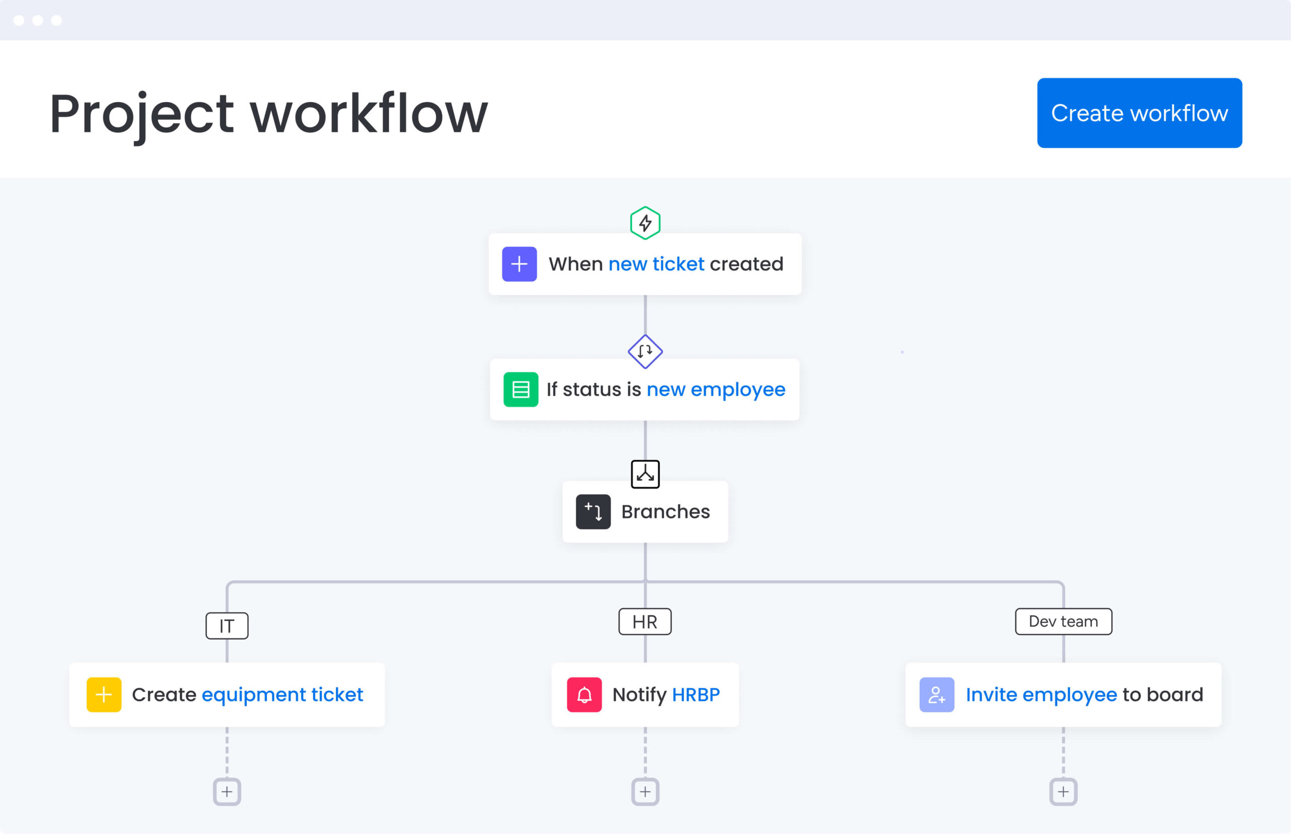
What is an arrow diagram?
An arrow diagram shows how work moves through a project by mapping activities, dependencies, and sequence using arrows and nodes. It turns complex requirements into a clear network, making it easier to see how one activity leads to the next.
As a type of network diagram, it works like an execution roadmap. Arrows represent activities that take time and effort, while nodes mark key events or milestones, such as when work starts or finishes. Together, they create a visual structure that reflects how the project actually unfolds.
By laying out the full network, teams gain visibility into which activities directly shape the project timeline and where there is room to adjust without putting delivery at risk.
Core purpose explained
The core purpose of the arrow diagramming method is to clarify how work depends on other work. It provides a structured way to visualize the relationships between tasks and understand how those relationships shape the overall project flow.
By making dependencies explicit, arrow diagrams help teams move beyond static task lists and into realistic planning. Leaders can see which activities drive the schedule, which ones have flexibility, and how changes in one area affect timelines elsewhere.
This clarity supports better resource decisions and more credible delivery commitments as projects evolve.
Arrow diagramming method terminology
To master arrow diagrams, you need to understand specific project management terminology. These terms show up in every network diagram, across industries and methodologies:
- Nodes: connection points representing events or milestones that consume no time or resources. They simply mark moments like “foundation poured” or “code approved.”
- Activities: the actual work packages shown by arrows that consume time and resources, with arrow direction indicating work flow.
- Dependencies: logical relationships between activities where an arrow diagram dictates that activities cannot begin until preceding arrows reach connecting nodes.
- Critical path: the longest continuous activity sequence through the network, determining the shortest possible project completion time.
- Float (or Slack): the amount of time an activity can be delayed without impacting the project’s final deadline.
When arrow diagrams add value
Arrow diagrams work best when operation sequence matters as much as the work itself. They provide the most value in complex projects with high interdependency. Construction, engineering, and product development projects particularly benefit from this approach.
Think about when delays in one department cascade through your entire organization. Arrow diagrams give you the visibility to manage those risks. They’re especially valuable when resources are scarce and shared across parallel activities, or when stakeholders need visual proof of the timeline.
Essential components of arrow diagrams
An effective arrow diagram needs three elements working together: nodes, activities, and dependencies. These components create a mathematical and visual snapshot of your project lifecycle.
Master the elements outlined below and you’ll build schedules that are realistic and resilient when disruptions hit.
Nodes as project milestones
Nodes anchor your diagram. They’re typically circles that mark where activities start and end. Here’s how nodes work:
- Event representation: nodes don’t represent work. They represent the project state at specific moments, such as “project start” or “requirements gathered.”
- Numbering convention: sequential numbering (i, j) ensures logic flows forward, with “i” nodes representing start events and “j” nodes representing finish events.
- Timeline organization: by anchoring activities between events, nodes break projects into manageable segments for tracking incremental progress.
Activities on arrows
Arrows drive your diagram by representing the execution phase. Each arrow reflects a specific piece of work and requires a duration estimate. While arrow length in sketches is often arbitrary, the assigned duration, such as “five days”, is essential for accurate calculation.
Arrows always move left to right to indicate time progression. For example, an arrow from Node A to Node B shows that an activity connects those two events. Activities are typically labeled with short descriptions above the arrow and durations below it, which helps keep diagrams readable as complexity increases.
Dependencies and relationships
Dependencies define the logic of your network and set the constraints that shape the schedule. They show which activities can run in parallel and which must happen in sequence.
The most common relationship is finish-to-start (FS), where activity B cannot begin until activity A finishes. In these cases, the arrow for B starts at the node where A ends. When a logical relationship exists without actual work, dashed arrows, known as dummy activities, are used. These carry zero duration but preserve the integrity of the network logic.
Keep in mind that arrows always move left to right, indicating time progression. For example, an arrow from Node A to Node B shows that the activity connects these two events.
Key benefits of arrow diagrams in project management
As project dependencies, timelines, and resources begin to overlap, it becomes harder to see what truly drives progress and where risk is building. The benefits below show how arrow diagrams bring structure to that complexity, helping teams improve visibility, focus on the critical path, and keep stakeholders aligned.
Unobstructed project visibility
Complex projects drown in information overload. Arrow diagrams distill thousands of requirements into one clear visual flow. This simplified communication translates technical dependencies into visual workflow formats that executives and non-technical stakeholders grasp instantly.
This visual clarity helps teams catch logic errors early, such as activities scheduled to begin before their predecessors are complete. That level of control is vital in highly interdependent environments like life sciences, where around 91% of capital projects fail to meet their authorized cost or schedule.
Critical path visibility
The critical path is the most important insight an arrow diagram provides. It determines the project’s minimum duration and shows which activities cannot be delayed, making it clear where teams need to focus to protect delivery dates.
By isolating critical activities, teams can build contingency plans around the most vulnerable parts of the schedule instead of spreading risk mitigation across non-critical work. This focused approach ensures resources are applied where they have the greatest impact.
Resource allocation insights
Arrow diagrams reveal work density at any point in the timeline, which is essential for balancing team capacity. By visualizing parallel paths, teams can see when resource demand exceeds availability and identify conflicts before they cause delays.
Applying schedule-optimization and project-value-improvement techniques can produce measurable results. For example, McKinsey reports that a travel company managed to cut its schedule by 10% via an acceleration workshop.
Stakeholder alignment
The diagram acts as a single source of truth for project logic. When stakeholders push for earlier delivery, it clearly shows which dependencies would need to change to make that possible.
Cross-functional teams can also see how their work fits into the broader project ecosystem, reinforcing shared responsibility for protecting the critical path.
Try monday work management
How to create effective arrow diagrams: 5 simple steps
Creating an effective arrow diagram starts by breaking the work down and building it back up in the right order. The steps below walk through how to identify activities, define dependencies, and translate that logic into a diagram teams can actually use during execution.
Step 1: map all project activities
The foundation of any network diagram is a comprehensive work list. This step involves decomposing project scope into discrete, manageable activities.
Start by engaging subject matter experts to ensure no critical steps are missed. Missing an activity in activity planning can derail schedules later. Also check activity granularity to ensure consistent detail levels:
- Too broad: “build house”.
- Too narrow: “pick up hammer”.
- Appropriate granularity: “pour foundation”.
Step 2: define activity dependencies
Once activities are listed, determine the sequence by asking three questions for each one:
- What must happen before this?
- What can happen after this?
- What can happen at the same time?
Identify logical constraints, such as “the roof cannot be installed until walls are up,” as hard dependencies. Also note soft dependencies based on team availability: for example, “the designer cannot start the brochure until they finish the website.”
Step 3: draw your arrow network
With the logic defined, visual construction begins. Start with a single start node and move to the right. Draw arrows for each activity, connecting nodes based on the dependencies identified in step 2.
If two activities share the same start and end nodes, or if a logical relationship exists without actual work, insert a dashed dummy arrow to preserve network integrity.
Step 4: assign duration estimates
Apply time values to the diagram by assigning realistic duration estimates to each arrow. Consult the people doing the work and use a consistent time unit, such as hours, days, or weeks, to ensure accurate calculations.
Step 5: identify the critical path
This final step turns the diagram into a management tool. The forward pass calculates the earliest possible start and finish times by moving left to right, while the backward pass works from the deadline to determine the latest allowable start and finish times.
The foundation of any network diagram is a comprehensive work list. This step involves decomposing project scope into discrete, manageable activities.
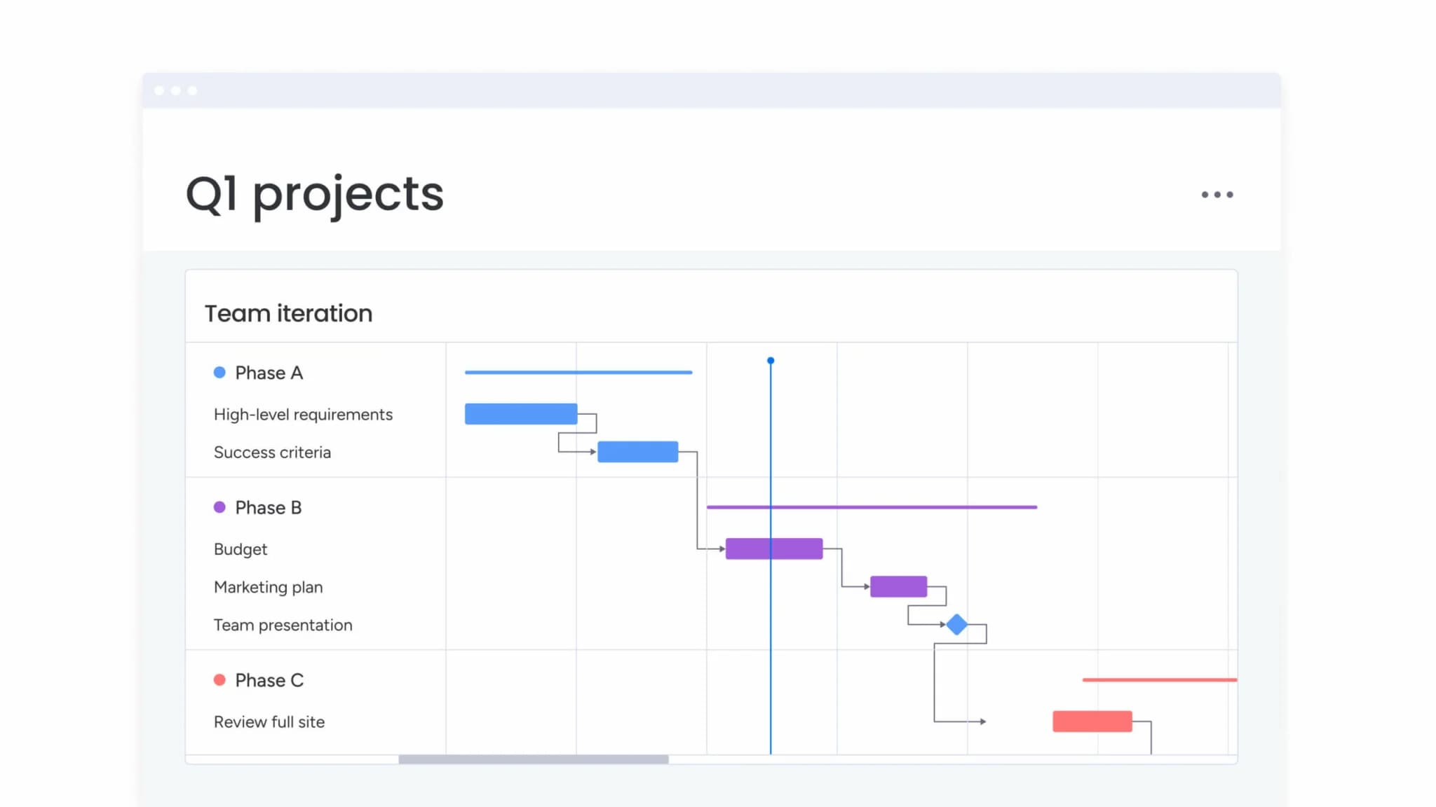
Activity on arrow vs activity on node methods
Network diagrams are not all built the same way. The way activities and dependencies are represented can change how easy a diagram is to read, update, and maintain as a project evolves.
The table below compares the two main approaches, Activity on Arrow (AOA) and Activity on Node (AON), highlighting how each method structures work and where they tend to fit best.
| Feature | Activity on arrow (AOA) | Activity on node (AON) |
|---|---|---|
| Representation | Arrows represent activities; nodes represent events | Nodes (boxes) represent activities; arrows represent logic |
| Complexity | Requires dummy arrows to maintain logic | No dummy arrows needed; logic is direct |
| Flexibility | Difficult to modify once drawn | Easier to adjust and rearrange |
| Software support | Less common in modern software | Standard for most PM software |
| Visual focus | Emphasizes flow and events | Emphasizes activities and hierarchy |
How does activity on arrow (AOA) work?
Activity on Arrow is the original approach to network diagramming and is closely tied to PERT (Program Evaluation and Review Technique). Instead of focusing on tasks themselves, it centers on milestones, with arrows showing the work that moves the project from one event to the next.
This approach makes sense when start and finish points are what stakeholders care about most. The trade-off is complexity. As dependencies grow, AOA relies on dummy arrows to preserve logic, which can make diagrams harder to follow for anyone who is not deeply familiar with the method.
Understanding activity on node (AON)
AON, also known as the Precedence Diagramming Method (PDM), is the standard used by most project management platforms including monday work management. Here, boxes represent activities themselves, and arrows simply show dependency.
This method supports all four dependency types (finish-to-start, start-to-start, and others) more naturally than AOA. It is generally more intuitive for teams accustomed to Kanban boards or lists, as the visual focus remains on work items themselves.
Selecting the right approach
Choosing between AOA and AON comes down to how your project is run and what your team needs to track most closely. AOA tends to work best in engineering and construction environments, where clearly defined event milestones are the primary reference points.
AON is better suited to software development, marketing, and general business work, where plans change frequently and flexibility matters. Because of that, most modern project management software supports AON as the standard format for network diagrams, using it to create timelines and dependencies that update automatically as work changes.
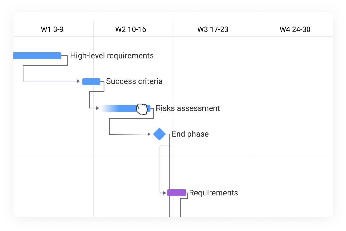
Arrow diagrams and critical path method integration
Arrow diagrams provide visual structure, but the Critical Path Method (CPM) provides analytical power. Integrating these two concepts allows project managers to move from simple scheduling to mathematical optimization.
Connecting CPM with arrow networks
The arrow network serves as the coordinate system for CPM calculations. By mapping projects as networks, managers perform mathematical “forward pass” and “backward pass” calculations across diagrams.
This process assigns specific time values to every node, determining the earliest and latest possible dates for each project event. The visual nature of arrow diagrams makes these calculations traceable and verifiable, which is essential for complex projects with hundreds of activities.
Calculating float and slack time
CPM analysis reveals schedule flexibility, known as float or slack. Understanding these values is essential for making informed trade-offs:
- Total float: time an activity can be delayed from its early start date without delaying project completion.
- Free float: time an activity can be delayed without delaying any successor activity’s early start.
- Management value: knowing which activities have float allows managers to temporarily deprioritize them and focus resources on critical path activities with zero float.
Timeline optimization strategies
Once the critical path and float are visible on the arrow diagram, teams can begin applying optimization strategies.
Crashing involves adding resources to critical path activities to shorten their duration, such as approving overtime. Fast-tracking takes a different approach by running activities in parallel that were originally planned in sequence.
Resource leveling adjusts the start and end dates of non-critical activities to smooth resource demand, helping prevent burnout and over-allocation.
These strategies are most effective when supported by platforms that can model changes dynamically and show the immediate impact on project timelines.
Try monday work managementReal-world arrow diagram examples
After digesting the theoretical knowledge of arrow diagrams, it’s helpful to look at specific industry scenarios. The examples below show how the method adapts to different operational challenges and demonstrate the practical value of network visualization.
Construction project scheduling
In commercial construction, many dependencies are fixed and physical. An arrow diagram helps teams map the build sequence clearly, from excavation to foundation work, then structural steel, and finally concrete floors.
Problems often appear at the handoff points. For example, concrete cannot be poured until steel framing has been inspected and approved. An arrow diagram makes that finish-to-start dependency explicit, while also showing where work can run in parallel, such as electrical rough-in on lower floors while steel framing continues above.
This shared view helps coordinate dozens of subcontractors who must arrive and leave the site in the right order to keep progress moving.
Software development workflows
Software programs tend to have fewer physical constraints, but their dependencies are often more complex. Backend services, frontend interfaces, and database changes all need to come together for a single release, even if they are built by different teams on different timelines.
An arrow diagram can reveal that the critical path runs through backend development, while frontend work has built-in flexibility. In this case, the diagram shows the frontend team has two weeks of float, which opens up practical options:
-
Shifting developers to support documentation or testing.
-
Absorbing short delays without affecting the release date.
-
Reallocating effort to unblock critical backend work.
Manufacturing process planning
Launching a new assembly line requires tight coordination across multiple workstreams. Equipment installation, staff training, and raw material procurement all need to finish in sync, often tied to a formal safety inspection or regulatory sign-off.
By working backward from the “production live” milestone, an arrow diagram makes the constraints visible. In many cases, long-lead custom machinery sits on the critical path, which means procurement needs to start immediately. Training, by contrast, can be scheduled closer to launch so knowledge is fresh when production begins.
This sequencing helps avoid idle time, rushed onboarding, or delays that ripple across the operation.
How arrow diagrams have evolved for dynamic work
The digital age has transformed arrow diagrams from static drawings on whiteboards into dynamic, intelligent ecosystems. While underlying logic remains, execution has evolved to meet modern business speed and collaboration requirements.
Dynamic vs static visualization
Traditional arrow diagrams were static snapshots, the moment an activity was delayed, the drawing became obsolete. Modern platforms render these diagrams dynamically. When users update activity duration, entire networks adjust instantly:
- Dependencies shift automatically: changes cascade through the network.
- Dates realign in real-time: no manual recalculation required.
- Critical paths recalculate in milliseconds: immediate visibility into schedule impact.
This shift allows diagrams to serve as living dashboards rather than historical records.
Cloud-based collaboration benefits
Project planning is no longer solitary activity performed by schedulers in back rooms. Cloud platforms allow distributed teams to build and view arrow diagrams simultaneously.
Site managers update nodes from mobile devices, and project directors at headquarters see critical path impact immediately. This transparency eliminates version control issues and ensures all stakeholders make decisions based on the same real-time data.
Automated dependency updates
In the past, scope changes required manually erasing and redrawing connections. Today, automation handles dependency logistics:
- Conflict detection: software automatically highlights circular logic or impossible sequences.
- Notification systems: when predecessor activities complete early, systems notify owners of successor activities.
- Reduced lag time: faster handoffs between activities minimize project delays.
AI-powered arrow diagram management
Artificial intelligence is the next frontier for network diagramming, moving from passive visualization to active recommendation. Teams are moving beyond simply documenting dependencies to actually predicting and preventing problems.
Intelligent schedule optimization
AI algorithms analyze arrow networks to suggest the most efficient paths. By processing historical data and current constraints, systems recommend sequence changes that shorten total project duration without adding risk. They simulate thousands of scenarios to find optimal activity arrangements.
Predictive bottleneck detection
AI looks beyond current state to predict future friction. It analyzes patterns, specific teams constantly missing deadlines or vendors frequently late, and flags these as risks on arrow diagrams. This allows managers to intervene weeks before bottlenecks actually stop production.
Automated resource balancing
Resource allocation across complex networks is mathematically difficult for humans but trivial for AI. Systems analyze arrow diagrams and automatically distribute work to ensure no individual is overcapacity while still respecting critical paths. They shift non-critical activities to balance loads, ensuring sustainable work pace.
“monday.com has been a life-changer. It gives us transparency, accountability, and a centralized place to manage projects across the globe".
Kendra Seier | Project Manager“monday.com is the link that holds our business together — connecting our support office and stores with the visibility to move fast, stay consistent, and understand the impact on revenue.”
Duncan McHugh | Chief Operations OfficerPut arrow diagrams into action with monday work management
Advanced platforms like monday work management take the rigorous logic of traditional arrow diagrams and embed it into a flexible, user-friendly Work OS. The powerful solution bridges the gap between complex methodology and daily execution, allowing teams to build sophisticated network diagrams without specialized training.
Visual timeline management at scale
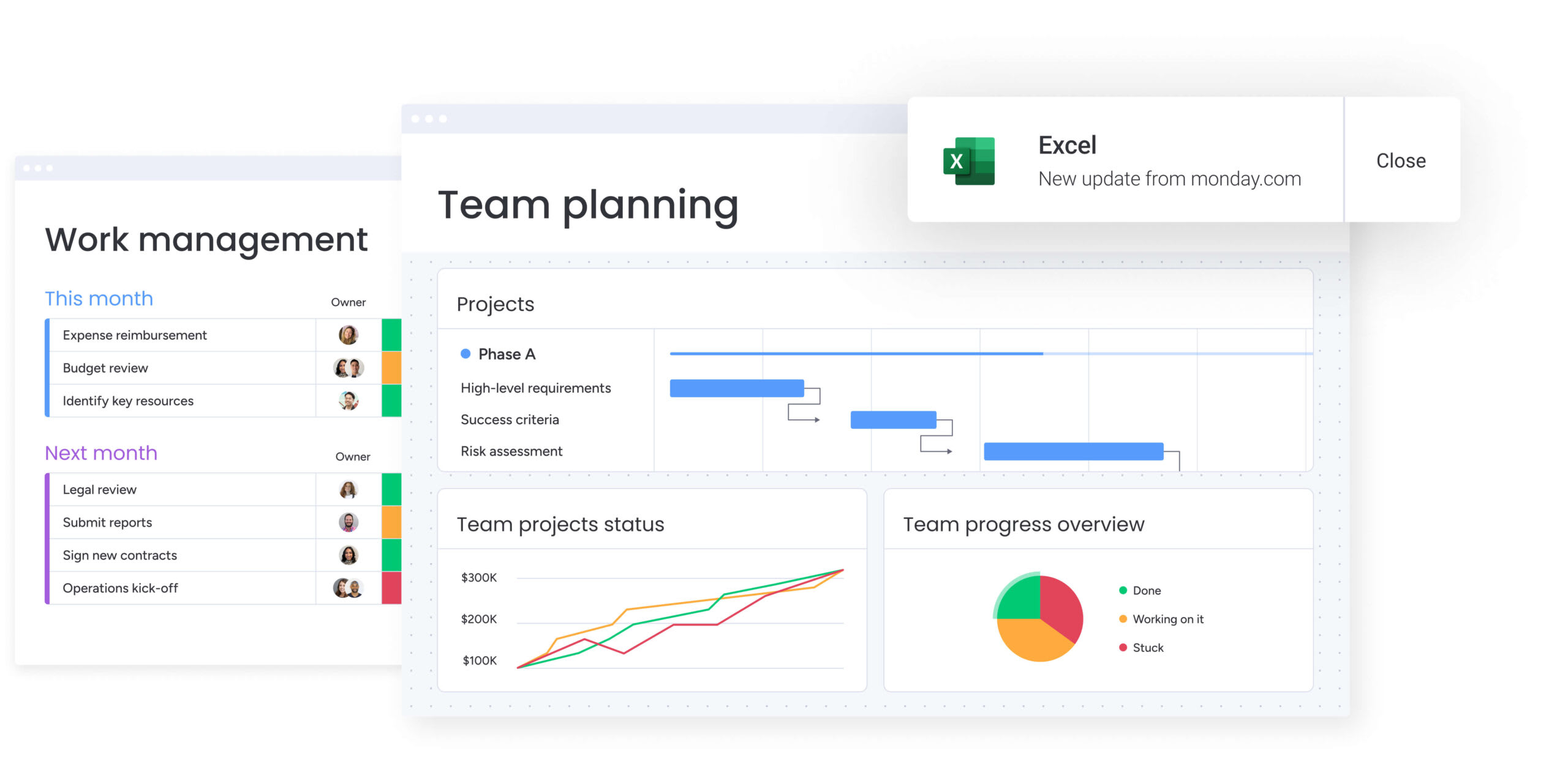
The platform translates arrow diagram concepts into Gantt View, offering dynamic, interactive timelines. Users can draw dependencies simply by dragging lines between items.
Unlike static diagrams, these views allow teams to zoom out for multi-year strategy or zoom in for daily activities. The visual interface further ensures schedule logic is accessible to everyone, not just project managers.
Real-time dependency tracking
monday work management automates dependency enforcement. When timelines shift, the platform identifies ripple effects:
- Automatic adjustments: if critical path activities are delayed, the system automatically adjusts dependent activities.
- Stakeholder notifications: relevant owners receive immediate alerts about timeline changes.
- Active workflow management: arrow diagram logic actively drives workflow rather than just documenting it.
Portfolio-wide critical path analysis
For enterprise organizations, the intelligent platform extends network logic across entire portfolios. It connects dependencies between different projects, visualizing how delays in one initiative impact another.
This high-level view allows executives to manage the “critical path” of entire business strategy, ensuring resources align with organizational vital goals.
AI-driven risk insights
Leveraging monday’s AI offering, the platform enhances traditional diagrams with predictive intelligence. It scans project networks to identify potential risks, activities with high complexity and zero float.
It also provides actionable suggestions to mitigate these risks, turning arrow diagrams from reactive schedules into proactive risk management instruments.
| Feature | Traditional arrow diagrams | monday work management |
|---|---|---|
| Updates | Manual redrawing required | Real-time, automatic updates |
| Collaboration | Static, single-user access | Cloud-based, multi-user collaboration |
| Dependency logic | Visual only; requires manual enforcement | Active enforcement; auto-shifts timelines |
| Critical path | Calculated manually | Instant calculation and visualization |
| Resource view | Separate analysis required | Integrated workload and capacity views |
| Insights | Passive data | AI-driven risk and optimization insights |
Frequently asked questions
What is the difference between arrow diagrams and Gantt charts?
Arrow diagrams prioritize the visualization of dependencies and project logic, whereas Gantt charts focus on the timeline and duration of activities. Arrow diagrams excel at showing how tasks relate to each other, while Gantt charts excel at showing when tasks occur over time.
Can arrow diagrams work for agile methodologies?
Arrow diagrams can map high-level dependencies across multiple sprints or releases in agile projects, though they are less effective for managing the daily, iterative work within a single sprint compared to Kanban boards. They work best for release planning and cross-team coordination in agile environments.
Which platforms create arrow diagrams most effectively?
Work OS platforms like monday work management offer the most effective solution by integrating arrow diagram functionality directly with execution, resource management, and collaboration features. The platform transforms static planning into dynamic workflows that update automatically.
How do dummy activities function in arrow networks?
Dummy activities are dashed arrows used in Activity on Arrow (AOA) diagrams to show a logical dependency between two nodes without representing actual work or time. They maintain network logic when multiple activities share start or end points.
What other names describe the arrow diagramming method?
Arrow diagrams are frequently referred to as Activity on Arrow (AOA) diagrams, network diagrams, PERT charts (Program Evaluation and Review Technique), or Critical Path Method (CPM) diagrams. Each name emphasizes different aspects of the same fundamental technique.
How frequently should teams update arrow diagrams?
Teams should update the diagram whenever there is a significant change in project scope, a missed deadline on the critical path, or a change in resource availability. With platforms like monday work management, updates happen automatically as teams complete work, ensuring diagrams always reflect current reality.