


You’re three months into a reorganization, and someone still asks, “Who approves vendor contracts again?” Meanwhile, new hires spend their first week trying to figure out which channels to join and who runs the marketing team. When your structure lives only in people’s heads or buried in outdated slide decks, even simple decisions become time-consuming puzzles.
An organizational chart maps roles, responsibilities, and reporting lines so everyone can see who does what and how teams connect. This guide walks you through the main chart types, with real examples from leading companies, and clear steps for building one that supports daily work rather than sitting in a folder you never open.
Key takeaways
- Turn org charts into operational tools: connect structure to real work, showing reporting lines alongside workloads, ownership, and active projects.
- Choose structure based on how decisions flow: hierarchical, flat, matrix, and hybrid models each shape speed, accountability, and collaboration differently.
- Go beyond names and titles: include skills, capacity indicators, and project assignments to make org charts useful in daily decision-making.
- Keep charts accurate without manual upkeep: automated updates prevent outdated structures that slow onboarding and create approval confusion.
- Manage structure dynamically with monday AI Workspace: visualize teams, capacity, and reporting relationships in one platform that evolves with your organization.
What is an organizational chart?
An organizational chart is a visual diagram that maps your company’s structure, showing roles, responsibilities, and reporting relationships between individuals and departments. It gives everyone a shared picture of how the organization fits together, from the executive team down to individual contributors.
For organizations managing complex workflows across departments, these charts answer fundamental questions that keep operations running smoothly:
- Who owns this decision? Identifying the right approver or stakeholder without endless email chains.
- Where does this function sit? Understanding which department handles specific responsibilities.
- How do teams connect? Seeing cross-functional relationships and dependencies at a glance.
Far from being static diagrams, org charts integrate with real-time data to show who’s working on what, current capacity levels, and how work flows between teams. A chart that keeps pace becomes a working reference instead of a snapshot that’s wrong within weeks.
Why do organizations need an organizational chart?
When employees understand reporting lines, team composition, and how their work connects to company goals, collaboration improves and decisions happen faster. A well-built organizational chart delivers practical, everyday value across the business:
- Faster onboarding: new hires quickly understand where they fit and who to collaborate with.
- Reduced ambiguity: clear ownership eliminates confusion about approval chains and decision rights.
- Strategic planning: leaders visualize current structure against future needs to identify gaps.
- Resource optimization: managers spot imbalances in team capacity and skill distribution.

7 types of organizational charts every business should know
Organizational charts come in several forms, but the most common types are hierarchical, flat, matrix, and divisional structures. Each shapes how decisions flow, how fast teams move, and who owns what. Here are the structures worth understanding before you commit to one.
1. Hierarchical organizational structure
The traditional pyramid creates distinct levels of authority with vertical reporting lines. Each person reports to one manager, and decisions flow from the top down. This structure suits large organizations that need clear accountability and predictable escalation paths.
2. Flat organizational structure
Flat structures eliminate middle management layers. Team members need strong organizational and self-management skills to work without constant oversight. Fewer layers mean faster communication and more autonomy, which suits smaller teams and early-stage companies where speed matters more than formal control. The risk is overload, since a handful of leaders can end up with too many direct reports.
3. Matrix organizational structure
Matrix structures create dual reporting relationships. An employee might report to both a functional manager and a project lead at the same time. This setup supports complex, cross-functional work, though it asks people to balance competing priorities carefully.
4. Divisional organizational structure
Divisional structures organize into semi-autonomous units. Each division runs around a product, region, or customer segment with its own resources and leadership. Large enterprises use this model to stay responsive across diverse markets and product lines.
5. Team-based organizational structure
Team-based structures organize work around cross-functional team management rather than fixed departments. Teams own outcomes end to end, which speeds delivery and builds a strong sense of ownership.
6. Network organizational structure
Network structures map relationships with external partners. Core teams coordinate contractors, agencies, and suppliers around shared goals. This model gives you flexibility to scale capacity up or down as demand shifts.
7. Hybrid organizational structure
Hybrid structures combine elements from different models. You might run hierarchical reporting for finance and team-based pods for product. Most growing companies land here, matching structure to how each function works.
Organizational chart examples by industry
Structure looks different across industries because work flows differently. These examples show how leading companies match their chart to their operating model. Use them as prompts for your own structure rather than templates to copy exactly.
Technology companies and flat structures
Major technology firms use flat structures to maintain innovation speed. Fewer approval layers let engineering teams ship, test, and iterate quickly. Autonomy sits close to the work, so decisions rarely wait for several rounds of sign-off.
Retail organizations and divisional models
Global retail brands organize around product categories. The challenge is preventing silos between divisions that could otherwise share customer insight. A clear chart shows where divisions overlap and where they need to coordinate. Shared services like supply chain and marketing sit alongside the divisions to avoid duplicated effort.
Consulting firms and matrix approaches
Professional services firms balance industry expertise with functional specialization. A matrix lets consultants serve multiple clients while staying connected to their practice area. The chart clarifies who leads each engagement and who owns each person’s development. That dual view helps consultants know where to turn for staffing decisions and for career growth.
Startups and team-based structures
High-growth startups organize around specific metrics or growth levers. Small cross-functional teams own a number and adjust structure as they scale. Whatever model you choose, connecting it to live work data on monday AI Workspace keeps the chart accurate as teams change.

What to include in an organizational chart
An organizational chart usually looks like a flow diagram of boxes and connecting lines, where each box holds a role and the lines show reporting relationships. Good org charts balance detail with clarity, so people find what they need without getting lost. Too little detail makes the chart useless, while too much turns it into a diagram nobody reads.
At minimum, include these elements so the chart stays useful in daily decisions:
| Element | Purpose | Implementation tip |
|---|---|---|
| Name and role | Identifies who holds each position | Pull names and titles directly from your HR system |
| Reporting line | Shows who reports to whom | Connect each box to a single primary manager |
| Department or team | Groups related functions | Color-code by department for quick scanning |
| Skills and capacity | Reveals who can take on work | Add capacity indicators next to each person |
| Location and time zone | Clarifies availability across regions | Note working hours to make coordination easier |
As more teams work across regions, showing location and time zone helps you coordinate distributed teams without guesswork. Modern charts also carry live data that turns structure into an operational view:
- Current projects: shows what each person owns right now.
- Capacity levels: flags who is stretched and who has room to take on more.
- Skills and certifications: helps you staff work accurately and plan development.
How to create and maintain an organizational chart
Building a chart that people use takes more than dragging boxes into a diagram. Follow these steps to create one that stays accurate and earns its place in daily work.
Step 1. Define your organizational structure goals
Start by clarifying who’ll use the chart and why. Improving communication between departments often tops the list, along with faster onboarding and clearer decision rights. Your goals shape what the chart needs to show. A chart built for onboarding looks different from one built for capacity planning, so decide the primary use first.
Step 2. Gather current employee and role data
Your chart is only as good as your data management. Pull current names, roles, and reporting lines from a single source of truth so you don’t build on stale information.
Step 3. Choose the right organizational chart format
Pick the structure type that matches how work flows. Don’t copy a competitor’s model by default. Choose the format that fits your decisions, dependencies, and the way your teams collaborate. The right format makes the chart easier to read and far more likely to be used.
Step 4. Design and visualize your company hierarchy
Create a design that’s scannable at a glance. Use consistent shapes, clear labels, and color-coding by department, so people find what they need in seconds rather than minutes. Keep the layout simple enough to read on a phone, since that’s where many people will check it.
Step 5. Maintain and update your organizational charts regularly
Automated updates keep charts current. Connect to HR systems for automatic syncing of personnel changes. Automations and integrations sync new hires, role changes, and departures across departments, so the chart updates itself instead of drifting out of date.
6 benefits of a connected organizational chart
A chart connected to live work does more than document structure. The following benefits show why a connected chart pays off across the organization.
Enhance transparency across all levels
Org charts make company structure visible to everyone. When people can see reporting lines and ownership, they stop guessing and start acting with confidence.
Accelerate decision-making
When authority is clear, decisions happen faster. People know exactly who signs off, so work moves ahead instead of stalling in approval limbo. Fewer escalations also free managers to focus on higher-value work.
Improve cross-functional collaboration
Teams can build relationships before projects require them. Seeing how functions connect helps people find the right partner early, well before a deadline forces the introduction.
Support efficient onboarding and knowledge transfer
New hires orient themselves faster. A clear chart shows where they fit, who to ask, and how their work connects to the wider team, which shortens time to productivity. It also preserves knowledge when experienced people move on, since responsibilities are documented rather than tribal.
Enable smarter resource allocation
A connected chart flags opportunities to rebalance resources when one team is overloaded and another has room. You see capacity gaps before they turn into missed deadlines.
Connect structure to strategic objectives
Your org chart shows whether your current structure supports long-term goals. If a priority has no clear owner, the chart makes that gap obvious so you can close it. The evolution of organizational charts: from static to dynamic
Today’s organizations need live structures that support daily operations management. The static chart is giving way to a living view of who does what, where, and with how much capacity.

AI and digital workers in modern organizations
AI is changing how we think about org structure. On modern charts, people and AI agents work together, with agents handling repetitive, task-specific work while people own judgment, relationships, and decisions. The chart reflects both, so capacity planning stays honest.
Real-time charts connected to work systems
Modern org charts pull from live data. Instead of a quarterly snapshot, you get a current view of who owns what and where capacity sits, updated as work happens.
Visualizing remote and hybrid teams
Distributed work needs richer org visualization. Hybrid work is now the norm rather than the exception, with Gallup finding about half of remote-capable US employees work hybrid as of 2025. Showing location, time zone, and availability helps hybrid teams coordinate across regions and plan handoffs with less back-and-forth.
Skills-based organizational mapping
Employees can identify career paths based on skill progression. Mapping skills alongside roles helps you staff projects accurately and plan development where the business needs it most. It also shows employees a clear path forward, which supports retention and internal mobility.
How monday AI Workspace turns an organizational chart into operational intelligence
A static chart tells you who reports to whom. An operational chart tells you who’s doing what, right now. Here’s how monday’s AI workspace keeps the chart working for you. Each capability below solves a specific problem that static charts leave unaddressed.
| Capability | Traditional static charts | monday AI Workspace |
|---|---|---|
| Updates | Manual edits after each change | Automatic sync with HR and identity systems |
| Data shown | Names and titles only | Live workload, capacity, and project ownership |
| Access | Shared file or slide deck | Role-based views with granular permissions |
| Insight | Reference only | Real-time dashboards and agent-flagged risks |
Build an org-chart app with monday vibe
Most teams wait on engineering to build custom internal apps, and org charts sit low on that queue. With monday vibe, you describe the org chart you need in plain language, and it builds a working app on monday AI Workspace. So yes, you can generate an org chart with AI. The app inherits your granular permissions, stays responsive on mobile, and connects to live people data. As your structure changes, Vibe can extend the same app with new views.

See workload and capacity with dashboards
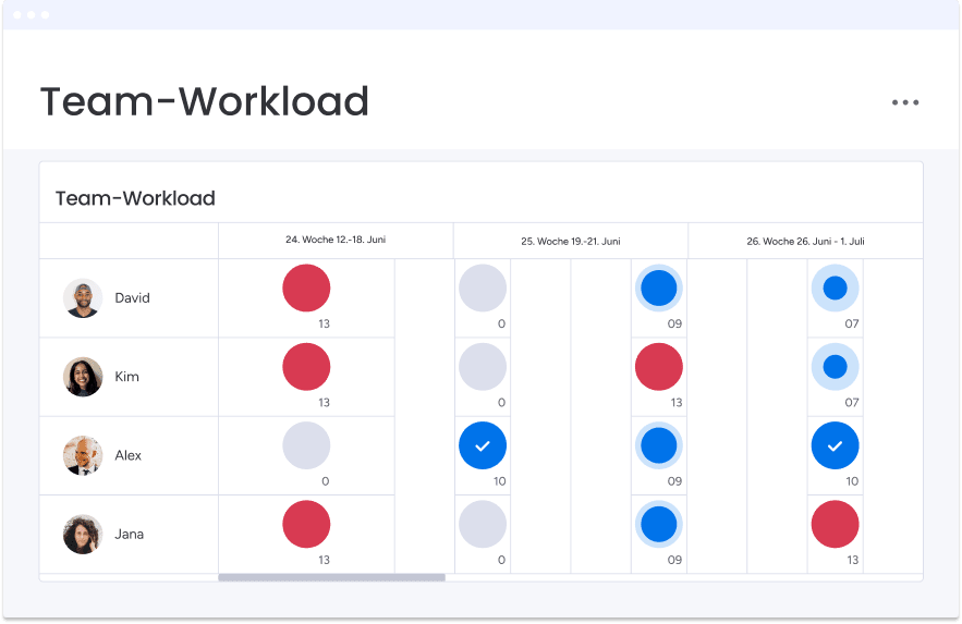
A chart that only shows titles hides the real question of who has room to take on work. Dashboards turn structure into a real-time picture, with workload, capacity, and resource-utilization views and color-coded indicators. You spot who’s overloaded before deadlines slip and rebalance through better capacity planning while there’s still time. Executives get a summary view across teams, while managers drill into their own group without waiting on a report.
Add an org-health agent with monday agents
Structural risks like single points of failure often go unnoticed until someone leaves. With monday agents, task-specific AI workers run alongside your team to catch these issues early. An operations agent can scan your structure and identifies risks such as unclear ownership or overloaded managers. People and Agents work together here: the agent flags the risk, and you make the call. Agents run within your permissions and leave a clear trail, so you keep full control of every decision.

Keep the chart current with automations and integrations
Manual upkeep is why most charts fall out of date. Automations, 200+ integrations, monday MCP, and mondayDB keep yours accurate without the busywork. New hires, role changes, and departures sync from your HR and identity systems across departments. Because mondayDB connects data across teams, the chart reflects the whole organization, and connections with HR platforms stay current automatically. The result is a chart people trust, because it matches the org they work in today rather than the one from last quarter.
Build organizational charts that drive operational excellence
An organizational chart represents more than reporting relationships. A well-defined chart shows how work really moves, so you can make faster decisions and give every team clear ownership toward your goals. And it’s this clarity that turns a diagram into a daily working tool.
As people and agents take on more work side by side, your organizational chart becomes a live map of capacity and accountability. Keep it connected to real work, and it will guide decisions instead of gathering dust in a shared drive. Start simple, keep it current, and let the chart grow with the way your organization operates.
Frequently asked questions
What are the four types of organizational charts?
The four most common types of organizational charts are hierarchical, flat, matrix, and divisional structures. Hierarchical charts use top-down reporting, flat charts remove management layers, and divisional charts group by product or region. Matrix structures create dual reporting relationships for project-based work across functions.
What is an organizational chart for business?
An organizational chart for business is a visual diagram that shows your company's structure, roles, and reporting lines. It helps employees see who owns each decision, which team handles what, and how departments connect, turning everyday coordination questions into a quick glance at the chart.
What does an organizational chart look like?
An organizational chart typically looks like a flow diagram of boxes and connecting lines. Each box represents a position or person, and the lines show reporting relationships. Modern charts add color-coding, capacity indicators, and live project data to show far more than hierarchy alone.
What does an organization chart reveal?
An organization chart reveals your company's hierarchy and decision-making structure. It shows reporting lines, department groupings, and spans of control, so you can see who reports to whom, where accountability sits, and how approvals and information flow across the organization.
How often should you update an organizational chart?
You should update your organizational chart immediately after any personnel change, such as a hire, promotion, or departure. The most reliable approach connects the chart to your HR system so updates sync automatically, which keeps reporting lines accurate without relying on manual edits.
Do modern organizational charts include AI agents?
Yes, modern organizational charts increasingly include AI agents alongside people. Agents handle repetitive, task-specific work, while people own judgment, relationships, and decisions. Showing both on the chart gives you an accurate picture of capacity, since people and agents work together as one team.
How does the AI Workspace handle organizational charts?
monday AI Workspace builds and maintains org charts as living apps. With monday vibe, you describe the chart you need and it builds an org-chart app. Dashboards show live workload and capacity, while HR integrations keep every reporting line current automatically.

 Get started