Teams often deliver work consistently, yet a sense of misalignment persists. Projects frequently linger in review phases longer than anticipated, while some team members are overwhelmed with tasks as others wait idly for assignments. While bottlenecks clearly exist within the system, pinpointing their exact location typically requires navigating a labyrinth of status updates and exhaustive follow-ups.
Cumulative Flow Diagrams (CFDs) reveal the objective reality of these workflows. By tracking work across various stages over time, these charts expose critical patterns that traditional reports often overlook. Instead of relying on conjecture, teams can pinpoint bottlenecks the moment they materialize and immediately discern whether processes are facilitating progress or creating friction.
This article explores the mechanics of CFDs, identifies healthy flow patterns, and outlines the warning signs that signal impending disruption. By mastering these charts and integrating the resulting insights, you can effectively resolve workflow inefficiencies and optimize delivery.
Key takeaways
- Spot workflow problems before they derail projects: watch for expanding bands and flat lines in your CFD to catch bottlenecks early and keep work flowing smoothly.
- Use band width to identify your biggest constraint: the widest colored section shows where work gets stuck — focus improvement efforts there for maximum impact on delivery speed.
- Transform manual tracking into automated insights: connect your project boards with platforms like monday work management to generate real-time CFDs, eliminate spreadsheet maintenance and provide automated bottleneck alerts.
- Read the overall shape for instant workflow health: parallel bands mean healthy flow, while diverging lines signal growing backlogs that need immediate attention.
- Focus on flow patterns, not just completion: CFDs reveal how work moves through stages over time, giving you predictive power that static status reports can’t match.

What is a cumulative flow diagram?
A cumulative flow diagram is a visual chart that tracks work items as they move through different workflow stages over time. It takes the form of a stacked area chart where each colored band represents a workflow stage; the width of each band shows how many items are in that stage at any given moment.
While static reports provide a single point-in-time snapshot, CFDs reveal the complete progression of work through your system. They enable you to identify patterns, pinpoint bottlenecks, and assess the efficiency of your processes. CFDs function as a diagnostic tool for your workflow, displaying both current status and historical performance trends.
CFDs provide value through their straightforward visual language:
- Smooth, parallel bands: indicate healthy workflow.
- Sudden bulges or flat lines: signal problems that need attention.
- Universal application: across marketing campaigns, HR onboarding, and operations requests.
Any workflow with defined stages can benefit from this visibility.
Key components of cumulative flow diagrams
Four visual elements make up a CFD. Each component reveals specific insights about how work moves through your system, giving you the foundation to interpret patterns and make data-driven decisions.
Horizontal axis shows time progression
The x-axis displays your timeline, typically broken into days, weeks, or sprints based on your project scope. Maintaining consistent time intervals is essential for identifying meaningful trends. A band that widens over two days indicates a different pattern than one widening over two weeks.
You can link workflow shifts to specific events:
- Product launch impact: did that band suddenly expand after a product launch?
- Team capacity changes: did it narrow after you hired additional team members?
- Process modifications: how did workflow adjustments affect flow patterns?
The timeline helps you understand cause and effect in your workflow patterns.
Vertical axis tracks work items
The y-axis displays the cumulative count of all work items that have entered your system. This number increases continuously because it represents the total volume of work since tracking began. The view encompasses not only currently active items but also the complete history of everything that has moved through the system.
The cumulative view keeps your entire workflow history intact. You can:
- Calculate delivery velocity: based on historical throughput.
- See arrival rates: over the project lifecycle.
- Forecast future completion dates: using actual performance data.
Colored bands represent workflow states
Each colored layer on your chart corresponds to a specific workflow stage like “Planning,” “In Progress,” or “Complete.” The bands typically stack in the order work flows through your process, making it easy to follow the progression visually.
When everyone uses the same colors, there’s no confusion about which stage is which. Everyone recognizes which color represents testing, review, or approval without checking a legend.
Teams using a Work OS can configure these stages to match their exact processes, ensuring the CFD reflects their actual workflow rather than a generic template.
Band width reveals work in progress
The vertical thickness of any colored band shows exactly how many items are in that stage. A widening band indicates that work is arriving faster than it’s leaving, creating a bottleneck in your workflow. A narrowing band shows the opposite: the team is clearing work faster than new items arrive.
A quick visual assessment reveals where work is accumulating and where it’s flowing smoothly. You can identify bottlenecks and flow patterns without running reports or calculating metrics manually — the band width provides immediate insight into your workflow status.

How to read a cumulative flow diagram?
Analyzing individual bands in isolation provides limited insight. A complete understanding requires an examination of how these bands relate to one another over time. These techniques reveal the actual state of a workflow and enable the resolution of underlying systemic issues.
- Start by examining the overall shape: the top line of the “Done” band represents throughput, where a steep slope indicates high productivity and a flat line suggests that work has stalled. This visual cue provides immediate confirmation regarding whether work is reaching completion.
- Next, analyze the band widths to understand your work in progress: consistent band width suggests stable processes with controlled workloads. When bands maintain similar thickness over time, your team is processing work at a steady, sustainable pace.
- Watch for divergence between bands: if your “To Do” line rises sharply while “Done” stays flat, your backlog is growing faster than your capacity to deliver. This pattern often appears when teams take on new commitments without finishing existing work.
Key analysis techniques include:
- Cycle time calculation: measure the horizontal distance work takes to move through stages.
- Bottleneck identification: the widest band typically represents your system’s constraint.
- Flow stability assessment: look for consistent band relationships over time.
Focus improvement efforts on the widest band first for maximum impact on overall flow.
What does a healthy cumulative flow diagram look like?
A well-functioning workflow produces specific visual patterns that signal predictability and efficiency. These patterns show you when things are running smoothly and when they’re not, giving you a clear baseline for improvement.
Healthy CFDs show these key characteristics:
- Parallel bands: lines between stages run roughly parallel, showing that work enters and exits each stage at similar rates.
- Steady arrival rate: the top boundary rises consistently without sudden spikes or drops.
- Narrow, stable bands: active work stages maintain relatively thin bands, indicating controlled work in progress.
- Continuous delivery: the “Done” area grows steadily without long flat periods.
- Smooth transitions: bands connect cleanly without jagged edges or gaps.
These patterns mean your team’s found its groove. Work flows predictably through stages, teams aren’t overwhelmed, and delivery is consistent. When your CFD shows these characteristics, you can confidently make commitments and forecast delivery dates.
5 CFD patterns that signal workflow issues
Catch these patterns early, and small problems won’t snowball. These warning signs let you step in before problems spread and derail your schedule.
1. Rapidly expanding bands
When a band gets progressively wider over time, forming a wedge shape, you’re seeing a bottleneck in action. Work enters that stage faster than it exits, creating an accumulation that will eventually overwhelm the team.
In a scenario where the “Review” band expands while “Implementation” remains thin, the review process cannot keep pace with the volume of submitted work. This imbalance increases cycle times and directly delays final delivery across the entire workflow.
Common solutions are:
- Add review capacity: through additional team members.
- Reduce the inflow: of work needing review.
- Streamline the review process: itself.
2. Shrinking band width
A rapidly narrowing band shows work starvation. While sometimes this indicates improved efficiency, it often means downstream teams are running out of work because upstream stages have stalled.
If your “Testing” band disappears, testers sit idle waiting for development to complete. This wastes capacity and creates start-stop patterns that reduce overall efficiency. Address this by examining what’s blocking the upstream stage.
3. Horizontal flat lines
Flat lines across all bands indicate complete work stoppage. This pattern emerges during system outages, holidays, or when critical blockers halt all progress. Even if only the “Done” line is flat while other bands show activity, it means work isn’t crossing the finish line.
Diagnostic approach reveals that:
- Flat “Approval” band: indicates absent stakeholders.
- Flat “Development” band: signals technical blockers.
- Flat across all bands: system-wide stoppage.
4. Irregular band fluctuations
Jagged, stair-step patterns in your bands suggest process instability. This often results from batch processing, where teams release large groups of items simultaneously rather than maintaining continuous flow.
Batching creates variability that makes delivery unpredictable. Teams can reduce this pattern by moving items individually as they complete, creating smoother flow. Modern work platforms enable this through automations that trigger status changes item by item rather than in batches.
5. Missing workflow colors
When a stage band disappears or becomes indistinguishable from others, your process likely lacks proper definition. This hides where work actually sits and obscures potential bottlenecks in undefined waiting states.
Missing bands often indicate work happening outside your tracking system or items bypassing standard processes. Ensuring all workflow stages appear on your board keeps the CFD accurate and complete.
Benefits of using cumulative flow diagrams for work management
CFDs enable teams to transition from reactive problem-solving to proactive workflow management. They reveal insights that traditional status reports cannot capture, including emerging issues before they impact delivery timelines.
| Aspect | CFD-driven management | Traditional status reports |
|---|---|---|
| Visibility | Shows flow patterns and trends over time | Provides point-in-time snapshots only |
| Bottleneck detection | Reveals constraints through band width analysis | Requires manual investigation to find issues |
| Forecasting | Enables data-based delivery predictions | Relies on estimates and assumptions |
| Communication | Single visual tells the complete story | Multiple reports needed for full picture |
Other CFD’s benefits are:
- Predictable delivery timelines: become possible when you observe the average slope of your “Done” line. Historical performance data replaces optimistic estimates, giving you realistic forecasts based on actual throughput.
- Resource optimization: improves when you see which bands consistently widen. Instead of hiring generally or shuffling people randomly, you can allocate resources precisely where bottlenecks occur.
- Process improvement insights: emerge from historical patterns. You can see exactly when process changes impacted flow, validating whether new workflows actually improved speed or just shifted problems elsewhere.
- Stakeholder communication: simplifies dramatically. One visual replaces complex spreadsheets and lengthy explanations. Stakeholders instantly understand progress and bottlenecks without technical knowledge.
Cumulative flow diagram vs burndown chart
Both charts track progress but serve different strategic purposes. Know when to use each, and you’ll track what actually matters.
| Aspect | Cumulative flow diagram | Burndown chart |
|---|---|---|
| Primary purpose | Visualizes workflow stability and bottlenecks over time | Shows remaining work against a deadline |
| Time view | Continuous and historical | Fixed iteration or project timeline |
| Work representation | Tracks items in every stage | Shows total remaining effort |
| Best for | Identifying process inefficiencies | Meeting specific sprint goals |
Teams often use both visualizations simultaneously. The burndown ensures the current sprint stays on track, while the CFD ensures the overall process remains healthy and sustainable. On an integrated platform, dashboards can display both side by side, providing complete visibility into tactical execution and strategic flow.

4 steps to create your first cumulative flow diagram
Your CFD is only as good as your data. Here’s how to get it right: follow these steps to build a CFD that actually shows you what’s happening:
Step 1: map your workflow stages
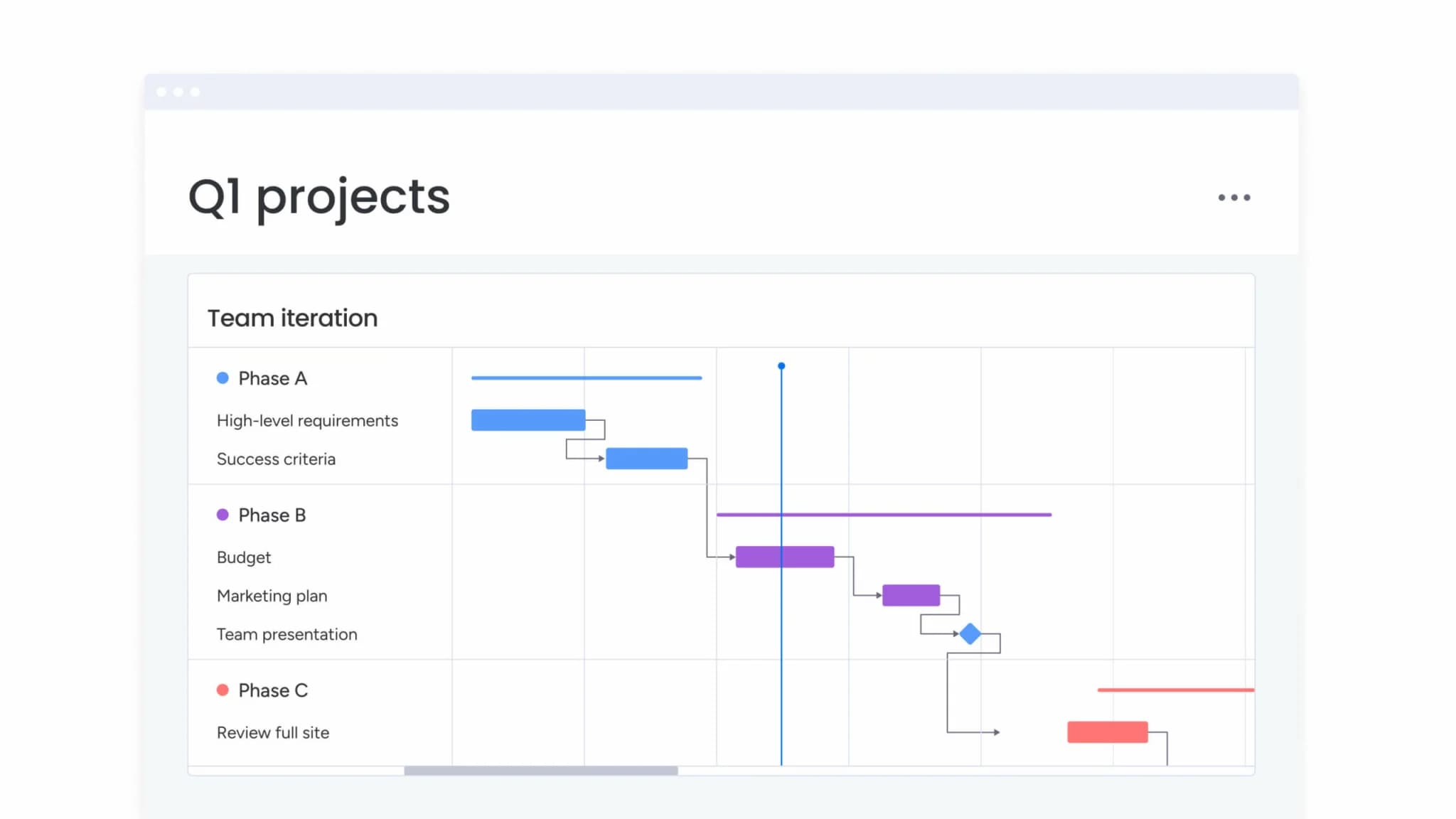
Start by defining the exact states work passes through in your process. Common stages might include “Backlog,” “Planning,” “In Progress,” “Review,” and “Complete.” These become both your board columns and your CFD bands.
Keep the balance right:
- Too many stages: fragment your data and make patterns hard to spot.
- Too few stages: hide important transitions.
- Optimal range: most teams find four to seven stages provide sufficient detail without overwhelming the visualization.
Step 2: collect work item data
Your chart needs daily snapshots showing how many items sit in each stage. Manual counting invites errors and inconsistencies that undermine your analysis.
Automated tracking benefits:
- Captures exact timestamps: whenever items change status.
- Ensures data integrity: across all workflow stages.
- Eliminates manual data entry errors: through automatic tracking.
Consistent collection is essential as gaps in your data create blind spots in your analysis. A work management platform tracks these changes automatically as team members update status columns, eliminating manual data entry.
Step 3: build your cumulative flow chart
Plot dates on the x-axis and cumulative counts on the y-axis, with each workflow stage becoming a stacked colored band. The key is maintaining consistent data capture and visualization settings.
The platform includes widgets that generate CFDs instantly from your board data. You can filter by:
- Time period: focus on specific date ranges.
- Project type: analyze different work categories.
- Team member: track individual contributions.
- Specific workflow aspects: drill into particular stages.
No spreadsheet formulas or external tools required.
Step 4: interpret and act on insights
Regular review sessions should focus on band shapes and relationships. When the “Review” band widens, the priority should be clearing the review bottleneck rather than adding more items to the queue.
Action-oriented analysis:
- Adjust work in progress limits: based on band patterns.
- Reallocate resources: to address bottlenecks.
- Modify processes: to improve flow consistency.
The goal is to transform data insights into continuous workflow improvements.
Cumulative flow diagrams in Agile and SAFe frameworks
CFDs give Agile retrospectives and SAFe implementations something they desperately need: real data. Instead of debating what might have caused delays, teams can point to specific patterns and investigate actual causes with concrete evidence.
Scrum team applications:
- Sprint reviews show stakeholders how smoothly work flowed: not just what was completed.
- Visual evidence shifts discussions: from subjective feelings to objective patterns.
- Retrospectives focus on data-driven process improvements: based on actual flow metrics.
SAFe framework integration:
- CFDs operate at the program level: visualizing feature flow across multiple Agile Release Trains.
- Prevents late-stage integration problems: by encouraging continuous delivery.
- Replaces big-bang releases: at iteration boundaries with steady flow.
Enterprise platforms aggregate team-level CFDs into program views, giving executives visibility without drowning them in individual project details. This multi-level visibility ensures alignment from daily execution to strategic planning.
AI-powered CFD analysis with predictive analytics
AI-powered analytics extend beyond historical reporting to provide forward-looking insights. These systems continuously monitor flow metrics and identify potential issues before they impact delivery timelines.
Automated bottleneck detection
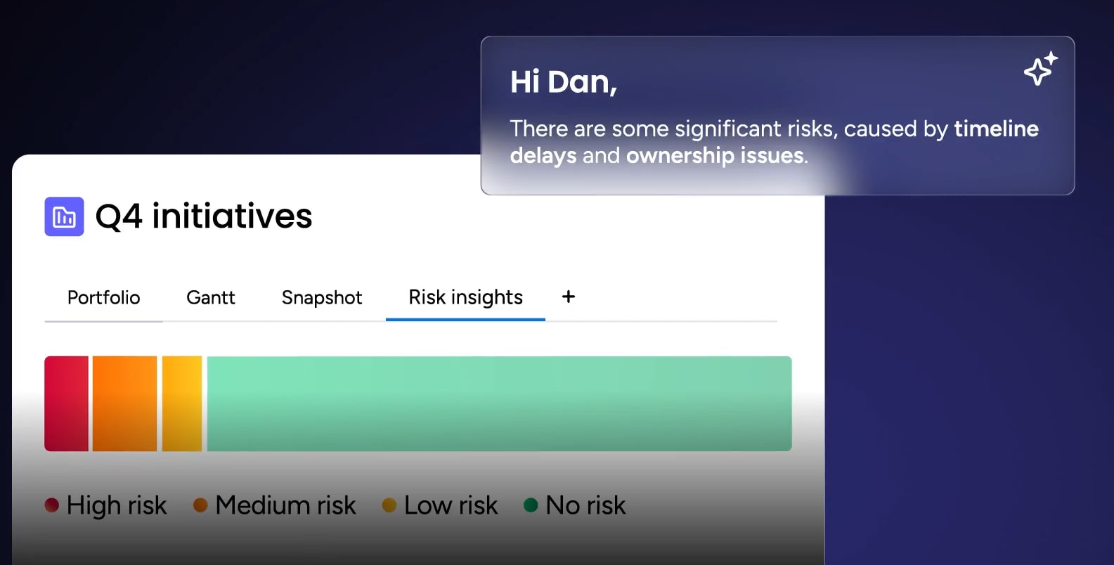
AI algorithms monitor band width ratios continuously, flagging anomalies when a stage exceeds historical norms. This enables teams to identify widening gaps as they emerge rather than discovering them weeks later during scheduled reviews, allowing for timely intervention.
The platform’s Portfolio Risk Insights feature scans project boards and flags issues by severity. Teams using an integrated platform receive alerts when workflow patterns indicate emerging problems, enabling intervention before delays cascade.
Flow efficiency predictions
Predictive analytics combine historical CFD data with current patterns to forecast delivery timelines accurately. By analyzing the “Done” line slope alongside current work in progress, the system provides completion forecasts that account for typical team variability.
Advanced forecasting capabilities:
- Understands seasonal patterns: in team performance.
- Accounts for team capacity changes: over time.
- Recognizes workflow complexity variations: across different project types.
Your forecasts become increasingly accurate as the system learns your team’s unique patterns.
Smart WIP limit recommendations
Machine learning analyzes your historical throughput to identify optimal work in progress limits. The system recognizes the specific workload volume where flow was fastest and suggests caps to maintain that efficiency.
Instead of arbitrary limits or trial and error, you get data-driven recommendations based on your team’s actual performance. These recommendations adapt as your team’s capacity and efficiency evolve.
Change your cumulative flow diagrams with monday work management
CFDs transform into live dashboards with monday work management, helping you improve constantly. The platform solves the biggest problems teams hit when tracking workflow and turns that data into a real edge.
- Automated CFD generation: pulls data directly from project boards to build diagrams instantly. As team members update statuses, the chart reflects changes in real time. No manual counting, no spreadsheet maintenance, no data lag.
- AI-powered insights: analyze your workflow data to highlight risks before they impact delivery. Features like AI Blocks can summarize patterns, while automated alerts notify owners when items sit too long in any status.
- Portfolio-level visibility: aggregates data from multiple boards into unified dashboards. This reveals whether bottlenecks in specific stages are isolated incidents or systemic issues requiring strategic intervention.
- Customizable workflow tracking: lets teams configure stages to match their exact processes. Whether you’re tracking marketing campaigns, HR onboarding, or operations requests, the CFD reflects your actual workflow, not a generic template.
| Capability | monday work management | Traditional methods |
|---|---|---|
| CFD creation | Automated from live board data | Manual data entry and formulas |
| Data accuracy | Captures exact status change timestamps | Prone to human error |
| Pattern analysis | AI identifies anomalies automatically | Requires visual inspection |
| Scope | Scales from single teams to portfolios | Limited to single-project views |
| Actionability | Click through to address stalled items | Static images require platform switching |
| Bottleneck detection | Automated alerts for flow issues | Manual pattern recognition |
“monday.com has been a life-changer. It gives us transparency, accountability, and a centralized place to manage projects across the globe".
Kendra Seier | Project Manager“monday.com is the link that holds our business together — connecting our support office and stores with the visibility to move fast, stay consistent, and understand the impact on revenue.”
Duncan McHugh | Chief Operations OfficerOptimize workflow visibility for competitive advantage
Cumulative flow diagrams transform hidden workflow problems into visible, actionable insights. Whether you’re managing a single team or orchestrating work across multiple departments, CFDs provide the visibility necessary to identify bottlenecks early, forecast delivery with confidence, and continuously improve workflow efficiency.
The effectiveness of any chart depends on three critical factors: automation, accessibility, and integration with your existing work systems. Real-time data collection eliminates manual tracking errors, while AI-powered analysis identifies patterns that might otherwise go unnoticed.
Organizations that implement CFD analysis effectively achieve predictable delivery timelines, optimized resource allocation, and enhanced stakeholder confidence. Rather than constantly addressing urgent issues, these teams proactively prevent problems before they impact delivery, creating a sustainable competitive advantage.
Transform workflow visibility into a strategic advantage. Begin your implementation with monday work management today.
Frequently asked questions
How do you make a cumulative flow diagram in Excel?
Creating a CFD in Excel requires manually logging daily counts for each workflow stage, then configuring a stacked area chart with proper formatting. This process demands consistent manual updates and formula maintenance, which is why many teams prefer automated solutions.
What is the difference between a burndown chart and cumulative flow diagram?
A burndown chart tracks remaining work against a deadline, focusing on completion. A cumulative flow diagram visualizes how work flows through all stages over time, revealing bottlenecks and process health.
Can cumulative flow diagrams track non-technical workflows?
Yes, CFDs work for any process with defined stages. Marketing teams track campaign production, HR monitors onboarding pipelines, and operations visualizes request processing with equal effectiveness.
How often should teams review their cumulative flow diagram?
Teams typically review CFDs weekly during regular syncs or at every retrospective. Frequent reviews help spot emerging bottlenecks before they derail timelines.
Which platforms automatically generate cumulative flow diagrams?
Platforms like monday work management, Jira, and Azure DevOps automatically generate CFDs from project data. For non-technical teams needing customizable workflow visualization, monday work management offers particular flexibility.
How do cumulative flow diagrams improve resource planning?
CFDs reveal exactly which stages constrain flow, allowing managers to allocate resources precisely where needed. This targeted approach ensures new capacity actually improves throughput rather than sitting idle.