Charts are one of our core widgets and based on user feedback, we decided to do a bug-a-thon to ensure all of your data is where you expect, when you expect it to be there. Plus, enjoy other product improvements like workloads displayed in percentages and easy sorting of boards in the table widget.
- Display workloads in percentage
Get a clear understanding of team member workloads by viewing as percentage or number of tasks. - Improved data integrity in charts
We’ve improved your data integrity with several updates to the core chart widget. - Sort boards within the table widget
Easily find boards within the table widget with new sort capabilities like ascending, creation date, and more.
Get the details:
Display workloads in percentage
Understand team workload any way you want – whether it’s by number of tasks, effort, or percentage of total capacity. You can assign “effort” to each task and then display the total effort for each person based on their available capacity.
Here’s how to display capacity:
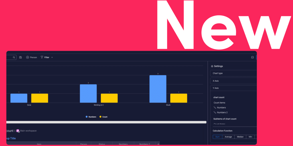
Improved data integrity in charts
Enjoy improved data integrity when it comes to your charts. Some of the updates include accurate data when you drill down on default/empty labels and mirror columns and the “count” feature which now shows accurate data for several y-axis bars.
See one of the chart improvements here:

Sort boards within the table widget
When you’re working with multiple boards, it can be hard to navigate smoothly and quickly between them. Now, you can sort boards in the table widget for a better searching experience. Try sorting by ascending and descending, board name, creation date, or left pane board position.
Here’s how you can sort boards:
Want to request a specific feature or share what you think about the latest updates?
Let us know in the monday.com community!