
Most teams are not short on data. They can see how many complaints came in this month, which projects slipped, or where defects are appearing. The harder question is what to tackle first. When five problems all feel urgent, it becomes easy to spread effort everywhere and make real progress nowhere.
A Pareto chart brings focus back into the picture. It organizes issues by impact and shows how quickly a small number of causes account for most of the results. Instead of guessing where to invest time and resources, teams can see the imbalance clearly and act on it.
The sections ahead walk through how Pareto charts are built, how the 80/20 principle plays out in real business situations, and when this approach makes sense. You’ll also see how to read the cumulative line correctly, avoid common mistakes that distort results, and turn analysis into decisions that actually move the needle.
Key takeaways
- Focus on the vital few causes: Most outcomes are driven by a small number of high-impact issues, and prioritizing these leads to the greatest improvement in results.
- Sort by impact, not just frequency: Rare but costly problems may require more attention than frequent minor issues, ensuring resources address what matters most.
- Use cumulative percentages to guide decisions: The cumulative line in a Pareto chart highlights how a few categories account for the majority of effects, supporting data-driven prioritization.
- Regularly update analysis: Reassessing data periodically captures new emerging problems, keeping priorities aligned with current realities.
- Leverage digital work management tools for execution: Integrating Pareto analysis with centralized platforms allows teams to turn insights into trackable projects and ensure action follows analysis.

What is a Pareto chart?
A Pareto chart mixes vertical bars with a cumulative line to show you which problems matter most, no guesswork required. Named after economist Vilfredo Pareto, this visualization arranges data in descending order from left to right, making it instantly obvious which issues deserve your attention first.
Three parts make this chart work:
- Vertical bars: Display individual categories arranged from highest to lowest frequency or impact.
- Cumulative percentage line: Shows the running total as a percentage, helping you spot when you’ve addressed the majority of issues.
- Dual Y-axes: The left axis measures count or cost, while the right tracks cumulative percentage from 0% to 100%.
Organizations use Pareto charts to focus limited resources on causes that generate the most significant impact. It separates big problems from small ones, so teams stop treating everything like an emergency.
That’s the trap that spreads effort too thin and kills momentum.
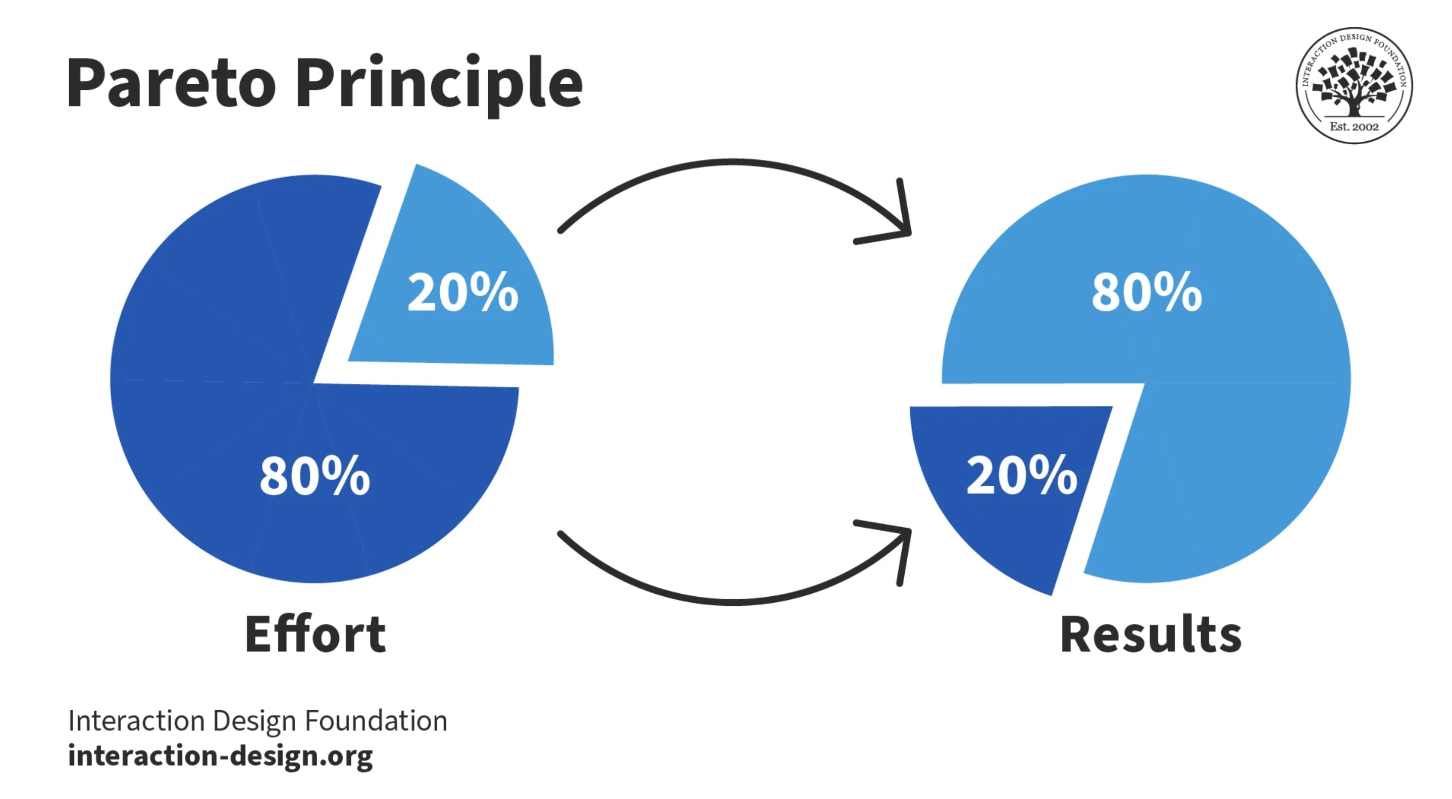
Understanding the 80/20 rule in Pareto charts
The Pareto Principle, also commonly known as the 80/20 rule, suggests that roughly 80% of consequences stem from 20% of causes.
Vilfredo Pareto first observed this pattern in 1896 when he noticed that 20% of Italy’s population owned 80% of the land, establishing what became known as the 80/20 rule. Quality management pioneer Joseph Juran later applied this observation to business, recognizing that most problems come from a vital few sources.
That same pattern appears across modern organizations. In many cases, the majority of disruption, cost, or delay can be traced back to a small cluster of recurring causes. Identifying where that concentration exists makes prioritization far more precise.
- Customer service: A small number of recurring product issues often drive most complaints.
- Project management: A handful of risk factors account for the majority of delays.
- Quality assurance: Specific process steps are responsible for most production failures.
- IT operations: A few root causes typically explain most system downtime.
The 80/20 split is a guideline, not a fixed equation. The ratio may look closer to 70/30 or 90/10 in practice, but the core insight remains the same. Outcomes are rarely distributed evenly either. Focusing on the few high-impact causes allows organizations to address most of the problem without stretching resources across every minor issue.
When to use a Pareto chart for problem-solving
Pareto charts are most effective when complexity makes it difficult to decide where to focus. They help highlight the few factors that have the greatest impact, allowing teams to prioritize efforts for maximum results.
Pareto analysis is really valuable when:
- Analyzing multiple root causes: When facing complex problems with numerous contributing factors, Pareto charts organize these factors by magnitude, revealing which variables actually drive the issue.
- Prioritizing with limited resources: Organizations rarely have unlimited budgets or personnel, making it essential to allocate resources where they’ll yield the highest return.
- Building stakeholder consensus: Cross-functional teams often disagree on priorities based on personal experience. Pareto charts transform subjective debates into objective discussions grounded in data.
When the whole team can view and update the same charts, analysis becomes even more actionable. Platforms like monday work management enable teams to create dynamic Pareto charts that refresh automatically as new data arrives, ensuring everyone works from the same source of truth.

How to create a Pareto chart
Understanding the theory behind Pareto analysis is one thing, but urning it into a chart that actually guides decisions is another.
A useful Pareto chart doesn’t come from guesswork. It comes from structured data, clear categories, and a deliberate build process. The steps below walk through how to move from raw information to a visual that highlights what truly deserves attention.
Step 1: Define problem categories
Start by identifying all relevant problem categories or causes to analyze. Make sure each category stands alone (no overlap) and together they cover everything you’re analyzing.
For instance, customer feedback categories might include:
- Billing error: Issues with invoicing or payment processing.
- Shipping delay: Problems with delivery timelines.
- Product defect: Quality issues with the actual product.
Keep each category distinct and measurable, that’s how you get accurate results.
Step 2: Select your measurement type
Choose the metric that best represents impact for your specific situation. Counting how often something happens is easy, but tracking cost or time lost usually tells you more.
Consider these measurement options:
- Frequency: Number of occurrences.
- Cost impact: Financial damage per incident.
- Time lost: Hours or days of disruption.
A high-frequency error that costs pennies might deserve less attention than a rare error costing thousands.
Step 3: Gather and validate data
Collect records over a relevant period that reflect typical patterns. Inconsistent or incomplete data reduces accuracy.
Ensure consistent definitions across the team. Set criteria for each category to maintain uniformity in recording incidents.
Step 4: Calculate category frequencies
Sum the occurrences, costs, or time for each category to determine the total. Then calculate what percentage each category contributes to that total. These numbers create the visual punch of your chart and give you solid data for making priority calls.
Step 5: Sort data by impact
Arrange categories in descending order, starting with the highest frequency or impact. This sorting turns a regular bar graph into a Pareto chart, which shows you what matters most at a glance. One glance reveals which issues require immediate attention and which can be addressed later.
Step 6: Build the bar graph
Next, plot categories on the x-axis and the measurement metric on the left y-axis. Bars should decrease in height from left to right for clear visual impact. Use consistent colors and spacing to maintain readability and a professional appearance.
Step 7: Add the cumulative line
Finally, include a cumulative percentage line on a secondary y-axis from 0% to 100%. This line shows how quickly the top issues account for most problems.
Modern platforms like monday work management can automate this process by pulling data directly from workflows, generating charts that update automatically when new information arrives.
How to interpret Pareto chart results
Creating the chart is only the beginning. The real insight comes from understanding how the bars and the cumulative line interact and what that pattern reveals about concentration and impact.
When read correctly, a Pareto chart does more than display data: it highlights where attention will create the greatest return and where additional effort may produce only marginal gains.
Finding the vital few causes
The steep portion of the cumulative line will reveal your highest-impact opportunities. When the first two or three bars cause the line to rise sharply toward 80%, those categories represent your vital few, the issues that deserve immediate attention and resources.
Look for the point where the cumulative line begins to flatten, indicating diminishing returns from addressing additional categories.
Reading cumulative percentages
Follow any point on the cumulative line to the right y-axis to see cumulative impact. For example, if the line above the third category reaches 75%, the top three categories are responsible for three-quarters of the total issues.
Translating data into priorities
Clear gaps between major and minor issues make prioritization straightforward. A gradual rise in the cumulative line indicates no dominant cause, suggesting a broader approach may be needed. Use these insights to focus resources on the vital few first, then address remaining categories as capacity allows.
When the first two or three bars cause the line to rise sharply toward 80%, those categories represent your vital few, the issues that deserve immediate attention and resources.
Pareto chart vs histogram and bar graph
At a glance, a Pareto chart, histogram, and bar graph can look almost identical. They all use bars. They all compare categories visually. But they’re built to answer very different questions — and if you choose the wrong one, you risk sending the wrong signal to your audience.
The comparison table below breaks this down clearly. It highlights how each chart differs in purpose, data arrangement, and best use case — so you can match the visual to the decision you’re trying to make, not just the data you have.
| Aspect | Pareto chart | Histogram | Bar graph |
|---|---|---|---|
| Purpose | Prioritize causes by impact | Show data distribution patterns | Compare discrete categories |
| Data arrangement | Always descending order | Grouped by value ranges | Any logical order |
| Key feature | Cumulative percentage line | Continuous data bins | Simple category comparison |
| Best for | Problem-solving and resource allocation | Understanding data spread and shape | General comparisons |
If you’re deciding where to focus improvement efforts, use a Pareto chart. If you’re analyzing how values spread across ranges, use a histogram. If you’re presenting straightforward comparisons between categories, a bar graph is the right choice.

Pareto chart examples across industries
When teams stop guessing and start ranking problems by impact, clarity follows fast.
Pareto analysis is great in real-world environments where resources are limited and not every issue can be tackled at once. Whether it’s production, customer experience, IT, or project delivery, the same pattern tends to emerge: a small number of causes are responsible for the majority of disruption.
Manufacturing defect analysis
A production team analyzing quality control data discovers that among 15 different defect codes, “misaligned seal” and “label smudging” account for 75% of all rejections. By focusing engineering efforts solely on the sealing and labeling stations, they reduce waste significantly without overhauling the entire production line.
This focused fix saves time and money while making the biggest dent in quality problems.
Customer complaint prioritization
A customer success team discovers that “billing discrepancies” and “shipping delays” represent 80% of complaints. Prioritizing these fixes improves customer satisfaction efficiently.
IT incident management
Analysis shows “server overload” and “database connectivity” cause 70% of critical incidents. Investments targeting these systems deliver measurable improvements.
Project risk assessment
A PMO reviewing stalled projects identifies that “resource unavailability” and “unclear scope” are the root causes of 85% of delays, highlighting critical project management challenges. This finding shows the problem isn’t individual PMs, it’s how the whole company handles resources.
Advanced work management platforms like monday work management can leverage portfolio-level risk insights to scan project boards and flag potential risks by severity, making planning and cross-portfolio analysis visible instantly.
How to ensure your Pareto analysis is accurate
Strong data alone doesn’t necessarily guarantee the right priorities. Several common mistakes can still distort results and lead teams in the wrong direction.
Identifying these risks early (outlined below) helps maintain focus on issues that truly matter and supports decisions grounded in evidence, rather than assumptions.
Incomplete data collection
Partial or biased datasets create misleading priorities and weaken analytical value. When analysis relies only on one channel, such as email complaints, while excluding phone calls or chat logs, the resulting Pareto chart fails to represent the full customer experience.
Data should be gathered from every relevant source to reflect reality. Comprehensive coverage ensures the analysis highlights the real drivers of problems instead of a narrow slice of activity.
Missing impact weighting
Counting all incidents equally is a frequent error that distorts priorities. Consider these two issues that both occur once:
- Website typo: Minor issue with minimal business impact.
- System crash: Major disruption affecting all operations.
Without weighting, analysis may elevate small problems above severe failures. Incorporating business impact alongside frequency ensures attention stays on issues with the greatest consequences.
One-time analysis only
Viewing Pareto analysis as a single exercise ignores how conditions evolve. As high-priority issues are resolved, new patterns emerge and demand attention. Static analysis quickly loses relevance in dynamic environments.
Regular reviews keep priorities aligned with current conditions and support continuous improvement rather than one-off corrections.
Categories too broad or narrow
Category definition directly affects insight quality. Overly broad labels, such as “human error,” provide little direction for action. Overly narrow categories fragment data and make meaningful patterns harder to detect.
The right balance produces categories that are specific enough to guide improvement while broad enough to reveal trends.
Analysis without follow-through
Creating a Pareto chart without implementing changes wastes the analysis effort. The chart diagnoses problems but doesn’t solve them. The right work platform connects your analysis straight to project work, so insights turn into assigned items people actually complete.
“monday.com has been a life-changer. It gives us transparency, accountability, and a centralized place to manage projects across the globe".
Kendra Seier | Project Manager“monday.com is the link that holds our business together — connecting our support office and stores with the visibility to move fast, stay consistent, and understand the impact on revenue.”
Duncan McHugh | Chief Operations OfficerAdvanced Pareto techniques for teams
A Pareto chart should be a starting line, not a final deliverable. Insight on its own doesn’t improve performance — action does. The real advantage comes when analysis is embedded directly into how work gets prioritized, assigned, and executed, so the moment a “vital few” issue is identified, momentum follows immediately.
Real-time dynamic Pareto charts
In fast-moving businesses, static snapshots go stale fast. Dashboards that update themselves show you new trends right away, so you can act before problems dig in.
Teams using monday work management can build dashboards that display live project data, creating Pareto distributions that refresh as new items enter workflows, no manual updates required.
AI-enhanced pattern detection
AI-driven analysis processes volumes of data that exceed manual capacity. Pattern recognition highlights correlations and early warning signals that may otherwise remain hidden.
AI Blocks in monday work management automatically categorize incoming data by type, urgency, or sentiment. This reduces manual sorting while surfacing insights that support faster, more informed decision-making.
Multi-dimensional analysis
Advanced teams look beyond single variables to gain deeper insights. A multi-dimensional approach might simultaneously analyze frequency, cost, and resolution time, helping prioritize issues that are frequent, expensive, and slow to fix, offering a more nuanced view of business impact than any single metric provides.
This full view stops you from fixing one thing while accidentally ignoring something just as important.
Digital Pareto chart templates and platforms
Effective Pareto analysis also depends on a digital foundation that supports scale and consistency. The most effective platforms integrate with existing systems, centralize data, and automate chart updates.
Key capabilities to support scalable analysis include:
- Cloud-based collaboration: Distributed teams work from shared datasets without version conflicts.
- Automated data integration: Direct connections to CRM, ERP, and ticketing systems remove manual entry.
- Customizable templates: Standardized structures that remain adaptable to specific metrics and contexts.
Intelligent platforms like monday work management integrate with more than two hundred applications, including Microsoft Teams, Gmail, Slack, and Salesforce. These connections support consistent analysis across teams while maintaining flexibility for different operational needs.
Turn Pareto analysis into action with monday work management
Sustained improvement requires more than a visual. A Pareto chart can highlight the vital few issues, but without a direct path to execution, those insights stall. The real shift happens when analysis is embedded inside the same system teams use to plan, assign, and deliver work.
That’s where monday work management changes the dynamic. Instead of exporting charts into slide decks or spreadsheets, teams can turn prioritization into immediate action. The comparison table below illustrates how manual approaches and basic spreadsheets separate analysis from delivery — while monday work management connects them in one unified workspace.
| Capability | Manual methods | Basic spreadsheets | monday work management |
|---|---|---|---|
| Data collection | Manual entry | Manual import | Automated integration |
| Chart creation | Manual calculation | Template-based | Dashboard widgets |
| Collaboration | Email/meetings | File sharing | Real-time workspace |
| Action planning | Separate systems | Limited tracking | Integrated project management |
| Updates | Manual refresh | Periodic updates | Real-time automation |
Here’s how monday work management supports each stage of Pareto analysis:
-
Automated Data Categorization: AI Blocks classify incoming items such as support tickets or defect reports, assigning structured labels based on type, urgency, or impact without manual effort.
-
Real-Time Dashboard Creation: Dynamic dashboards generate live Pareto charts that update instantly as new data enters workflows.
-
Cross-Departmental Collaboration: Shared workspaces ensure operations, quality, and leadership teams act on the same prioritized insights in real time.
-
Direct Action Tracking: High-impact categories can be converted into structured projects immediately, complete with ownership, timelines, and measurable progress.
For PMOs, this enables portfolio-level visibility, surfacing recurring risk patterns across multiple projects. For quality teams, it supports automated defect intake, real-time monitoring, and threshold-based alerts.
With monday work management, Pareto analysis moves from a static report to an operational system that drives continuous improvement.
Frequently asked questions
What is the difference between a Pareto chart and a histogram?
The difference between a Pareto chart and a histogram is that Pareto charts display categorical data in descending order to prioritize causes, while histograms show the distribution of continuous numerical data. Pareto charts display categorical data in descending order and include a cumulative percentage line, while histograms show the distribution of continuous numerical data across ranges without any specific ordering requirement.
How do you calculate the 80/20 rule in a Pareto chart?
To calculate the 80/20 rule in a Pareto chart, examine the cumulative percentage line to identify which categories contribute to approximately 80% of the total impact. Trace horizontally from the 80% mark on the right y-axis to where it intersects the cumulative line, then look down to see which categories fall within that range.
Can Pareto analysis work with qualitative data?
Pareto analysis can work with qualitative data by converting categories into quantitative measures. Count the frequency of customer feedback themes or weight process issues by their business impact to create meaningful Pareto charts from qualitative sources.
What digital platforms can create automated Pareto charts?
Several digital platforms create automated Pareto charts, including specialized statistical software, business intelligence applications, and comprehensive work management platforms. monday work management integrates data collection, analysis, and action planning in collaborative workspaces, making Pareto analysis accessible to all teams.
How often should teams update their Pareto analysis?
Teams should update their Pareto analysis based on their business cycle and problem-solving needs. Monthly updates work well for operational issues, quarterly reviews suit strategic planning, while real-time updates prove valuable for critical quality or customer service metrics.
What if my Pareto chart doesn't show an 80/20 distribution?
When your Pareto chart doesn't show an 80/20 distribution, it indicates problems are more evenly distributed across categories. This still provides valuable information, suggesting you need a broader improvement approach rather than focusing on just a few vital causes.