
Every team has that one recurring problem nobody can seem to fix. You patch it, it comes back. You escalate it, and it circles around. The real issue is that most teams jump to solutions before they’ve identified the actual root cause.
That’s where fishbone diagrams come in. Also called Ishikawa diagrams or cause-and-effect diagrams, they give teams a structured, visual way to trace a problem back to its origins across multiple categories. Originally developed for manufacturing quality control, they’re now used across industries, from healthcare and software development to marketing and operations.
This guide covers what fishbone diagrams are, when to use them, how to build one step by step, real examples across industries, and common mistakes to avoid. You’ll also see how a visual work platform can bring your entire root cause analysis workflow online, from brainstorming causes to tracking corrective actions.
Get started with monday.comKey takeaways
- Structured root cause analysis: A fishbone diagram template helps teams move beyond guesswork by mapping potential causes across categories like people, processes, and materials
- Step-by-step creation process: Building a fishbone diagram follows six steps, from defining a specific problem statement to creating an action plan with assigned owners and deadlines
- Industry-specific frameworks: Choose from 4S (service), 6M (manufacturing), 8P (retail/hospitality), or custom categories to match your team’s context
- Cross-functional collaboration: Fishbone diagrams work when diverse perspectives are included — quality assurance, operations, project management, and more
- Digital fishbone workflows: monday AI Work Platform lets teams create fishbone diagrams on WorkCanvas by monday.com, then convert findings into trackable action items with automations and dashboards
What is a fishbone diagram?
A fishbone diagram is a visual brainstorming and analysis method that maps the potential causes of a specific problem or outcome. It’s also known as an Ishikawa diagram, named after Kaoru Ishikawa, the Japanese organizational theorist who developed the method in the 1960s for quality control in manufacturing, and a cause-and-effect diagram, which describes exactly what it does. The American Society for Quality (ASQ) considers it one of the seven basic quality tools used in problem-solving techniques across industries.
The name comes from the diagram’s shape. When completed, it looks like the skeleton of a fish. The “head” on the right side holds the problem statement. A horizontal line, the “spine,” extends to the left. Diagonal lines branch off the spine like ribs, each representing a major category of potential causes. Smaller lines branch off those categories for individual causes and sub-causes.
A fishbone diagram template is a blank diagram with space for recording a problem statement or final outcome, as well as categories or affinities and the inputs relevant to each.
So what does a fishbone method of problem-solving actually look like in practice? The components of a fishbone diagram template include:
- The fish head: On the right-hand side of the diagram, you record the problem or final outcome you’re investigating
- The fish spine: A single horizontal line extends to the left, connecting the problem statement to the rest of the diagram
- Fish bones: Diagonal lines extend off the spine for each major cause category (such as people, process, or equipment)
- Sub-bones: Additional lines branch off the category bones, providing space to record individual causes and contributing factors
Fishbone diagram vs. other root cause analysis methods
Fishbone diagrams aren’t the only way to investigate root causes, but they fill a specific role that other methods don’t. Here’s how they compare to three common alternatives:
| Method | Best for | Approach | Limitation |
|---|---|---|---|
| Fishbone diagram | Team brainstorming across multiple cause categories | Breadth-first: maps many potential causes visually | Identifies causes but doesn't rank them |
| 5 Whys | Drilling into a single cause chain | Depth-first: asks "why" repeatedly to reach the root | Can oversimplify multi-cause problems |
| Fault tree analysis | Reliability engineering and safety analysis | Top-down logic tree with AND/OR gates | Requires specialized knowledge to build |
| Pareto chart | Prioritizing causes by frequency or impact | Data-driven: ranks causes using the 80/20 rule | Needs quantitative data, which isn't always available |
Teams often use fishbone diagrams and 5 Whys together, the fishbone to brainstorm and categorize potential causes, then 5 Whys to validate the most likely candidates. A root cause analysis template can help structure this combined approach.
When to use a fishbone diagram
When should you use a fishbone diagram over other analysis methods? The short answer: whenever you’re facing a problem with multiple possible causes, and you need input from more than one person or team. Fishbone diagrams shine when the root cause isn’t obvious, and a structured brainstorming session can surface causes that a single perspective might miss.
Consider using a fishbone diagram in these scenarios:
- Recurring quality issues: A defect, complaint, or error keeps appearing despite previous fixes; the real cause hasn’t been found yet
- Process bottleneck diagnosis: Work slows down at a specific stage, and you need to identify whether it’s a people, process, or equipment issue
- Customer complaint patterns: Satisfaction scores drop, or complaint volume spikes, and multiple departments may be contributing to the problem
- Post-incident reviews: After a significant failure or outage, the team needs to systematically examine what went wrong across systems, procedures, and human factors
- New product or service design: Before launch, teams can use fishbone diagrams to anticipate what could go wrong and address risks proactively
- Strategic planning sessions: When performance gap analysis reveals a disconnect between goals and results, fishbone diagrams help trace the causes
So how do you know when a fishbone diagram is the right approach for your team? If the problem involves cross-functional input – quality assurance, operations, project management, marketing, software development, or healthcare – a fishbone diagram helps everyone contribute their perspective in a structured format.
Benefits of using a fishbone diagram
Root cause analysis can easily turn into an unfocused discussion where everyone shares opinions, but nothing gets resolved. A fishbone diagram changes that dynamic by giving the conversation a visual structure that keeps teams aligned and productive. Here’s what makes them worth the effort.
- Visual problem decomposition: Complex problems become manageable when you break them into categories and sub-causes. Instead of staring at a vague issue, teams can see every dimension of the problem laid out in one view
- Team alignment: Cross-functional teams often have different assumptions about what’s causing a problem. A fishbone diagram gets everyone literally on the same page, making conflicting perspectives visible so they can be discussed and resolved
- Structured brainstorming: Without structure, brainstorming sessions tend to go in circles. The category framework forces teams to systematically explore each dimension rather than fixating on the first cause someone mentions
- Reusable documentation: A completed fishbone diagram becomes a reference document teams can revisit when similar problems arise. It captures institutional knowledge about what was investigated, what was ruled out, and what was identified as the root cause
- Faster resolution: By organizing and visualizing causes upfront, teams spend less time debating and more time acting. The path from problem identification to corrective action shortens significantly when everyone can see the evidence
The key advantage isn’t a single benefit; it’s that fishbone diagrams combine visual thinking, structured collaboration, and documentation into a single activity. That combination is what makes fishbone analysis one of the most enduring methods in total quality management. Organizations that follow the ISO 9000 quality management standard often incorporate fishbone diagrams into their process improvement toolkit.
How to create a fishbone diagram in six steps
Ready to run your first fishbone analysis? Whether you’re using a whiteboard, a digital canvas, or a pre-built fishbone diagram template, the process follows the same six steps. The key is being specific at each stage; vague inputs lead to vague outputs.
Step 1: Define the problem statement
Write a specific, measurable problem statement and place it in the fish head on the right side of the diagram. This is the single most important step: a vague problem leads to a vague analysis.
For example, “Quality is declining” won’t give your team enough direction. Instead, try: “Customer support ticket resolution time increased 40% in Q3 compared to Q2.” The more precise the statement, the more focused your brainstorming will be.
Step 2: Identify major categories
Choose a category framework that fits your industry and problem. These categories become the main “bones” branching off the spine. The most common frameworks are:
- 6M (manufacturing): Man, Method, Machine, Materials, Measurements, Milieu (Mother Nature)
- 8P (service industries): Price, People, Place/Plant, Procedures, Promotion, Processes, Product, Policies
- 4S (general/service): Surroundings, Suppliers, Skills, Systems
- Custom categories: Create your own based on your specific context — content, audience, channels, timing, and creative work well for marketing teams
Don’t overthink this step. Pick the framework that feels closest to your situation and adjust as needed during the brainstorming phase.
Step 3: Brainstorm potential causes
With your categories in place, it’s time to generate causes for each one. Effective brainstorming techniques include:
- Round-robin: Each team member contributes one cause per category, rotating until ideas are exhausted
- Silent brainstorming: Everyone writes causes on sticky notes (physical or digital) before sharing, which prevents groupthink
- 5 Whys within categories: For each initial cause, ask “why?” to uncover deeper contributing factors
Encourage cross-functional participation. A manufacturing engineer, a floor supervisor, and a quality inspector will see different causes for the same production problem.
Step 4: Organize causes into sub-categories
As causes accumulate, group related ones together as sub-bones branching off the main category bones. This clustering reveals patterns: if five different causes all relate to training gaps, that’s a signal worth investigating.
Look for causes that appear in multiple categories. A staffing shortage, for example, might appear under both “People” and “Processes” simultaneously. These cross-category causes are often the most impactful.
Step 5: Analyze and prioritize root causes
A fishbone diagram identifies potential causes, but it doesn’t tell you which ones matter most. After brainstorming, narrow the list using one of these approaches:
- Dot voting: Each team member gets three to five votes to place on the causes they believe are most likely
- Impact/effort matrix: Plot causes by their likely impact on the problem and the effort required to investigate or fix them
- Data validation: Where possible, use data to confirm or eliminate suspected causes
Aim to identify the two to three most likely root causes. Trying to address everything at once dilutes your team’s focus and resources.
Step 6: Create an action plan
The diagram itself is a means to an end, not the end itself. For each prioritized root cause, define:
- A specific corrective action
- An owner responsible for execution
- A deadline for completion
- Success metrics to verify the fix worked
Use a corrective action plan template to structure this step. A digital platform makes all the difference, turning your diagram into trackable action items with assigned owners, due dates, and automated follow-ups. Without this step, even the most thorough fishbone analysis stays theoretical.
Fishbone diagram examples by industry
The power of a fishbone diagram template lies in its flexibility. The same structure works across manufacturing floors, marketing teams, service desks, and software development. What changes is the category framework and the specific causes within each branch. Here are real-world examples of fishbone diagrams across four contexts.
Simple fishbone diagram example
A simple fishbone uses custom categories tailored to the specific problem. Say you’re a supply chain leader investigating why product delivery times have increased by 20% over the past quarter. Your categories might include:
- Logistics: Carrier delays, route inefficiencies, warehouse congestion
- Inventory: Stockouts from inaccurate forecasting, slow replenishment cycles
- Suppliers: Raw material lead time increases, quality rejections causing re-orders
- Internal processes: Order processing bottlenecks, manual handoffs between departments
The simple fishbone diagram lets teams create categories that are most relevant for their specific situation. Development teams working on a software deployment would use entirely different categories than clinical teams working to reduce patient readmission rates.
Manufacturing fishbone diagram: the 6M framework
The 6M fishbone is the most widely used framework in manufacturing and production environments. Here’s a worked example for a real manufacturing problem:
Problem statement: “Defect rate on production line 3 exceeded 5% for three consecutive months.”
- Man: New operators without sufficient training, high turnover on night shift, inconsistent quality inspection procedures
- Method: Outdated assembly instructions, no standardized setup process between shift changes
- Machine: Aging press equipment with calibration drift, preventive maintenance schedule overdue by six weeks
- Materials: New resin supplier with inconsistent batch quality, humidity-sensitive components stored improperly
- Measurements: Sampling rate reduced from 100% to 10% during Q2, measurement instruments last calibrated eight months ago
- Milieu (Mother Nature): Temperature fluctuations in the production hall during summer months, dust contamination near the loading dock
After brainstorming, dot voting revealed that machine calibration drift and the new resin supplier were the two most likely root causes, both of which were confirmed through follow-up data analysis.
Service industry fishbone diagram: the 8P framework
The 8P approach is designed for service industries like retail, hospitality, and food service. Here’s a worked example:
Problem statement: “Customer satisfaction scores dropped 15% in Q2 compared to Q1.”
- Price: Competitor price reduction made our pricing feel less competitive
- People: Three experienced team members left in Q1, replacements still in onboarding
- Place/Plant: Lobby renovation caused noise and access issues for six weeks
- Procedures: New check-in process added two minutes to the average wait time
- Promotion: Marketing campaign set expectations the current service level couldn’t meet
- Processes: Complaint escalation process had no defined SLA for response time
- Product: Menu changes removed three popular items without customer notification
- Policies: Updated refund policy perceived as less generous than the previous version
Marketing fishbone diagram example
Fishbone diagrams aren’t limited to manufacturing and service operations. Marketing teams can use custom categories to diagnose campaign performance issues. Here’s an example no traditional quality management guide covers:
Problem statement: “Campaign conversion rate dropped 25% after the website redesign.”
- Content: Landing page copy didn’t match ad messaging, CTAs were below the fold on mobile
- Audience targeting: Audience segments weren’t updated to reflect the new site structure
- Channel mix: Email traffic sent to outdated landing page URLs for two weeks after launch
- Timing: Redesign launched during the team’s highest-traffic campaign period
- Creative: New visual design tested well internally but didn’t resonate with the core audience segment
- Analytics: Conversion tracking broke during the migration, masking the real drop for 10 days
In this example, the team discovered that broken conversion tracking was hiding the true impact, and the audience targeting mismatch was the primary driver of the conversion decline.
Common fishbone diagram mistakes and how to avoid them
Fishbone diagrams are straightforward, but a few common mistakes can undermine their effectiveness. If your fishbone analysis sessions feel unproductive or your results don’t lead to real change, one of these pitfalls might be the reason.
- Vague problem statements: “Quality is declining” gives your team nothing specific to investigate. Compare that to “Defect rate on line 3 exceeded 5% for three consecutive months,” the second version focuses the entire analysis on a measurable, bounded issue
- Too few or too many categories: Fewer than four categories limit your analysis; more than eight makes it overwhelming. Stick to four to eight categories that genuinely relate to the problem
- Skipping the prioritization step: A fishbone diagram identifies causes, but it doesn’t rank them. Without a follow-up prioritization exercise – dot voting, impact/effort scoring, or data validation – the team has no basis for deciding what to fix first
- No action plan after analysis: The diagram is a diagnostic method, not a solution. If the session ends without assigned corrective actions, owners, and deadlines, the analysis stays theoretical. Always close with a DMAIC-style action plan
- Working in silos: A fishbone diagram built by one person or one department misses the cross-functional perspectives that make the method effective. Include team members from every function that touches the problem, even if their involvement seems tangential
The pattern across these mistakes is the same: fishbone diagrams fail when teams skip steps or treat them as a checkbox exercise instead of a genuine collaborative investigation.
How to run root cause analysis with monday AI Work Platform
monday AI Work Platform connects the entire root cause analysis workflow in one system — from brainstorming causes to assigning corrective actions, tracking progress, and verifying resolution. Here’s how it works.
Visualize root causes with WorkCanvas
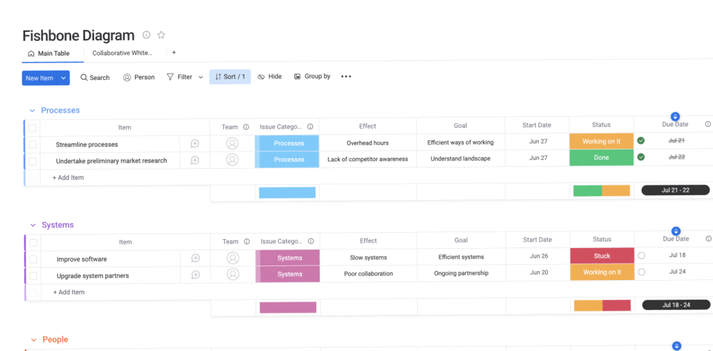
WorkCanvas by monday.com is a collaborative whiteboard where teams can visually create fishbone diagrams, capture cause-and-effect relationships in real time, and link findings directly to action items. Map out every potential cause in a shared visual space your whole team can access from anywhere, with all causes and decisions captured in one place.
Start with the Fishbone Diagram Template to get a pre-built structure you can customize for any root cause analysis session. Teams can collaborate simultaneously, adding causes, grouping sub-categories, and voting on priorities directly on the canvas.
Turn findings into trackable action items
Once your team identifies root causes, the platform converts fishbone analysis results into assigned action items with owners, due dates, and progress tracking. Automations send reminders when corrective actions are due and notify stakeholders when items are completed. Dashboards provide real-time visibility into the progress of root cause analysis across all open investigations.
For broader project oversight, pair your fishbone workflow with the Single Project Template to track corrective actions alongside your existing projects. Technical teams investigating system issues can use the IT Root Cause Analysis Template for a structured approach to incident investigation.
Scale root cause analysis with AI
monday agents, including the Risk Analyzer and Process Automator, can assist with pattern recognition across multiple investigations, flagging recurring causes that appear across different fishbone sessions. monday vibe lets teams build custom root cause analysis tracking apps from natural language prompts, so you can create a tailored RCA workflow without writing a single line of code.
Use Workdocs to document fishbone sessions with embedded live board data, creating a searchable knowledge base of past investigations your team can reference when similar problems arise. Explore hundreds of additional templates in the Template Center to connect your root cause analysis workflow to project management, process improvement, and quality assurance. For teams pursuing formal quality excellence, this approach aligns with frameworks such as the Baldrige Performance Excellence Program.
Get started with monday.comFrom root cause to resolution: build your fishbone workflow today
Fishbone diagrams give teams a structured way to stop guessing and start solving. By visually mapping potential causes, aligning cross-functional perspectives, and following through with prioritized action plans, you move from “we think we know the problem” to “we’ve confirmed the root cause and assigned the fix.”
The method itself is simple. The challenge is ensuring the insights from your fishbone analysis translate into corrective actions that are tracked, completed, and verified. The platform brings that full cycle into one connected workspace, from brainstorming causes on WorkCanvas to tracking corrective actions on boards with automations and dashboards that keep every investigation moving forward.
Whether you’re running your first fishbone session or scaling root cause analysis across an entire organization, the platform provides your team with a visual, collaborative, and automated foundation to turn every investigation into measurable improvement.
Get started with monday.comFAQs
What is the 6M model of a fishbone diagram?
The 6M model of a fishbone diagram is a category framework used primarily in manufacturing and production. The six categories are Man (labor and skills), Method (processes and procedures), Machine (equipment and facilities), Materials (raw goods and components), Measurements (inspections and data), and Milieu, also called Mother Nature (environmental factors). It's the most widely used 6M fishbone framework for identifying root causes in production environments.
What are the 5 categories of a fishbone diagram?
The 5 categories of a fishbone diagram vary by framework, but a common five-category model used outside manufacturing includes People, Process, Equipment, Materials, and Environment. Category count and naming depend on the industry and the specific problem being analyzed; some frameworks use four categories (4S), while others use six (6M) or eight (8P).
How do I create a fishbone diagram in Word?
To create a fishbone diagram in Word, you can use the Insert > Shapes function to draw the spine, category bones, and text boxes manually. Word doesn't include a built-in fishbone diagram template, so you'll need to build it from individual shapes. For a more collaborative experience, dedicated platforms like monday.com offer purpose-built fishbone diagram templates with real-time collaboration, visual brainstorming, and the ability to convert findings into trackable action items.
Is there a fishbone diagram template in Excel?
A fishbone diagram template in Excel is not natively available, but you can approximate one using the shapes and drawing features built into spreadsheets. The limitation of this approach is that spreadsheets lack real-time collaboration and visual brainstorming features, making them less effective for the team-based discussions required by fishbone analysis.
What is the fishbone method of problem solving?
The fishbone method of problem-solving is a structured brainstorming technique in which teams visually map potential causes of a problem across defined categories, then analyze and prioritize them to identify the root cause. Developed by Kaoru Ishikawa in the 1960s for quality control, the fishbone method, also known as the Ishikawa method, remains one of the most widely used root cause analysis approaches across manufacturing, healthcare, software development, and business operations.
What is the difference between a fishbone diagram and 5 Whys?
The difference between a fishbone diagram and 5 Whys lies in their approaches to root cause analysis. A fishbone diagram maps multiple potential causes across categories, providing breadth, while the 5 Whys method drills deep into a single cause chain by asking "why?" repeatedly. Teams often use both together; the fishbone diagram to identify and categorize candidates, then the 5 Whys to validate the most likely root cause. monday AI Work Platform supports both approaches with customizable boards and 5 Whys templates that connect directly to your fishbone analysis workflow.